Some companies nail their user onboarding. I’ll break down the best ones.
Today: how @Shopify onboards new users
The verdict: ⭐️⭐️⭐️⭐️ out of 5
Let’s jump in!
Today: how @Shopify onboards new users
The verdict: ⭐️⭐️⭐️⭐️ out of 5
Let’s jump in!

For people not familiar with @Shopify, it's SaaS tool that allows anyone to set up an online store and sell their products.

Let's signup!
Enter email and click on "Start free trial"
This brings up a popup that asks for your password and store name.
I love it! Here's why.
Enter email and click on "Start free trial"
This brings up a popup that asks for your password and store name.
I love it! Here's why.
Double-opt-in signups work because of The Principle of Consistency. 🧠
Once someone has performed an action, they're more likely to do the next step to remain consistent with their previous action.
Once someone has performed an action, they're more likely to do the next step to remain consistent with their previous action.
It's a powerful psychology principle that @chargebee used to doubled their signup rate.
Source: @CXLdotcom cxl.com/blog/saas-sign…
Source: @CXLdotcom cxl.com/blog/saas-sign…
You'll see the team at Shopify use The Principle of Consistency over and over again in the signup process.
More on that later... [Foreshadowing!]
More on that later... [Foreshadowing!]
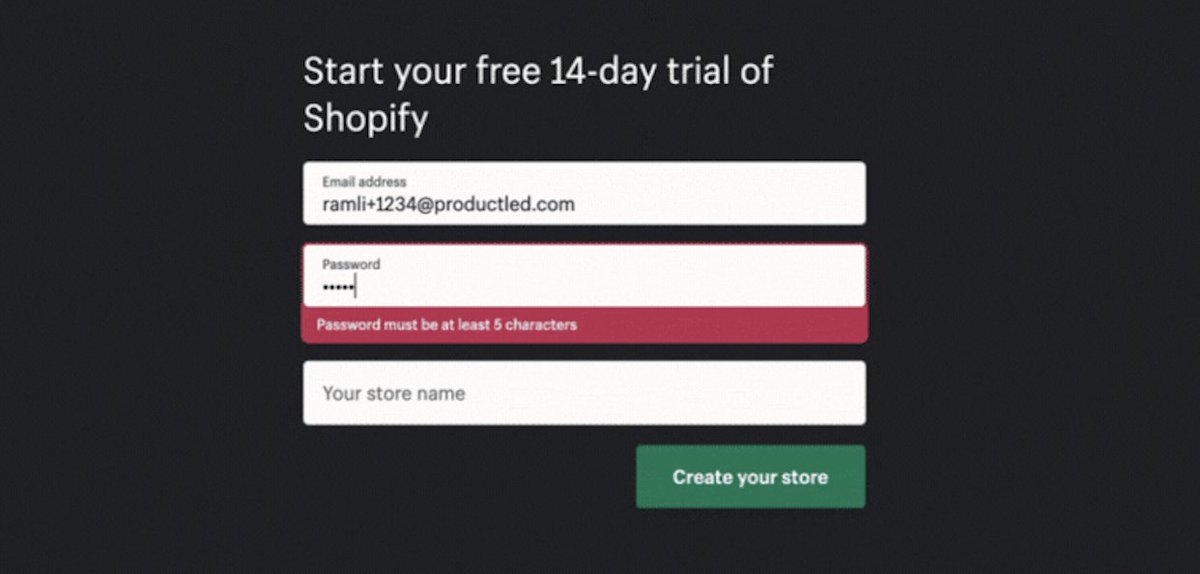
Let's fill out our password.
@Shopify does here one of my pet peeves:
Not telling me the requirements for the password until after I've messed up.
@Shopify does here one of my pet peeves:
Not telling me the requirements for the password until after I've messed up.
Have you ever entered a password and get a notification:
*WRONG!!! YOUR PASSWORD SUCKS! PLEASE ENTER 3 NUMBERS AND 5 WEIRD CHARACTERS. *
I exaggerate! But that's what it feels like to me.
*WRONG!!! YOUR PASSWORD SUCKS! PLEASE ENTER 3 NUMBERS AND 5 WEIRD CHARACTERS. *
I exaggerate! But that's what it feels like to me.
A better way is to state upfront your password requirements.
Here's how @FACELIFTbbt does it.
When you get to the password field, they show everything you need to have in your password.
Here's how @FACELIFTbbt does it.
When you get to the password field, they show everything you need to have in your password.
It's also odd that Shopify's only password requirement is it needs to be at least 5 characters.
So, I'm throwing caution to the wind—I've set my password to "abcde"
Let's see if I get an error message. 😈
So, I'm throwing caution to the wind—I've set my password to "abcde"
Let's see if I get an error message. 😈
Let's type a random store name "Ramli ProductLed Store" and click "Create your store"
Aside: I love this button copy. Generic button copy like "Next" or "Submit" are 💩. Much better to tell people what will happen next if you click the button.
Aside: I love this button copy. Generic button copy like "Next" or "Submit" are 💩. Much better to tell people what will happen next if you click the button.
Now comes the account setup.
It asks for three things:
1) Are you already selling?
2) What is your current revenue?
3) Which industry will you be operating in?
But the Shopify team has something up their sleeves!
It asks for three things:
1) Are you already selling?
2) What is your current revenue?
3) Which industry will you be operating in?
But the Shopify team has something up their sleeves!
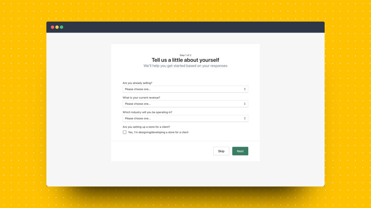
If you select "I sell with a different system" a new field appears!
"Which system do you use the most?"
This is a UX design principle called Progressive Disclosure in action! 🧠
"Which system do you use the most?"
This is a UX design principle called Progressive Disclosure in action! 🧠
Progressive disclosure simplifies user interactions by focusing the user's attention on the most important details first and hiding other details for later.
This reduces the risk of people becoming overwhelmed.
Source: @shopify's blog (how meta right!)
shopify.ca/partners/blog/…
This reduces the risk of people becoming overwhelmed.
Source: @shopify's blog (how meta right!)
shopify.ca/partners/blog/…
Shopify uses this principle one more time.
After I select, "BigCommerce" from the dropdown list, I new field appears!
"Why are you creating this store?"
I love it! I select "I'm moving my store to Shopify."
After I select, "BigCommerce" from the dropdown list, I new field appears!
"Why are you creating this store?"
I love it! I select "I'm moving my store to Shopify."
For your signup process, if you require users to fill out multiple fields, consider using Progressive Disclosure by showing fields after users have completed previous ones already.
Let's move on and fill the rest of the required information.
Click "Next"!
Aside: I'm ok with the button copy "Next" here because at the top it says "Step 1 of 2." It's clear I'm going to step 2 when I click on this button.
Click "Next"!
Aside: I'm ok with the button copy "Next" here because at the top it says "Step 1 of 2." It's clear I'm going to step 2 when I click on this button.
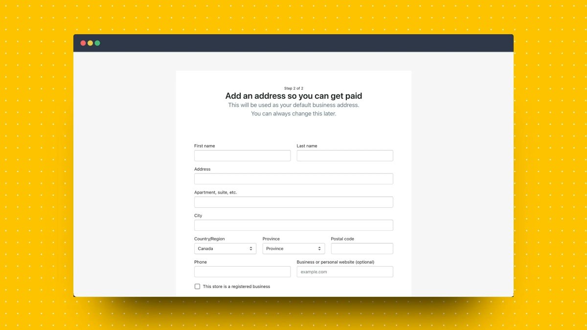
Well, you look at this. Ten more fields I have to fill out for step 2.
This is the Principle of Consistency in action again!
After users have filled out the 3 fields in step 1, they're more likely to fill out 10 more fields in step 2.
This is the Principle of Consistency in action again!
After users have filled out the 3 fields in step 1, they're more likely to fill out 10 more fields in step 2.
Tip: If you have a long signup process, break it up into multiple pages. Save the highest friction fields to the last step.
@Instapage found that breaking up signup forms into multiple pages increased completion by 189%
Source: instapage.com/blog/multi-ste…
@Instapage found that breaking up signup forms into multiple pages increased completion by 189%
Source: instapage.com/blog/multi-ste…
I do have one gripe with this signup form, though.
The phone number is mandatory.
Why?!?
Is it really required for me to set up my store?
Risk: I'll get a BUNCH of calls from sales. 👎
The phone number is mandatory.
Why?!?
Is it really required for me to set up my store?
Risk: I'll get a BUNCH of calls from sales. 👎
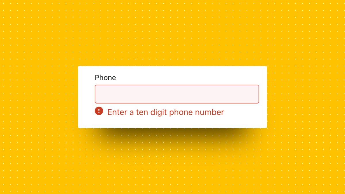
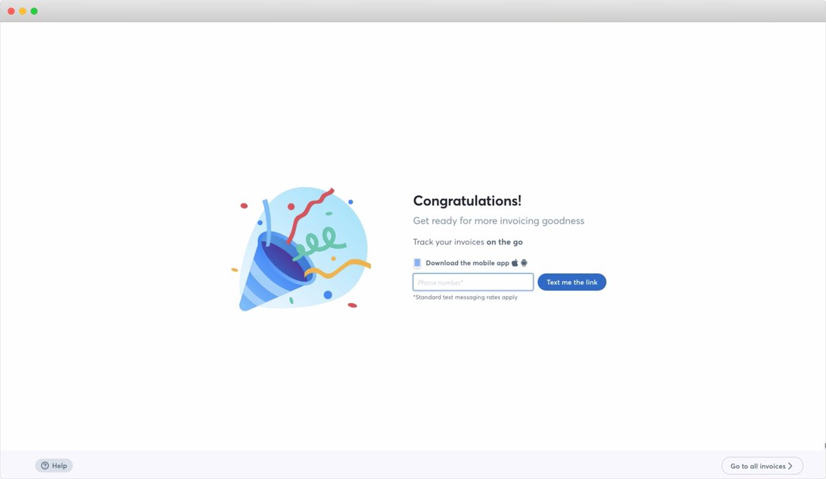
If you're going to ask for a phone number, state clearly what users are getting.
Here's how @WaveHQ does it.
"Provide us your phone number so we can send you a link to download our mobile app and track your invoices *on the go*."
Expected value > perceived risk
Here's how @WaveHQ does it.
"Provide us your phone number so we can send you a link to download our mobile app and track your invoices *on the go*."
Expected value > perceived risk
Anyway, let me fill in a clearly fake phone number 123-456-7891.
And click "Enter my store"
Again, I love that button copy. I know where I'm going next.
And click "Enter my store"
Again, I love that button copy. I know where I'm going next.
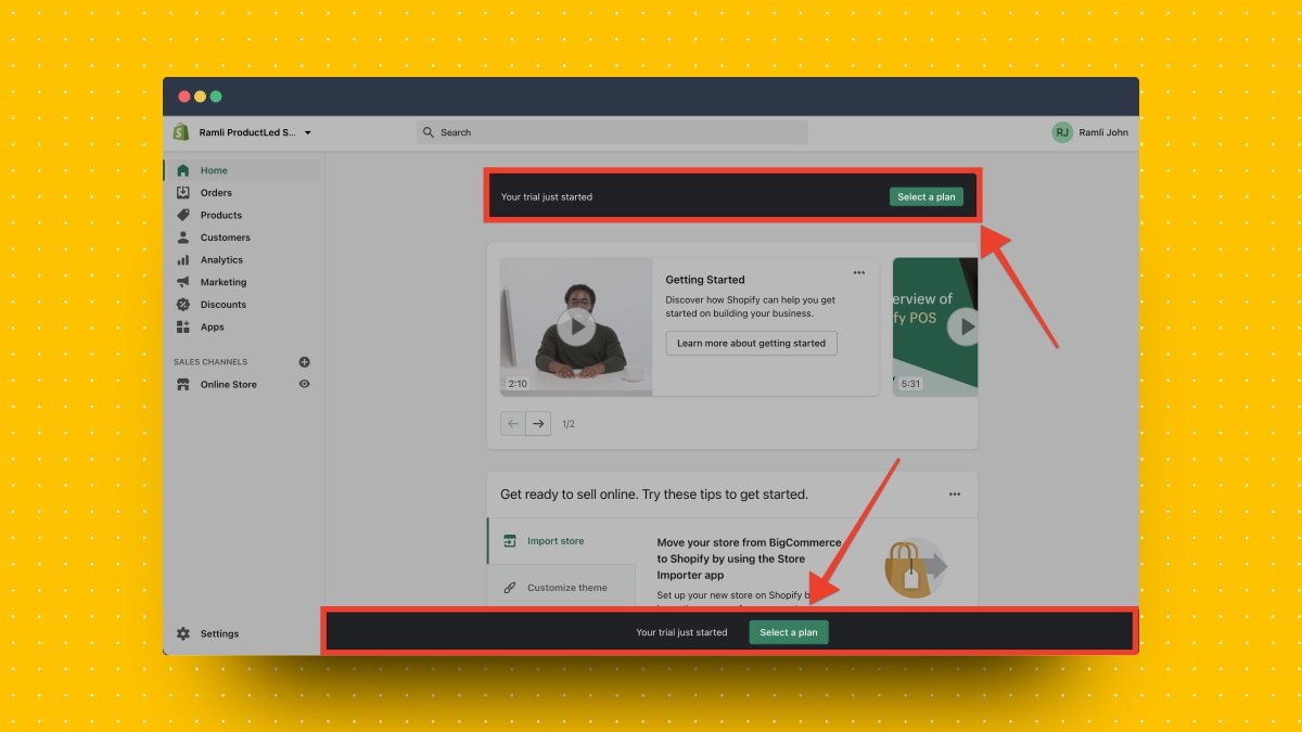
We're finally in the Shopify app.
There are two CTAs that stand out "Select a plan"
Shopify repeats it twice. So it must be important. 🤷♂️
Let's click on it
There are two CTAs that stand out "Select a plan"
Shopify repeats it twice. So it must be important. 🤷♂️
Let's click on it
Gah they're making me enter a credit card to select a plan!
I know why they're doing this—users who enter a credit card are probably more likely to convert.
But, as the primary CTA for user onboarding? Get me to experience the product's value first!
I know why they're doing this—users who enter a credit card are probably more likely to convert.
But, as the primary CTA for user onboarding? Get me to experience the product's value first!
After "Select a plan" the next most prominent CTA is "Getting started", which brings you to a course to getting started with Shopify.
I love it!
The video lessons are well-produced & engaging.
But in this situation, I don't think this should be the main CTA. Here's why.
I love it!
The video lessons are well-produced & engaging.
But in this situation, I don't think this should be the main CTA. Here's why.
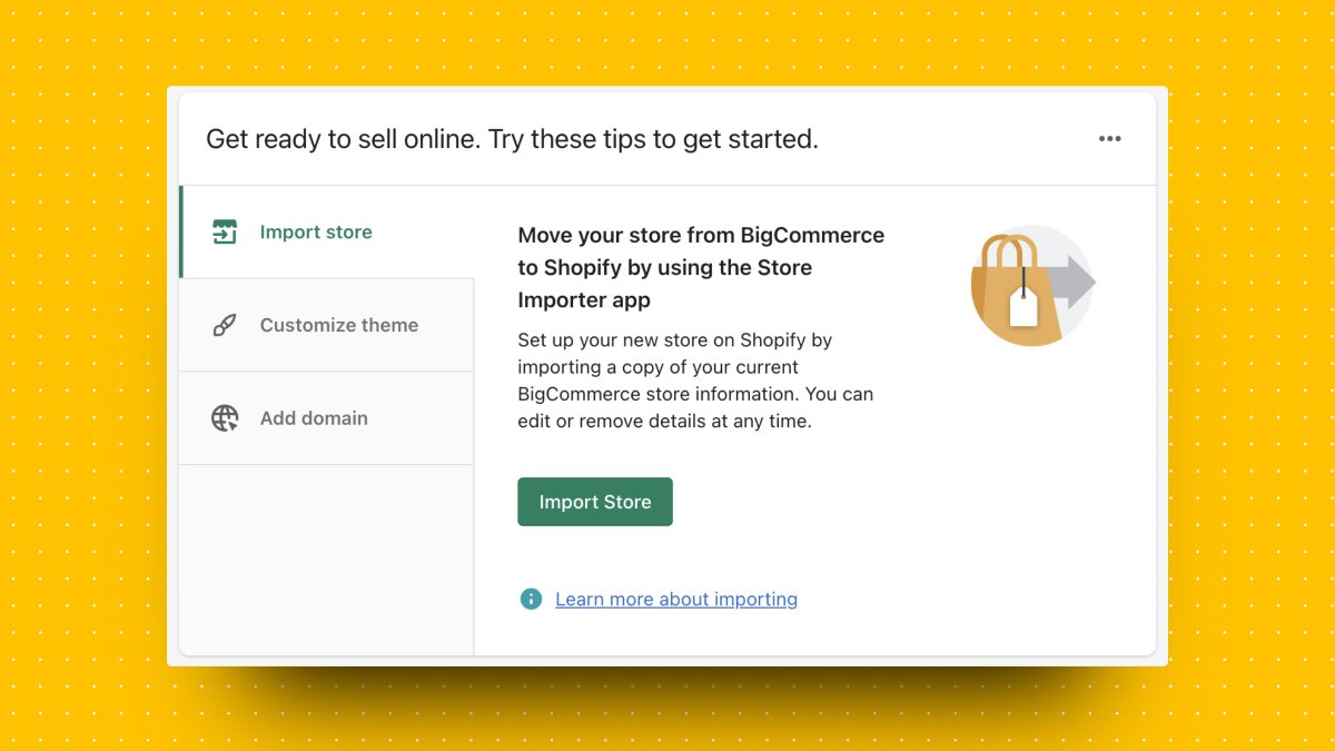
In the signup process, I've let Shopify know that I have a BigCommerce store and that I'm moving my current store over.
About halfway down the page, I finally get instructions on how to do this!
About halfway down the page, I finally get instructions on how to do this!
For me, this is the logical next step for onboarding.
If I told you that I want to move my BigCommerce store to Shopify, I don't need a "Getting Started with Shopify" course or "Select a plan."
I want specific instructions to help me accomplish my goal.
If I told you that I want to move my BigCommerce store to Shopify, I don't need a "Getting Started with Shopify" course or "Select a plan."
I want specific instructions to help me accomplish my goal.
One final thing:
I LOVE how Shopify clearly shows how I can ask for help.
Please. Please. Don't make it hard for users to ask for help.
What's the best way to get help if they get stuck?
I LOVE how Shopify clearly shows how I can ask for help.
Please. Please. Don't make it hard for users to ask for help.
What's the best way to get help if they get stuck?

That's all folks!
Here's recap of what @Shopify did well in their onboarding:
✅ Broke up the signup into multiple pages
✅ Hid unnecessary fields & only showed them in relevant situations
✅ Button copy clearly described the next step
Here's recap of what @Shopify did well in their onboarding:
✅ Broke up the signup into multiple pages
✅ Hid unnecessary fields & only showed them in relevant situations
✅ Button copy clearly described the next step
What could be improved:
🚀 Share the password requirements upfront
🚀 Don't make the phone number a mandatory field unless you say what's in it for users
🚀 Focus on the user's primary goal for the onboarding. In this case, it's moving my BigCommerce store
🚀 Share the password requirements upfront
🚀 Don't make the phone number a mandatory field unless you say what's in it for users
🚀 Focus on the user's primary goal for the onboarding. In this case, it's moving my BigCommerce store
What did you like about Shopify's onboarding?
What did you think could be improved?
Let me know in the comments below!
Tomorrow, I'll be going through @Canva's onboarding. Feel free to suggest other apps you want me to look at.
What did you think could be improved?
Let me know in the comments below!
Tomorrow, I'll be going through @Canva's onboarding. Feel free to suggest other apps you want me to look at.
If you enjoyed this, my new book "Product-Led Onboarding" is dropping on Tuesday, June 8.
Details are below.
Follow me @ramlijohn for more product growth and user onboarding tips.
Details are below.
Follow me @ramlijohn for more product growth and user onboarding tips.
https://twitter.com/RamliJohn/status/1397209350926647304
• • •
Missing some Tweet in this thread? You can try to
force a refresh