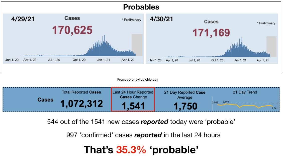
I've decided to split today's misinformation into two parts - first, the cases:
Absolute collapse are the two words to describe them. Although the proportion of probables is up again - coincidentally at the same time of the week as it was last week and the week before and so on.
Almost like there's a certain number of antigen tests being performed in the state every week, and that these antigen tests have a certain false positivity rate. But I'm sure this pattern is just coincidence.
But the other great news is that at this rate, within just 2 days we will have *magically* reached our Metric of Freedom. Coincidentally right when they thought we might!
Just as coincidentally - our testing has dropped to rock bottom levels as well. So many coincidences!
Sometimes it's in the empty spaces where most meaning sits. Most people have been slicing away at the whole and complete emails from Dr. Fauci's email FOIA release. And, admittedly, some of those intact emails are highly satisfying to read.
But what is far more interesting are the pages of greyed out redactions. Consider pages 1567-1572 from his emails.
They are of his correspondence with Dr. Kenneth Bergmann, Senior Medical Officer in the Division of Neurology in the Center for Drug Evaluation and Research at the FDA that took place between April 4th - April 15th, 2020.
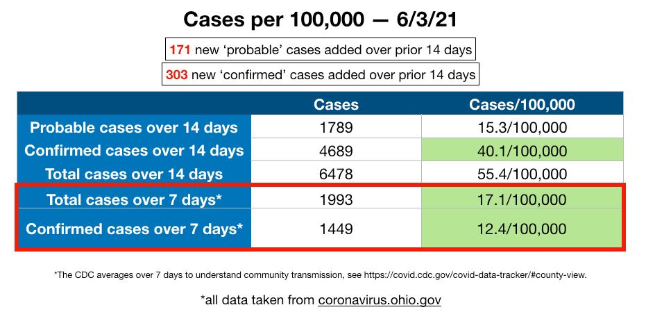
Well, someone clearly wants this whole cases thing to end, and end fast. We continue our staggering plummet in cases.
In just the past 5 days, we have dropped over 2k total cases over 14 days, if we continue this trend, in 5 days, we will be under 50/100k over 14 days. Woohooo!
Again, I am sure this has *nothing at all* to do with the fact that for the last 3 days we have data for, the number of tests given has fallen between just 9000 and 17,000 total tests given - far below the 60,000+ given daily throughout the months of March and April.
⭐️ Fun fact: we have the same positivity rate now with just 9000 tests given as when there were 60,000 tests given. But for sure our 'cases' aren't being influenced by testing!
That would be the noise of collapse over the weekend (which is entirely expected, of course). All metrics have dropped precipitously. The total cases over 14 days dropped by 1200 over just 2 days. Could there still be some reporting lag?
Sure - but I'm betting we won't see any significant jumps over the next days, not enough to overcome such a drop. We've dropped so low that our confirmed cases over the full 14 days has smashed through the 50/100k & we're getting extremely close with the total cases as well.
⭐️ Magic how it all happens right now, isn't it?
And of course, all of this drop in cases according to our genius Overlords only has to do with people getting their jabs, even though v-starts have also completely dropped off a cliff as well.
Those of you who have spent the time closely watching the changes in the csv file (from coronavirus.ohio.gov) day to day know how random it is in there. Each new csv file has changes in it.
Obviously, there are newly added cases in the near term, but what is wacky are all the changes that are *constantly* happening on days much further in the past. Cases are added, but they are also *subtracted.*
It is usually all over the place though, and not big numbers - a couple added here, a few subtracted there. But as I have been doing the daily cases/100,000 data collection, I noticed something very odd happening.
Here's your daily dose of 'misinformation that could cause physical harm.'
You know - data pulled directly from coronavirus.ohio.gov (go check it all for yourself - it's all right there for anyone to look at and double check!)
I'm torn about the designation, honestly. Because I rather agree with the factcheckers, the manipulation and distortion put out there by ODH and Gov. DeWine has been causing a whole lot of harm.
But censorship is never the answer. Demonstrating over and over again with their own data what is really going on is the answer.
So, Delaware County has triggered indicator #6, 'increase' in new hospital admissions again.
Let's take a look, shall we?
Please look at the above graphic showing indicator #6 and a spreadsheet showing the 'hospitalizations.' First, note that this graph is a 7 day moving average. Each point represents 7 full days all averaged together. In order to have a value of '0' it's not just one day with 0.
It's at least 7. And on this graph, we see that there were 11 days without a single hospitalization from 4/2 and 4/11 there were 0 hospitalizations. And then again, there have been NO HOSPITALIZATIONS since 4/16.