🤔Things that make you go 'Huh....'

Those of you who have spent the time closely watching the changes in the csv file (from coronavirus.ohio.gov) day to day know how random it is in there. Each new csv file has changes in it.
Obviously, there are newly added cases in the near term, but what is wacky are all the changes that are *constantly* happening on days much further in the past. Cases are added, but they are also *subtracted.*
It is usually all over the place though, and not big numbers - a couple added here, a few subtracted there. But as I have been doing the daily cases/100,000 data collection, I noticed something very odd happening.
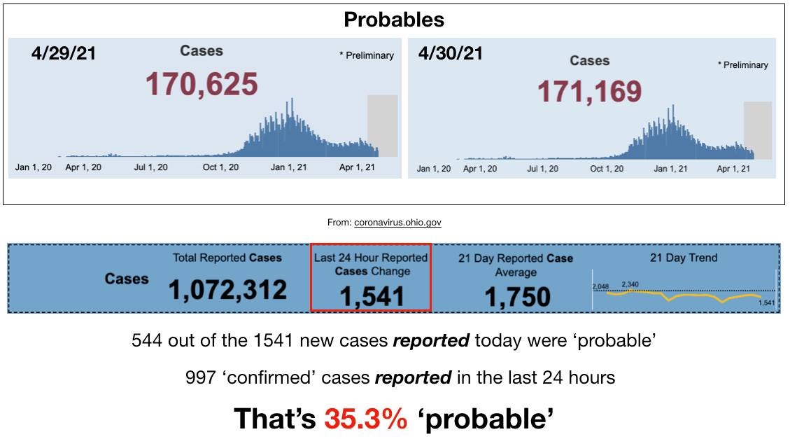
I noticed larger than normal numbers of *confirmed* cases being removed from days ~1 month prior. A few days have up to ~20 cases removed.
Now having ~20 cases removed from probables on a day is not that odd in the near term, there are about that # removed from the probables after ~3 days (which makes sense if a person gets a +antigen test and then takes a PCR test as confirmation - the way it should be done).
But that many *confirmed* cases being removed from the dataset a month prior? That's just *weird!*
Attached find a section of my spreadsheet, comparing the date of the csv file along the top vs the change in number of confirmed cases assigned to each day from one csv file release date to the next.
Over 7 csv file releases including the assigned case dates of 3/24/21-4/2/21 there was a deficit of 90 confirmed cases, 80 of those being completely removed from just 3 assigned dates - 3/24, 25 and 26. Most of those 80 removed on just two csv files, the one released 4/29 & 30.
Weird, huh? Nearly a hundred confirmed cases removed from a few days over a month ago.
And it's an interesting set of days that it happened to, isn't it? For a refresher - March 24th was the date of the veto override vote from the General Assembly for SB22 - the bill that gives the legislature override power over the health orders.
Now, in the days following that override something funny happened - our 'cases' skyrocketed. I even noted and documented it at the time, it was such a strange and sharp increase at such an interesting time. To read that original post, see: facebook.com/photo?fbid=101…...
Or simply see the attached slide I created on March 28th.

Isn't it interesting? Anyone else have any theories for the removal of so many confirmed cases from those few days over a month ago?

#InThisTogetherOhio

• • •

Missing some Tweet in this thread? You can try to force a refresh
 

Keep Current with Understanding Ohio COVID Data

Understanding Ohio COVID Data Profile picture

Stay in touch and get notified when new unrolls are available from this author!

Read all threads

This Thread may be Removed Anytime!

PDF

Twitter may remove this content at anytime! Save it as PDF for later use!

Try unrolling a thread yourself!

how to unroll video
  1. Follow @ThreadReaderApp to mention us!

  2. From a Twitter thread mention us with a keyword "unroll"
@threadreaderapp unroll

Practice here first or read more on our help page!

More from @ohio_data

3 May
from 05/1/21

Here's your daily dose of 'misinformation that could cause physical harm.'

You know - data pulled directly from coronavirus.ohio.gov (go check it all for yourself - it's all right there for anyone to look at and double check!)
I'm torn about the designation, honestly. Because I rather agree with the factcheckers, the manipulation and distortion put out there by ODH and Gov. DeWine has been causing a whole lot of harm.
But censorship is never the answer. Demonstrating over and over again with their own data what is really going on is the answer.
Read 4 tweets
30 Apr
So, Delaware County has triggered indicator #6, 'increase' in new hospital admissions again.

Let's take a look, shall we?
Please look at the above graphic showing indicator #6 and a spreadsheet showing the 'hospitalizations.' First, note that this graph is a 7 day moving average. Each point represents 7 full days all averaged together. In order to have a value of '0' it's not just one day with 0.
It's at least 7. And on this graph, we see that there were 11 days without a single hospitalization from 4/2 and 4/11 there were 0 hospitalizations. And then again, there have been NO HOSPITALIZATIONS since 4/16.
Read 7 tweets
29 Apr
Today is Thursday, data dump day. The day we get our new official cases/100,000. Just 1 week ago, we were at 185.8 cases/100,000. Today, we will be at 155.9 (or close to it - they pull their data at a slightly different time than the csv file).
This is the number for all cases, probable and confirmed, and over 14 days. Two weeks ago, we were at 200 cases/100,000 (the last time Gov. DeWine mentioned the formerly all-important number). A drop of 44.1 cases/100,000, a truly incredible drop, yet will he speak of it today?
What argument do they have for the drop? In order for it to be truly 'science' a prediction must be made that is falsifiable. What is their falsifiable prediction? Have we masked harder? Have we kept further apart?
Read 7 tweets
24 Mar
- Numbers have meaning. -

They don't just come from the ether. In Ohio (and many other places now) we are again focused on easily manipulated 'cases' and more specifically the now all-important 'cases per 100,000.'
Governor DeWine likes to say that it's a standard metric that they've been using all along (though I've noticed of late he no longer tries to tie it directly to the CDC's usage anymore, hmmmm) And it is a standard metric for the CDC. But not how it it being used in this instance.
This metric has been used for a long time for tracking the flu, and indeed, 50 cases/100,000 is the standard 'epidemic level' but what Gov. DeWine does not tell us is that it **matters how long we count for.**
Read 8 tweets
15 Mar
- Prevalence -

I have been criticized for the focus I have been putting on 'probable' cases for the last month or so. 1/3rd of our cases are 'probable,' so what? "They're mostly just positive antigen test cases! Just as good as PCR confirmed!"
Well, according to the FDA, no. The FDA has been very explicit that antigen tests need to be used in a very conscientious way. Specifically, that to properly interpret antigen tests results, the provider needs to take into account the prevalence of the disease in the region.
Please see fda.gov/.../potential-…... to see their exact recommendations, with a special focus on the section I have attached in the first image.

From that clip, it is clear that prevalence is an incredibly important number to understand.
Read 13 tweets
13 Mar
- Denominators, Part Two -

Or more of how Ohio's 'special math' works.

I had a question about what the significance of the number of days counted in the cases/100,000 metric is - whether it's 7 days (as the CDC counts it) or 14 days (the way Ohio counts it).
So I figure this is a good time for another set of hypotheticals to illustrate how this all works and how important the details really are. In the first attached graphic, I want you to imagine a county with exactly 100,000 residents that has exactly 7 new cases every single day.
If we count only one week's worth of cases (green box) we come up with 49 cases/100,000 - Freedom!

But if we count over 2 weeks (red box), we are suddenly at 98 cases/100,000!! PANIC! Image
Read 7 tweets

Did Thread Reader help you today?

Support us! We are indie developers!


This site is made by just two indie developers on a laptop doing marketing, support and development! Read more about the story.

Become a Premium Member ($3/month or $30/year) and get exclusive features!

Become Premium

Too expensive? Make a small donation by buying us coffee ($5) or help with server cost ($10)

Donate via Paypal Become our Patreon

Thank you for your support!

Follow Us on Twitter!