1/n
Growth of COVID-19 outbreaks may seems specialized, but is crucially important.

If growing by commonly used Logistic function, early growth is exponential & forecast of outcome is impossible.

For Gompertz function, growth is slowing from start allowing forecast of end.
2/n
Described on YouTube year ago, this is still not widely understood


Then we focused on small outbreaks (1000's cases) well-contained in New Zealand and South Korea.

Stimulated by @Marco_Piani & @PienaarJm, we now analyze Lompardy, NYC, UK & Spain.
3/n
Before releasing results & Excel fits, I describe the growth functions and then show raw data.

If you want to learn about growth functions, study the properties of the functions so that you can identify how the real data changes.

I got this wrong from 1-Feb-20 to 20-Mar-20. Image
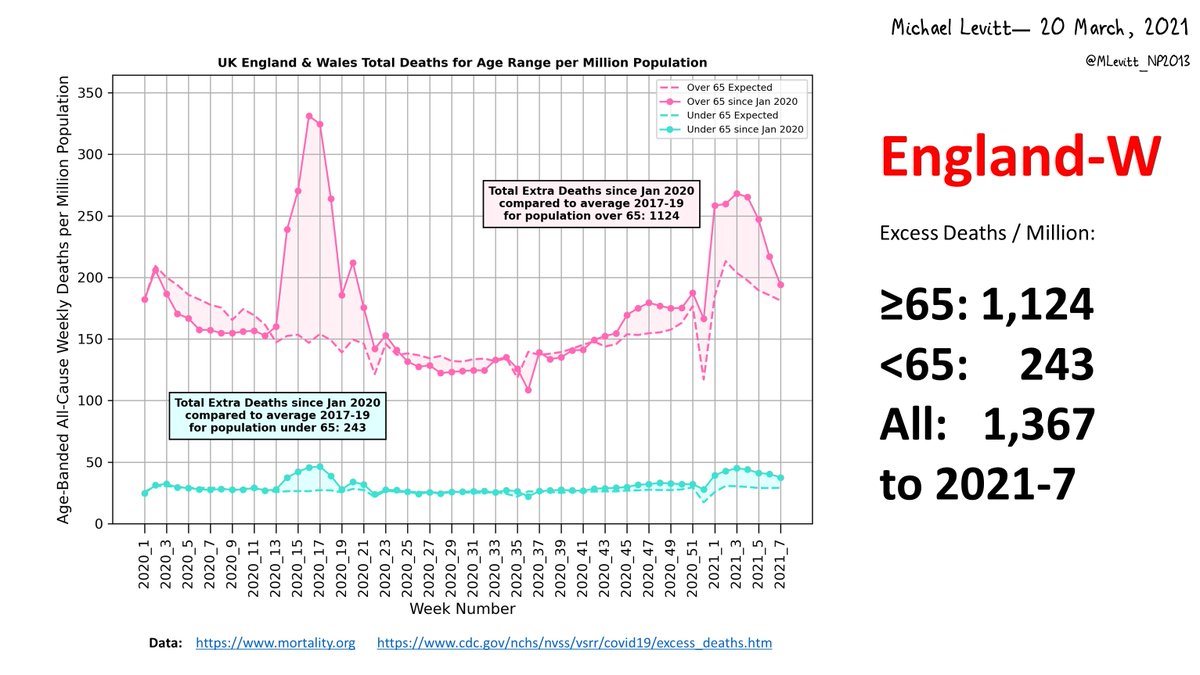
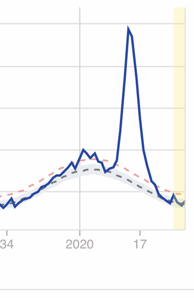
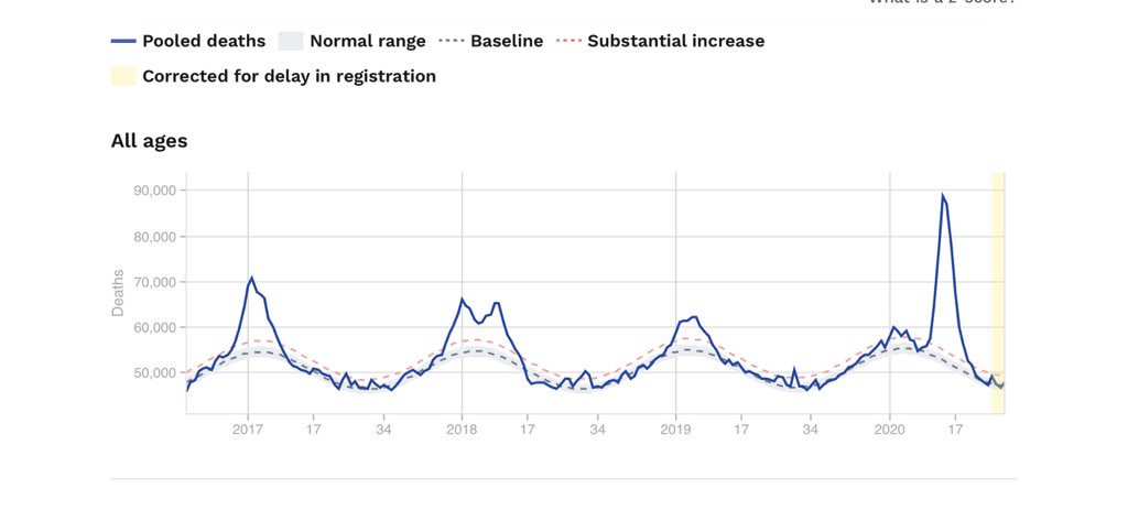
Never trusted reported cases. numbers Reported COVID-19 deaths are backed up in some places by excess death in time of COVID-19. @MalJone66192992

Outbreaks in area separated from another by weaker contacts is limited & stops when susceptibles are exhausted @stevenmosher

• • •

Missing some Tweet in this thread? You can try to force a refresh
 

Keep Current with Michael Levitt

Michael Levitt Profile picture

Stay in touch and get notified when new unrolls are available from this author!

Read all threads

This Thread may be Removed Anytime!

PDF

Twitter may remove this content at anytime! Save it as PDF for later use!

Try unrolling a thread yourself!

how to unroll video
  1. Follow @ThreadReaderApp to mention us!

  2. From a Twitter thread mention us with a keyword "unroll"
@threadreaderapp unroll

Practice here first or read more on our help page!

More from @MLevitt_NP2013

30 May
I am sure that there will be something that correlates with COVID19 death rate better that the stringency of restrictions.

Finding it is important!

The entire world needs to know what to do the next time there is a serious viral threat.
1/8
Interesting replies led me to carefully analyze data in @youyanggu GitHub table. Alway more objective when one collects data, another analyses it.

Looking at data so first tidy table in Excel.

Color formatting is red-yellow-green low value to high. Image
2/8
Rather than make plots of one measure against another, we get the correlation coefficient of all pairs of measures.

Correlation coefficient, CC, of A to B is same as CC of B to A so table is symmetric. Correlation coefficient of A to A is always 1; it is whited out here. Image
Read 9 tweets
21 Mar
1/7
Excess death (E) in any period is the difference between the actual all-cause deaths and those that are expected. Expected deaths in the current year, c, can be calculated in many ways. Easiest is to use the data from a few recent years as a reference (we use, 2017 to 2019).
2/7
Data can be used in 3 ways to calculate expected deaths.
(1) as average death in the reference years.
(2) as average corrected for the change in total population.
(3) as average for each age band corrected for its population, what we call age-adjusted.

We use 5 age bands.
3/7
(1) If D(i) is death in reference years i, then expected death in year c is E(c)=average[D(i)].
(2) If P(i) is population; E(c)=P(c)*average[D(i)/P(i)].
(3) If (P(i,j) is population of age band j in year i, D(i,j) the corresponding death; E(c,j)=P(c,j)*average[D(i,j)/P(i,j)]
Read 7 tweets
11 Mar
Thanks all. Link is ynet.co.il/news/article/B…

Your analyses in reply to @AlexBerenson are wonderful.

I worry that the number of deaths (0, 1 & 2 vaccines) averages 46/day for first 6 weeks. Real Israeli deaths then are 171/day, 3.7X more.

Something is wrong. Please help me.
@ynetnews @adiryanko @Blitz20191 @AlexBerenson @MatanHolzer @dvir_a @boulderfish
Sorry I missed you analyses. Just for a little sanity check. In Israel there are ~45,000 deaths each year (about 124/day). This year expected 47,000/year or 129/day. Where are missing deaths?
·
I am wrong as this is just Covid19 deaths. Sorry...
Read 4 tweets
27 Jul 20
Excess deaths are related to total all-cause deaths. While subject to recording delays, this number avoids all uncertainty about what caused death. Often reported each week, total death can be converted to excess by subtracting a baseline of the total number of deaths expected.
The baseline can be calculated as an average over earlier years or even simply be the totals for a different year. Deaths can be reported anywhere but a larger population makes numbers more certain. The total death is shown here for Europe (350 million) euromomo.eu/graphs-and-maps.
Notice the winter flu peaks that are large in 2016/17 & 2017/18 but smaller in the next two years. There is also a large peak centered at Week 14 in 2020. This is due to COVID19. The excess death from COVID19 is the total number of deaths above the baseline for the entire period.
Read 6 tweets
27 May 20
Here is my clearer analysis of the Population Fatality Rate (PFR) related to influential predictions by Ferguson et al. 2020. It use data released by the Chinese CDC on 14Apr20 @ChinaCDCWeekly, not full-text indexed by Google @Google but released in The @guardian on 1Mar20. ImageImageImage
Here is the evidence showing Google still does not full-text index this essential report. The Guardian @guardian finally gave CCDC @chinacdc age-range death numbers on 1 Apr. weekly.chinacdc.cn/en/article/id/…
theguardian.com/world/2020/mar… Vulnerability of OLDER people is not even headlined! ImageImageImage
A perceptive reader will ask for the Verity et al., 2020 IFR. My 25Mar report to UK scientific leaders used that data. After normalization to percent, Verity IFR data is identical (0.6% RMSD) to deaths/Chinese_population in Col. F on Tweet1 Excel. My numbers are unchanged. ImageImageImage
Read 4 tweets
16 May 20
@EdConwaySky @benton328 @phil_luttazi @KielRobinson @CeeMacBee @ScottGottliebMD @CT_Bergstrom @BuckSexton @nataliexdean @sav_says_ @JamesOKeefeIII @NAChristakis Europe's COVID19 Excess Deaths plateau at 153,006, 15% more than 17/18 Flu with same age range counts. Details follow ImageImageImageImage
EuroMOMO euromomo.eu/graphs-and-maps Excess Deaths from 2020 Week 8 now match reported COVID Deaths @JHUSystems perfectly (better than 2%). In earlier weeks the reported deaths were lower. Not sure why? It allows me to do this in depth analysis & comparison with EuroMOMO influenza. Image
Analysis of Europe's Excess Deaths is hard: EuroMOMO provides beautiful plots; data requires hand-recorded mouse-overs. COVID19 2020, Weeks 08-19 & flu 2018, Weeks 01-16 is relatively easy for all age ranges (totals 153,006 & 111,226). Getting Dec. 2017 flu peak is very tricky. This is a composite with fo...
Read 5 tweets

Did Thread Reader help you today?

Support us! We are indie developers!


This site is made by just two indie developers on a laptop doing marketing, support and development! Read more about the story.

Become a Premium Member ($3/month or $30/year) and get exclusive features!

Become Premium

Too expensive? Make a small donation by buying us coffee ($5) or help with server cost ($10)

Donate via Paypal Become our Patreon

Thank you for your support!

Follow Us on Twitter!

:(