Excess deaths are related to total all-cause deaths. While subject to recording delays, this number avoids all uncertainty about what caused death. Often reported each week, total death can be converted to excess by subtracting a baseline of the total number of deaths expected.
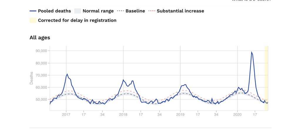
The baseline can be calculated as an average over earlier years or even simply be the totals for a different year. Deaths can be reported anywhere but a larger population makes numbers more certain. The total death is shown here for Europe (350 million) euromomo.eu/graphs-and-maps.
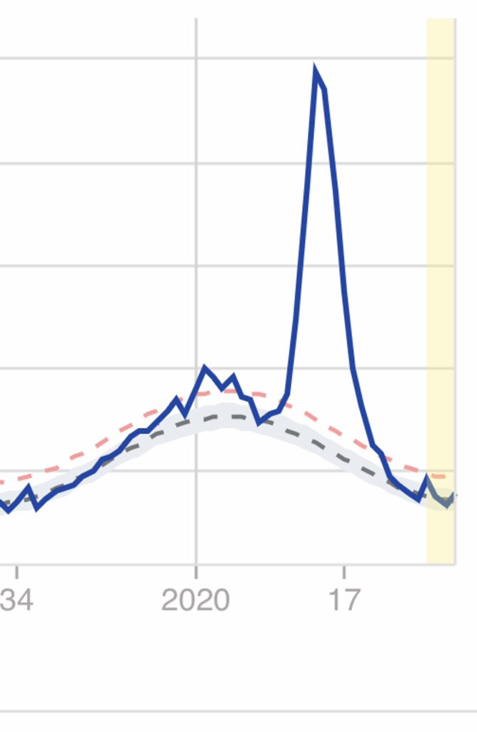
Notice the winter flu peaks that are large in 2016/17 & 2017/18 but smaller in the next two years. There is also a large peak centered at Week 14 in 2020. This is due to COVID19. The excess death from COVID19 is the total number of deaths above the baseline for the entire period.
Here is my clearer analysis of the Population Fatality Rate (PFR) related to influential predictions by Ferguson et al. 2020. It use data released by the Chinese CDC on 14Apr20 @ChinaCDCWeekly, not full-text indexed by Google @Google but released in The @guardian on 1Mar20.
A perceptive reader will ask for the Verity et al., 2020 IFR. My 25Mar report to UK scientific leaders used that data. After normalization to percent, Verity IFR data is identical (0.6% RMSD) to deaths/Chinese_population in Col. F on Tweet1 Excel. My numbers are unchanged.
EuroMOMO euromomo.eu/graphs-and-maps Excess Deaths from 2020 Week 8 now match reported COVID Deaths @JHUSystems perfectly (better than 2%). In earlier weeks the reported deaths were lower. Not sure why? It allows me to do this in depth analysis & comparison with EuroMOMO influenza.
Analysis of Europe's Excess Deaths is hard: EuroMOMO provides beautiful plots; data requires hand-recorded mouse-overs. COVID19 2020, Weeks 08-19 & flu 2018, Weeks 01-16 is relatively easy for all age ranges (totals 153,006 & 111,226). Getting Dec. 2017 flu peak is very tricky.
The app was written in Python by Andrea Scaiewicz advised by João Rodrigues. It is research software allowing comparison of all locations with >50 deaths or >3000 cases (see examples). Response is slow as freely hosted by heroku @heroku. Tested too little, it is likely buggy.
The table of locations is classified by Class score. Columns can be sorted or filtered by a string (eg. "====" with quotation selects worst locations). UNSM is raw data, SMO3 is moderate smoothing & SMO5 is more extreme smoothing.
This is part 2 of my first Tweet today on EuroMOMO euromomo.eu/graphs-and-map; I hit send and not (+) and have no idea how to link them. I ended part one "is now substantially higher with about 46,000 added deaths." See below.
Continuing properly... (2) EuroMOMO euromomo.eu/graphs-and-maps now gives numbers by mouse-over. Getting values is easier than WebPlotDigitization but still tricky with my laptop and track pad. What I post here has been double checked but EuroMOMO does update. Please do check me!
With these numbers I made a table showing the Excess Deaths for Weeks 8 to 16 of 2020 (26-Feb-20 to 22-Apr-20). Remember Excess Deaths are a count of total deaths for all causes. If COVID related lock-down reduced traffic deaths, they will affect the the total.