1/ #Myocarditis/#Pericarditis rates after #vaccination.
#CDC #VAERS US data (June) versus German #PEI (July).
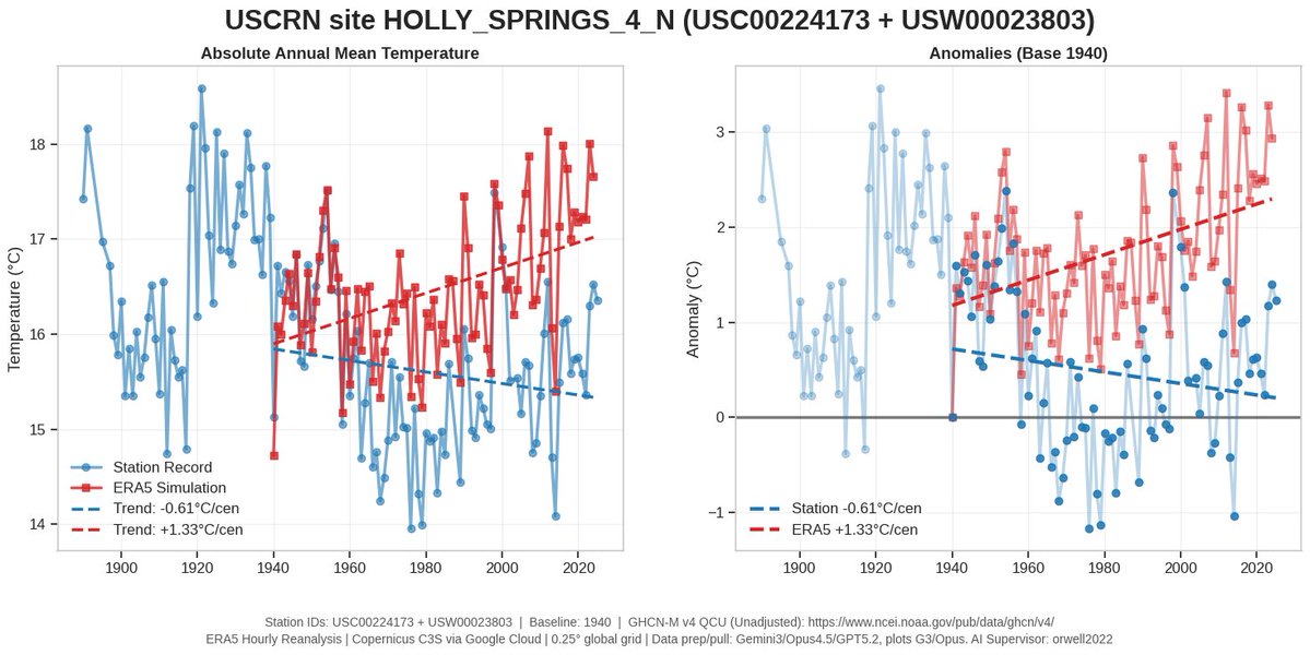
I start with the result graph. For details and source see below. Conclusion: the US and German data are very comparable.
#CDC #VAERS US data (June) versus German #PEI (July).
I start with the result graph. For details and source see below. Conclusion: the US and German data are very comparable.

2/ Sources.
CDC USA report: June 23, 2021, Tom Shimabukuro
Paul Ehrlich (PEI) Germany report, July 15, 2021
CDC USA report: June 23, 2021, Tom Shimabukuro
https://twitter.com/orwell2022/status/1411615930245861380?s=20
Paul Ehrlich (PEI) Germany report, July 15, 2021
https://twitter.com/orwell2022/status/1417426730797748226?s=20
3/ Data preparation:
1) The CDC report is very well done and properly normalized. No further calculations are needed. All is done and ready.
2) The German report is poor. No normalization by doses, nor by sex. In General the report is of a very low quality.
1) The CDC report is very well done and properly normalized. No further calculations are needed. All is done and ready.
2) The German report is poor. No normalization by doses, nor by sex. In General the report is of a very low quality.
4/ So for the German PEI report, some calculations and estimations were needed. The administered dose per age group are also not published and need to be estimated.
Approach: use German 2019 population pyramid and multiply by vaccination rate (estimated). Here the result.
Approach: use German 2019 population pyramid and multiply by vaccination rate (estimated). Here the result.

5/ Remarks. Germany hasn't given a general recommendation for vaccinating children below 18.
Thanks to the #STIKO, they didn’t follow the unethical example of CDC.
That’s why the German curve begins at 18 only. The data below 18 is fortunately not available.
Thanks to the #STIKO, they didn’t follow the unethical example of CDC.
That’s why the German curve begins at 18 only. The data below 18 is fortunately not available.

6/ The general quality of the German PEI reports are of low quality (lacking dose/age normalization etc.).
The comparison with the high quality report by CDC shows this very clearly. But judge for yourself.
@RWMaloneMD @waukema @AlexBerenson @Lareb_NL @CDCgov @rki_de
The comparison with the high quality report by CDC shows this very clearly. But judge for yourself.
@RWMaloneMD @waukema @AlexBerenson @Lareb_NL @CDCgov @rki_de
7/ Many thanks again to #STIKO and Prof. Dr. Thomas Mertens who resists the unethical pressure by @Karl_Lauterbach and other #zerocovid members.
@BrinkmannLab @ViolaPriesemann @jensspahn @hugodejonge @maybritillner
https://twitter.com/orwell2022/status/1406873620924833796?s=20
@BrinkmannLab @ViolaPriesemann @jensspahn @hugodejonge @maybritillner
8/
https://twitter.com/orwell2022/status/1397486362341826562?s=20
https://twitter.com/orwell2022/status/1407039990480125958?s=20
https://twitter.com/orwell2022/status/1407041947290812419?s=20
https://twitter.com/orwell2022/status/1400392441178492931?s=20
https://twitter.com/orwell2022/status/1418232658753097733?s=20
https://twitter.com/orwell2022/status/1405640862009368577?s=20
9/ Bonus round: why vaccinating children is unethical:
Using the same type of normalization as decribed above, I estimated the age dependant vaccine CFR from the German PEI report and compared it with the C19 IFR for healthy. IFR source below here:
Using the same type of normalization as decribed above, I estimated the age dependant vaccine CFR from the German PEI report and compared it with the C19 IFR for healthy. IFR source below here:
https://twitter.com/orwell2022/status/1397117285937057794?s=20

10/ All safety features have fallen. This here is unprecedented. Politics make medical decisions now and ignore #STIKO. The kids must be vaccinated at all costs it looks like. And rumors say that STIKO will change it’s recommendation. Based on new data? No.
https://twitter.com/marcfriedrich7/status/1422257763456008198
11/ Risk - Benefit the wrong way around. It’s absolutely “heartbreaking” (sorry for the sarcasm).
Unfortunately my little thread will grow bigger. There is a new PEI report available. I’ll update my graphs.
#STIKO #FDA #PEI #CDC shame on you.
Unfortunately my little thread will grow bigger. There is a new PEI report available. I’ll update my graphs.
#STIKO #FDA #PEI #CDC shame on you.
https://twitter.com/Doc_MediFacts/status/1429351191146860544
12/ Interesting. Canadian data. Significant higher rates are seen, more in line with the the Israel data.
https://twitter.com/walidgellad/status/1428765590102097927
13/ Here is a graphical comparison: Canada vs. Israel (claimed source is a FOI request:
Clearly CDC US and PEI DE have an underreporting issue while Canada and Israel show similar (higher) numbers.
What about @Lareb_NL ? Nothing to report? Silence?
https://twitter.com/kucherov_anton/status/1428094328623218697?s=20)
Clearly CDC US and PEI DE have an underreporting issue while Canada and Israel show similar (higher) numbers.
What about @Lareb_NL ? Nothing to report? Silence?

14/ The potential root cause for the age curve has been discussed by @bringsmileback here: a combination of testosteron and stronger Th1 inflammatory response in young boys compared to older men:
https://twitter.com/orwell2022/status/1430110579176452115?s=20
• • •
Missing some Tweet in this thread? You can try to
force a refresh