1. Weekend Reading (Early Edition): With the August Crop Report from the USDA out tomorrow, thought there might be some interest on my most recent paper, "To batch or not to batch? The release of USDA crop reports." Published in Agricultural Economics onlinelibrary.wiley.com/doi/full/10.11…
2. My co-authors (Joshua Huang, Teresa Serra, and Phil Garcia) and I took a deep dive into the benefits and costs of implementing a batch auction around the release of USDA crop reports (and acreage and stocks). PDF is free for now at this link onlinelibrary.wiley.com/doi/pdf/10.111…
3. Some background. USDA was basically forced to move to "real-time" release of Crop Reports after the onset of electronic trading. No matter where the USDA set the release time a futures exchange could easily move trading hours to cover the release.
4. That is why we now have crop reports released at noon EST in the middle of live trading in grain futures markets. USDA correctly surmised that they just as well put the release time when it worked best for them. So a noon real-time release it became.
5. Regardless of how we got to real-time release of USDA crop reports, it has been controversial. I have an earlier paper with Michael Adjemian showing that grain futures prices are more volatile immediately following real time release. Is there something else we could try?
6. This is where the idea of a batch auction comes in. You don't halt futures trading around the release, but also don't allow transactions. People can update bids and offers during the batch period and then trades occur at best bids and offers at the end of the batch period.
7. So something like a 15 minute batch auction around USDA report release could be conducted. This would eliminate the speed advantage of HFTs and algo traders. Everyone would get the same price at the end of the 15 minutes.
8. Turns out there is a batch auction everyday before trading opens at 830am CST with electronic trading. We study in this new paper how corn futures prices adjusted during batch auctions when USDA reports were released before trading opened.
9. In other words, there was a period before real-time release when USDA reports were released into the pre-opening electronic trading batch auction. How much of market price reaction occurred during the pre-opening batch auction. No big surprise. Alot.
10. Charts are a little complicated but they show that about 50-70% of price discovery happened during the pre-opening batch auction. Not all but most of price discovery for sure.
11. My personal conclusion is that there is a lot of merit in considering a batch auction in grain futures markets around the release of major USDA reports (WASDE, Acreage, Production, Stocks). It would eliminate speed advantage of algos and probably a bit less price volatility
1. With it being USDA August Crop Report week, good time to review Corn Belt weather during the last 40 days, the critical growing period for corn and very important for soybeans as well.
2. First a shoutout to the Midwest Climate Center for making these great maps available to the public. Precip in main part of Corn Belt was a mixed bag. Decent rule of thumb in my experience is that anything above 75% of norm is likely in decent to good shape.
3. IL good to very good on precip since July 1, except far north. IA not as good but still less than half of state in any real trouble. Have to get to northern half of MN to see super dry areas.
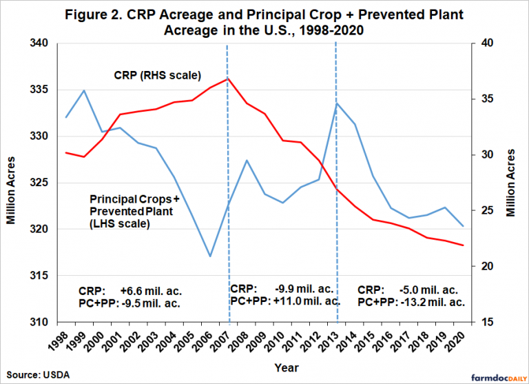
1. Back on crop acres with new #FDD article this week. Tried to figure out what happened to the 14.4 million acres that left US crop production after 2014. farmdocdaily.illinois.edu/2021/06/where-…
2. Here is my accounting of total US crop acreage. Notice that total was pretty stable from 1998-2014 around the average of 359.4 million acres. Then down down down through 2020. Total drop after 2014 of 14.4 million acres through 2020.
3. Started analysis with acres going into and out of CRP. Anything funny going on there. The answer is yes. Should be an inverse relationship between CRP and principal crop plus prevent plant acres. This held through 2014, then both declined. What gives?
1. One more quick thread on the biodiesel hedging article. This one is directed to grad students and other researchers looking for interesting problems to dig into. I am asked more than you think, "How do you find interesting research topics?"
2. Well to start with, I am an applied economist. Very applied. To find interesting applied economic research problems I think you have to be engaged with the relevant industry and part of the ongoing conversation.
3. I used to do this by reading a lot of trade magazines but now I get pretty much a 24/7 flow of engagement on twitter. But there is a trick. I am interested in what people in the industry are saying and talking about, not necessarily what other academics are saying.
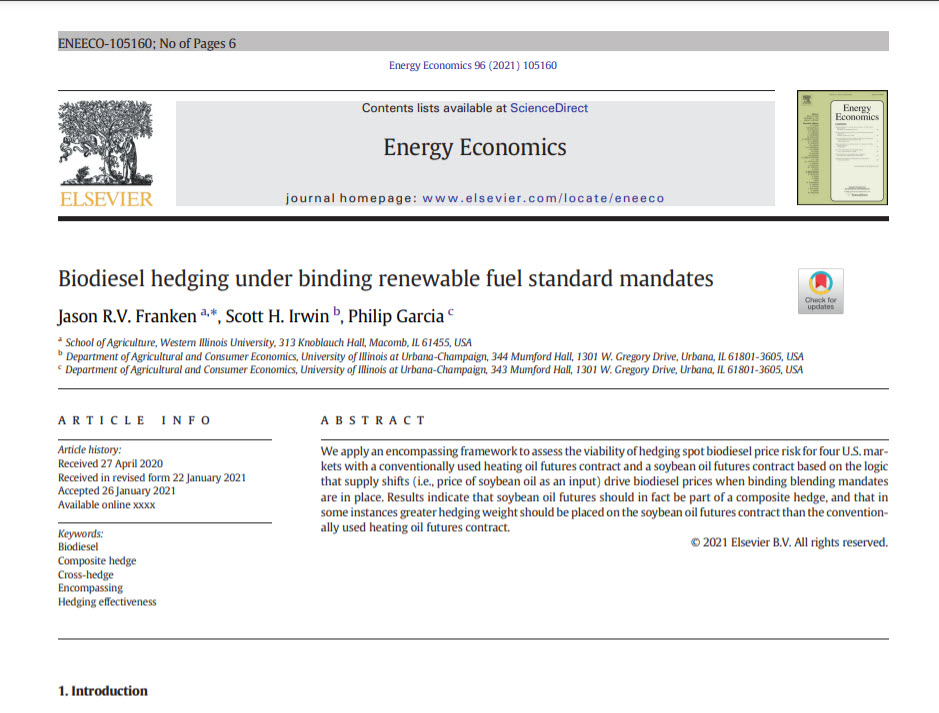
1. Weekend Reading: Have not done one of these for awhile. This one is on a brand spanking new article coming out in Energy Economics "Biodiesel hedging under binding renewable fuel standard mandates." sciencedirect.com/science/articl…
2. Hopefully that link is in front of the paywall. I can never tell from publishers page. I really think this is a fun little article. My co-authors are my long-time partner in crime Phil Garcia and Jason Franken of Western Illinois.
3. The genesis for this article was from following trade conversation on biodiesel pricing and hedging. Always much discussion about the leading role of heating oil/diesel futures on biodiesel prices, and by implication, how one should hedge biodiesel.
1. Weekend Reading: Just published in the AEPP (free access) with farmdoc colleagues "Coronavirus Impacts on Midwestern Row‐Crop Agriculture" onlinelibrary.wiley.com/doi/full/10.10…
2. Our main purpose in writing this paper was to show that the coronavirus pandemic simply added to the downward financial pressures on Corn Belt ag that have been building since 2014, when the long price boom ended.
3. This downward trend in returns is nicely summarized in this chart. The big soybean return in 2018 was MFP1. So any truly good news for crop farmers after 2013 was from gov't payments. Don't be put off by the x axis scale. Need to get that fixed.
1. Very useful graphic @BrightonCap. Closest thing to hard data on COVID death rates. This measures the risk of getting COVID X risk of dying from COVID. The worst rate is 0.18% for NJ. Vast majority of states less than 0.1%, or less than 1 out of every 1,000 people.
@BrightonCap 2. I am not making this point to say anything one way or the other regarding COVID policy responses supported by people. Just interesting to me how different people react to this kind of risk but not others. So far, death risk for population as a whole is not very large.
@BrightonCap 3. Of course, this does not account for long-term health impacts to getting COVID, which are still very poorly understood. I know I don't want to take that risk if I can avoid it!