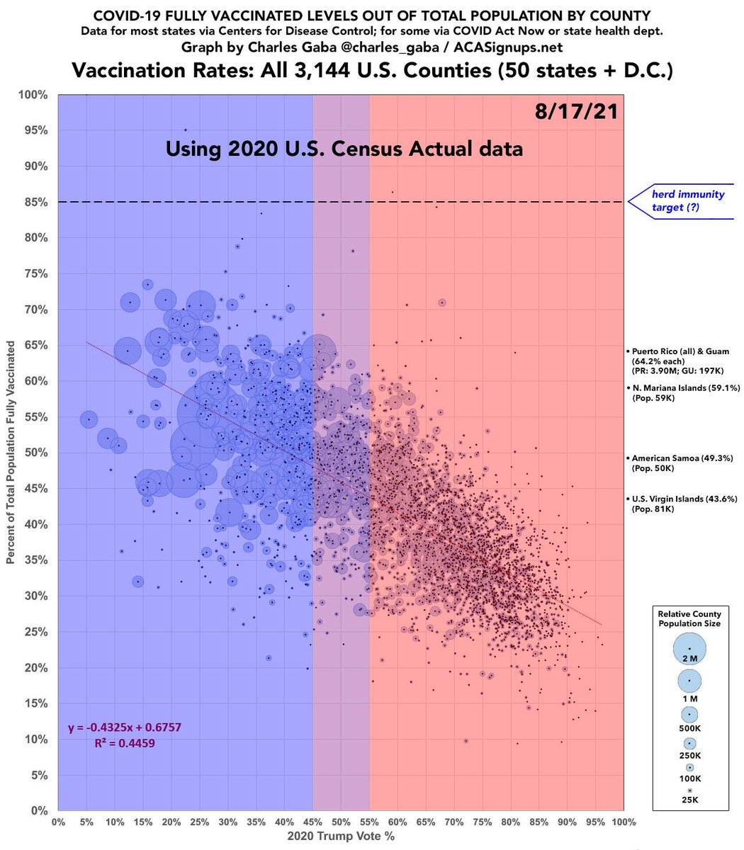
📣 Weekly Update: U.S. #COVID19 Vaccination Levels by *county* & partisan lean...now w/official @uscensusbureau population data! (thread) 1/
acasignups.net/21/08/18/weekl…
acasignups.net/21/08/18/weekl…
Last night I posted a poll asking how much of a difference people thought switching from *estimated* 2019 population data to *official* 2020 Census data would make.
The options were "a lot" or "a little." 2/
The options were "a lot" or "a little." 2/
https://twitter.com/charles_gaba/status/1427834306953687055
It was a trick question, however, because the answer is...BOTH!
--In 85% of the 3,114 counties in the 50 states + DC, the population difference is less than 5% higher or lower than the 2019 estimate. 3/
--In 85% of the 3,114 counties in the 50 states + DC, the population difference is less than 5% higher or lower than the 2019 estimate. 3/
--However, there's 153 counties where the 2020 Census pop. is >5% *higher* than the estimate; 26 are >10% higher; and 4 counties where it's over 25% higher!
--Conversely, there's 305 counties where the count is >5% *lower*; 85 are >10% lower; and 3 where it's >25% lower. 4/
--Conversely, there's 305 counties where the count is >5% *lower*; 85 are >10% lower; and 3 where it's >25% lower. 4/
The biggest discrepancy on the higher side is Harding County, NM where the actual population is 49% higher than the 2019 estimate (657 vs. 441).
The biggest gap on the lower side is Loving County, TX, where there's just 64 residents vs. the 169 estimate (62% smaller!) 5/
The biggest gap on the lower side is Loving County, TX, where there's just 64 residents vs. the 169 estimate (62% smaller!) 5/
So, there's 458 counties where the population difference is more than 5%, 111 where it's more than 10% and 7 where it's more than 25%. That must make for a radical change in what the national county-level scatter plot looks like, right?? 6/
WRONG! Here's a side-by-side comparison of what vaccination levels look like as of 8/17/21 using the 2019 estimated populations vs. the 2020 official populations of every county: 7/ 


From what I can tell, the counties where the official 2020 population is significantly *higher* than the 2019 estimates were pretty much cancelled out by the counties where it's significantly *lower*...all the way across the partisan spectrum! 8/
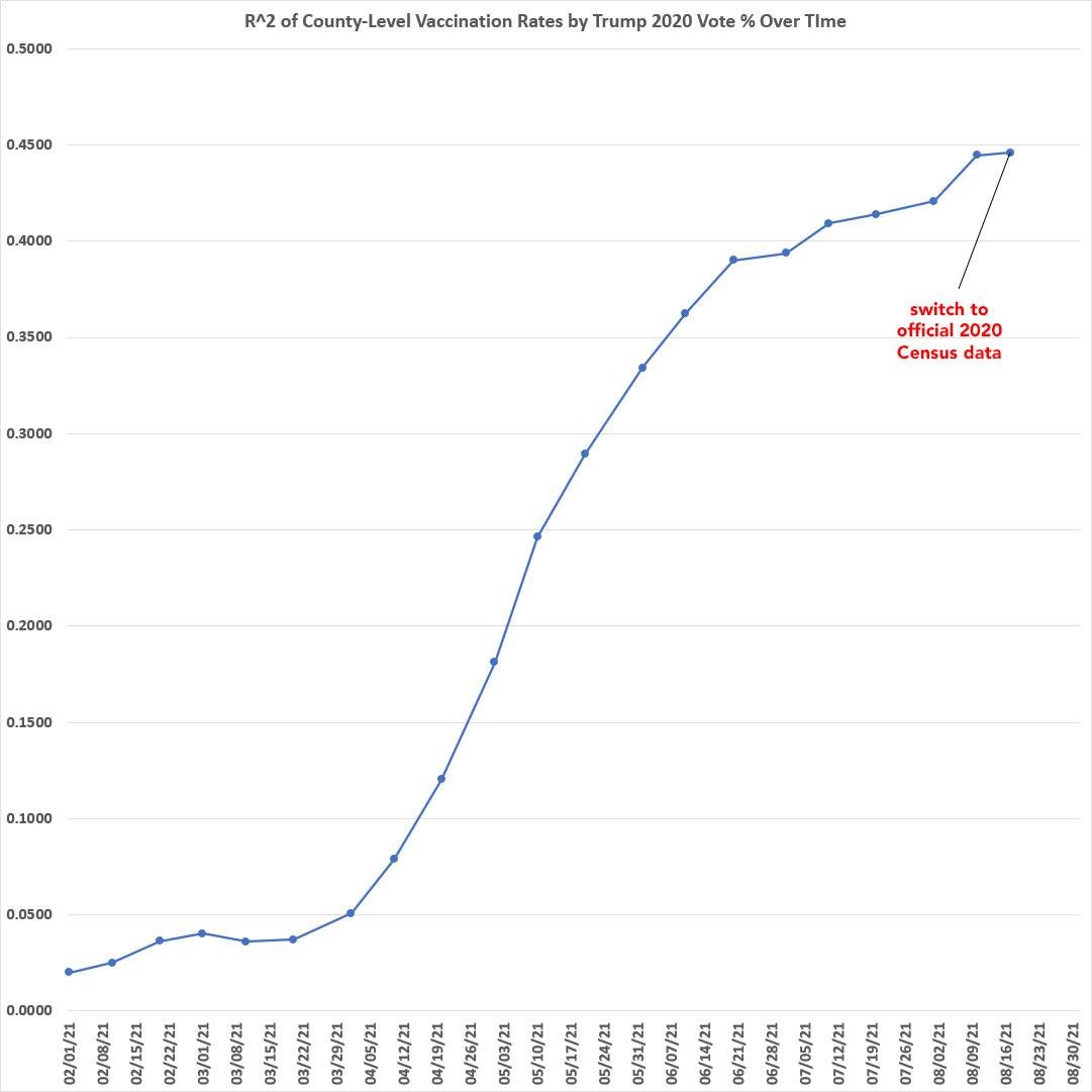
Here's the R^2 and slope over time. The one-time switch from 2019 estimated to 2020 official population data is barely noticeable on the R^2. It *did* make the slope a bit shallower...but only a little. 9/ 


ALSO: The FOX News/GOP leadership 180º turnaround from *opposing* getting vaccinated to *promoting* it (clearly coordinated) started around July 21st.
This means any impact from that messaging reversal should have started showing up over the past week in fully-vaxxed data. 10/
This means any impact from that messaging reversal should have started showing up over the past week in fully-vaxxed data. 10/
via the 3 week gap between 1st & 2nd shots for the Pfizer shot, anyone who was convinced to #GetVaxxed by Sean Hannity/Mitch McConnell/etc. starting around 7/21 should have started showing up in the "fully vaxxed" data starting around 8/11 or so. 11/
However, those getting the Moderna shots wouldn't start showing up in the fully vaxxed data until today or later.
Given this, & given the switch to 2020 Census data, I'm gonna wait another week before looking at the "low-vax blue" and "low-vax red" counties again. /END
Given this, & given the switch to 2020 Census data, I'm gonna wait another week before looking at the "low-vax blue" and "low-vax red" counties again. /END
• • •
Missing some Tweet in this thread? You can try to
force a refresh


