
Remember me and my Year 8 maths? Well I am back. And this time I am going to need something stiffer than coffee. #NDIS #Auspol
The Minister for the #NDIS put out a press release today. Apparently she is going release “key monthly data” from now on to “ensure everyone is informed”. You can check it out here -
ndis.gov.au/news/6705-new-…
ndis.gov.au/news/6705-new-…
I like a good chart and a footnote as much as the next girly swat so consider me ready and willing to be informed Minister.
And this, dear reader, is where the plot twist comes in. And why it pays to always read the footnotes.
The NDIA said in their latest Quarterly Report that average payment per #NDIS participant was $54,300 at the end of 2021. But the Minister’s press release said the average payment per participant in July was $53,400. So unless that’s a typo there has actually been a DECREASE. 
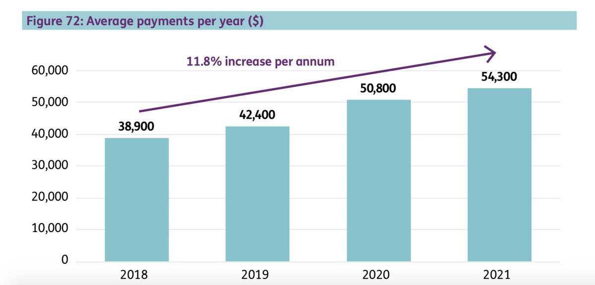
(I won’t be the least bit offended if you want to check my Year 8 maths. The latest #NDIS Quarterly Report is here)
ndis.gov.au/about-us/publi…
ndis.gov.au/about-us/publi…
Now for the even finer print. There is a tiny, tiny footnote on page 103 of that latest Quarterly Report saying that in the six months Jan - Jun 2021 the average payment per participant was actually $55,900. So that means that the DECREASE has been even bigger in the last month.
Can’t imagine why that wasn’t in the press release.
Oh wait … yes I can. Because it doesn’t fit with the current plan of scaring the bejeezus out of the public by throwing around big, bigger and even biggest numbers.
Public support for the #NDIS is strong. Hasn’t wavered for years. The latest Australia Talks by the ABC showed that people want Australians with disability to get the support they need. And they expect government to deliver it.
If you are not convinced check out this excellent piece by the even more excellent @EDesmarchelier
abc.net.au/news/2021-06-0…
abc.net.au/news/2021-06-0…
And that’s not the end of it …
The media release says that in July 2021 $2.1 billion was spent in a month. It says that this was an increase of 18% on the same time last year. Which seems like a lot until ....
You realise that at same time last year there were 391,999 participants in the NDIS. Now there are 472,639 participants. There are 80,640 more participants than last year. And that, my friends, is an increase of 20.5%.
So yes we have spent more money that this time last year because we are supporting more participants than last year.
Again even me and my Year 8 maths can work this out.
Neeexxtttt. The press release says there has been a 3% increase in “annualised paid supports” since this time last year. Last year on July 1 the NDIA put the #NDIS prices up. Like they do Every. Single. Year.
The amount the prices go up isn’t uniform. Different increases for different supports. Makes things super easy to follow huh?
Last year “assistance with self care” on a weekday went up 2.7%. But on a Saturday it went up 5%.
The NDIA have put the prices up again this year. Some went up around 3%. Some like “assistance with self care” went up about 5%. You can check out the announcement here - ndis.gov.au/news/6585-2021…
So remember that when they say average payment per participant is going up. Some of that is Just. Prices. Going. Up. Participants don’t get an extra second of support.
And journos for the love of all the things please, please, please ask some questions about all of this. Don't just cut and paste from the press release. Your job is to report – not type. #Auspol
Consider yourself informed.
• • •
Missing some Tweet in this thread? You can try to
force a refresh


