While this is the highest daily #COVID19 death figure since March, a BIG note of caution:
This is in large part a bank holiday effect (v low over weekend so registrations now just catching up).
Deaths certainly rising but v much more gradual than this single day’s figure implies.
It’s too early to know what happens next.
But the data on Covid deaths is STILL tentatively promising.
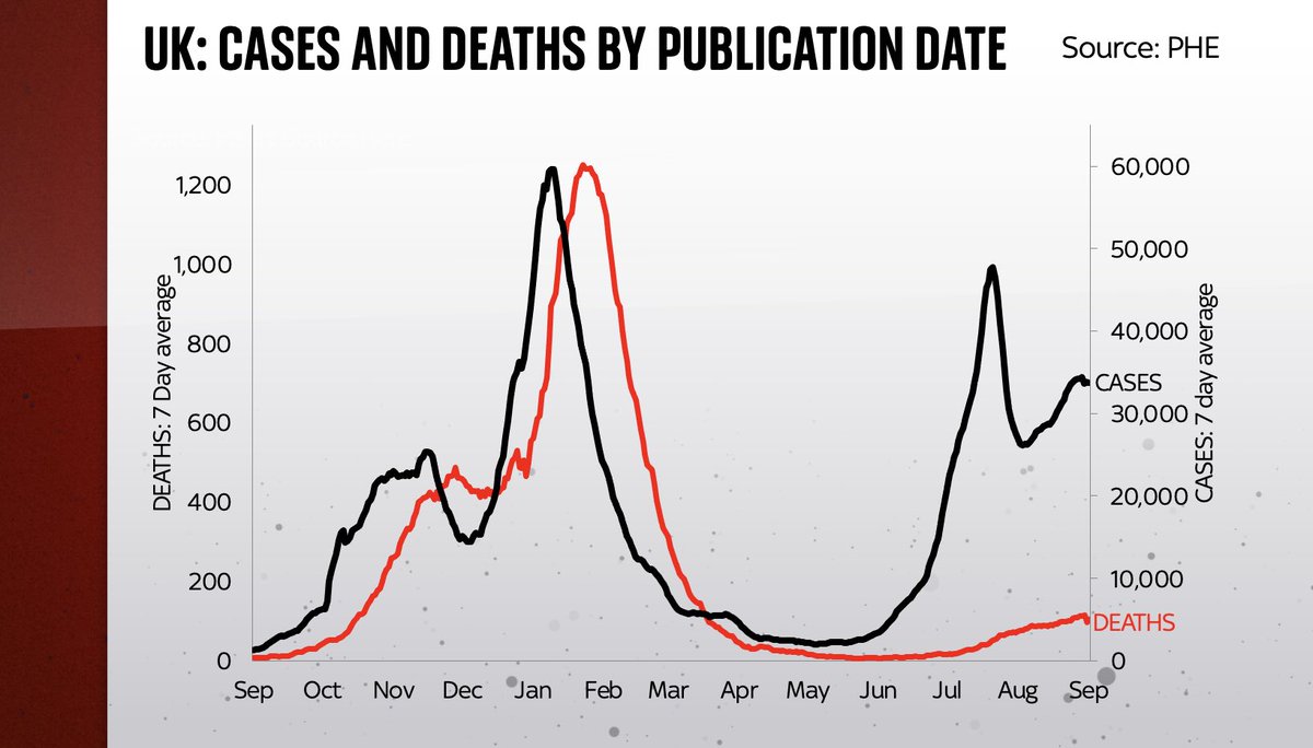
Dark blue line is cases; red line is deaths.
Look at the relationship between cases & deaths in the previous wave. Then look, post-vax, at how much it’s weakened.
Back in June when I first pointed out that those two lines were diverging (👇) there were a few who predicted that it couldn’t last.
But it has lasted.
Yes deaths are rising; there are many tragic stories.
But across the country the trend is v v different to last time.
Here’s another way of thinking about this: the last time Covid cases were as high as they are today, deaths were running at more than 500 a day (and when you adjust for the 14 day lag between cases and deaths, more like 700-800).
Today deaths are roughly 100 a day.

• • •

Missing some Tweet in this thread? You can try to force a refresh
 

Keep Current with Ed Conway

Ed Conway Profile picture

Stay in touch and get notified when new unrolls are available from this author!

Read all threads

This Thread may be Removed Anytime!

PDF

Twitter may remove this content at anytime! Save it as PDF for later use!

Try unrolling a thread yourself!

how to unroll video
  1. Follow @ThreadReaderApp to mention us!

  2. From a Twitter thread mention us with a keyword "unroll"
@threadreaderapp unroll

Practice here first or read more on our help page!

More from @EdConwaySky

15 Sep
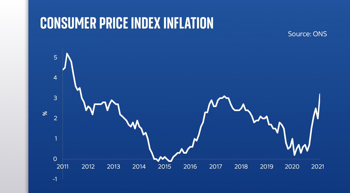
BIG jump in UK CPI inflation.
Up from annual rate of 2% in July to 3.2% in Aug.
Not just the highest level of inflation since 2012, it’s also the biggest month-on-month change in the level in the history of this inflation measure (going back to 1997)
Here’s one reason to believe the inflation rise may be temporary: the main contributing factor was a BIG jump in prices, this year vs last, in restaurants.
And what was happening last year? Eat Out to Help Out.
Once that washes out, some of the upward pressure should go away…
Here’s a reason to believe the rise in inflation may NOT be temporary. Lots of pricing pressure in the pipeline, inc THIS: energy prices are going up v v fast, which will feed into household bills in the coming months. And that’s before you consider costs of raw goods…
Read 5 tweets
7 Sep
By my reckoning today's NI/health levy is the sixth biggest tax increase in at least three decades.
It's massive!
Here's how it compares to the other biggest tax rises.
Combine it with the Corp tax increase & 2021 may end up being the biggest tax-raising year in recent times
Here's another striking pattern which will be exacerbated by today's non-Budget: just look at how income tax and National Insurance rates have begun to converge in recent years.
If this continues much longer NI will actually be higher!
NB this is only the employee NI main rate
As @TheIFS have pointed out, the tax burden is now heading for the highest sustained level ever. Note it was ever so slightly higher in 1969/70 but that was a bit of a blip. Whereas the govt plans are for taxes to be high for a long time.
Read 5 tweets
16 Aug
What’s the most underrated material in the modern world?
How about CONCRETE?
Often dismissed as boring, ugly & inert.
Concrete is actually surprising, dynamic & incredibly complex.
With that in mind here are a few reasons why we need to start talking about concrete 🪨
🧵 Image
First off, we use a lot of it. A hell of a lot of it.
Every minute of every day, construction firms around the world pour out the equivalent of more than 200,000 bathtubs of concrete.
Every minute.
Every year we pour enough concrete to cover the entire landmass of England.
The vast majority of concrete these days is being poured in China, to build bridges, skyscrapers, high speed rail etc.
Indeed China produced more cement in the past three years alone (2018-2020) than the US did in EVERY year since the first Portland cement plant opened in 1865. Image
Read 40 tweets
27 Jul
Here’s a story about a #COVID19 datapoint that looks very scary, but turns out to be quite reassuring.
The statistic is buried in a recent @PHE_uk release.
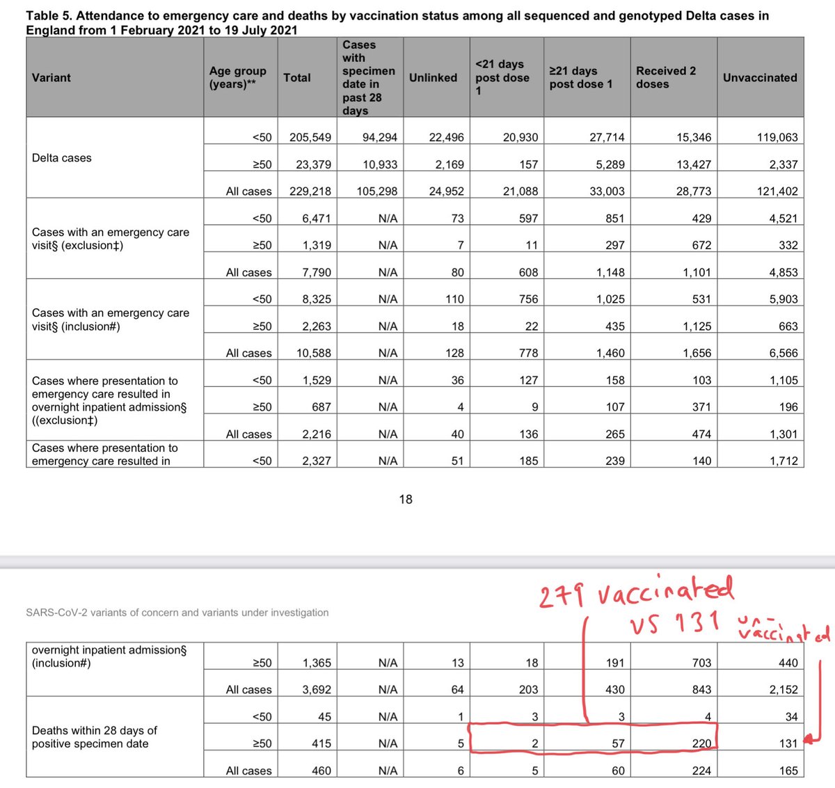
I’ve ringed it here.
It’s the no of double-jabbed people who’ve died with Delta variant assets.publishing.service.gov.uk/government/upl…
More vaccinated people are dying w/ the Delta variant of #COVID19 than unvaccinated.
Indeed, look at those aged over-50 and the proportion is even higher:
279 vaccinated people dying vs 131 unvaccinated.
More than double.
Scary, right? Well not necessarily…
Let’s run through it
There are two things to bear in mind here.
First, the vaccines are not 100% effective. They reduce your likelihood of dying of the disease. But even after vaccination some age groups are still relatively vulnerable. @d_spiegel explained this well here theguardian.com/theobserver/co…
Read 13 tweets
24 Jul
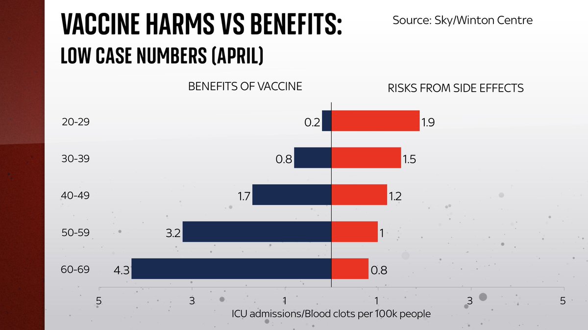
Remember how, back in April/May, the decision was made that under-30s and then under-40s should be given the option to have a vaccine other than AstraZeneca, because of the risks of side-effects? Well, the calculus has now changed and the benefits now probably outweigh the risks
It comes back to this chart. You might remember this from when Jonathan Van-Tam announced the decision. The point was that the bars on the right (the risks of blood clot events) were bigger than the bars on the left (the risks of getting #COVID19 and going into ICU) for under-40s
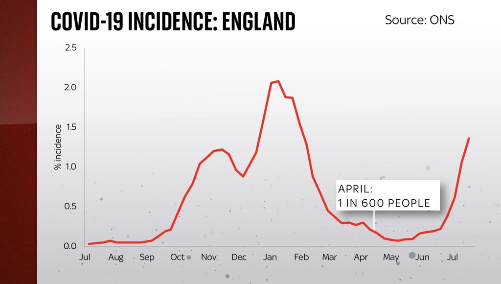
That chart was predicated on the notion that the risk of getting #COVID19 was pretty low. It was, back in April, because only one in 600 people had the virus. But since then things have changed. Now it’s one in 75 who have #COVID19. Meaning those bars on the right are bigger.
Read 8 tweets
12 Jul
Quick Covid data update. Cases heading higher, so too admissions. But the link between them is weaker than in previous waves.
In short, the coming months will be nerve-wracking.
Cases will get v v high. This will feel like a wave in that respect. But in other respects v different
Same data but on a log axis - now you can see that hospital admissions are now growing at almost the same rate as cases.
Roughly doubling every 11 days.
V unsettling. Especially given cases have further to rise. So what next?
Here’s a simple extrapolation of cases and hospitalisations (second chart is same data with log axes).
Extrapolate current growth rates and you’re talking abt 100k cases by late July.
Hospital admissions up to 1000 by 19 July, possibly touching 2000 by end July.
Read 10 tweets

Did Thread Reader help you today?

Support us! We are indie developers!


This site is made by just two indie developers on a laptop doing marketing, support and development! Read more about the story.

Become a Premium Member ($3/month or $30/year) and get exclusive features!

Become Premium

Too expensive? Make a small donation by buying us coffee ($5) or help with server cost ($10)

Donate via Paypal Become our Patreon

Thank you for your support!

Follow Us on Twitter!

:(