Here’s a story about a #COVID19 datapoint that looks very scary, but turns out to be quite reassuring.
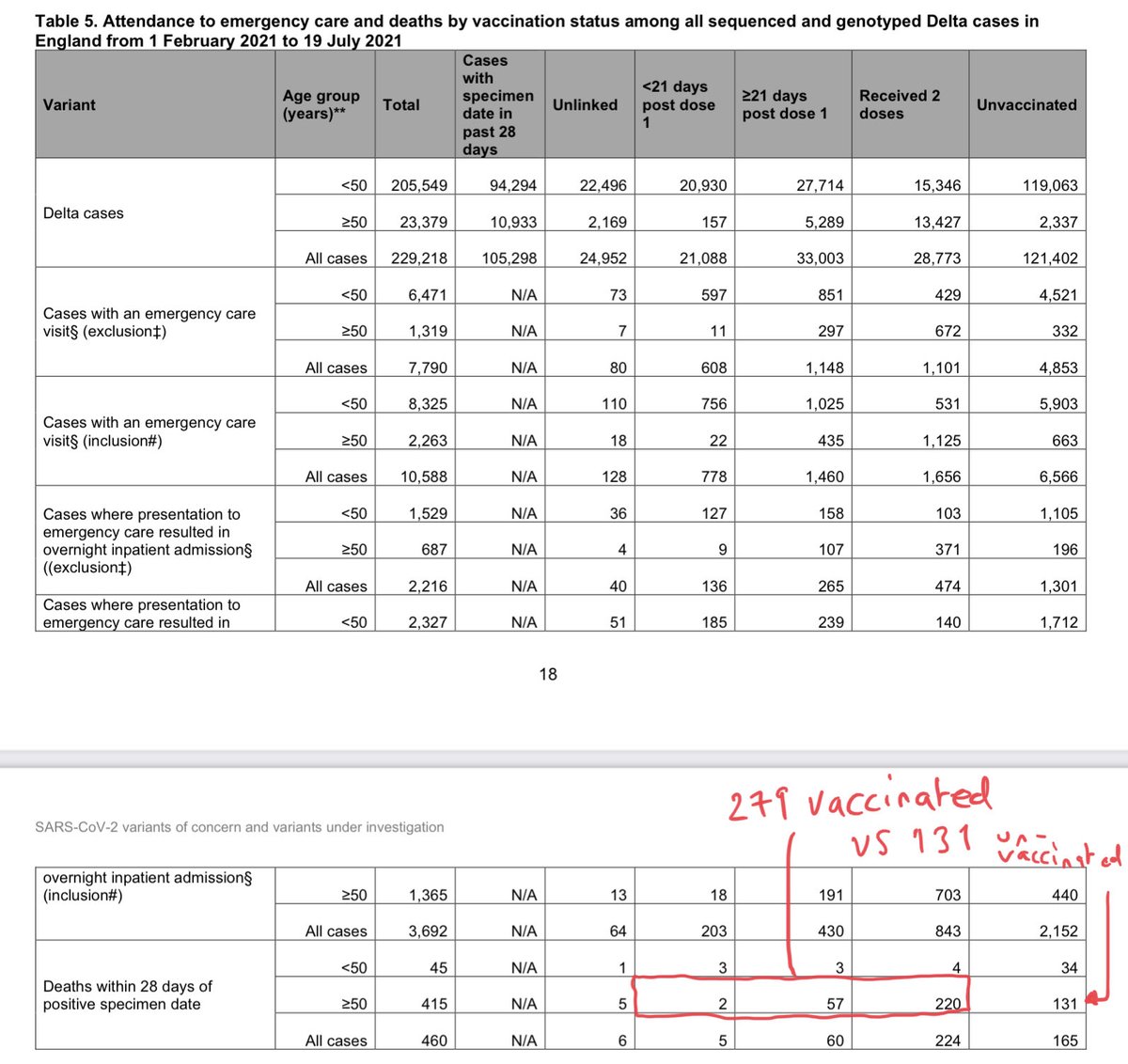
The statistic is buried in a recent @PHE_uk release.
I’ve ringed it here.
It’s the no of double-jabbed people who’ve died with Delta variant assets.publishing.service.gov.uk/government/upl…
The statistic is buried in a recent @PHE_uk release.
I’ve ringed it here.
It’s the no of double-jabbed people who’ve died with Delta variant assets.publishing.service.gov.uk/government/upl…

More vaccinated people are dying w/ the Delta variant of #COVID19 than unvaccinated.
Indeed, look at those aged over-50 and the proportion is even higher:
279 vaccinated people dying vs 131 unvaccinated.
More than double.
Scary, right? Well not necessarily…
Let’s run through it
Indeed, look at those aged over-50 and the proportion is even higher:
279 vaccinated people dying vs 131 unvaccinated.
More than double.
Scary, right? Well not necessarily…
Let’s run through it
There are two things to bear in mind here.
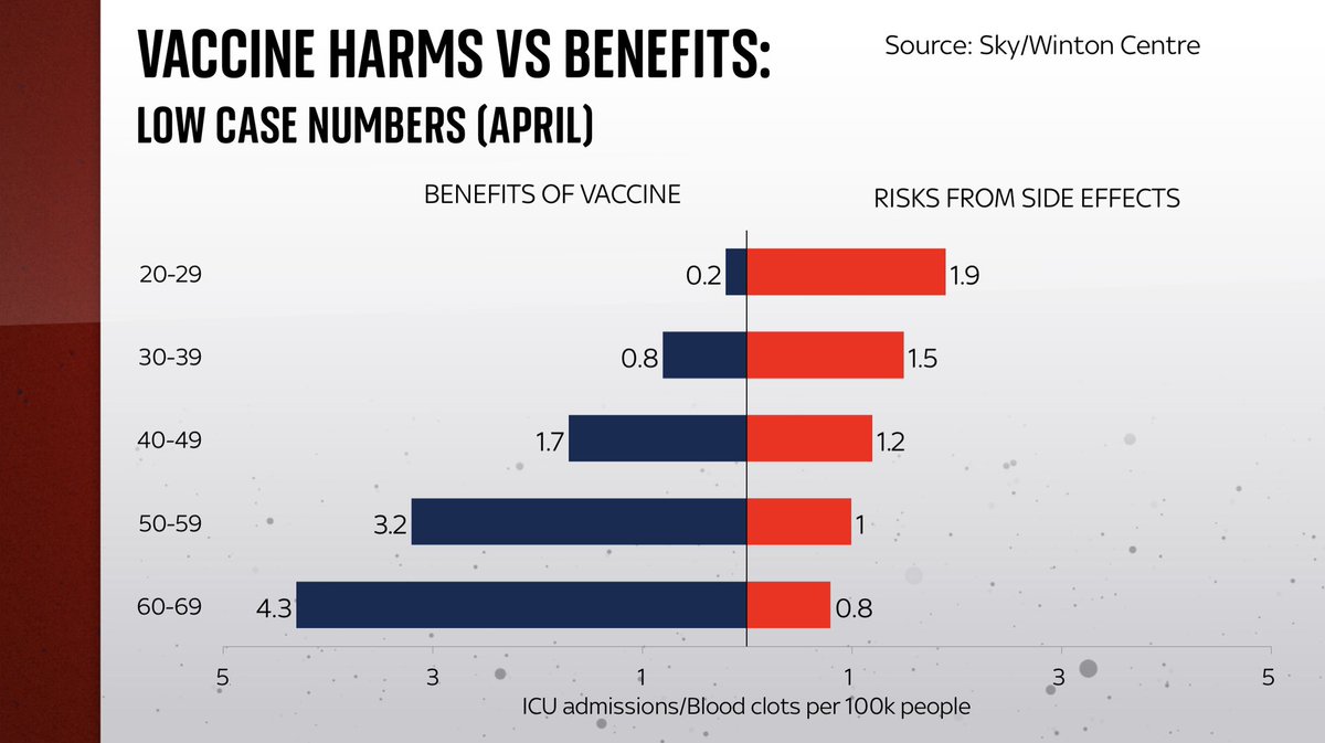
First, the vaccines are not 100% effective. They reduce your likelihood of dying of the disease. But even after vaccination some age groups are still relatively vulnerable. @d_spiegel explained this well here theguardian.com/theobserver/co…
First, the vaccines are not 100% effective. They reduce your likelihood of dying of the disease. But even after vaccination some age groups are still relatively vulnerable. @d_spiegel explained this well here theguardian.com/theobserver/co…
Here’s a useful @Johnnmurdoch chart illustrating this (I’ve done a similar one for @skynews tonight).
Post-vax, a 90 year old faces similar risk as an unvaxxed 60yo. Same thing for an 80yo: after being jabbed, similar risk profile to an unjabbed 50yo.
Risk reduced. Not eliminated
Post-vax, a 90 year old faces similar risk as an unvaxxed 60yo. Same thing for an 80yo: after being jabbed, similar risk profile to an unjabbed 50yo.
Risk reduced. Not eliminated
https://twitter.com/jburnmurdoch/status/1418952154342166539
The second thing to bear in mind is that the vast majority of over 50s in the UK - the age group most likely to face these higher mortality levels - are vaccinated. About 91% at present. And, over the period that PHE data covers, around 89% had at least one jab…

Now, back to the figs from that PHE dataset - the one that shows the majority of hospitalisations and deaths among over-50s were vaccinated. First thing to do is to compare the case numbers with the hospitalisations.
Like this. Notice anything?
Like this. Notice anything?

That’s right: the dark blue bit of the bottom bar - the hospitalisations - is smaller than in the top bar - all the cases.
To put it another way, consider the proportion of Delta cases among over-50s that turn into hospitalisations:
3.5% among vaccinated
8.4% among unvaccinated
To put it another way, consider the proportion of Delta cases among over-50s that turn into hospitalisations:
3.5% among vaccinated
8.4% among unvaccinated

In other words, the hospitalisation-per-case ratio for those over-50s who are unvaccinated is 2.4 times higher than for those who have had one or more jab.
So they ARE effective.
Yet, and this is the crucial bit, the NUMBER of vaxxed people hospitalised is nonetheless higher
So they ARE effective.
Yet, and this is the crucial bit, the NUMBER of vaxxed people hospitalised is nonetheless higher

Similar thing for the death figures.
Remember those numbers above👆: 279 vaccinated people dying, vs 131 unvaccinated.
How do they look when we put them into the same kind of context…?
Compare the blue/red proportions in the bars
Remember those numbers above👆: 279 vaccinated people dying, vs 131 unvaccinated.
How do they look when we put them into the same kind of context…?
Compare the blue/red proportions in the bars
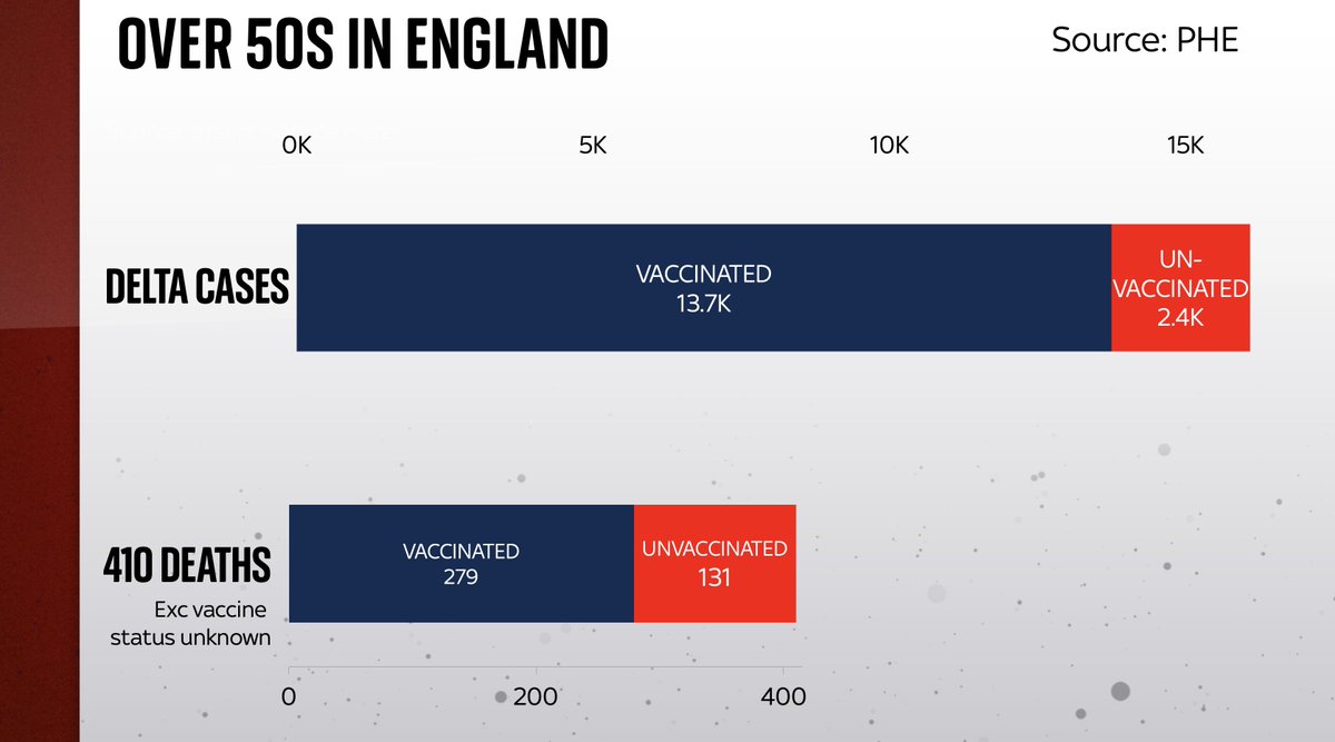
Of those vaccinated over-50s who caught Delta, 2% died.
But of those unvaccinated over-50s who caught Delta, 5.6% died.
That’s a significant difference, yet is only really apparent when you compare cases with deaths.
Looking at deaths alone is misleading.
But of those unvaccinated over-50s who caught Delta, 5.6% died.
That’s a significant difference, yet is only really apparent when you compare cases with deaths.
Looking at deaths alone is misleading.

Indeed, with 2.8 times more deaths per case among the unvaccinated portion of cases, you’re talking about high levels of vaccine effectiveness. How high? Perhaps 70-80%, but I’d be wary of putting too much weight on this dataset as I’m not sure it’s representative of the pop’n

It’s a reminder of something we’ve often encountered throughout #COVID19. CONTEXT IS EVERYTHING.
As populations become mostly vaccinated, simple numbers of hospitalisations/deaths will be dominated by the vaccinated.
It doesn’t mean the vaccines aren’t working as expected
As populations become mostly vaccinated, simple numbers of hospitalisations/deaths will be dominated by the vaccinated.
It doesn’t mean the vaccines aren’t working as expected
Why are so many of those being hospitalised and dying of #COVID19 in the UK vaccinated? Here's a short video breaking down the numbers
• • •
Missing some Tweet in this thread? You can try to
force a refresh