A chart from a very interesting, ongoing research project of Roger Fouquet at the LSE lse.ac.uk/granthaminstit…
He estimates the 'Net Domestic Consumer Surplus' – as a measure of economic welfare to complement GDP – for the UK over the last 300 years.
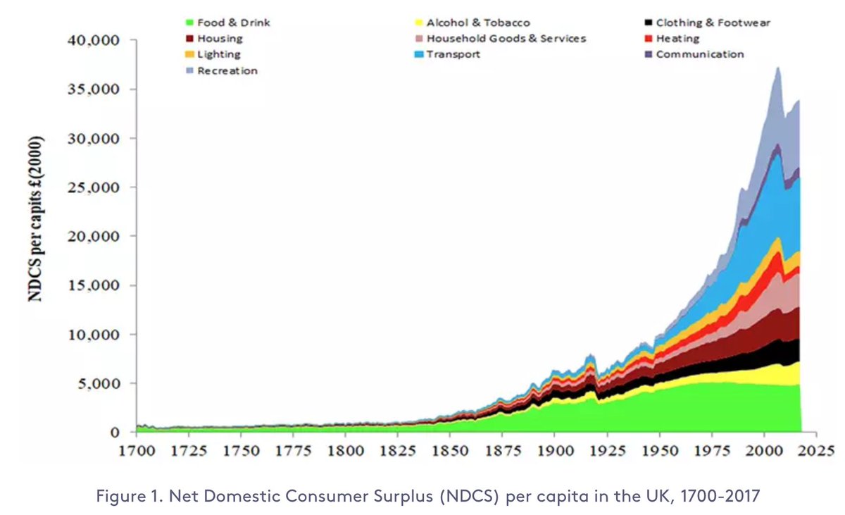
It's a very ambitious project – he has to do extensive historical data work to reconstruct the consumption of goods and services over the last three centuries.
As Roger mentions in the link above, he is looking for funding to finish this work.
Do you know a person or an institution that would be interested to fund this research project?
If so, let him know – his email is at the link.
This research is what I was looking for when I was asking whether someone had ever tried to evaluate a kind of whole economy consumer surplus.
At the time no one knew of a project like this – Roger seems to be the first one who is doing it!
For several energy metrics of key importance, *only* the @IEA publishes global data.
Below is a list of them.
The issue is that despite the fact that the IEA is largely publicly funded, they put this data behind paywalls.
They are therefore not part of the public discourse.
The fact that the @IEA charges thousands of Euros per dataset is due to their funders (the energy ministers) requesting that the IEA finances part of their budget through the sales of data.
During the rapid outbreak the test positivitiy rate also increased rapidly. This has now largely stopped.
I'd interpret this as suggesting that the gap between confirmed cases and total cases was increasing for a long time, but that this isn't continuing anymore.
To understand a global pandemic we need global data.
But even more than one year into the pandemic some of the most basic international data on COVID is missing.
Just because there is no international organization that brings this data together.
A thread.
To make it concrete, let's consider one set of measures for which international data is missing.
Cases, hospitalizations, & deaths *by age* would be very useful measures for decision makers, for epidemiologists, and really for everyone who wants to understand what is happening.
For a disease like COVID – for which the severity of the outcome is so dependent on the age of the infected person –, these metrics are absolutely key.
(e.g. differences in the mortality rate accross countries are to a good part due to different age profiles)
Confirmed cases are always only a fraction of all cases as not every infected person is tested and diagnosed.
The question is, how large of a fraction?
The IHME model for India suggests that the number of total cases is 29-times higher than the number of confirmed cases.
As you’ve seen in the chart above the latest data from the model is for April 11.
If the ratio between confirmed cases and total cases has stayed at 29, then the 233,074 cases that India confirms now correspond to 6.76 million cases daily.
(233,074*29=6.76M)
All these epidemiological models, including the IHME model, are far from perfect and that's important to keep in mind.
Two months ago India confirmed 11,300 cases per day.
This shows the rise of confirmed cases since then.
A straight line on a logarithmic axis tells you that you are looking at exponential growth with a constant growth rate.
Now India confirms more than 200,000 cases a day.
This is how the rate of positive tests changed in that same period.
A strongly rising positive rate tells us that the testing efforts are not keeping up with the size of the outbreak.