'Energy poverty and indoor air pollution: a problem as old as humanity that we can end within our lifetime'
My new post is out: ourworldindata.org/energy-poverty…
👇 A thread with my main points below
My new post is out: ourworldindata.org/energy-poverty…
👇 A thread with my main points below
The lack of access to modern energy sources subjects people to a life of poverty.
If you don’t have artificial light, your day is over at sunset.
This is why the students in this photo are out on the street: they had to find a spot under a streetlight to do their homework.
If you don’t have artificial light, your day is over at sunset.
This is why the students in this photo are out on the street: they had to find a spot under a streetlight to do their homework.
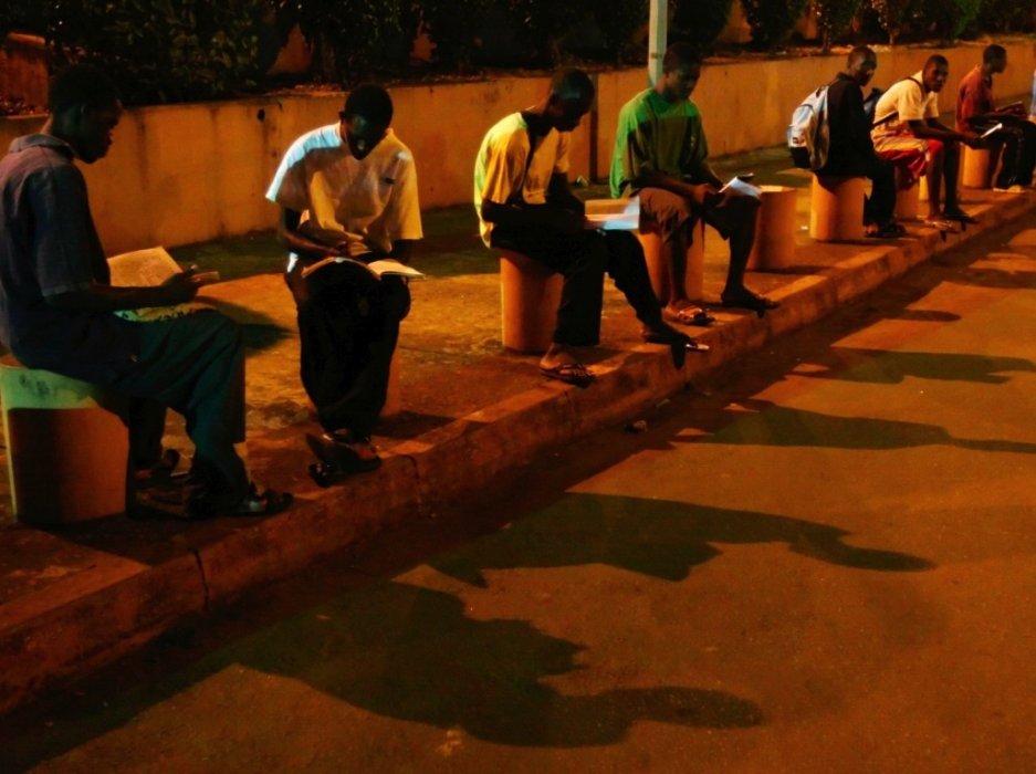
It’s a photo that shows both the determination of those who were born into poverty, but also the steep odds that they have to work against.
Energy poverty is so common that you can see it from space.
The poorest regions in the world are dark at night, as the satellite image shows.
The poorest regions in the world are dark at night, as the satellite image shows.

But to understand one of the world’s biggest problems that comes with energy poverty we need to take a look in the world’s kitchens:
In high-income countries, people use electricity or gas to cook a meal.
But 40% of the world – 3 billion people – do not have access to these clean, modern energy sources for cooking. What do they rely on instead?
The visualization below is the WHO’s answer.
But 40% of the world – 3 billion people – do not have access to these clean, modern energy sources for cooking. What do they rely on instead?
The visualization below is the WHO’s answer.
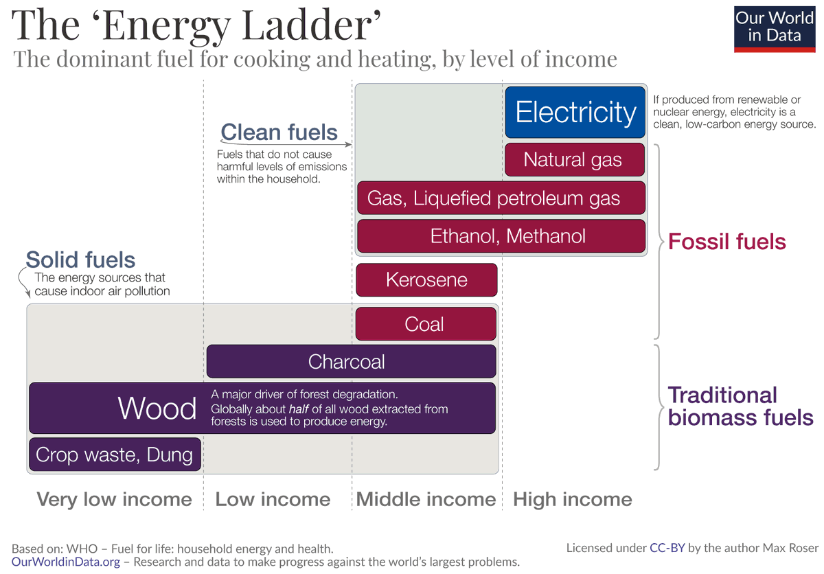
The 'Energy Ladder' shows:
The poorest households burn wood and other biomass, like crop waste and dried dung.
Those who can afford it cook and heat with charcoal or coal.
The poorest households burn wood and other biomass, like crop waste and dried dung.
Those who can afford it cook and heat with charcoal or coal.
Burning these solid fuels fills the room with smoke and toxic chemicals.
They expose those in the household – often women and children – to pollution levels that are *far* higher than in even the most polluted cities in the world.
They expose those in the household – often women and children – to pollution levels that are *far* higher than in even the most polluted cities in the world.
It leads to a range of health impacts as I discuss in the post.
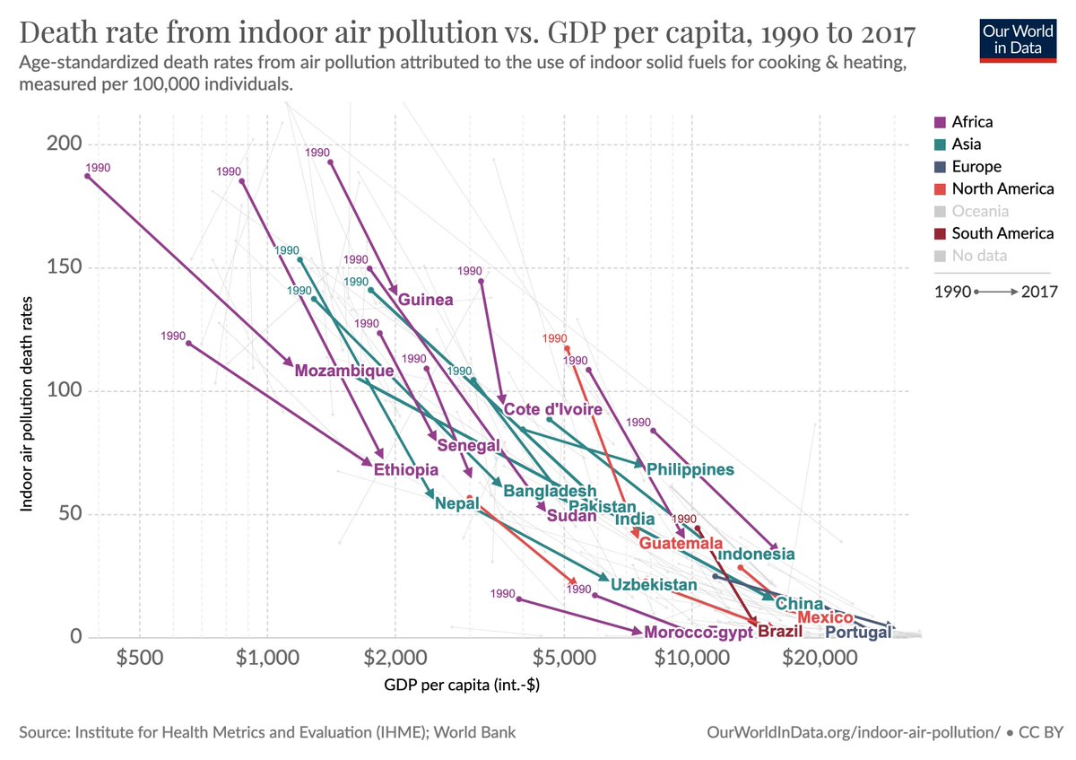
The death toll from indoor air pollution is estimated to be between 2.3 and 3.8 million annually.
The death toll from indoor air pollution is estimated to be between 2.3 and 3.8 million annually.
Humanity suffered and died from indoor air pollution for thousands of years.
As the name ‘traditional’ fuels implies, these were the sources that our ancestors in premodern days relied on.
As the name ‘traditional’ fuels implies, these were the sources that our ancestors in premodern days relied on.
The impact of manmade air pollution is documented in the remains of hunter-gatherers that lived in caves about 400,000 years ago.
High levels of air pollution have also been documented in the preserved lung tissue of Egyptian mummies.
High levels of air pollution have also been documented in the preserved lung tissue of Egyptian mummies.
Accounts of air pollution are common in the ancient world.
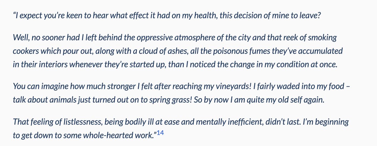
In the post I quote the philosopher Seneca who wrote the following in the year 61 after leaving Rome:
In the post I quote the philosopher Seneca who wrote the following in the year 61 after leaving Rome:
The premodern energy systems that bothered Seneca are a thing of the past for those who live in rich countries today.
But globally 3 billion people today (40%) do not have access to clean, modern energy for cooking today.
But globally 3 billion people today (40%) do not have access to clean, modern energy for cooking today.

It's also a major environmental problem.
Globally about half of all wood extracted from forests is used to produce energy, mostly for cooking and heating.
Globally about half of all wood extracted from forests is used to produce energy, mostly for cooking and heating.
But it is very much a solvable problem.
It is one of the many reasons why growth and electrification are so important for people’s wellbeing and health.
It is one of the many reasons why growth and electrification are so important for people’s wellbeing and health.
One thing that I emphasize in the post is that it is still a very long way to go for many world regions.
The @IEA estimates that by 2030 there will still be 2.4 billion people without access to clean cooking facilities.
The @IEA estimates that by 2030 there will still be 2.4 billion people without access to clean cooking facilities.
Is there anything that can be done in the meantime to improve this?
Yes. In the post I discuss the study by @BerkouwerS and @josh_t_dean:
Yes. In the post I discuss the study by @BerkouwerS and @josh_t_dean:
If you are convinced by this research, you can support poor households in Kenya to use these improved cook stoves: burnstoves.com/carbon-credits
It is a way to reduce deforestation, provides economic benefits to the households, and reduces indoor air pollution.
It is a way to reduce deforestation, provides economic benefits to the households, and reduces indoor air pollution.
Air pollution in the household is a problem that goes back hundreds of thousands of years.
Millions of people lost their lives to it over the course of history.
Millions of people lost their lives to it over the course of history.
Energy poverty is still the reality for around 3 billion people in the world today.
What’s different from the past is that it’s now a solvable problem.
What was unavoidable for the ancient Romans or the hunter-gatherers is entirely avoidable today.
What’s different from the past is that it’s now a solvable problem.
What was unavoidable for the ancient Romans or the hunter-gatherers is entirely avoidable today.
Key for making progress against energy poverty in the coming years are economic growth, increased production of clean energy, and electrification.
It would mean large benefits for environmental protection, gender equality, and for people's health.
It would mean large benefits for environmental protection, gender equality, and for people's health.
Indoor air pollution is a problem as old as humanity itself.
It is now possible to end it within our lifetimes.
It is now possible to end it within our lifetimes.
• • •
Missing some Tweet in this thread? You can try to
force a refresh