travellingtabby.com/uk-coronavirus…
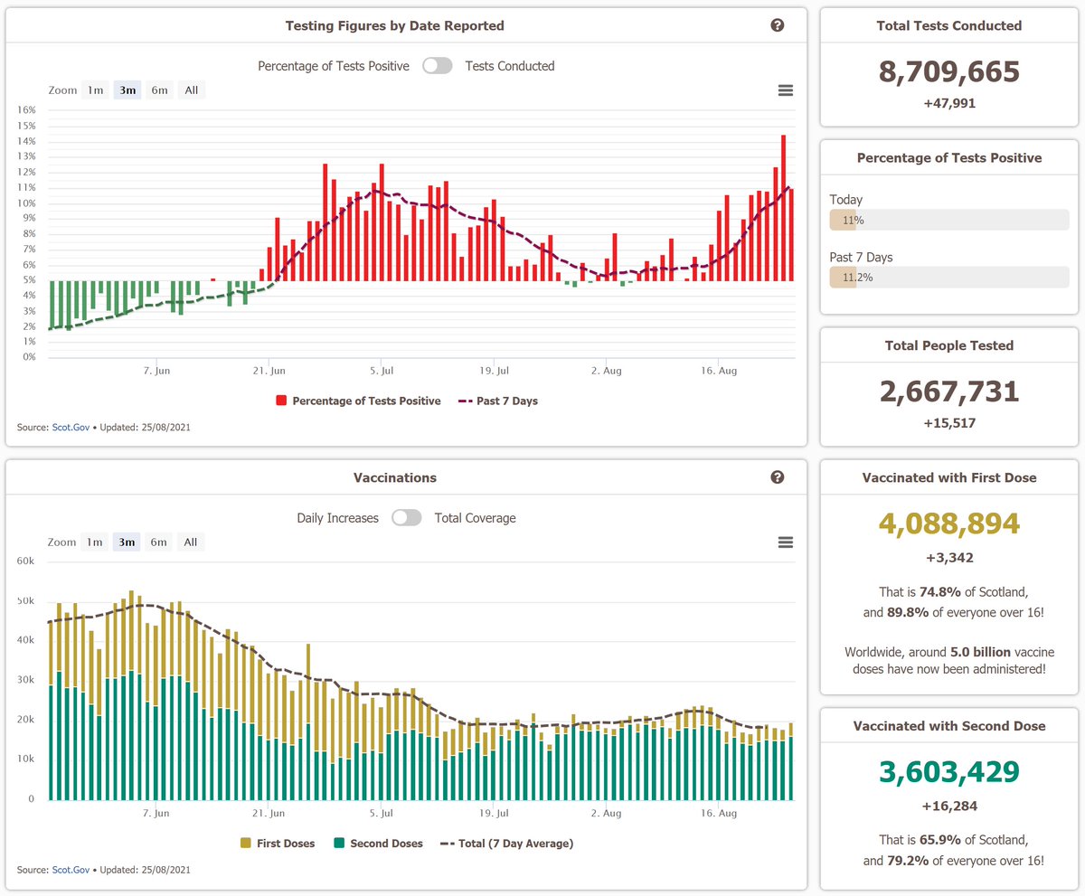
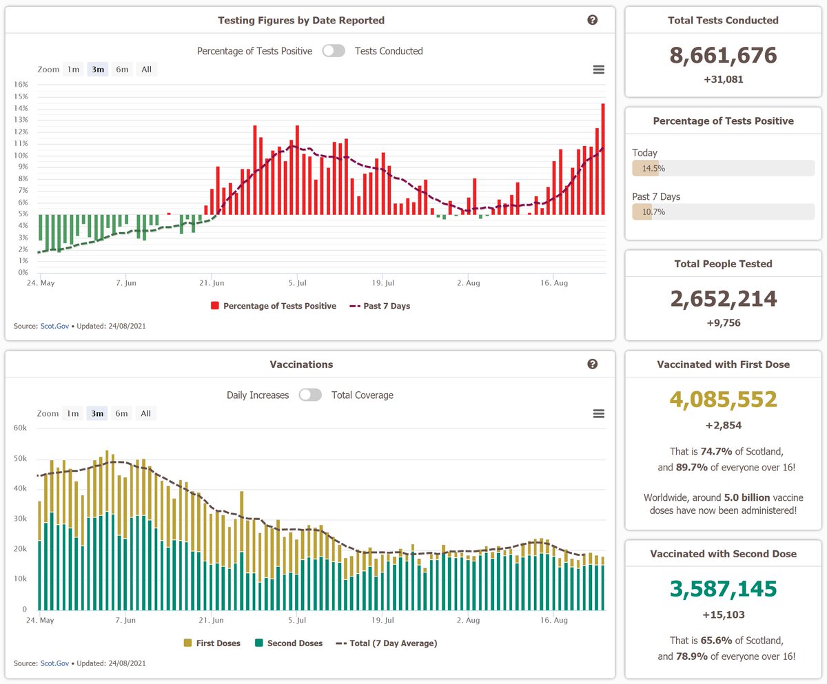
For the first time in a month, Scotland no longer has the highest 7 day case rate in the UK. That is now Wales, who have been seeing a bit of an increase over the past week.
#Covid19UK #coronavirusuk #DailyCovidUpdate


For the first time in a month, Scotland no longer has the highest 7 day case rate in the UK. That is now Wales, who have been seeing a bit of an increase over the past week.
#Covid19UK #coronavirusuk #DailyCovidUpdate


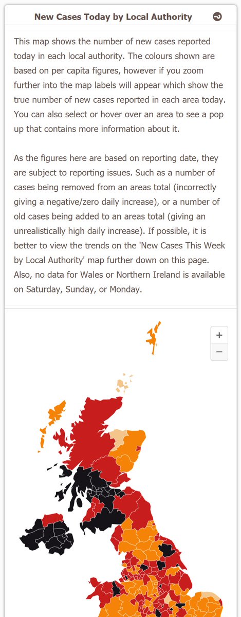
That is true at a local authority level too, where Neath Port Talbot now have the highest case rate in the UK, as cases in West Dunbartonshire continue to fall.
Also I'm not going to do a big thread this week, but I'll share some of the weekly charts below!
Also I'm not going to do a big thread this week, but I'll share some of the weekly charts below!

First here is this one, showing the current situation across the UK at a glance.
And also a few of the ones showing vaccinations by age (still no data on under 18s included in them though.. hopefully they'll be in there soon!)


And also a few of the ones showing vaccinations by age (still no data on under 18s included in them though.. hopefully they'll be in there soon!)


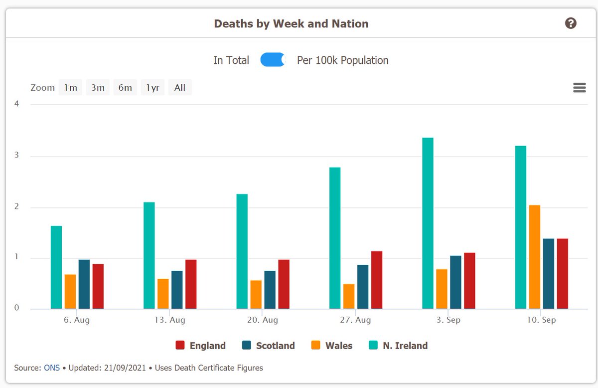
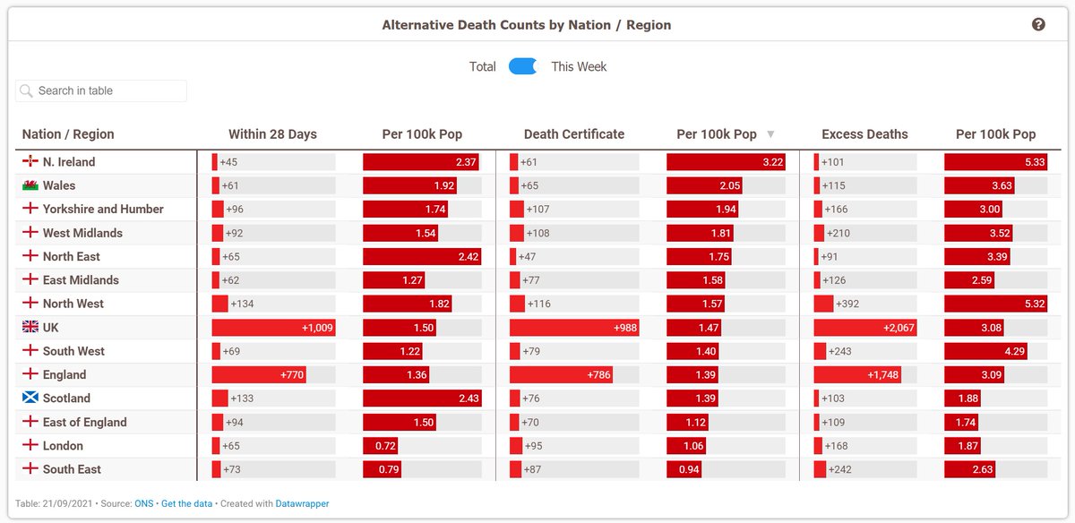
Then here are some of the weekly ONS figures too. Deaths were up again this week, and are now at just under 1,000.
Excess deaths were also up by quite a bit. Although last week was a bank holiday, so a bit of a bounce like this was to expected as the reporting catches up.


Excess deaths were also up by quite a bit. Although last week was a bank holiday, so a bit of a bounce like this was to expected as the reporting catches up.


• • •
Missing some Tweet in this thread? You can try to
force a refresh


