OK, this was an interesting rabbit hole: "Famous corporate logo designs with a hidden message"
Here are 12 gems 🧵
1/ In Google's logo, 5 of 6 letters are primary colors. The only outlier is "L", a secondary color (green).
Per the logo's designer:"Instead of having the pattern go in order, we put a secondary color on the L, which brought back the idea that Google doesn't follow the rules."
2/ In the SpaceX logo, the letter "X" matches the trajectory of of the Falcon 9 Rocket.
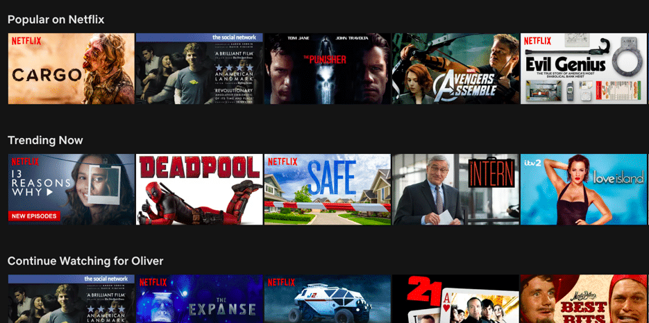
A Netflix user will browse the app for 90 seconds and leave if they find nothing.
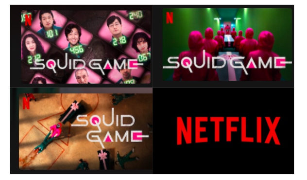
Thumbnail artwork is actually NFLX's most effective lever to influence a viewer's choice. A user will look at one for only 1.8 seconds, so NFLX spends huge to optimize them.
Here's a breakdown🧵
1/ Spoiler alert: humans are visual animals.
Our eyes move 3-4x per second to process information and we can analyze an image in as little as 13 milliseconds.
2/ In 2014, Netflix consumer research showed that thumbnail artwork:
◻️ is "the biggest influencer...to watch content"
◻️ is the focus of 82% of browsing time
A user looks at one for only 1.8 seconds. If they can't find Netflix content in 90 seconds, they'll leave the app.