NerdWallet started with $800 and an Excel spreadsheet. Now, the personal finance site is headed for a ~$5B IPO.
To get here, it mastered SEO including a genius hack that drives millions of organic page views: free finance tools (eg. mortgage calculators).
Here's a breakdown🧵
To get here, it mastered SEO including a genius hack that drives millions of organic page views: free finance tools (eg. mortgage calculators).
Here's a breakdown🧵
1/ Founded in 2009, NerdWallet began as a credit card comparison site but has expanded into mortgages, personal finance, investing and more.
The business model: NerdWallet offers free reviews/content/tools and receives affiliate fees if it drives conversions on finance products.
The business model: NerdWallet offers free reviews/content/tools and receives affiliate fees if it drives conversions on finance products.
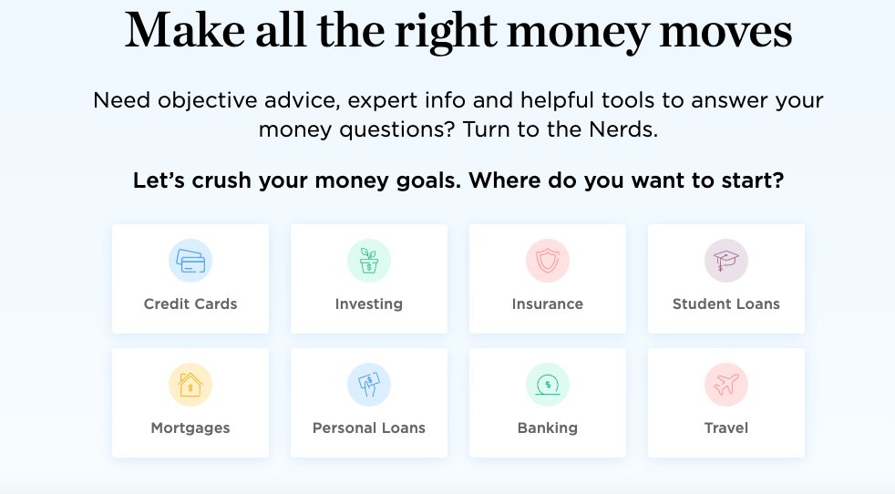
2/ Per SimilarWeb, NerdWallet gets 20m+ site visits a month. And 86% of that is via search (which is nearly all organic).
NerdWallet has a big editorial team (100+) to create content that ranks high in valuable finance searches.
It also offers ALOT of free tools.
NerdWallet has a big editorial team (100+) to create content that ranks high in valuable finance searches.
It also offers ALOT of free tools.
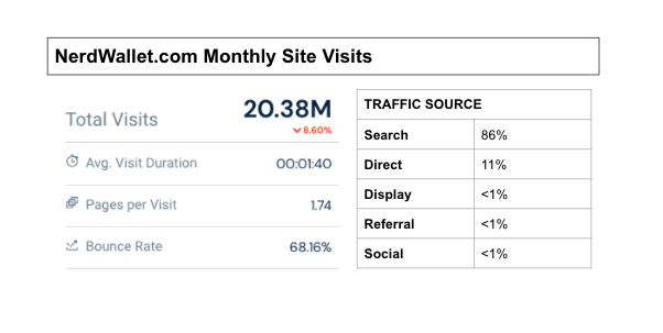
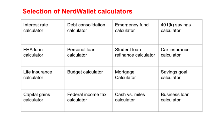
3/ In total, NerdWallet has 25 (!) free finance calculators
These tools are genius SEO hacks in the ultra competitive personal finance world.
It dominates Google for keywords like “mortgage calculator”, “refi calculator”, “compound interest calculator”,”retirement calculator”.
These tools are genius SEO hacks in the ultra competitive personal finance world.
It dominates Google for keywords like “mortgage calculator”, “refi calculator”, “compound interest calculator”,”retirement calculator”.

5/ “Mortgage calculator” alone gets ~3.5m Google searches a month.
In total, NerdWallet's free finance calculators drive an estimated 1m monthly visitors.
How much would an always-on marketing campaign which drives 1m visitors a month cost via other marketing channels?
In total, NerdWallet's free finance calculators drive an estimated 1m monthly visitors.
How much would an always-on marketing campaign which drives 1m visitors a month cost via other marketing channels?
6/ These free content tools are quickly becoming the go to playbook for the smartest marketers:
◻️ Canva = tool that ranks #1 for “color wheel”
◻️ Shopify = tool for “business name generator"
◻️ Hubspot = tool for "email signature generator”


◻️ Canva = tool that ranks #1 for “color wheel”
◻️ Shopify = tool for “business name generator"
◻️ Hubspot = tool for "email signature generator”



7/ Notice how each tool is specifically created with the desired target market in mind:
◻️ Canva’s "color wheel" --> "Designers”
◻️Shopify’s "business name generator" --> "First time business owners"
◻️Hubspot’s “email signature generator" --> "Sales professionals"
◻️ Canva’s "color wheel" --> "Designers”
◻️Shopify’s "business name generator" --> "First time business owners"
◻️Hubspot’s “email signature generator" --> "Sales professionals"
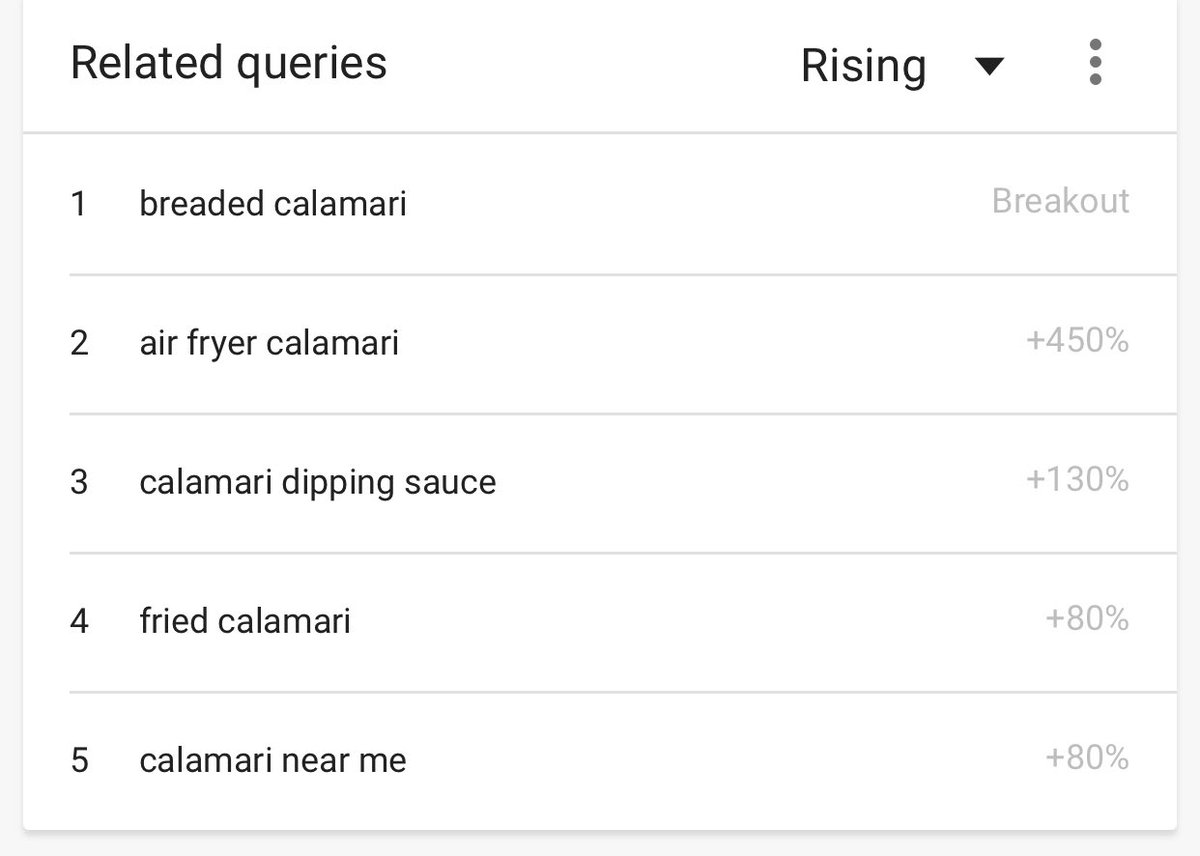
8/ How can you find content tool ideas for your business?
Searches for “calculators” are perfect for content tools but there are many alternatives ("templates”, “worksheets”, “generators”, “planners”) to find what your audience might be looking for.
Give it a whirl:
Searches for “calculators” are perfect for content tools but there are many alternatives ("templates”, “worksheets”, “generators”, “planners”) to find what your audience might be looking for.
Give it a whirl:

9/ If you enjoyed that, I write threads breaking down tech and business 1-2x a week.
Def follow @TrungTPhan to catch them in your feed.
Here's one that might tickle your fancy:
Def follow @TrungTPhan to catch them in your feed.
Here's one that might tickle your fancy:
https://twitter.com/trungtphan/status/1403004789642854409?lang=en
10/ The analysis is from SEO expert @ahogan (def follow him; his primary tool for these insights is Ahrefs).
Here's another SEO breakdown I wrote based on his notes:
Here's another SEO breakdown I wrote based on his notes:
https://twitter.com/trungtphan/status/1379938847115542529?lang=en
11/ In addition to calculators, NerdWallet also builds domain authority with:
◻️ Awards ("best mortgage lender", "best state for young families") that sites link to
◻️ Syndicate content (Forbes, AP, etc)
◻️ Back link magnets (reports, guides)
More here: thehoth.com/blog/nerdwalle…
◻️ Awards ("best mortgage lender", "best state for young families") that sites link to
◻️ Syndicate content (Forbes, AP, etc)
◻️ Back link magnets (reports, guides)
More here: thehoth.com/blog/nerdwalle…
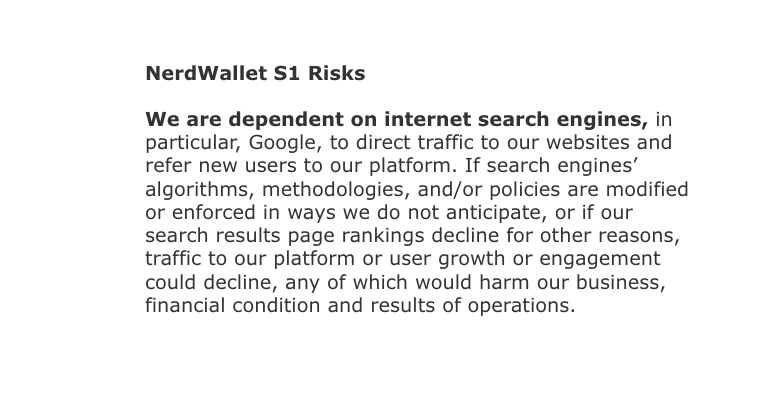
12/ Unsurprisingly, NerdWallet's S1 flags its dependence on Google as a key risk:
🔗sec.report/CIK/0001625278
🔗sec.report/CIK/0001625278
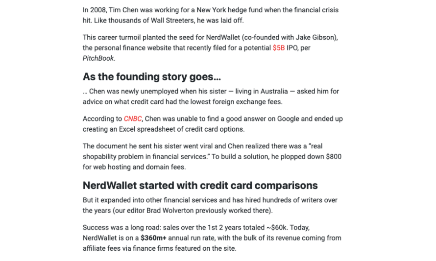
13/ Here's background on how NerdWallet started with "$800 and an Excel spreadsheet":
🔗thehustle.co/10132021-nerdw…
🔗thehustle.co/10132021-nerdw…
• • •
Missing some Tweet in this thread? You can try to
force a refresh

