“I spend too much at Starbucks” is a legendary meme.
It's also not an accident: the coffee retailer -- worth $120B -- uses many psychological hacks in its store and menu designs to get you to drop more cash.
Here are 11 of them 🧵
It's also not an accident: the coffee retailer -- worth $120B -- uses many psychological hacks in its store and menu designs to get you to drop more cash.
Here are 11 of them 🧵
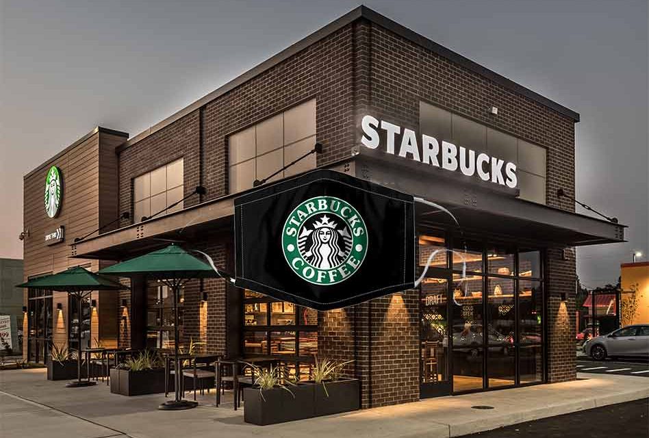
1/ Starbucks is all about positioning
The chain has higher prices vs competitors. But that's the point.
People typically assign higher value/quality to higher prices. Known as "irrational value assessment", this makes Starbucks an everyday luxury that people will pay for.
The chain has higher prices vs competitors. But that's the point.
People typically assign higher value/quality to higher prices. Known as "irrational value assessment", this makes Starbucks an everyday luxury that people will pay for.

2/ Premium brand = premium customer base
By setting its prices higher, Starbucks attracts clientele that are relatively price insensitive.
Starbucks frequently raises its prices with little negative effect to its bottom line.
By setting its prices higher, Starbucks attracts clientele that are relatively price insensitive.
Starbucks frequently raises its prices with little negative effect to its bottom line.

3/ "More than coffee"
Former Starbucks CEO Howard Schultz created the premium feel by emphasizing experience:
◻️Positioned SBUX as a "third place" (b/t home, work)
◻️Brought bean grinding in-store (for aroma)
◻️Banned auto espresso machines (it took away from the barista craft)
Former Starbucks CEO Howard Schultz created the premium feel by emphasizing experience:
◻️Positioned SBUX as a "third place" (b/t home, work)
◻️Brought bean grinding in-store (for aroma)
◻️Banned auto espresso machines (it took away from the barista craft)

4/ Lighting and visual cues
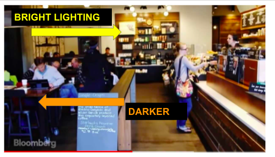
The Starbucks operations is about "flow", efficiently moving people around the store+ getting them to spend.
To form lines, it directs people to well-lit areas (usually the merchandise, which provides the added benefit of nudging products for sale).
The Starbucks operations is about "flow", efficiently moving people around the store+ getting them to spend.
To form lines, it directs people to well-lit areas (usually the merchandise, which provides the added benefit of nudging products for sale).
5/ Shop layout
Across its 32k+ locations, Starbucks places its cashiers in the middle or back of the cafes. As customers work through the line, they're watching other patrons enjoy their beverages and bites.
This is all priming them for their eventual orders.

Across its 32k+ locations, Starbucks places its cashiers in the middle or back of the cafes. As customers work through the line, they're watching other patrons enjoy their beverages and bites.
This is all priming them for their eventual orders.


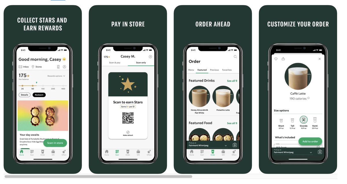
6/ Mobile app
There's a psychological effect known as "peak-end rule": people remember experiences by the most intense part and the end.
The pre-order app takes away 2 of the most unpleasant parts (paying + waiting), improving the *whole* experience.
There's a psychological effect known as "peak-end rule": people remember experiences by the most intense part and the end.
The pre-order app takes away 2 of the most unpleasant parts (paying + waiting), improving the *whole* experience.
7/ Starbucks card
Customers have $1.6B+ on Starbuck's apps/cards (hence the joke "SBUX is a bank").
In a concept called "mental accounting", people irrationally classify money in different buckets and treat them differently. That SBUX money is way more *spendable* than cash.
Customers have $1.6B+ on Starbuck's apps/cards (hence the joke "SBUX is a bank").
In a concept called "mental accounting", people irrationally classify money in different buckets and treat them differently. That SBUX money is way more *spendable* than cash.

8/ Loyalty program
Starbuck's Loyalty Program has 20m members and they contribute ~50% of the company's revenue.
The retailer takes all customer data and is able to provide individualized offers at scale. The freebies are habit forming and keep people coming back.
Starbuck's Loyalty Program has 20m members and they contribute ~50% of the company's revenue.
The retailer takes all customer data and is able to provide individualized offers at scale. The freebies are habit forming and keep people coming back.

9/ Personalized orders
We all know the joke: "Starbucks mispelt my name". However, the very fact that the baristas write it down increases your affinity for the brand.
This is known as the "cocktail party effect": people focus (and assign more value) to info about themselves.
We all know the joke: "Starbucks mispelt my name". However, the very fact that the baristas write it down increases your affinity for the brand.
This is known as the "cocktail party effect": people focus (and assign more value) to info about themselves.

10/ Menu structure
Through the 90s, the 3 sizes that Starbucks listed were Short, Tall and Grande. It has since bumped Short (you can still order it but its not on menu) and added Venti.
Now, the most popular size is the Grande (the new middle option and larger than SHORT).
Through the 90s, the 3 sizes that Starbucks listed were Short, Tall and Grande. It has since bumped Short (you can still order it but its not on menu) and added Venti.
Now, the most popular size is the Grande (the new middle option and larger than SHORT).

10/ Pricing
In addition to upping default sizes, Starbucks also uses pricing to steer you.
In what is known as the "attraction effect", your choice-set gravitates to the items that are "closer together". Here, the price b/t Grande and Venti is *closer* than Tall and Grande.
In addition to upping default sizes, Starbucks also uses pricing to steer you.
In what is known as the "attraction effect", your choice-set gravitates to the items that are "closer together". Here, the price b/t Grande and Venti is *closer* than Tall and Grande.

11/ No dollar signs on menu
Why? psychologically, a dollar sign triggers the idea of "price" and "spending...instead of "experience" and "what you're receiving".
Here IS a dollar sign: ~$29B, which is Starbucks projected sales this year.
Why? psychologically, a dollar sign triggers the idea of "price" and "spending...instead of "experience" and "what you're receiving".
Here IS a dollar sign: ~$29B, which is Starbucks projected sales this year.

12/ If you enjoyed that, I write threads breaking down tech and business 1-2x a week.
Def follow @TrungTPhan to catch them in your feed.
Here's one you may enjoy:
Def follow @TrungTPhan to catch them in your feed.
Here's one you may enjoy:
https://twitter.com/trungtphan/status/1409185044501987340
13/ I discuss interesting topics like this once a week (with a healthy dose of dumb jokes) on the Not Investment Advice (NIA) podcast.
🔗youtube.com/notinvestmenta…
🔗youtube.com/notinvestmenta…

14/ Sources
Formation: formation.ai/blog/how-starb…
Bloomberg:
CNBC:
Medium: medium.com/@akashmanu.iii…
Brightside: brightside.me/wonder-curiosi…
Price Intelligently: priceintelligently.com/blog/bid/18445…
Kent Hendricks: kenthendricks.com/starbucks-menu…
Formation: formation.ai/blog/how-starb…
Bloomberg:
CNBC:
Medium: medium.com/@akashmanu.iii…
Brightside: brightside.me/wonder-curiosi…
Price Intelligently: priceintelligently.com/blog/bid/18445…
Kent Hendricks: kenthendricks.com/starbucks-menu…
16/ Oh, also, a Starbucks barista one gave a famous answer on Quora explaining "what your drink said about you": 

18/ Some Reddit comments from former Starbucks baristas...which are big if true
https://twitter.com/TrungTPhan/status/1404105174738636804?s=20
19/ Last thing.
If you enjoyed this thread, you'll DEF like this one:
If you enjoyed this thread, you'll DEF like this one:
https://twitter.com/TrungTPhan/status/1451938190110052360?s=20
Definitely have more coming this week fam!!
https://twitter.com/romeensheth/status/1452675298982567948
• • •
Missing some Tweet in this thread? You can try to
force a refresh


