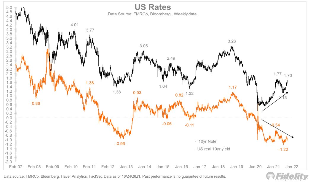
With the Fed's taper imminent, rates were on the move again last week, both in nominal and real terms. The TIPS break-even spread continues to test its upper bound of the past five years or so. Are inflation expectations ready to break out? (THREAD) Image
TIPS break-evens have rebounded from the depths of the pandemic. History shows a tendency to mean-revert around 2%, with the top of the range around 2.3% in recent years. But further back, break-evens spent a fair amount of time near 3%. /2 Image
Given that the CPI is north of 5%, a breakout to 3% would not surprise me. /3
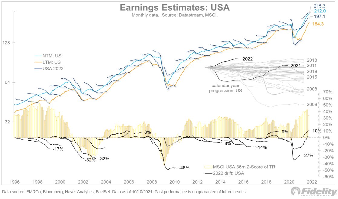
If inflation expectations do accelerate from here, it could very well happen without an acceleration in growth. That may stoke some fears of stagflation. You can see in the chart below that inflation breaks are clearly diverging from economic momentum. /4 Image
It’s interesting that both nominal yields and TIPS break-evens are rallying here, leaving real rates firmly in negative territory. /5 Image
This final chart highlights the divergence between nominal and real rates. One would be forgiven for expecting real rates to be above zero, considering where we are in the market cycle. /END Image

• • •

Missing some Tweet in this thread? You can try to force a refresh
 

Keep Current with Jurrien Timmer

Jurrien Timmer Profile picture

Stay in touch and get notified when new unrolls are available from this author!

Read all threads

This Thread may be Removed Anytime!

PDF

Twitter may remove this content at anytime! Save it as PDF for later use!

Try unrolling a thread yourself!

how to unroll video
  1. Follow @ThreadReaderApp to mention us!

  2. From a Twitter thread mention us with a keyword "unroll"
@threadreaderapp unroll

Practice here first or read more on our help page!

More from @TimmerFidelity

28 Oct
Bitcoin briefly beat its previous all-time-high, only to reverse lower. Short-term holders (less than 3 months) account for only 15% of all bitcoins, which remains below where it has been at most bottoms. So what's going on? (THREAD) Image
One thing: There’s now a retail vehicle for owning bitcoin, for those investors who don’t want to have to remember their keys. It may not be perfect but it might do for now. /2
In retrospect, some sort of buy-the-rumor, sell-the-news effect was to be expected, although the on-chain dynamics continue to show no signs of a speculative extreme. /3
Read 5 tweets
22 Oct
Bitcoin made a new all-time high of $66,000 on Wednesday. The chart below shows that both my supply and demand models continue to point to higher prices. (THREAD)
The gains have been pretty stealthy and without the help of momentum chasers. That may be ending now with the SEC approval of a futures-based ETF. /2
Whether such a development will prove to be a sell-the-news event remains to be seen, but I doubt it given the on-chain dynamics mentioned above. /3
Read 5 tweets
22 Oct
Is today's market an echo of the 1940s? The next few charts show the risk-reward tradeoff for the current cycle and for the WWII era. Look at this first one—a snapshot of the past 70 years—and I'll explain. (THREAD)
The chart above sets the stage with the baseline history. Cash at the lower left, stocks at the upper right, 60/40 in the sweet spot, and commodities in the worst place possible: earning only the inflation rate but with a massive vol. /2
Now let’s look at the past 18 months in the chart below. Commodities are up and to the right, along with equities, while bonds are well below the inflation rate. /3
Read 10 tweets
20 Oct
To put the current inflation spike in perspective, let's compare the current cycle to previous economic expansions. This chart shows the CPI index during all expansions since 1870 (as defined by NBER). (THREAD) Image
I'm intrigued by the 1940s analog. Unfortunately, we don’t have a true picture of inflation during the 1942-46 cycle, because of war-time price controls. I have seen some estimates that prices would have been 30% higher were it not for the price controls. /2
The next chart shows what commodity prices are doing now and what they have done during past expansions. It’s interesting that the current surge looks a lot like that other post-pandemic expansion of 1921-23. /3 Image
Read 5 tweets
14 Oct
Would a rotation from growth to value benefit non-US equities? In principle, yes, but the earnings picture for MSCI EAFE (Europe, Australasia and Far East) and EM (and especially China) suggests some caution. (THREAD)
The chart above, and the ones below, use the Datastream “squiggles” series for consensus earnings estimate progression by calendar year. The estimates run from the February before the calendar year to the February after. /2
The top panel above shows the dollar estimates and the bottom panel shows the progression from the start of each squiggle. The yellow bars show the 36-month Z-score of the MSCI USA total return. /3
Read 9 tweets
14 Oct
Will market leadership change back to value since rates are on the move? Long-duration growth stocks are convex to interest rates, and the relative performance of cyclicals/value stocks (especially financials and energy) is positively correlated to rising yields. (THREAD)
So, in theory, if bond yields rise to a new equilibrium (I’m guessing 2% for the 10-year), then value should take over for now. /2
I doubt the latest employment report will dissuade the Fed from starting its taper soon, so that suggests that in 2022 the bond market could be facing the opposite supply/demand dynamic as in 2021. /3
Read 4 tweets

Did Thread Reader help you today?

Support us! We are indie developers!


This site is made by just two indie developers on a laptop doing marketing, support and development! Read more about the story.

Become a Premium Member ($3/month or $30/year) and get exclusive features!

Become Premium

Too expensive? Make a small donation by buying us coffee ($5) or help with server cost ($10)

Donate via Paypal Become our Patreon

Thank you for your support!

Follow Us on Twitter!

:(