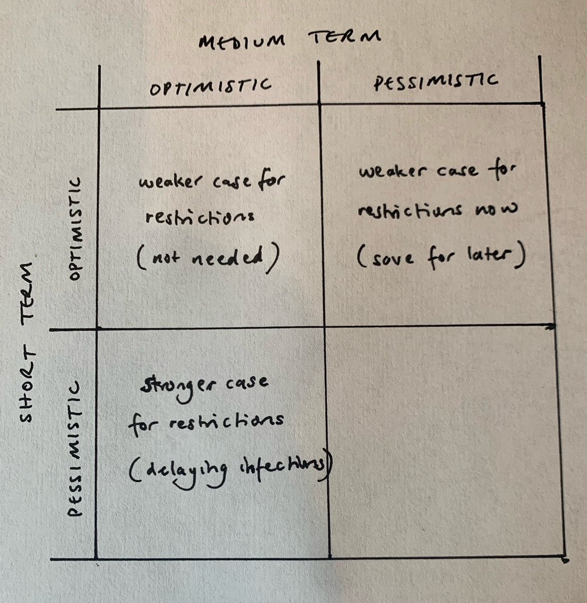
I’ve been thinking a bit about optimism and pessimism, and how that might affect our views on whether additional restrictions (such as the government’s “Plan B”) should be imposed. It’s not quite as simple as it might first appear. Let me explain…. 🧵
The first thing to note is that optimism and pessimism can operate on different timescales. So you might think that things are going to get worse over the next couple of months, but that 2022 will be a more positive experience, due to boosters and improved treatments.
Or you might be relatively optimistic about the next couple of months, but concerned about the potential for a resurgence in early 2022 as we reach the depths of midwinter, and as waning immunity hits the populations in their 40s and 50s who may not have had a booster yet.
So, digging into my strategy toolkit, let’s form ourselves a 2x2 grid, with an optimistic/pessimistic split on each axis: one for the short term (Nov & Dec 2021) and one for the medium term (first half of 2022).
If we did think that case rates were going to take a short break over half term, and then resume their upwards trend (particularly in older ages) – but that things were going to improve in the New Year, then that could support a case for temporary restrictions, ...
effectively delaying the potential for infections to a point where there is more vaccine-based immunity in the population – and hence reducing the total number of cases, admissions, and deaths. So let’s enter this onto the grid as follows:
Conversely, if we expect a continued decline in cases and admissions over the next month or two, but are worried about a resurgence in 2022, that provides weaker support for introducing restrictions at this point –not least because, as I’ve argued elsewhere, suppression before...
… a peak is likely to make the following peak higher (and later), not lower. In this case we’d do better to keep the restrictions in our back pocket until we’re on the upswing of the next peak, and consider using them then, if at all. So this forms our next entry on the grid:
Now let’s consider the other diagonal. What if we are optimistic about the short term, and about the medium term? Well then things are looking good, and it’s hard to see the case for additional restrictions. So this can also go on our grid:
And finally, if we’re pessimistic about the short term and the medium term, then we’re in for a tough winter, and frankly we’re going to need all the help we can get. So restrictions are more likely to be on the cards for the duration, and we can complete the grid, as follows:
What we see from this grid is that it’s really our view on the short term that guides our thinking on the need for restrictions. Our view on the medium term might influence *why* we think it’s a good or bad idea to add more restrictions, but it’s unlikely to change that view.
Of course, none of this forms a case for or against restrictions, and I haven’t tried to do any cost-benefit analysis on any specific proposals. I’m just interested in how optimism and pessimism, over different time horizons, might influence that thought process. /end
• • •
Missing some Tweet in this thread? You can try to
force a refresh
There been something bugging me for a while about how my model (and others) works. And I think I’ve finally pinned it down. It’s subtle and technical, but I think might turn out to be surprisingly important. And it’s all to do with the “leakiness” of the immunity model. 🧵
The difference between a “leaky” vaccine and an “all-or-nothing” vaccine has been well-covered by others – my favourite explanation is in this thread:
As it happens I’m not particularly happy with the “leaky” terminology – it could mean a number of different things, and so could be misinterpreted. I prefer to think about this in terms of the variability of the vaccine effectiveness (VE) at individual level.
It’s been a while since we’ve had a set of SPI-M models and it’s taken me a few days to read through them properly. Having done so, I have a few thoughts – as usual I’ve found 10 key messages to take away. For reference, the papers are all here: gov.uk/government/col… 🧵
In terms of overall messages, I would agree with everything that @BristOliver said here:
. So I’ll focus my own comments more in the detail of how the modelling has been done, and its implications.
1) In general, the models are fairly optimistic about the course of the next 2 months, but after that they vary a lot – with some scenarios showing significant peaks in 2022 (at any time from January through to June) and others with no big resurgence
The news from today’s case data continues to be good, but because I can only do undiluted positivity for so long before providing some balance, I’m going to give you the good news quickly, and then give you four reasons to avoid premature celebrations.
First, the good news: case growth in school-age kids continues to decline, and even more quickly in the last day or two. (note: this latest cliff-edge is undoubtedly exaggerated by the impact of people doing fewer LFD tests last weekend, as half term started for most kids)
In particular we can see the 10-14s now clearly over a peak: (best to look at that orange dotted line, which is a 7-day centred average, for an indication of the trend)
interesting article with some great quotes from @AdamJKucharski and @BristOliver. but unusually I disagree with @TomChivers on two counts: 1) I don’t think we can or should make our policy responses into an algorithm (it’s too complex a system, with strong human factors) and…
2) although “plan B” may feel low-cost to some, if we’re about to enter a downswing of cases (which seems quite likely, although not yet guaranteed) then implementing it now is as likely to make the next peak of hospitalisations higher, as it is lower.
this may seem counter-intuitive, but as the dynamics become more endemic-like, so they behave more like a pendulum. and if the pendulum is already moving in the direction you want it to, giving it a shove in that direction will certainly get you there faster (and for longer) but
I usually like to mix good news and bad news (“this.. but also that”). But I can’t find any bad news in today’s dashboard data, so here goes with a happy half-term round-up. Case growth continuing to fall, and now even more steeply in the under-20s:
And in the (un-averaged) detail for schoolkids, that trend looks *really* good.
Switching to look at cases (not growth), we can start to see the peak in the 10-14s emerging:
A bit of a mixed bag in today’s case data. The good news is in children, where the trend of recent days (stalling growth) continues:
And if we look into the detail, we can see weekly growth rates heading very slightly negative in all three school-age groups (although that last day will get revised up a bit, it does suggest we’re about at the peak of cases).
I note that (as @BristOliver mentions here) there’s a risk that the Immensa problems in the South West are now causing the growth to appear lower than the true underlying trend – so we should watch this closely over the coming days.