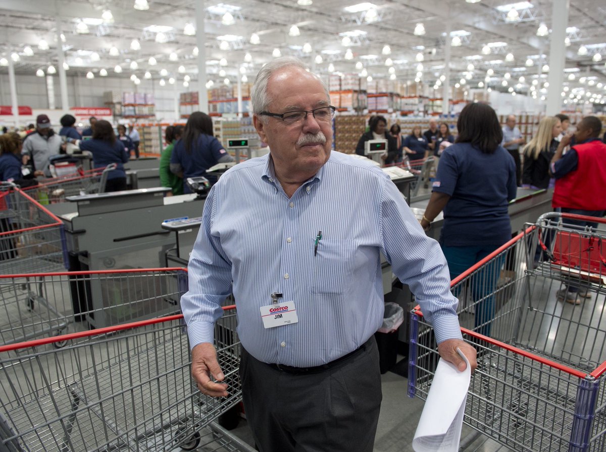
Trader Joe's has a playful brand but its business is very serious (annual revenue = $14B+).
With no ad spend or online sales, the chain perfected one psychological hack in its store/product design to achieve industry-leading sales of ~$1.7k per square foot.
Here's a breakdown🧵
With no ad spend or online sales, the chain perfected one psychological hack in its store/product design to achieve industry-leading sales of ~$1.7k per square foot.
Here's a breakdown🧵

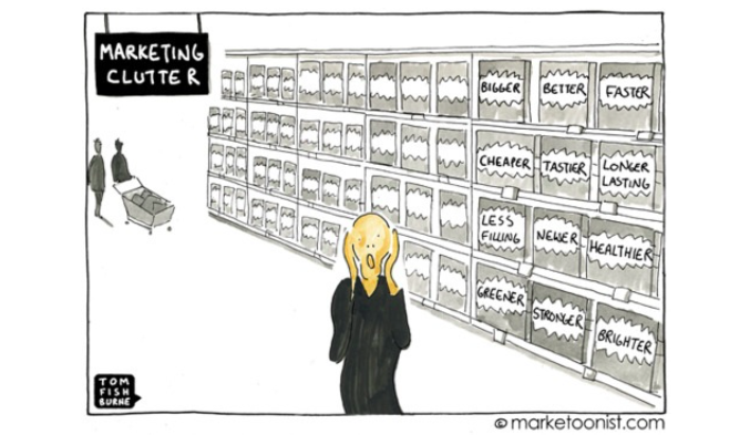
1/ "The Paradox of Choice" is the main psychological phenomenon that explains Trader Joe's (TJs) success.
While "choice" sounds great, too many options can lead to analysis paralysis: the inability to make a decision and/or fear of making wrong choice.
While "choice" sounds great, too many options can lead to analysis paralysis: the inability to make a decision and/or fear of making wrong choice.
2/ In 2000, Stanford researches highlighted "The Paradox of Choice" by setting up 2 display tables in a store with:
◻️24 jam option (60% of shoppers tried, 3% bought)
◻️6 jam options (40% of shoppers tried, 30% bought)
The table with fewer jam options converted 10x better!
◻️24 jam option (60% of shoppers tried, 3% bought)
◻️6 jam options (40% of shoppers tried, 30% bought)
The table with fewer jam options converted 10x better!

3/ TJs was founded in 1969 by Joe Coulombe, who previously ran a chain of 7-11 type convenience stores.
Coulombe married small stores w/ affordable exotic goods aimed at the "overeducated but underpaid". The compact store size was critical in overcoming "The Paradox of Choice".
Coulombe married small stores w/ affordable exotic goods aimed at the "overeducated but underpaid". The compact store size was critical in overcoming "The Paradox of Choice".

4/ Smaller store size = fewer SKUs
Today, TJs has 500+ stores conveniently located in urban areas. The average store size is 10-15k sqft, about 1/3rd a Whole Foods.
Due to its smaller footprint, TJs carries about 10% of the inventory of a typical grocer: 4k SKUs vs. 40k SKUs.
Today, TJs has 500+ stores conveniently located in urban areas. The average store size is 10-15k sqft, about 1/3rd a Whole Foods.
Due to its smaller footprint, TJs carries about 10% of the inventory of a typical grocer: 4k SKUs vs. 40k SKUs.

5/ Fewer SKUs = High quality @ low prices
To maximize space, Coulombe optimized for "high value relative to size": ~80% of TJs inventory is under its own brand, using same manufacturers as top competitors.
With few SKUs, TJ gets volume discounts and passes it on to shoppers.
To maximize space, Coulombe optimized for "high value relative to size": ~80% of TJs inventory is under its own brand, using same manufacturers as top competitors.
With few SKUs, TJ gets volume discounts and passes it on to shoppers.

6/ Curated products = cult following
TJs offers high-quality + affordable goods from all over the world (India, Italy, Mexico, Japan).
The 100% exclusive items lead to another psychological hack: for TJs legion of fans, the *switching costs* of shopping elsewhere are too high.
TJs offers high-quality + affordable goods from all over the world (India, Italy, Mexico, Japan).
The 100% exclusive items lead to another psychological hack: for TJs legion of fans, the *switching costs* of shopping elsewhere are too high.

7/ Treasure hunt
TJs rabid fan base will check the store just to see the latest and greatest product drops. The "treasure hunt" mentality is built right into TJ's design.
One salient example: its freezers are open air (for browsing) vs. the standard closed-door look.
TJs rabid fan base will check the store just to see the latest and greatest product drops. The "treasure hunt" mentality is built right into TJ's design.
One salient example: its freezers are open air (for browsing) vs. the standard closed-door look.

8/ A fun brand
Also, TJ dubs itself the "neighbourhood grocery store" and bringing out the mom 'n pop feel:
◻️Employees wear Hawaiian shirts
◻️Hand-written price tags and illustrated packaging evokes sense of "crafted" and "custom"
◻️Stores have custom murals (Austin below)
Also, TJ dubs itself the "neighbourhood grocery store" and bringing out the mom 'n pop feel:
◻️Employees wear Hawaiian shirts
◻️Hand-written price tags and illustrated packaging evokes sense of "crafted" and "custom"
◻️Stores have custom murals (Austin below)

9/ Highly-engaged employees
The TJ experience is also very pleasant thanks to its employees ("crew members"). Instead of promotions, sales or ads, TJ put that money towards its people.
With above-market pay (+ 2 raises a year), churn is low and service quality stays high.
The TJ experience is also very pleasant thanks to its employees ("crew members"). Instead of promotions, sales or ads, TJ put that money towards its people.
With above-market pay (+ 2 raises a year), churn is low and service quality stays high.

10/ Instead of bombarding us with options, TJs stocks exclusive high-quality SKUs at low prices (that people love).
TJs sells $1.7k per sqft, ~2x Whole Foods ($937) and more than other grocery chains.
In sum: TJ beats the "The Paradox of Choice" by doing a few things VERY well.
TJs sells $1.7k per sqft, ~2x Whole Foods ($937) and more than other grocery chains.
In sum: TJ beats the "The Paradox of Choice" by doing a few things VERY well.

11/ If you enjoyed that, I write threads breaking down tech and business 1-2x a week.
Def follow @TrungTPhan to catch them in your feed.
Here's a one that might tickle your fancy:
Def follow @TrungTPhan to catch them in your feed.
Here's a one that might tickle your fancy:
https://twitter.com/trungtphan/status/1453396116012089347
12/FYI: To write these thread, I've been using the Synth browser to collect and organize my ideas (**DISCLAIMER: Founder is my buddy and I'm an investor).
synth.app
synth.app

13/ Sources
CNBC: cnbc.com/2020/03/09/psy…
Marker: marker.medium.com/how-two-buck-c…
Przemek Szustak: medium.com/@przemekszusta…
Business Insider:
Barry Schwartz coined the term (and wrote the book) called "The Paradox of Choice": amazon.ca/Paradox-Choice…
CNBC: cnbc.com/2020/03/09/psy…
Marker: marker.medium.com/how-two-buck-c…
Przemek Szustak: medium.com/@przemekszusta…
Business Insider:
Barry Schwartz coined the term (and wrote the book) called "The Paradox of Choice": amazon.ca/Paradox-Choice…

14/ Also, you might like this thread I did about Trader Joe's legendary "Two Buck Chuck" Wine:
https://twitter.com/TrungTPhan/status/1432000225862848514
15/ This is a great nugget: while running the convenience chain, Coulombe -- a Stanford MBA -- wanted to see how grocers operated and spent his weekends doing free work for a neighbourhood store.
He received a free *education* that led to Trader Joe's.
He received a free *education* that led to Trader Joe's.

16/ Here's a dumb meme
https://twitter.com/TrungTPhan/status/1391007491232837639?s=20
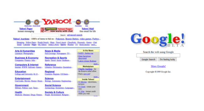
17/ The Yahoo! vs. Google homepages (these ones from 1999) is a great example of "The Paradox of Choice" and how keeping it simple can win out. 
• • •
Missing some Tweet in this thread? You can try to
force a refresh

