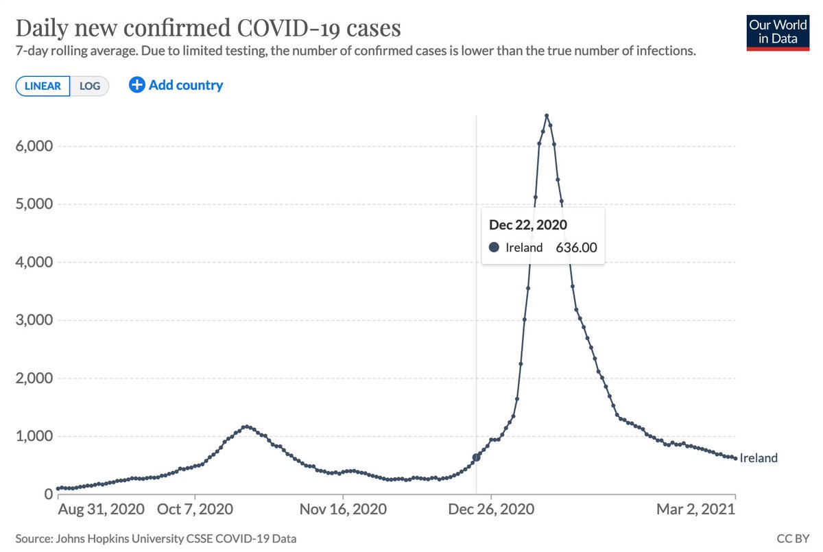
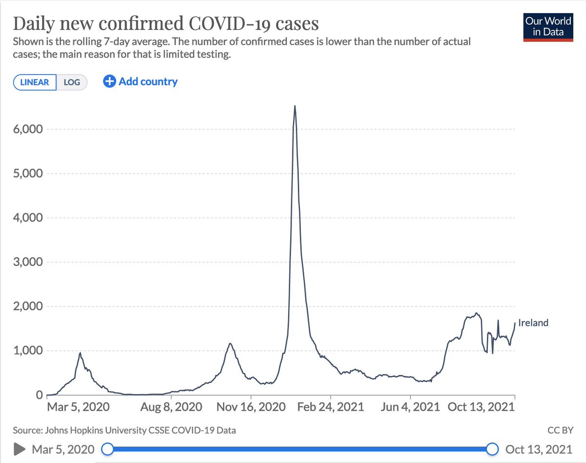
Since July Ireland's cases has been very strange. To hazard a guess, it looks like 6 or 7 small waves in various population groups, with the most recent and biggest triggered by Oct 22nd relaxing for the fully jabbed. An eyeball fit looks like this! Caveats 1/n @MLevitt_NP2013 
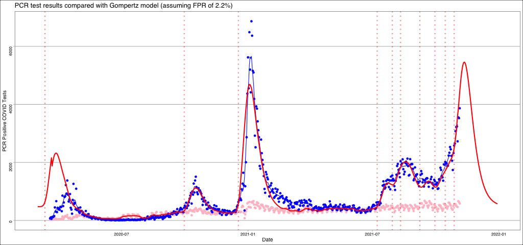
In this pure speculation, I am assuming that the rate constant is the same for every wave... just because it looks like it was for the first 3... maybe reasonable... may not... 2/n
To fit the "strange" section I therefor need lots of small Gompertz peaks that manage to add together to give something close to the data. This kind of eyeball fitting is an art rather than a science and can be wildly out. 3/n
What would support the many waves fit would be if the individual waves were seen in the county level data... so you might see one wave in waterford but not on sligo... another wave in dublin, etc 4/n
In any case, irrespective of the other fits... it does look extremely likely that there is a new wave right now that was "triggered" around Oct 22nd. This wave looks to be comparable to last Christmas' wave... but on the level of background at this stage I think +/- 50% error 5/n
The thing I should note is that the wave from last christmas completely ignored lockdown. Only reason it is off on the data points is because we didn't have the capacity to remove duplicates from the cases for 2 weeks after Dec 25th but a fit on up to Dec 24th >95% accurate 6/n
So if this eyeball prediction is correct then cases should top out at around 5000 positives per day by Nov 12th and will have fallen to 2500 positives per day by Nov 25th (assuming there are no new waves after this big one) 7/n
If my above "prediction" is correct I will be very surprised as there is too much uncertainty in the eyeballing I did to draw that last curve, but I think we should be close to the max by Nov 12th (give or take a day) and half that level by Nov 25th (give or take 2) 8/n
I'd like to have a more scientific fit, but I think there is value in the artistic fit as if close then it would indicate that masks dont work (as the rate is the same) and probably the other NPIs too... better to get prediction out now while I work on the science based fit 9/n
Oh and I fully expect "circuit breaker 2: this time it's the non-vaccinated only" to be released around Nov 14th and have zero effect... if it were to have an effect then the half-max level would be moved earlier to at least the 20th Nov... 10/n
Why do I think Circuit Breaker 2 will have no effect? Because it seems screamingly obvious to me that the most recent wave can only be explained by being a "pandemic of the vaccinated" as all the non-vaccinated are still excluded from society and left out eating in the rain 11/n
Now if Circuit Breaker 2 were to do the logical thing, and be a lockdown only of the vaccinated (being that they are the source of the current wave) then that might have an effect... but we are so close to the peak that I suspect it would have little to no effect anyway 12/n
Anyhow. I'm stepping above the parapet and giving a prediction:
* Cases will rise until a max at or around Nov 12th (+/- 1 day)
* Cases will then fall to half their max at or around Nov 15th (+/- 2 days)
NOTE: Assuming there is no further waves triggered
13/n
* Cases will rise until a max at or around Nov 12th (+/- 1 day)
* Cases will then fall to half their max at or around Nov 15th (+/- 2 days)
NOTE: Assuming there is no further waves triggered
13/n
And finally, any actions the government or NPHET do will not affect the curve in a way that makes cases fall faster... their actions may trigger additional waves or may make cases fall slower... but they will not do anything to make cases lower faster. 14/n
If I am substantially wrong, I will tweet an "It's a fair cop, I was wrong" video of me pouring a bucket of iced water over my head. 15/15
@threadreaderapp unroll
Damn typo. Half max on Nov 25th
@RemindMe_OfThis 2021-11-12 18:00 UTC
@RemindMe_OfThis 2021-11-25 18:00 UTC
• • •
Missing some Tweet in this thread? You can try to
force a refresh