Here is a real world example of why it is important to know what kind of shape an epidemic curve is. I will take Ireland in late 2020 as an example. Some background that is important to know. Late in Dec 2020 Ireland's system for detecting duplicate positives was overloaded 1/n
As a result, the test numbers reported by day were "limited" for a week or so while they scaled up capacity and then worked through the backlog. The backlog was cleared by around Jan 7th. Where exactly this effect kicked in depends on which data set you look at 2/n 
I am sad that this happened as it would have been a perfect chance to see if there was any effect of the lockdown that was rolled out from Dec 26th. Anyway just remember the case reporting dates from Dec 20th until Jan 7th were subject to delay 3/n
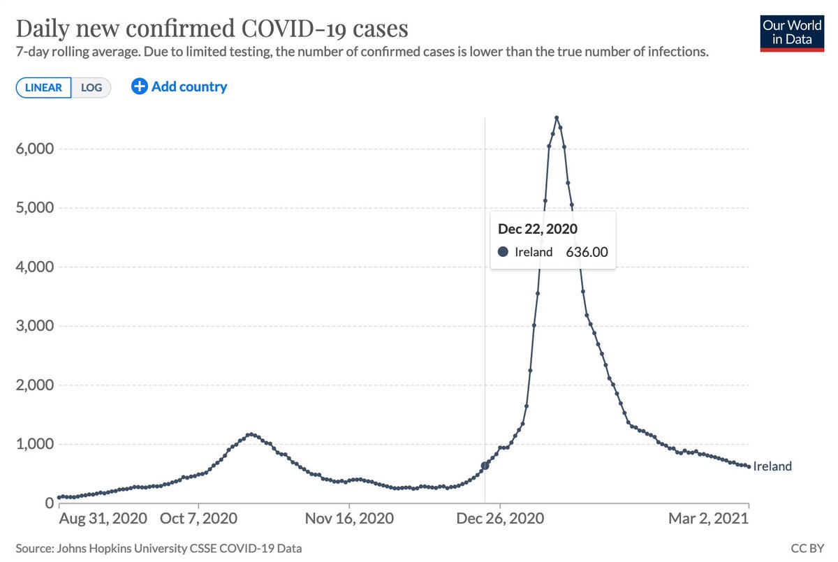
You may notice that there is an earlier peak in Oct 2020. We can fit the various epidemic curves to this peak and see what we see. First we will try the Logistic curve. All the SEIR models produce Logistic curves and the SEIR models seem logical... so it's not unreasonable 4/n

Alternatively we could try a Gompertz curve, which an empirical curve (i.e. we have not had a model that says why its the shape it is) but it has been seen a lot 5/n
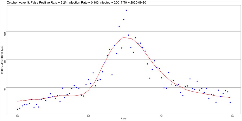
When you look at how noisy the data is (due to how few cases there were in that Oct 2020 mini-wave) there is little between the two fits. Logistic maybe seems a little better at the start but is equally worse at the end. Note: these fits are least squares residuals 6/n
The fits were against all three parameters:
* the number of people infected during the wave (both agree around 20k)
* the rate of the curve
* the "point of inflection" which is kind of related to when the curve 'starts' or when it reaches a max 7/n
* the number of people infected during the wave (both agree around 20k)
* the rate of the curve
* the "point of inflection" which is kind of related to when the curve 'starts' or when it reaches a max 7/n
Once we know the rate of each curve, when we see another epidemic wave of the same disease kicking off in the same type of population, we can use that rate to estimate how big a population group is being caught by the new wave. Prediction is good 8/n
We should also note that the level 5 lockdown introduced on Oct 21 did not have any significant effect on the epidemic curve irrespective of which curve you pick. The light blue line is Oct 21 and the fitted curves match the data well 9/n
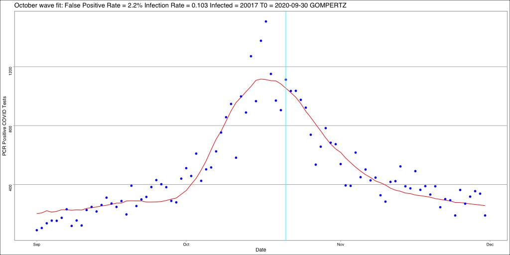
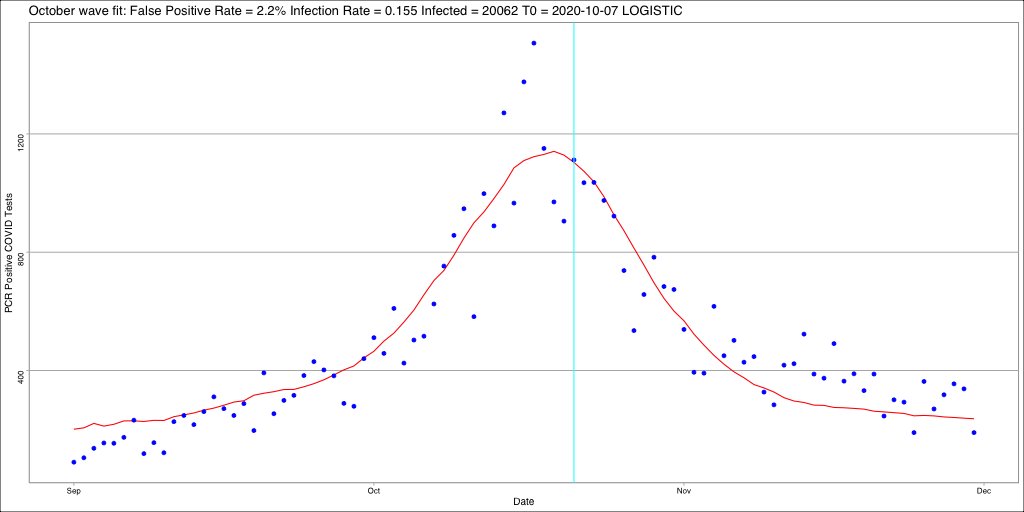
Of course it can take up to a week before you could expect to see any change, and by then the case numbers were so low as to make any change undetectable... anyway back to predicting 10/n
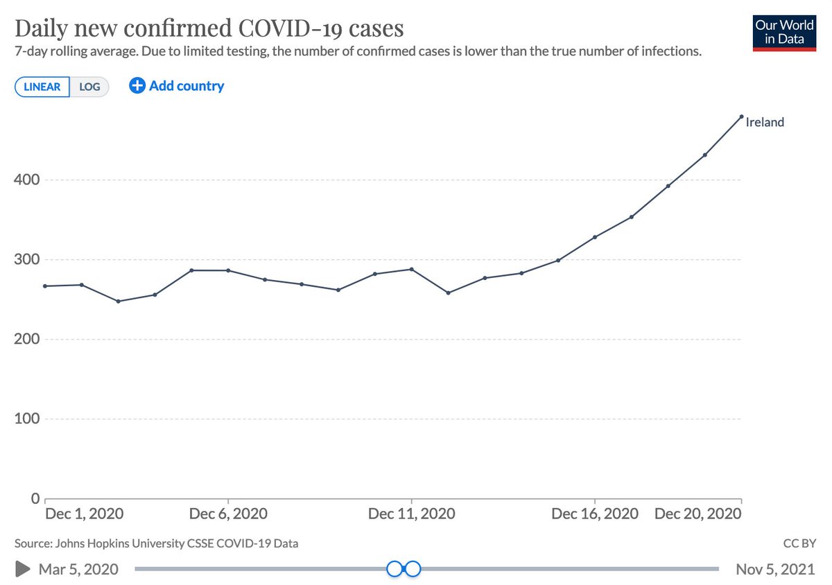
So along comes December 2020, we re-open for retail on Dec 1st, Restaurants Dec 4th and household visits Dec 18th... by this stage the case numbers are starting to trend upwards... certainly by Dec 20th we have a trend we can no longer ignore 11/n
So we should try and predict what will happen. If you are an SEIR model believer, you would fit a logistic curve to this rise up and see what that predicts (you might not fit it the way I will do, you might dress the fit up in a pile of simulations rather than direct fit) 12/n
If you are in the empirical camp of epidemiologists, you would probably explicitly fit the Gompertz curve as that's the empirical thing to do. In both cases we effectively use the rate from the earlier wave and tweak the amount infected and the "start" time 13/n
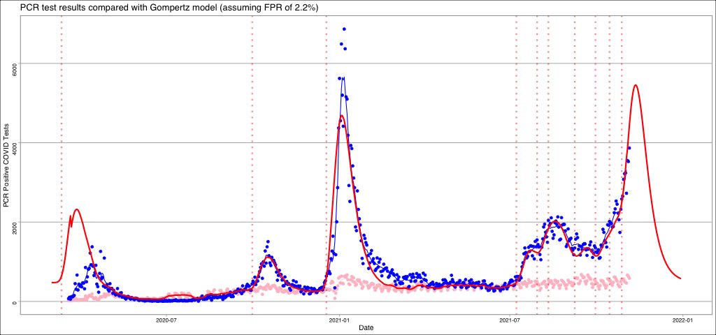
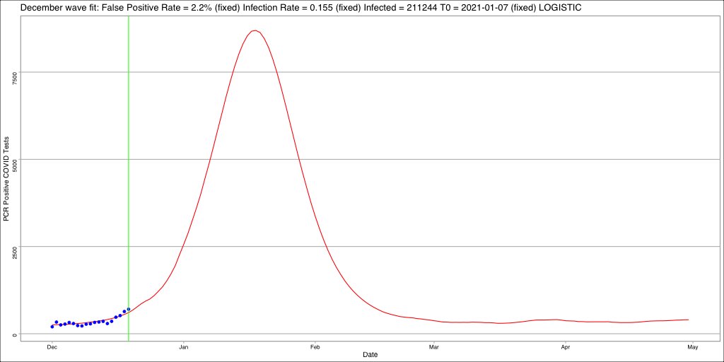
Here is the residual fit (red line) of the logistic curve up to Dec 20th (green line) using the rate from the Oct wave. This fit says approx 210k people will be infected. 10x worse than the Oct 2020 wave... 14/n
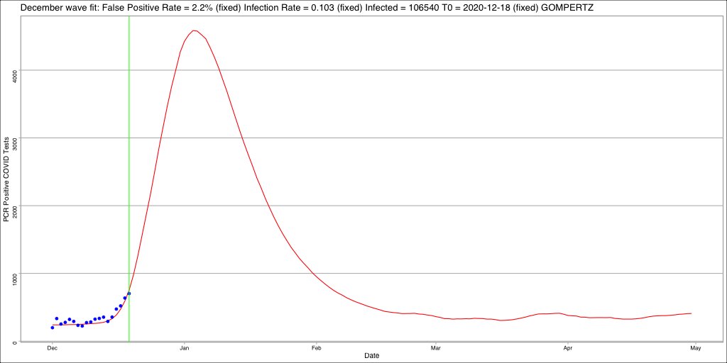
Here is the residual fit (red line) of the Gompertz curve up to Dev 20th (green line) using the rate from the Oct wave. This fit says approx 107k people will be infected. 5x worse than the Oct 2020 wave 15/n
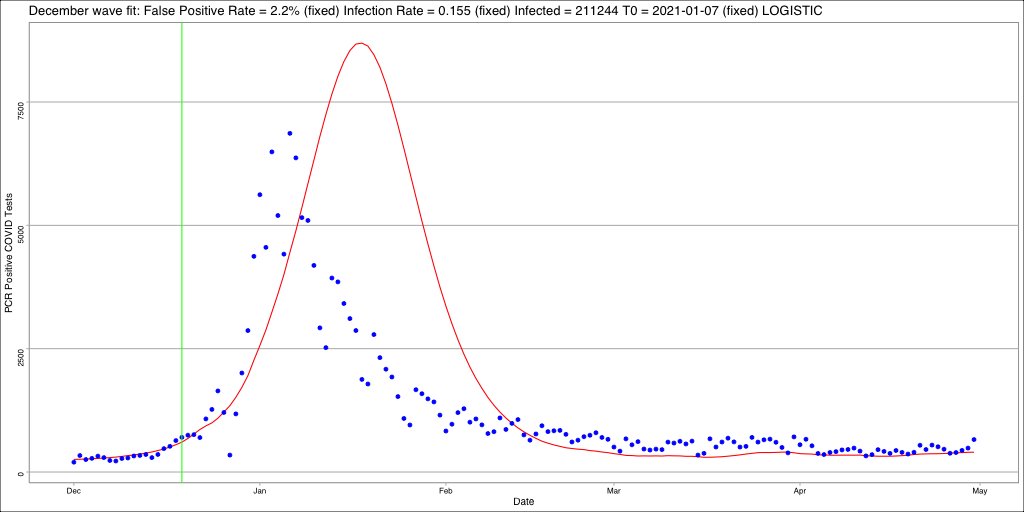
So the question is how did we do with our predictions? Well let's see how well the Logistic fit did? If we believe the SEIR models then the phased reintroduction of Level 5 lockdown between Dec 24th and Dec 30th worked wonders and reduced infections by half, "lockdowns work" 16/n

What about the Gompertz fit? Well the Gompertz fit is frightening accurate. It predicted how many would get infected in the wave to within 95% (depending on how you count)... oh and "lockdowns did sweet feck all" 17/n
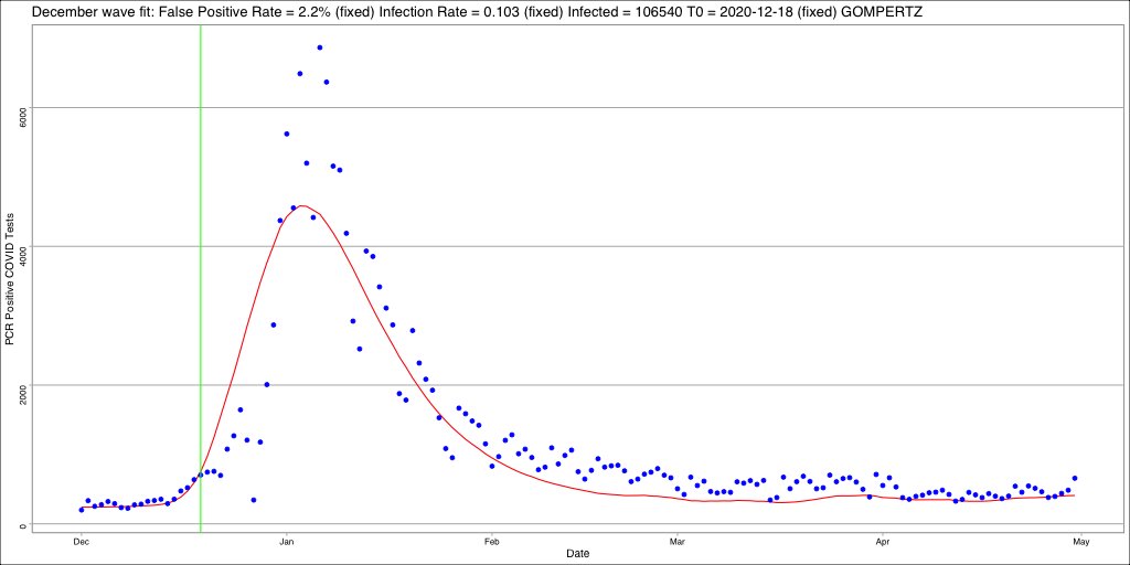
This is why it is vitally important to know what shape the epidemic curves actually follow. If we believe the SEIR models then lockdowns appear to work because its the only way to explain why the prediction didn't pan out. If we believe Gompertz then lockdowns did nothing 18/n
Into this maelstrom we have @MLevitt_NP2013 @Cescoxonta and @andreascaie with their latest preprint:
https://twitter.com/mlevitt_np2013/status/1456825752297648130?s=21in this preprint they show how a different method of simulating epidemics can give Gompertz curves when playing 5 degrees of Kevin Bacon 19/n
The question for you, the reader who has stuck through all this is, which do you believe:
* It's Gompertz and lockdown did nothing to stop it
* It's Logistic and lockdown halved the impact of the epidemic
I'll finish this thread with a poll 20/21
* It's Gompertz and lockdown did nothing to stop it
* It's Logistic and lockdown halved the impact of the epidemic
I'll finish this thread with a poll 20/21

The Irish December 2020 COVID wave followed a...
21/21
21/21
@threadreaderapp unroll
^^^ @FatEmperor @RealEddieHobbs @SaraHaboubi1 @BernieSpofforth @JamesMelville @GillianMcKeith @RanIsraeli @JamesDelingpole
• • •
Missing some Tweet in this thread? You can try to
force a refresh