Since the 11th of March 2020, every day, almost without fail, my wife has gone to the RTE website and noted down the COVID figures. Finally last night I got her to forward the text file to me and I moved it to a Google Sheet. Here is the link for you. docs.google.com/spreadsheets/d… 1/n
Now there were a few minor issues:
1. She had typed in 186 positives from the German labs on the 11th of April when RTE reported it as 286
2. She had got slightly out of sync between the 18th and 29th of June this year, but I was able to repair the data 2/n
1. She had typed in 186 positives from the German labs on the 11th of April when RTE reported it as 286
2. She had got slightly out of sync between the 18th and 29th of June this year, but I was able to repair the data 2/n
Otherwise, a very interesting data set. We can use this data set to compare with the government's record of COVID cases: covid-19.geohive.ie/datasets/d8eb5… So I imported that into a sheet and compared the two of them. There is a very interesting thing to note, though 3/n
Namely, the recorded cases are (apart from April 2020) always higher than the reported cases. Now this is quite strange. You would expect them to roll any excess positives that they missed from yesterday into today and so half of the differences should be negative... 4/n 
So this is certainly odd... One of the reasons my wife started recording this data was because she noticed that the number they announced was different from the change in the previous total positive cases. So it turns out what she was recording up to Jun 2021 was different 5/n
She was recording the difference between today's total cases and yesterday's total cases... and then the total cases stopped being reported as often so she had to switch to recording the announced number 6/n
This reveals something very interesting about the geohive dataset. Namely the ConfirmedCovidCases column seems to be the announced cases for that day but the TotalConfirmedCovidCases matches the total cases reported and recorded by my wife up to Jun 2021 (1 exception) 7/n

The exception is around the test results from the German lab when we were over testing capacity in April 2020. I think ConfirmedCovidCases is the announced number because since June 2021 it matches exactly my wife's record... so this means we have to look at gov data alone 8/n
So what we do is import the Government data set... I've done that already if you want: docs.google.com/spreadsheets/d… and then we can compare the difference between the previous total and the current total with the current case count for each day 9/n
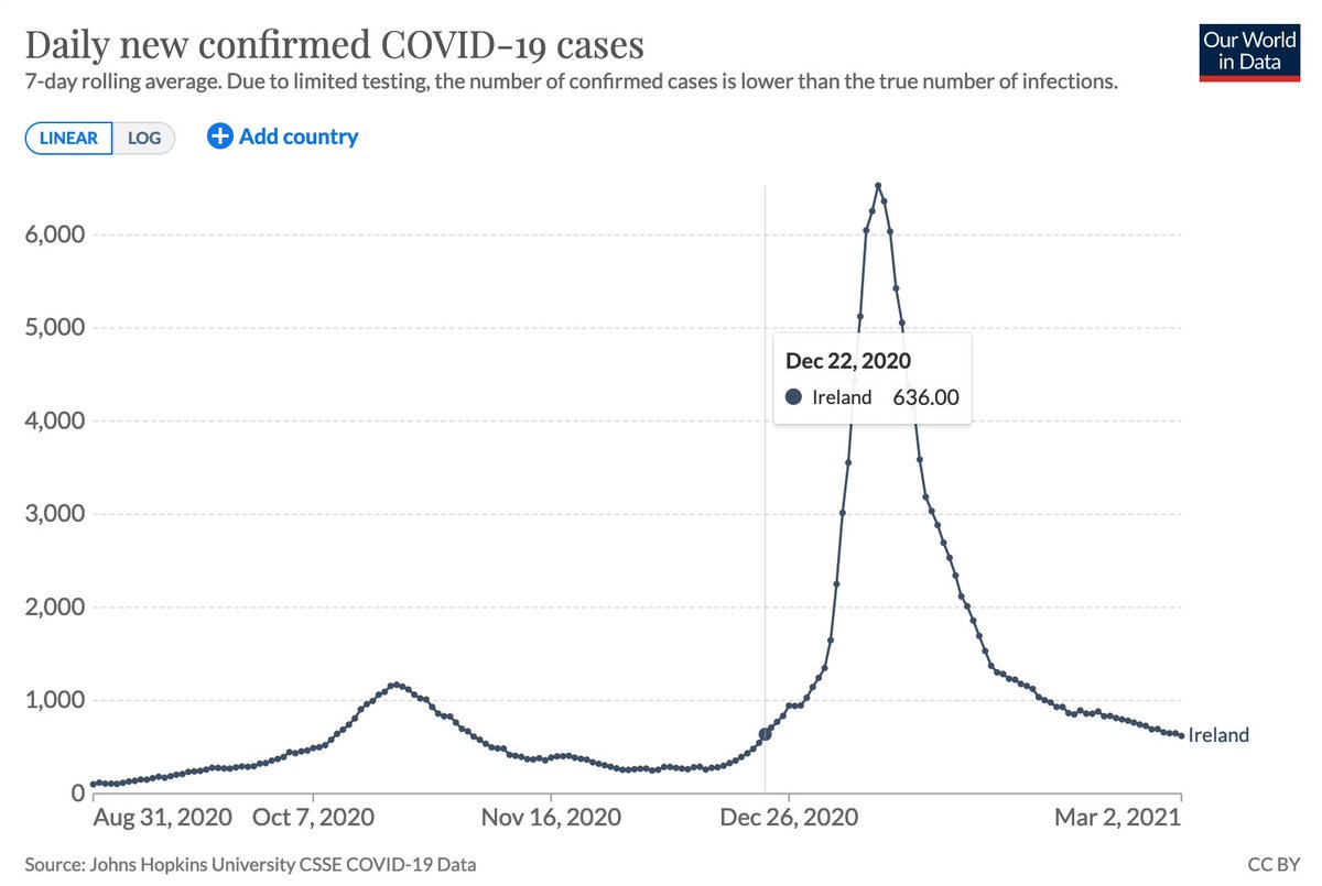
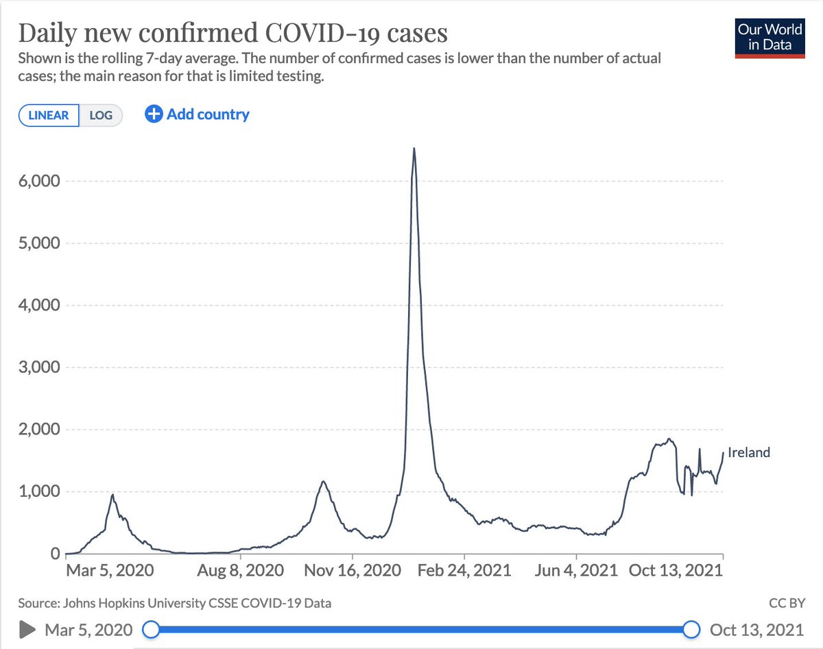
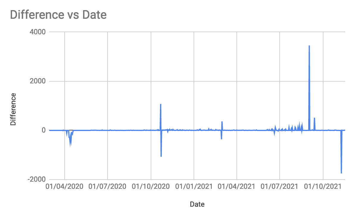
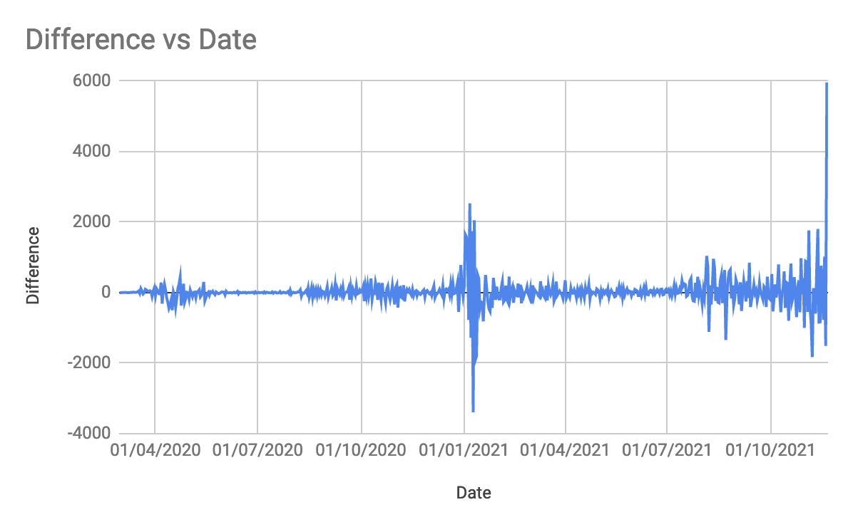
Initially if we plot this, from the big picture view it looks almost like we would expect it.. some up, some down with typically a day or so in between... I'll take you through some of them (chronologically) 10/n
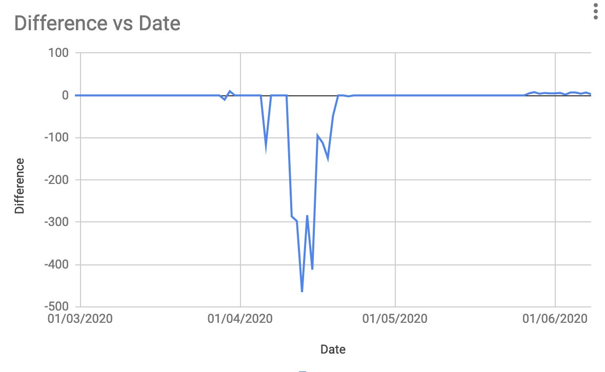
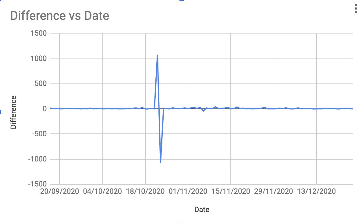
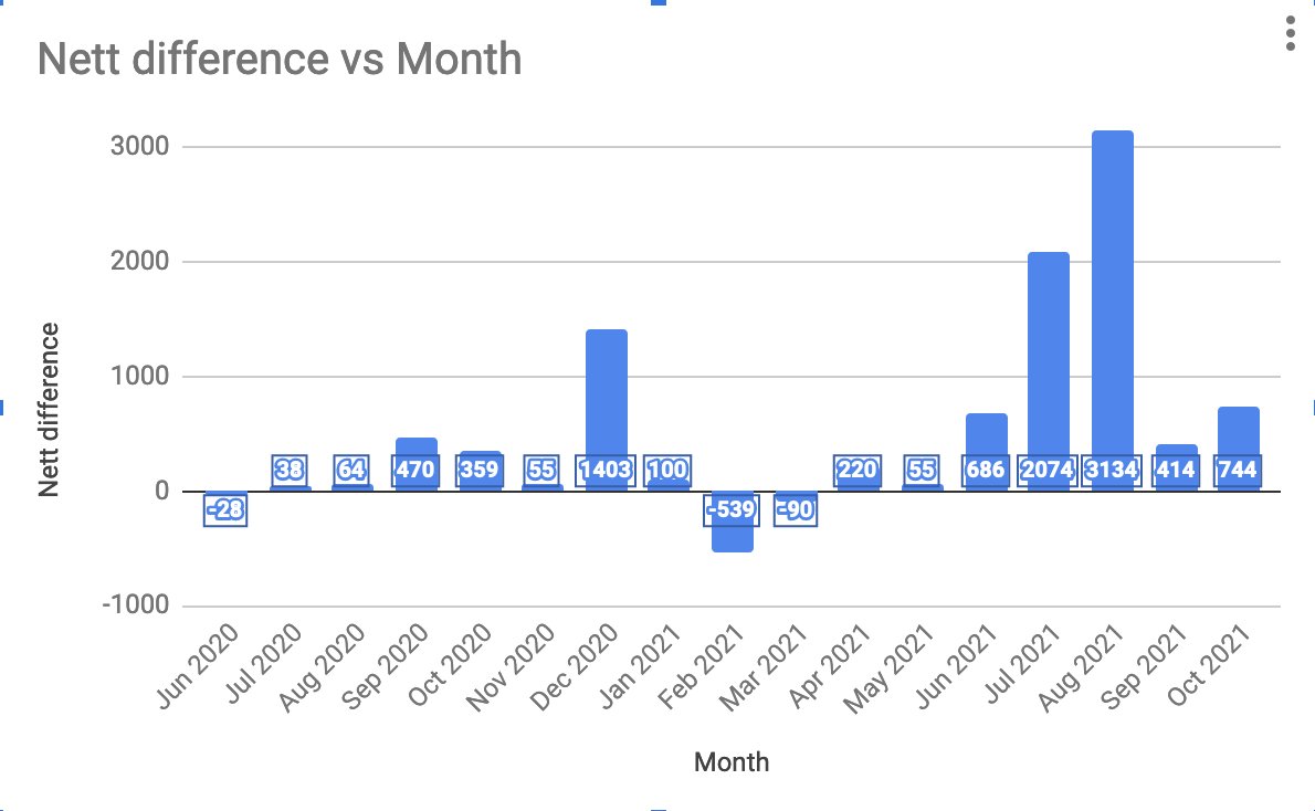
In April 2020 we have the German lab test results. These seem to have been recorded in the total test positives but not in the daily cases. At the time they announced those separately so I'll not cry foul. Note this indicates they didn't retrospectively adjust the data 11/n
In October 2020 we have our next big data point. This is the kind of difference we'd expect. A difference that is cancelled out the following day. It's a bit odd that it goes positive first as that means the ConfirmedCovidCases was announced first but hey stuff happens 12/n
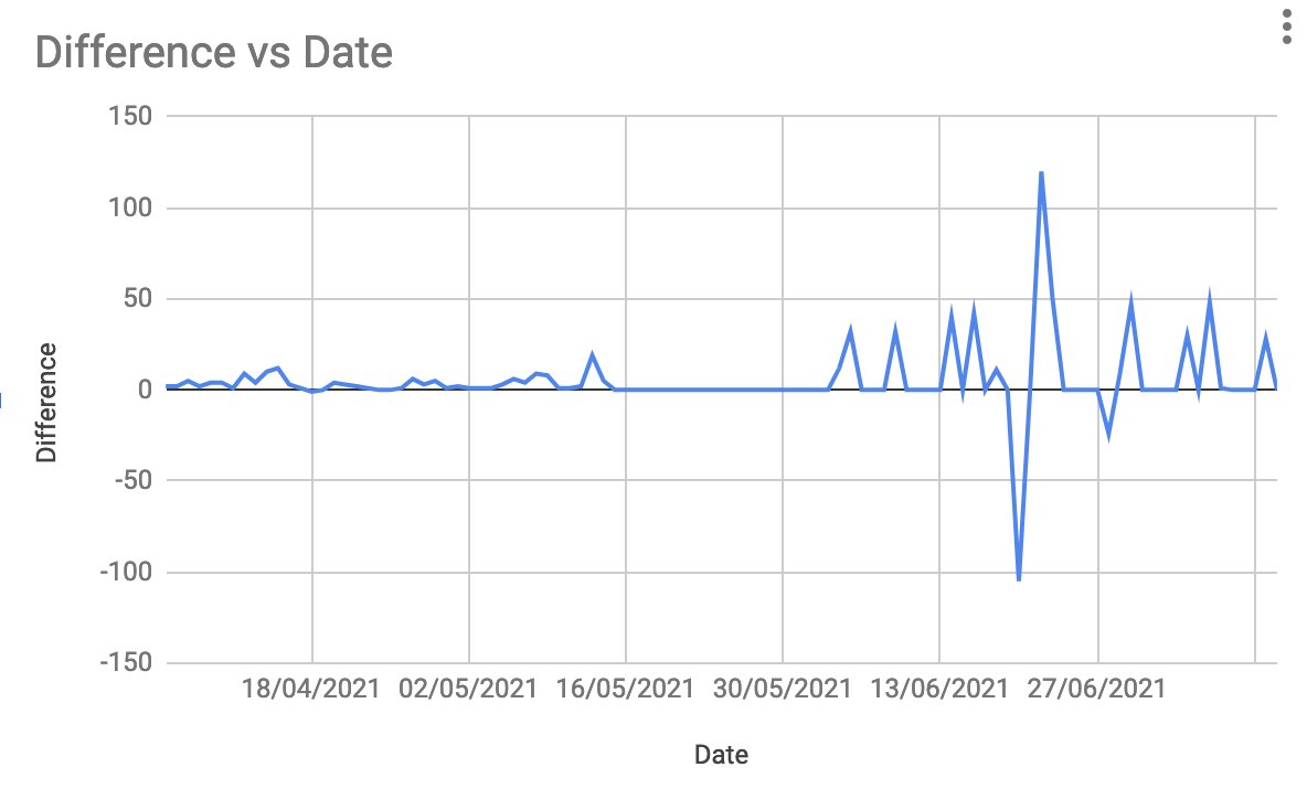
End of February to start of March 2021 gives us the exact kind of thing we were expecting... in even the correct order, total goes up but they announce them the next day 13/n

And again at the end of June 2021 when the -100ish is cancelled the next day by +100ish... though more concerning is that we seem to have mostly everything else as 0 or above 14/n
And then we hit 2nd of September 2021 when 3458 cases were removed from the total... strangely on that day there is no mention of this: rte.ie/news/coronavir… you would imagine two days worth of cases (at the time) having been removed would be good news? 15/n
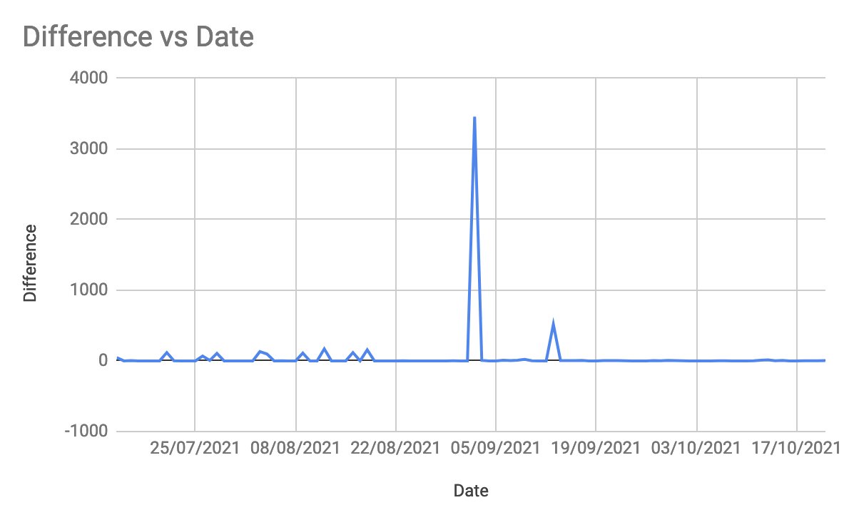
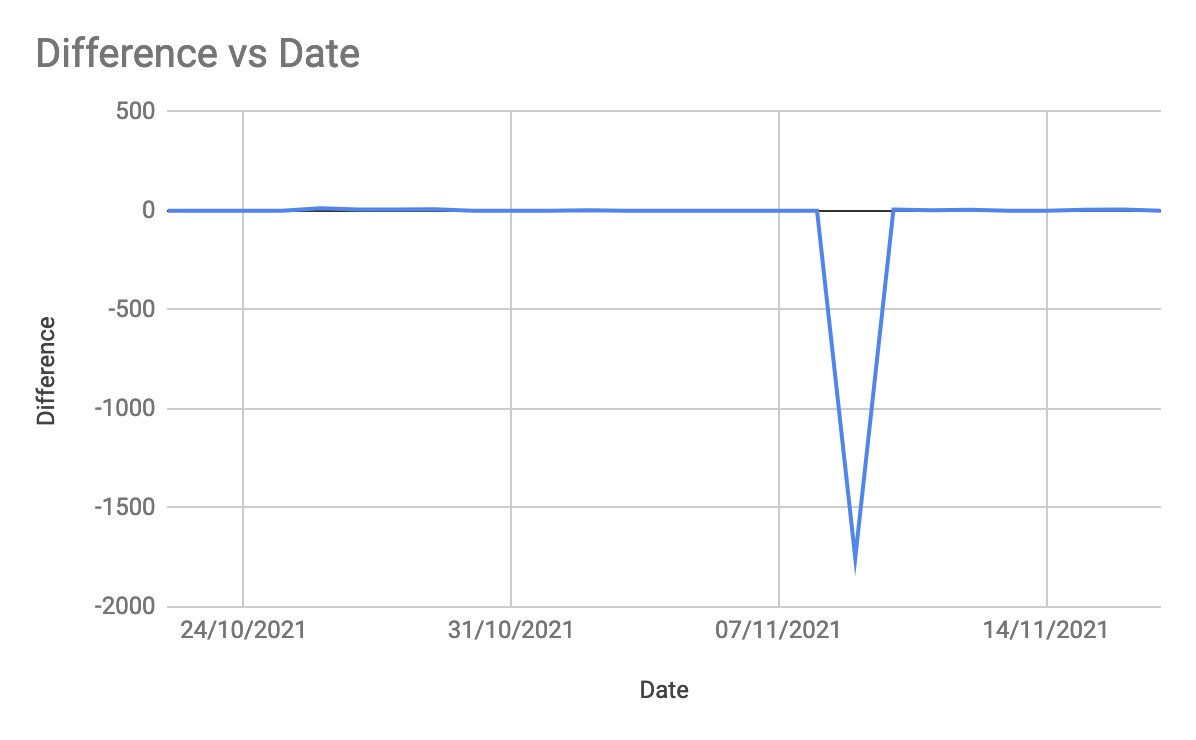
And then... along comes 9th November 2021 when 1753 cases were added to the total but not announced. rte.ie/news/coronavir… on a day we reported 3578 new cases we added an additional 49% of that to the total cases and nobody said anything! 16/n
A suspicious person might think that it might be a good thing to have 1700 odd cases you can announce at a later date... but that is the realm of those who don the headgear made from Alumninium foil... perhaps September was an over-correction 17/n
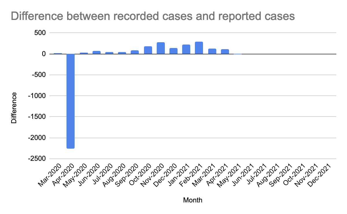
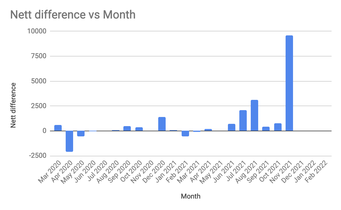
Let's go back and take a look at the monthly sums of the differences as they will remove the under/over's that are on consecutive days and see if my wife's "reporting is always higher" graph holds true even in the officially reported data on geohive 18/n
So if we work that graph out we get this, which has just three negative corrections, all the remaining corrections are positive... this means that the daily reported cases are more than the total cases would indicate 19/n
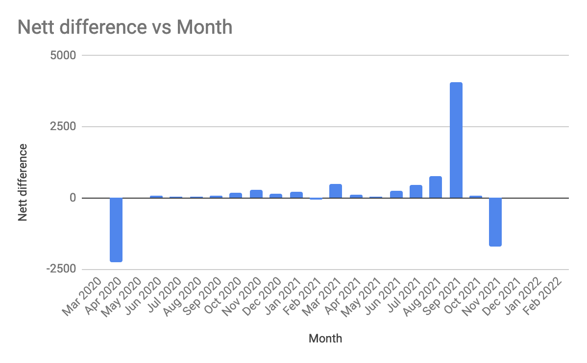
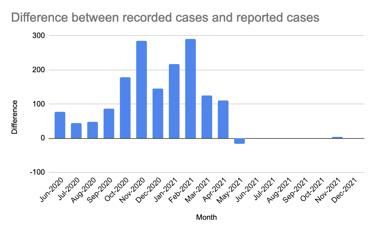
This is easier to see if we zoom the graph to start from May 2020 and end in Oct 2021 and expand the Y axis so that September 2021 (in red) is NOT to scale. The daily figures announced are consistently almost always higher than the running total 20/n

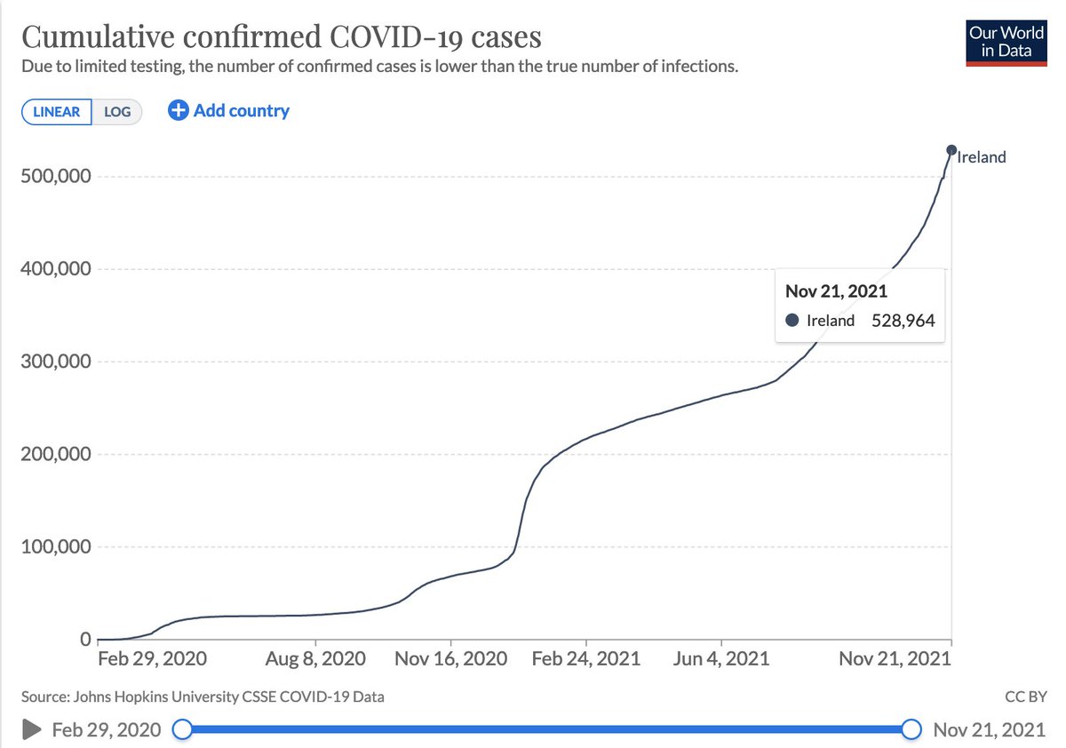
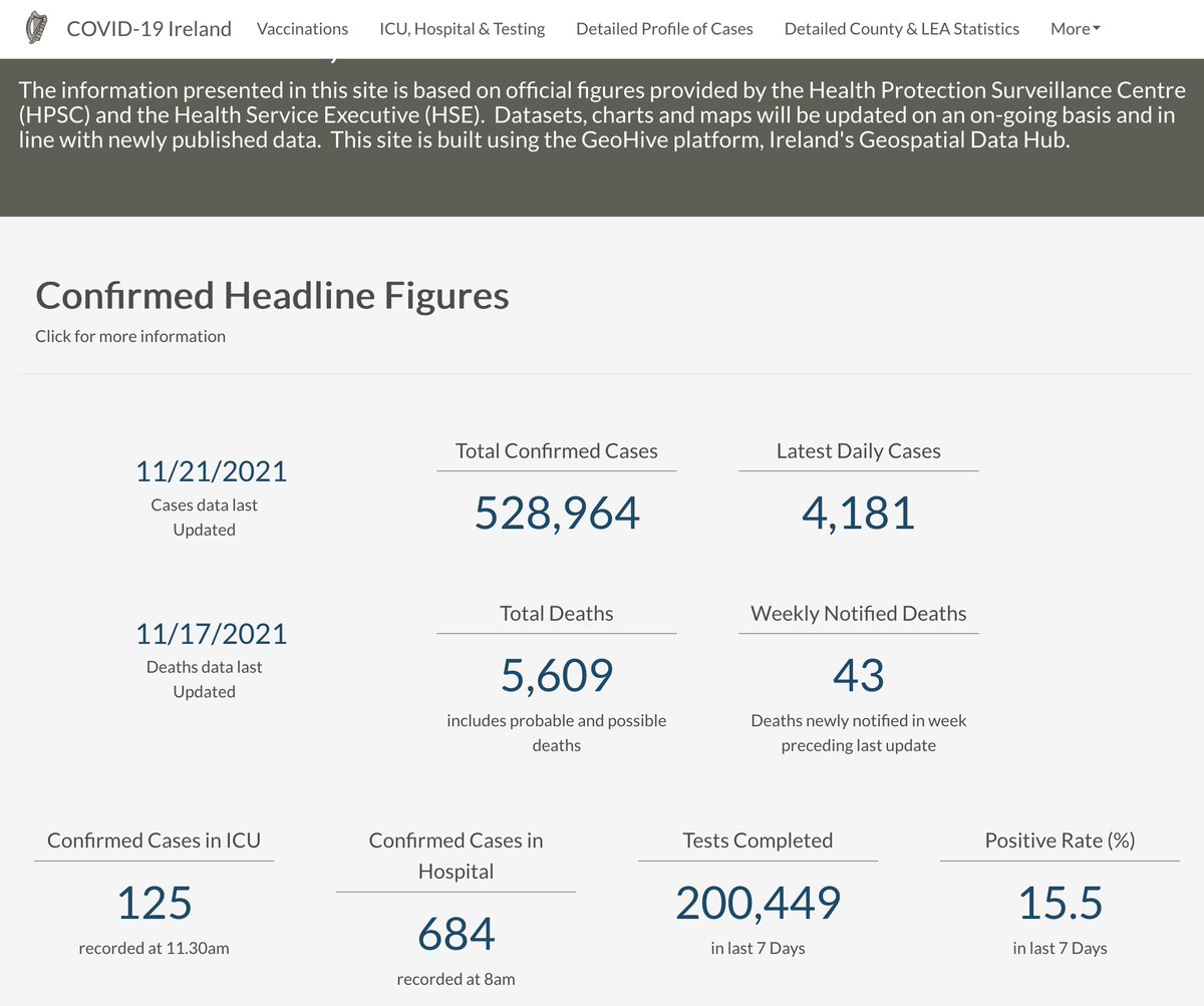
In fact, if you add up all the reported cases since the start we get a total of 532,348 whereas we are currently reporting the total cases as 528,964 (e.g. see OWID) which is an over-report of 3,384 cases, just over 0.6% 21/n
Now there is another column in the geohive dataset... CovidCasesConfirmed this gives a total of 515,686 cases, i.e. 13,278 cases fewer than the headline figure on the government's data dashboard 22/n
If we compare that to the daily reported new cases we see something that is a bit more like what I would expect... numbers on both sides of zero 23/n
If we aggregate the differences by month, we see that the overall trend is towards over-reporting even on that column... though we'd have to allow for that column to be some delayed confirmation process though it is unclear what exactly 24/n
In any case the Gov's dashboard for COVID is reporting 528,964 and not 515,686 so I have to assume the number we should be using is the TotalConfirmedCovidCases column number, so what exactly happend on 9-Nov-2021 and why weren't those 1,753 additional cases announced then? 25/25

@threadreaderapp unroll
I'm wondering if any of @RealEddieHobbs @FatEmperor @SaraHaboubi1 @BBN_Ireland have any theories what exactly is going on!
• • •
Missing some Tweet in this thread? You can try to
force a refresh