Großer Faktencheck Thread! ⬇️🧵⬇️
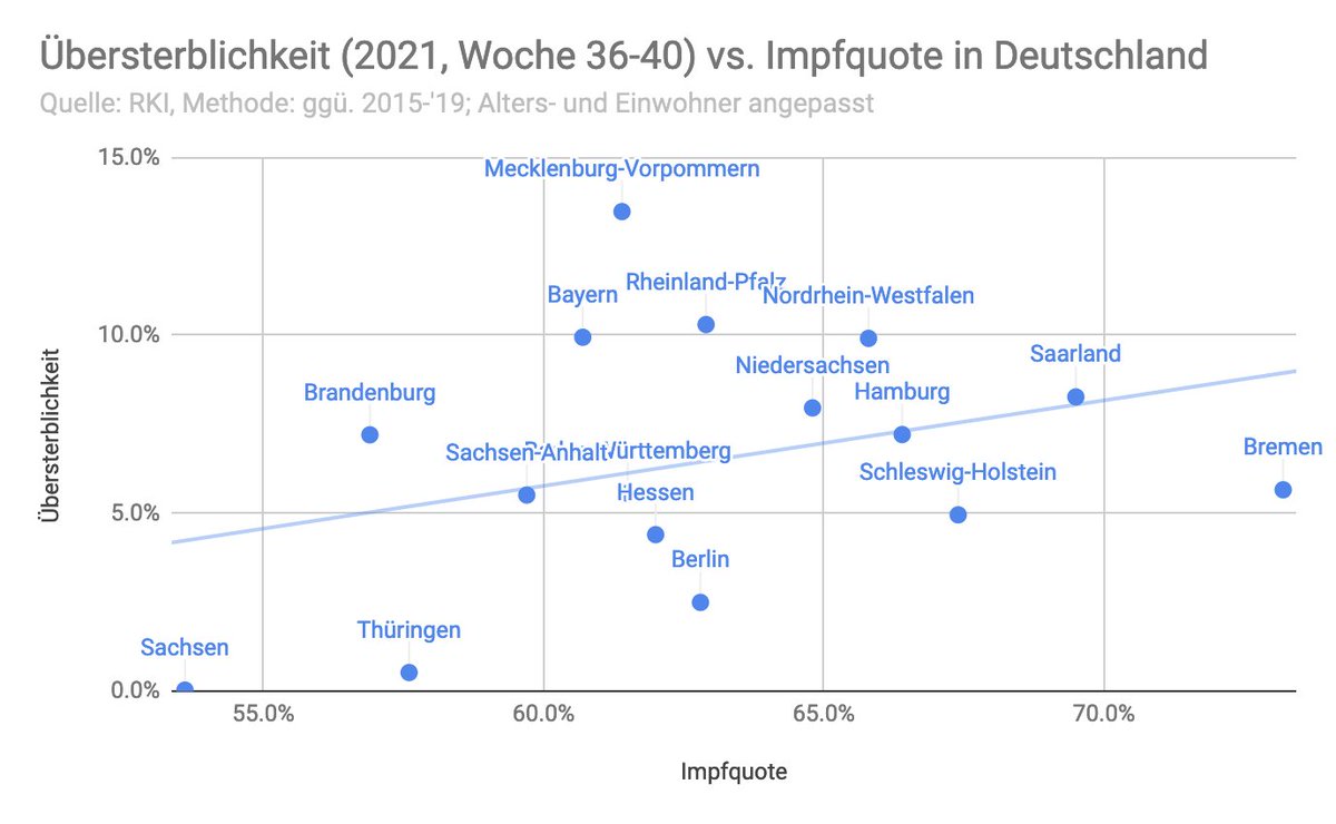
Thema Übersterblichkeit vs Impfquote in Deutschland!
Ich habe mir die Mühe gemacht und die Übersterblichkeit nach Alter und Einwohnerzahl korrigiert.
Ja, was das untere Video sagt stimmt, ABER... 1/n
#Corona #Coronavirus #Covid #Covid19
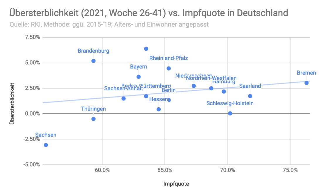
Thema Übersterblichkeit vs Impfquote in Deutschland!
Ich habe mir die Mühe gemacht und die Übersterblichkeit nach Alter und Einwohnerzahl korrigiert.
Ja, was das untere Video sagt stimmt, ABER... 1/n
#Corona #Coronavirus #Covid #Covid19
https://twitter.com/rosenbusch_/status/1461385358671851538

1) Es ist kein statistisch relevantes Ergebnis. Geringe Korrelation; p>0.05

2) Zu kleiner Zeitraum
Wenn wir den Zeitraum auf die letzten 8 Wochen erweitern, ergibt sich ein ähnliche Bild. (auch keine stat. relevanz)
Aber, selbst dieser Zeitraum ist immer noch zu klein...
Wenn wir den Zeitraum auf die letzten 8 Wochen erweitern, ergibt sich ein ähnliche Bild. (auch keine stat. relevanz)
Aber, selbst dieser Zeitraum ist immer noch zu klein...

Hier, das ganze nochmal als Liste.
Sachsen und Thüringen wurden von den Autoren als Beispiele für niedrige Übersterblichkeit bei gleichzeitiger niedriger Impfquote angeführt.
Sachsen und Thüringen wurden von den Autoren als Beispiele für niedrige Übersterblichkeit bei gleichzeitiger niedriger Impfquote angeführt.

Das ist zwar faktisch korrekt, lässt aber aussen vor, dass beide Länder schon enorme Übersterblichkeit hinter sich hatten, und warscheinlich jetzt über viele Genesene und Immune Personen verfügen.

Hier das ganze im Quartalsvergleich:

Und hier als Ranking für die letzten 2 Jahre:

Insgesamt würde ich sagen, dass die Analyse der Authoren korrekt erscheint, aber die Schlussfolgerung ist falsch.
Wir können bisher weder sagen, dass die Impfung zu mehr Übersterblichkeit führt NOCH dass die Impfung Übersterblichkeit verhindert.
Wir können bisher weder sagen, dass die Impfung zu mehr Übersterblichkeit führt NOCH dass die Impfung Übersterblichkeit verhindert.
KORREKTUR!
Im VLOOKUP der Impfquote ist mir leider vor ein Fehler unterlaufen.
Hier die korrigierten Grafiken. Positive Korrelation, besteht weiterhin, allerdings nicht signifikant. Daher bleibt es bei der Kernaussage.
Im VLOOKUP der Impfquote ist mir leider vor ein Fehler unterlaufen.
Hier die korrigierten Grafiken. Positive Korrelation, besteht weiterhin, allerdings nicht signifikant. Daher bleibt es bei der Kernaussage.
und letzte 8 Wochen

H/T an @jens_140081
Auch interessant, ohne die Extrema, Sachsen, Thueringen und die Stadtstaaten, sehen wir 0 Korrelation!

Woche 15-41:
R2=0.15, p>0.05
R2=0.15, p>0.05

Woche 26-41:
R2=0.05, p>0.05
R2=0.05, p>0.05
• • •
Missing some Tweet in this thread? You can try to
force a refresh