I'm continuing to see people talking about the rate at which sequenced Omicron cases are doubling as if it's a matter of interpretation, or something that different people could reasonably disagree on. It isn’t. It’s like 2+2.
Perhaps it would be useful for me to give a short tutorial on how to calculate doubling rates? It's actually very easy, when you know how. Is anyone interested in that?
OK, looks like there is some interest. So here's a short tutorial for people who never knew how to do this, or who are a bit rusty. I suspect there are a lot of people in this category, so I hope it’ll be useful to them. (I'll deal with qualifiers at the end of this thread).
The good news is it’s very simple, although you may need a computer to get a reasonable degree of accuracy. There are just a few easy steps. I’ll explain how to do it Excel, as that’s a tool that many people have access to.
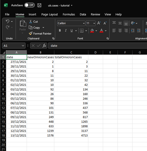
Step 1 is to enter the data. This is the most tedious part, but I’ll try to make it slightly less so by pasting the numbers over the next two tweets.
date,newOmicronCases,totalOmicronCases
2021-11-27,2,2
2021-11-28,1,3
2021-11-29,8,11
2021-11-30,11,22
2021-12-01,10,32
date,newOmicronCases,totalOmicronCases
2021-11-27,2,2
2021-11-28,1,3
2021-11-29,8,11
2021-11-30,11,22
2021-12-01,10,32
2021-12-02,10,42
2021-12-03,92,134
2021-12-04,26,160
2021-12-05,86,246
2021-12-06,90,336
2021-12-07,101,437
2021-12-08,131,568
2021-12-09,249,817
2021-12-10,448,1265
2021-12-11,633,1898
2021-12-12,1239,3137
2021-12-13,1576,4713
2021-12-03,92,134
2021-12-04,26,160
2021-12-05,86,246
2021-12-06,90,336
2021-12-07,101,437
2021-12-08,131,568
2021-12-09,249,817
2021-12-10,448,1265
2021-12-11,633,1898
2021-12-12,1239,3137
2021-12-13,1576,4713
If you paste those into Excel, you should get something that looks like this. 
We need to add a couple of columns, which will be our X and Y variables. Firstly, we have cases by date, but dates aren’t so convenient for doing maths, so let’s add a column with day number.

I’m calling 27th Nov day 1, but it doesn’t actually matter what number you assign it as long as you go up by one each day.
Now for the y-variable. We’re dealing with exponential growth here, but we want to draw a straight line, so here’s where we take advantage of the magic of logarithms. Create a column called “log.cases”. In the first cell under this, add this formula “=log(B2, 2)”.
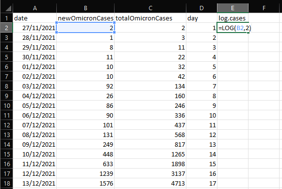
That formula will compute the logarithm of the value in cell B2 to the base 2. And because 2 is 2^1, that gives a value of 1. You can then copy that cell and paste it onto the rest of the cells in that coulmn, which should give you this.
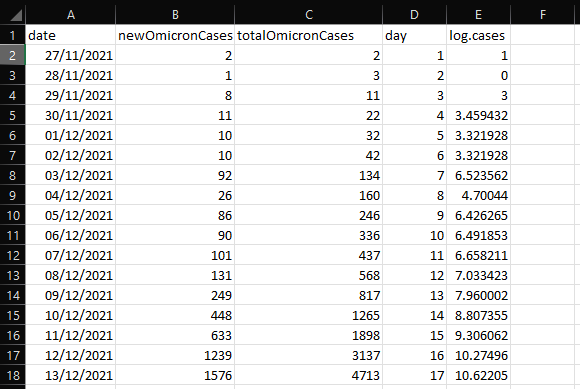
You might be wondering, why base 2? Well, it doesn’t actually matter – you could use base 10 or base e (natural logarithms). But 2 is convenient because we’re interested in doubling times, and it’ll simplify things later.
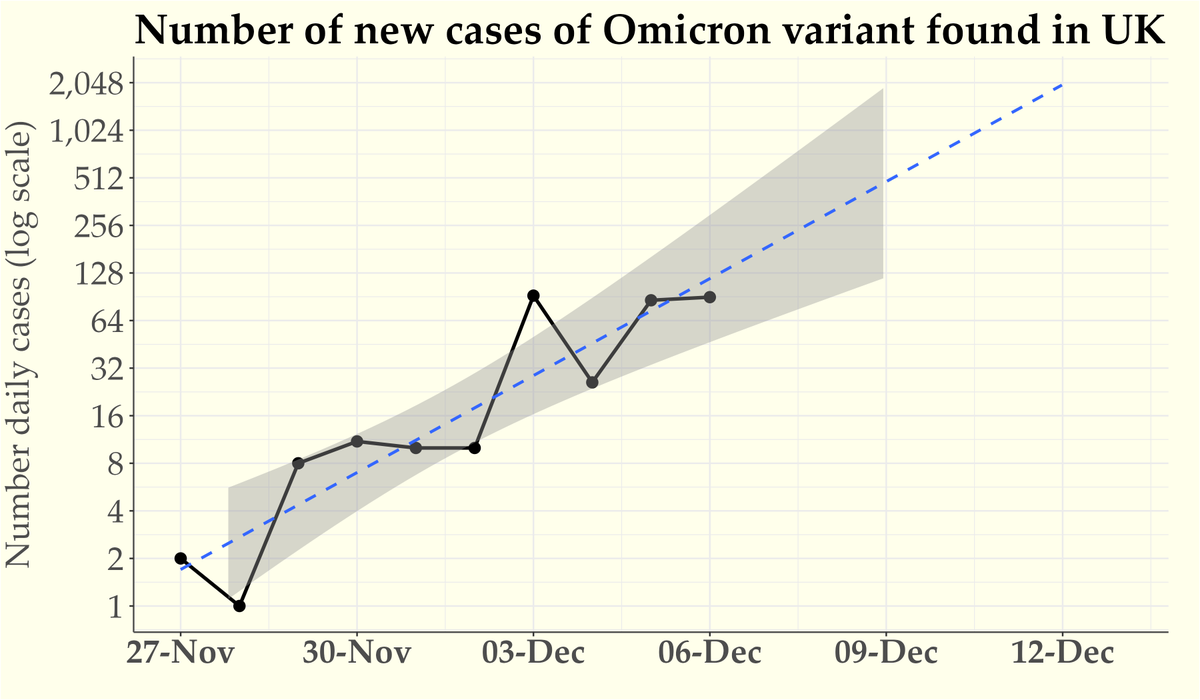
We have all the columns we need now. It’d be good practice to make a scatter plot the data (log cases by day number). I’m not going to explain how to do that in Excel (ugh), but if you like by all means give it a try. It'll look something like this.

You can see that those dots are going up roughly linearly over time. What we want to do now is to draw a line of best fit, so that we can measure the slope of that line.
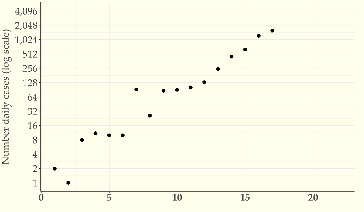
One thing to note is that we want the line that is the best fit to the data as a whole. It’s not about starting or ending at a particular point (in principle, a line of best fit needn’t touch any of the points).
You could probably do a reasonably good job of drawing this line by hand. But a better way is to use what’s called the method of least squares. en.wikipedia.org/wiki/Least_squ…
That's the method standardly used in linear regression, where we try to predict values of y (log cases) based on values of x (day number). Don’t worry if that sounds complicated to do – it’s actually super easy in Excel.
Find an empty cell, and add this formula: “=SLOPE(E2:E18,D2:D18)”. I’ve used E and D because those are the columns that have log.cases and day number, so adjust accordingly if yours are in different columns.

As of today, I get a value of 0.601. That’s the slope of the line of best fit. Incidentally, if you want to plot the line you’ll also need the intercept of the line, which you get with “=INTERCEPT(E2:E18,D2:D18)”. But we don’t need that to get the doubling rate.
Almost there! We now know that for every day (every increase of 1 on the x-axis) the line goes up by 0.6 units. But remember, our y-axis is in units of log base 2 (doublings). So that means the line goes up by 0.6 doublings every day.

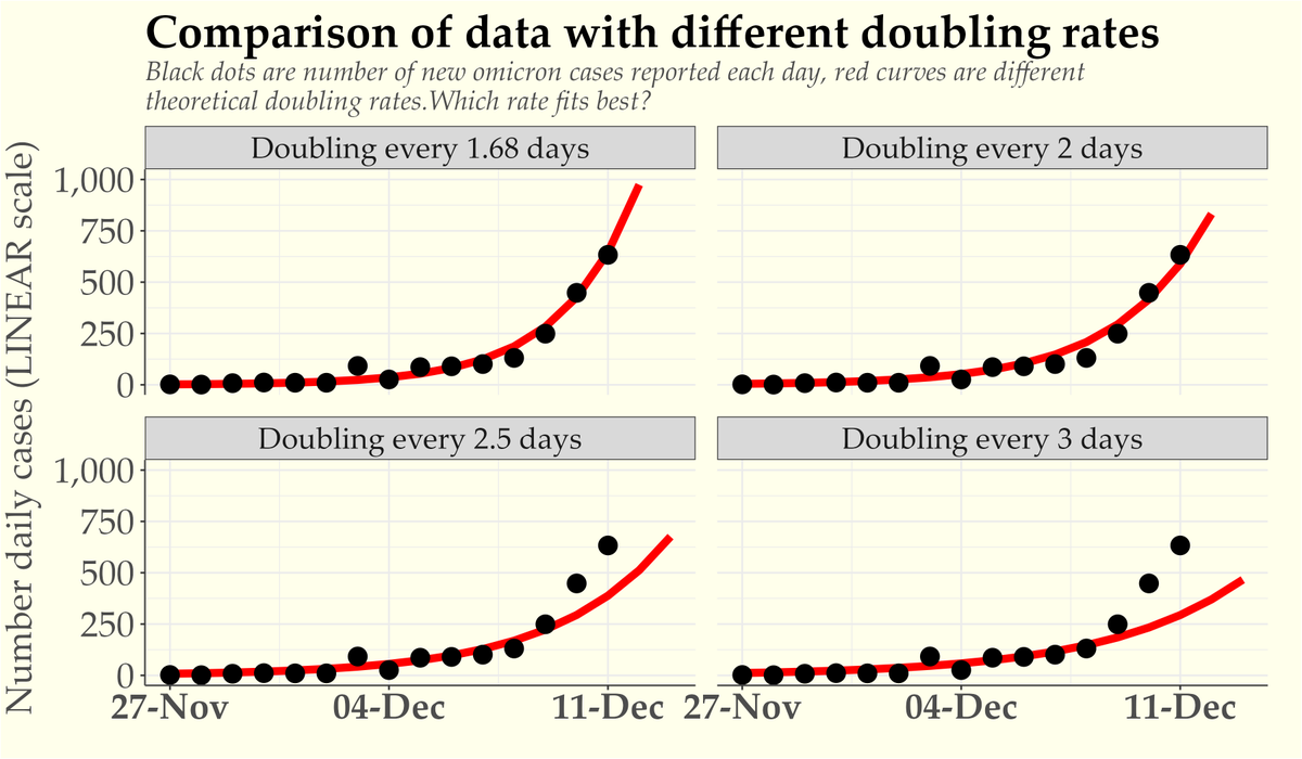
That means the number of days for each doubling is therefore 1/slope = 1/0.6 = 1.66. Rounding that to one decimal place, the sequence is doubling every 1.7 days.
Hey presto, we're done. (Qualifiers about what this all means will come next, after a cup of tea).
Hey presto, we're done. (Qualifiers about what this all means will come next, after a cup of tea).
OK, as promised, a few qualifiers and other notes. What we’ve calculated here is a doubling rate. That’s different from the R rate (which measures how many people an infected person goes on to infect).
You need additional information (or assumptions) to compute the R rate. I’ll leave that to the epidemiologists.
But I'll emphasise that the doubling rate is an important thing to know. It tells us how fast the sequence (in this case, the epidemic) is growing. In principle, you can use that information to project into the future, like this.

Is it appropriate to extrapolate like this? One shouldn’t go too far into the future, obviously. But it’s important to know where we’re heading if the rate doesn’t change.
And when the rate does slow, it’s good to be able to measure that, so that we can try to infer what works (and whether we need to do more).
I know from previous graphs I’ve plotted over long intervals that exponential growth can keep going at a steady rate for a long time. And though it’s not such a long time, the omicron doubling rate reached it's current rate four doublings ago.
If we have four more doublings that will take us to around 30,000 omicron cases per day, and another 4 after that is about half a million cases per day.

Some people seem to be under the impression that there’s some underlying law that means that doubling must cease prior to reaching such large numbers. That's wishful thinking which underestimates the number of susceptible individuals in the population.
Nevertheless, it probably is true that we won’t get to 500k or a million *cases* per day, because we don’t have the necessary testing capacity. Our capacity to sequence omicron cases is presumably even smaller (I don’t know what that capacity is – maybe we’re getting close now?)
It’s important to remember that positive cases are a proxy for infections. So headlines like this one about 200,000 Omicron infections per day are unfortunately quite feasible and consistent with the smaller numbers in our graph if we assume that ...
https://twitter.com/Kathy_Rastle/status/1470444769088315395?s=20
a) we only sequence a fraction of infections, &
b) sequencing takes some time, so today’s value reflects infections some days ago.
That latter point suggests we’ve had a couple (2/3/4?) doublings since the latest numbers we’re plotting (I don’t know how long sequencing takes).
b) sequencing takes some time, so today’s value reflects infections some days ago.
That latter point suggests we’ve had a couple (2/3/4?) doublings since the latest numbers we’re plotting (I don’t know how long sequencing takes).
One thing you might reasonably ask is whether the calculations aren’t undermined if these data reflect cases a week ago and are only a fraction of the true number of infections? I think the answer is no. This is just one of the properties of real-world data.
Remember, what we care about in the above calculations is the *rate* of growth, rather than the absolute numbers. If all the numbers were tripled, or the date of report was systematically N days later than the specimen date, the answer wouldn’t change at all.
If the date of report is less systematically related to the specimen date (e.g., mostly 7 days later, but sometimes 5 or 6 days, sometimes 8 or 9 days later), the error bars become a little wider, but the slope won’t change much (it won’t turn into 3 day doubling).
Anyway, the important point is that the data we’re working with are an imperfect, noisy proxy for the thing that we’re mostly interested in, which is infections (to oversimplify slightly, the spread of the virus isn’t affected by whether infected samples have been sequenced).
So when I say that the sequenced cases are doubling every 1.7 days, and that’s just a fact, I am leaving the door open on the possibility that omicron *infections* are doubling at a different rate.
*But* we should start from the doubling rate we know.
*But* we should start from the doubling rate we know.
One thing the UK has done incredibly well throughout the pandemic is to gather the data rapidly and make it available for everyone to see. It’s an incredibly impressive feat involving a huge amount of data (thank you @UKHSA!)
We should make good use of that data when we’re making statements about what’s happening, particularly when assessing a state of emergency. When experts make statements like “cases are doubling every 3 days” and that gets repeated uncritically it impacts the public conversation.
I can understand people being reluctant to accept that cases could be doubling even faster than 3 days. But we need to be guided by the data. That's what I was getting at with this tweet a couple of days ago (and here's an updated version of the plot).
https://twitter.com/ProfColinDavis/status/1469690929678270464?s=20

This thread is long enough, so I won't go into possible issues with this data set, or pros and cons of using a different proxy (the SGTF data set). But I’ve yet to see any convincing reason to question the doubling rate from this data set. The SGTF data give converging evidence.
I’ll also forgo elaborating on my concerns about a) how the rate is (if anything) faster when one looks at just the last week, and b) when rates do slow, it might (initially) be a data issue rather than a true reflection of a slowing spread.
You now have the know-how to compute the doubling rate, based on the available data. UKHSA updates the daily numbers every day. If someone wants to claim that rates are “doubling every 2-3 days” you could ask them for the data and check it yourself!
• • •
Missing some Tweet in this thread? You can try to
force a refresh