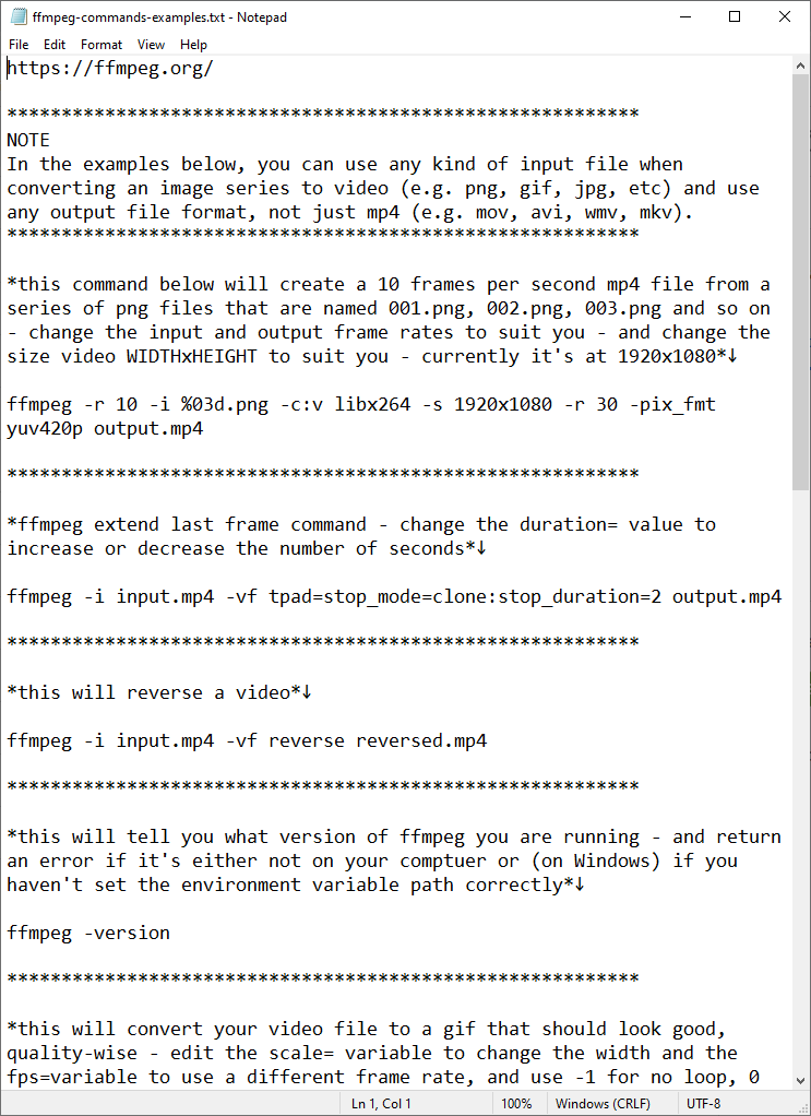
A long blog post in which I:

- explain how to turn a sequence of images (maps, but could be anything) into a video, as in the example here

- give away all sorts of trade secrets

- share some image sets to play with

- provide lots of example commands

statsmapsnpix.com/2021/12/map-an…
I cover installation of #ffmpeg on Mac (easy), Linux (easy) and Windows (easy, but can seem horrendously complex for new users) and ...
I also try to break things down into chunks so that they make sense to the new user - and then you can have all sorts of fun with animating the map files I provided
I've shared image sets for

- LHR to JFK flight
- LHR to Rome flight
- A9 road animation (shown here)
- Highland contours
- UK population density scanner thingy
- US contours

I made all these in QGIS Atlas, but you can make individual frames many ways
I've shared the individual frames from this UK population density video as well, so if you are keen to try it you can play around with it and have fun and live a happy life
I also show you how to convert a video file (such as an mp4) to a gif - that doesn't look like it's been roughed up by a gang of pixelmonsters
but if you just want to know how to convert a .mov file to a .mp4 file, that's covered too
if you want to make your own map frames - like the ones I've shown here - then you can do that in QGIS, by following my tutorial booklet

automaticknowledge.org/training/workb…

(works on Mac, Linux and Windows)
oh, and I've also added instructions on how to add a sound file to your video (like in the one here and in the first video)
anyone who uses Google Earth Studio may also find it useful, or any other software or tool that spits out a series of images - e.g. I used it to patch together this 'places I have lived' image series from Google Earth Studio
you won't always be able to see things super-clearly on videos on twitter (I find it's normally better on mobile than on desktop) so the little 'convert to gif' snippet in the blog is useful for when you need that
this is all part of my sneaky plan to lure you in, if you're thinking of dabbling with this kind of thing but not sure where to begin - some low stakes fun is sometimes a good entry point

statsmapsnpix.com/2021/12/map-an…
(and if anyone who is good at maths or math can calculate the speed of the plane in the first tweet that'd be great)
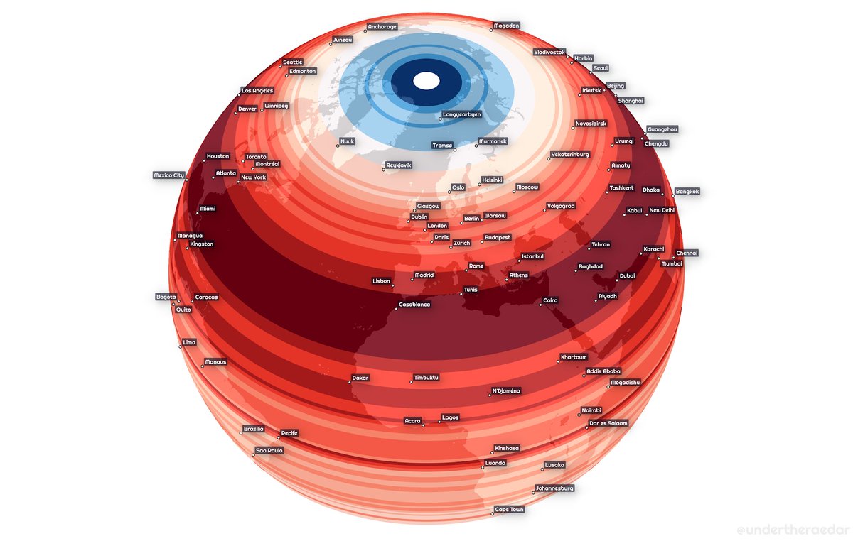
all this stuff can be useful for visual storytelling in all kinds of ways - here we can see a familiar form emerging from the darkness (I've shared these frames too)
will end this thread by adding in the #ffmpeg hashtag so that I can find it again more easily, and by saying that I'll leave this little text file of commands online in the web folder (linked to in the blog) for anyone to use

• • •

Missing some Tweet in this thread? You can try to force a refresh
 

Keep Current with Alasdair Rae

Alasdair Rae Profile picture

Stay in touch and get notified when new unrolls are available from this author!

Read all threads

This Thread may be Removed Anytime!

PDF

Twitter may remove this content at anytime! Save it as PDF for later use!

Try unrolling a thread yourself!

how to unroll video
  1. Follow @ThreadReaderApp to mention us!

  2. From a Twitter thread mention us with a keyword "unroll"
@threadreaderapp unroll

Practice here first or read more on our help page!

More from @undertheraedar

26 Dec
A little bit of map fun today with elevation data - a kind of topographic map, with lower elevations filling up first - spot the Danube, the Alps and all sorts of other things (elevation data from @CopernicusEU)
a few stills from the topogiffic map above - I'm not an expert but that looks like the Great Hungarian Plain ImageImageImage
the data doesn't cover every European country but where it does you can see some interesting things, including parts of the Romanian border Image
Read 5 tweets
28 Nov
Weird alien eyeball? Or world population by latitude? Just another map experiment but since it fits with today's #30DayMapChallenge theme I'll share it here

statsmapsnpix.com/2021/11/world-…
I included a population vs land by latitude gif too, because it seems people don't like to live in the sea
does it matter if you use WorldPop instead of GHSL? Not that much, but WorldPop has a 2020 version so I used that
Read 11 tweets
27 Nov
If you have snow photos you must post snow photos ImageImageImageImage
it won't last long and neither will my fingers if they remain ungloved ImageImageImage
things are getting out of hand ImageImageImage
Read 4 tweets
14 Nov
Just catching up on the latest in functional economic geography news

"A boundary commission should propose adjustments that reflect economic reality." 🥳
already imagining some new shapes
although my preference would be to add a fuzzy 'maybe zone' to the edge of these kinds of maps to reflect the reality of commuter reality
Read 6 tweets
7 Nov
Filed under:

'random Canadian-Scottish geography questions you can answer quickly while having your breakfast at the weekend'

- I may also have calculated the Scottish-Latitude population of Canada while I was at it, surprisingly low Image
plus, not everyone knows that the northern bits of Shetland are further north than the southern tip of Greenland - and even when you hear this you are duty-bound to check it yourself on Google maps because it sounds made up ImageImage
the answer to my vital question, thanks to some 10km gridded data, is that a little over 570,000 people would appear to live at Scottish latitudes in Canada, and I think we can all sleep easy now

open.canada.ca/data/en/datase…
Read 13 tweets
21 Apr
A short city population/datanerdfest coming up in this thread, beginning with a little panoramic tour of the Tokyo metro area - city as far as the eye can see

(I made this using Google Earth Studio btw, a very useful tool)
background: I have been using/playing with/analysing global city population data quite a bit over the years, most recently in an academic paper on the topic with @CJHoole and @stehincks

open access version: eprints.whiterose.ac.uk/149455/3/Conto… Image
we looked at population density for the whole world, using 1km resolution data from the EU's GHSL project - e.g. here's a little snapshot of how it looks across part of West Africa, from our paper Image
Read 14 tweets

Did Thread Reader help you today?

Support us! We are indie developers!


This site is made by just two indie developers on a laptop doing marketing, support and development! Read more about the story.

Become a Premium Member ($3/month or $30/year) and get exclusive features!

Become Premium

Too expensive? Make a small donation by buying us coffee ($5) or help with server cost ($10)

Donate via Paypal

Or Donate anonymously using crypto!

Ethereum

0xfe58350B80634f60Fa6Dc149a72b4DFbc17D341E copy

Bitcoin

3ATGMxNzCUFzxpMCHL5sWSt4DVtS8UqXpi copy

Thank you for your support!

Follow Us on Twitter!

:(