Your Dec 28, 2021 #COVID19 update
Based on today's CDC updated timeseries #, #Florida now up to 6th highest in total # of new cases over the past 7 days (766 per 100k).
NYC, DC, NJ, NY state, & RI round out a top 5 you don't want to be in.
There's a big BUT...
1/
Based on today's CDC updated timeseries #, #Florida now up to 6th highest in total # of new cases over the past 7 days (766 per 100k).
NYC, DC, NJ, NY state, & RI round out a top 5 you don't want to be in.
There's a big BUT...
1/

First, the timeseries did not include the 12/27 data for any state. FL had another 29,059 new cases, increasing its 7-day average daily cases to over 25,600 (highest ever).
Second, all except 11 states have 0 cases logged for 12/26 (incomplete). So, not apples to apples.
2/
Second, all except 11 states have 0 cases logged for 12/26 (incomplete). So, not apples to apples.
2/

I wanted to focus on #hospitalizations.
ADULTS: New confirmed daily admissions have more than doubled in the last week alone (287/day to 581/day)
KIDS: New confirmed daily admissions have nearly tripled in the last week alone (10/day to 29/day)
3/
ADULTS: New confirmed daily admissions have more than doubled in the last week alone (287/day to 581/day)
KIDS: New confirmed daily admissions have nearly tripled in the last week alone (10/day to 29/day)
3/

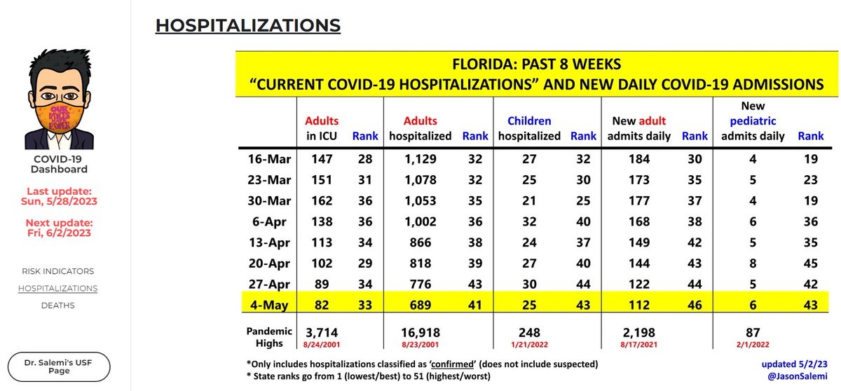
Instead of new admissions, I'd prefer to focus on people 'currently hospitalized' with confirmed COVID-19.
ADULTS: Exactly 1 week ago, there were 1492. There are now 2702.
Adults in the ICU up an additional 85 patients in last week.
Still WAY below #delta surges.
4/
ADULTS: Exactly 1 week ago, there were 1492. There are now 2702.
Adults in the ICU up an additional 85 patients in last week.
Still WAY below #delta surges.
4/

KIDS: Exactly 1 week ago, there were 49 hospitalized. There are now 74.
The HHS data does not report pediatric ICU beds separately.
Numbers not good, but also well below previous surges.
5/
The HHS data does not report pediatric ICU beds separately.
Numbers not good, but also well below previous surges.
5/

These pediatric hospitalizations are increasing in an even more pronounced fashion for the country as a whole.
The @HHSGov data many of us rely on does not characterize severity, the primary reason for the hospitalization, etc.
6/
The @HHSGov data many of us rely on does not characterize severity, the primary reason for the hospitalization, etc.
6/

To place these increases in some context, the @nytimes just published a story titled "Omicron Is Not More Severe for Children, Despite Rising Hospitalizations"
nytimes.com/2021/12/28/hea…
This does not mean it's still not a concerning issue.
7/
nytimes.com/2021/12/28/hea…
This does not mean it's still not a concerning issue.
7/
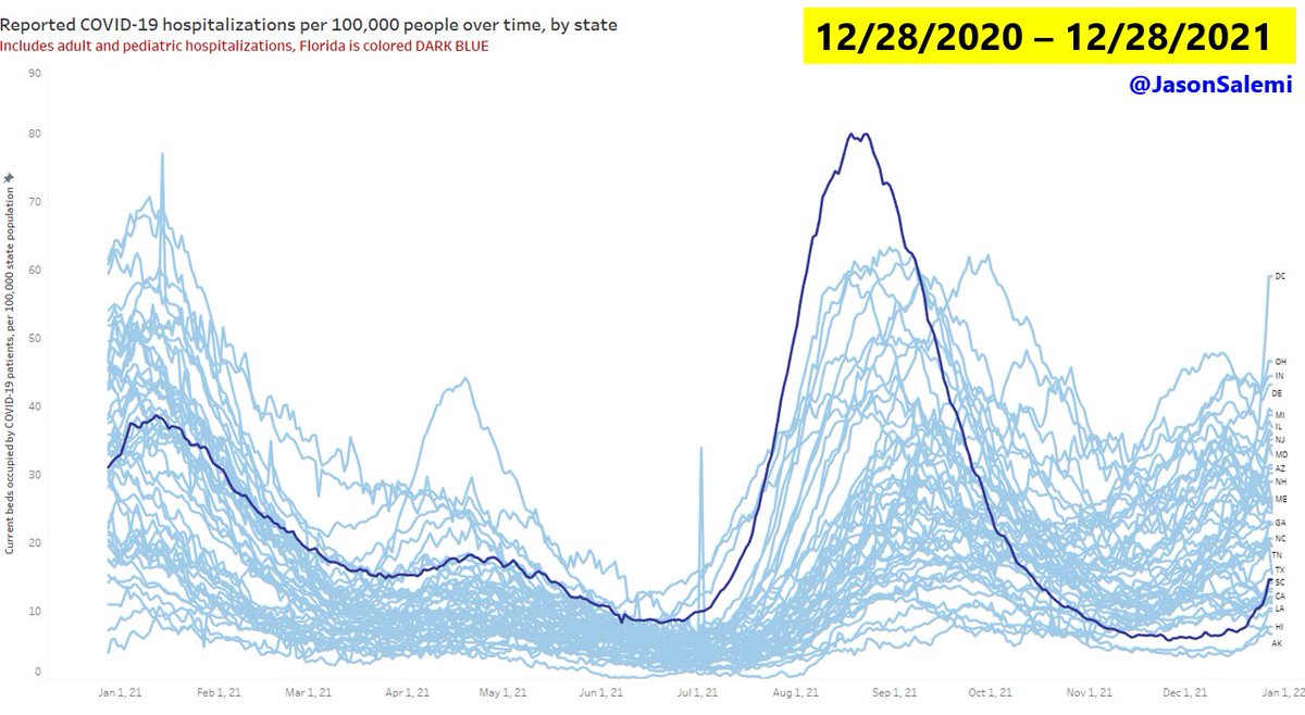
And when you combine all reported COVID-19 hospitalizations (adult and pediatric) and adjust for population size, here's where Florida falls (dark blue line for FL, look to the far right of the figure).
8/
8/
Finally, these data are dirty. This morning, I retweeted a good thread that tackles some of the issues with interpreting the hospitalization data.
See below:
9/
See below:
https://twitter.com/JasonSalemi/status/1475827806701600769?s=20
9/
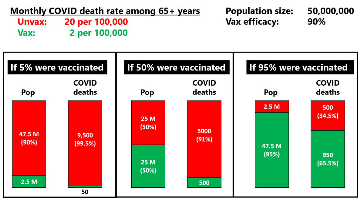
A SHIFT TO MITIGATION
Although it's not the only tool in our #omicron #toolbox, we do have systematically collected data for vaccinations.
Here's where we stand in getting our seniors optimally immunized. In Florida, only about 55% of seniors fall in this ideal category.
10/
Although it's not the only tool in our #omicron #toolbox, we do have systematically collected data for vaccinations.
Here's where we stand in getting our seniors optimally immunized. In Florida, only about 55% of seniors fall in this ideal category.
10/

Much more concerning is where we stand on adults younger than 65.
As I've pointed out in previous threads, the snafus with vaccine reporting (eg generation of duplicate records for the same person) will slightly underestimate the % optimally immunized & % not vax.
11/
As I've pointed out in previous threads, the snafus with vaccine reporting (eg generation of duplicate records for the same person) will slightly underestimate the % optimally immunized & % not vax.
11/

The @COVKIDProject has excellent immunization dashboards for the pediatric population, so I won't duplicate that info.
covkidproject.org/vaccinations
12/
covkidproject.org/vaccinations
12/
Finally, here's our immunization progress in the entire US, among all age groups.
We were increasing for a while, but pretty stagnant for past few days. Only 35% optimally immunized. The % fully vaccinated (CDC terminology is a bit misleading).
13/
We were increasing for a while, but pretty stagnant for past few days. Only 35% optimally immunized. The % fully vaccinated (CDC terminology is a bit misleading).
13/

That's all for now - of course we'll get much more in depth with Friday's @HealthyFla weekly report, which offers more granularity by county and other demographic characteristics.
Stay safe everyone!
14/
Stay safe everyone!
14/
• • •
Missing some Tweet in this thread? You can try to
force a refresh