Really, don't blink with this damn variant.
A few striking things I noticed, including a comparison of the #delta & #omicron surges in #Florida.
Nearly 47,000 cases reported today, 7-day avg just under 30,000.
Blows our delta peak out of the water by almost 8000/day.
🧵
1/13
A few striking things I noticed, including a comparison of the #delta & #omicron surges in #Florida.
Nearly 47,000 cases reported today, 7-day avg just under 30,000.
Blows our delta peak out of the water by almost 8000/day.
🧵
1/13

We continue to lead the country in the % increase in average daily cases compared to two weeks prior.
#Florida has had a 991% increase
But the absolute increase is astonishing - we are now averaging nearly 27,000 more cases EACH DAY compared to 2 weeks ago.
2/13
#Florida has had a 991% increase
But the absolute increase is astonishing - we are now averaging nearly 27,000 more cases EACH DAY compared to 2 weeks ago.
2/13

Whereas only a few weeks ago, we had the LOWEST 7-day cases per capita in the country (largely due to the catastrophe that was the #delta surge)...
We're now 4th highest in the country over the last 7 days, behind only NYC, DC, and NJ.
3/13
We're now 4th highest in the country over the last 7 days, behind only NYC, DC, and NJ.
3/13

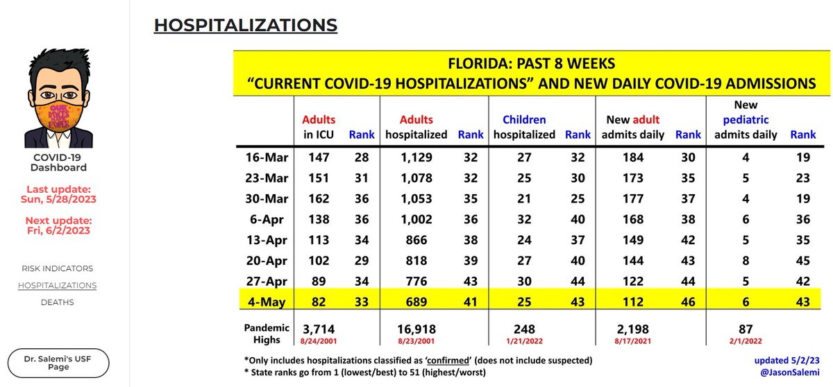
If you have enough cases, you'll end up with more hospitalizations.
2 weeks ago
- ADULTS HOSPITALIZED: 1189
- KIDS HOSPITALIZED: 24
Now
- ADULTS HOSPITALIZED: 3364 (183% increase)
- KIDS HOSPITALIZED: 90 (275% increase)
Fig below shows the increase during December alone.
4/13
2 weeks ago
- ADULTS HOSPITALIZED: 1189
- KIDS HOSPITALIZED: 24
Now
- ADULTS HOSPITALIZED: 3364 (183% increase)
- KIDS HOSPITALIZED: 90 (275% increase)
Fig below shows the increase during December alone.
4/13

I ALWAYS want to give appropriate context.
The blue box is what I showed you on the previous tweet.
Our current # for adults (3364) is 5 times less than the #delta peak (~17,000).
Our current # for kids (90) is 2.5 times less than the #delta peak (229).
5/13
The blue box is what I showed you on the previous tweet.
Our current # for adults (3364) is 5 times less than the #delta peak (~17,000).
Our current # for kids (90) is 2.5 times less than the #delta peak (229).
5/13

But here's the thing.
I mapped the change in daily cases and adults hosp with confirmed C19 during the beginning of the #delta and #omicron waves.
Cases are much higher during omicron's first 2 weeks, but look at those hospitalizations.
We've continued to say...
6/13
I mapped the change in daily cases and adults hosp with confirmed C19 during the beginning of the #delta and #omicron waves.
Cases are much higher during omicron's first 2 weeks, but look at those hospitalizations.
We've continued to say...
6/13

Even if the severity of #omicron - whether intrinsic severity or severity after you factor in that we are less immunologically naive...
If you end up with a huge surge in cases, the sheer # of hosps may be very similar to #delta, or God forbid higher.
7/13
If you end up with a huge surge in cases, the sheer # of hosps may be very similar to #delta, or God forbid higher.
7/13

2 more things about this fig.
1) Look at how that red dashed line is trending
2) b/c I pair cases with hosps 5 days later, this DOES NOT INCLUDE hosps for the most recent 5 days of cases (& these are the 5 highest we've had during #omicron)
29480 25655 23790 22669 21108
8/13
1) Look at how that red dashed line is trending
2) b/c I pair cases with hosps 5 days later, this DOES NOT INCLUDE hosps for the most recent 5 days of cases (& these are the 5 highest we've had during #omicron)
29480 25655 23790 22669 21108
8/13

Here's the same figure, but for #kids hospitalized with confirmed #COVID19.
Already way more at this stage than during the #delta surge.
Again, even though the hosp-to-case ratio is lower during #omicron,
Tons of cases = a lot of hospitalizations.
@COVKIDProject
9/13
Already way more at this stage than during the #delta surge.
Again, even though the hosp-to-case ratio is lower during #omicron,
Tons of cases = a lot of hospitalizations.
@COVKIDProject
9/13

Again, I can't control the caveats to these data.
1) can't know severity of a given hosp
2) don't know primary reason for hosp
3) don't know how much COVID impacts the hosp
It's still gonna be a considerable problem for our absolutely taxed healthcare professionals.
10/13
1) can't know severity of a given hosp
2) don't know primary reason for hosp
3) don't know how much COVID impacts the hosp
It's still gonna be a considerable problem for our absolutely taxed healthcare professionals.
10/13
Still so much in our #mitigation #toolbox
Perhaps contrary to what you may have heard recently, as I stated when interviewed for this local TV story...
A well-fitting & HIGH-QUALITY mask (eg N95, KN95) is a really good idea. Fits perfectly fine.
wesh.com/article/expert…
11/13
Perhaps contrary to what you may have heard recently, as I stated when interviewed for this local TV story...
A well-fitting & HIGH-QUALITY mask (eg N95, KN95) is a really good idea. Fits perfectly fine.
wesh.com/article/expert…
11/13
Tweets 6-9 may be of high interest to our gurus in other states to share
@bethlinas @nataliexdean @angie_rasmussen @berthahidalgo @EpiEllie @BillHanage @bhrenton @ashtroid22 @Cleavon_MD @choo_ek @Theresa_Chapple @WhitneyEpi @MelissainJax @ProfMattFox @charlesornstein
12/13
@bethlinas @nataliexdean @angie_rasmussen @berthahidalgo @EpiEllie @BillHanage @bhrenton @ashtroid22 @Cleavon_MD @choo_ek @Theresa_Chapple @WhitneyEpi @MelissainJax @ProfMattFox @charlesornstein
12/13
Tweets 6-9 may be of high interest to our gurus in other states to share
@paimadhu @AshleyRParker @firefoxx66 @K_G_Andersen @kakape @Craig_A_Spencer @lucystats @PWGTennant @_stah @gregggonsalves @HelenBranswell @florian_krammer @BillyCorben @aetiology @EricTopol
13/13
@paimadhu @AshleyRParker @firefoxx66 @K_G_Andersen @kakape @Craig_A_Spencer @lucystats @PWGTennant @_stah @gregggonsalves @HelenBranswell @florian_krammer @BillyCorben @aetiology @EricTopol
13/13
Context tweet: at least some data from a large healthcare system in Florida regarding what is being termed "incidental" COVID-19 hospitalizations.
It's not trivial, which would represent some good news.
14/13
It's not trivial, which would represent some good news.
https://twitter.com/JasonSalemi/status/1476580219578429444?s=20
14/13
• • •
Missing some Tweet in this thread? You can try to
force a refresh