Revisiting SMOEC, and updating some of the old excel charts for you guys
I've since begun tracking SMOEC (SIlver - MOney - EConomy) in trading view because its automated and easier, but there's some fun things in the excel charts also
1st, here's the Money Supply to GDP ratio:
I've since begun tracking SMOEC (SIlver - MOney - EConomy) in trading view because its automated and easier, but there's some fun things in the excel charts also
1st, here's the Money Supply to GDP ratio:
https://twitter.com/ThHappyHawaiian/status/1407746939576332292

As you can see it's been pretty flat, and has technically been flat since April 2020
Why use nominal GDP? I made SMOEC as a way to measure silver valuation levels without touching CPI at all, given the changes over the years to how it's measured. So Real GDP is a no go for me
Why use nominal GDP? I made SMOEC as a way to measure silver valuation levels without touching CPI at all, given the changes over the years to how it's measured. So Real GDP is a no go for me
The next step is to divide the silver price by said ratio and then you have what I call 'SMOEC' ("smoke")
I do think there is some subjectivity on how you draw the long term support line, so I've drawn both of my interpretations here
I do think there is some subjectivity on how you draw the long term support line, so I've drawn both of my interpretations here

The blue support line above indicates a floor price of ~$18.30, while the more conservative green line indicates a floor closer to ~$17.05
In my previous excel charts I was basing my work more off of the blue line, just to be clear as we move to those
In my previous excel charts I was basing my work more off of the blue line, just to be clear as we move to those
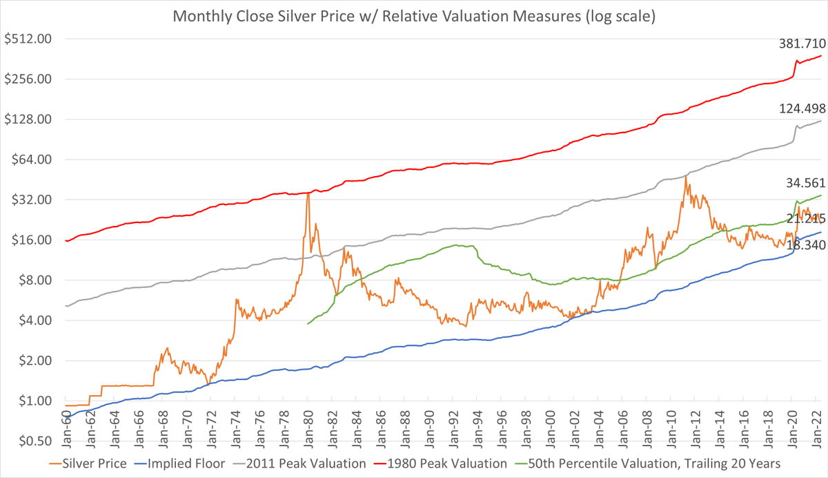
The 1st of the two excel charts shows the SMOEC ratio translated to dollars, for ease of understanding where we are in historical context
The blue line below is the same as the blue line the trading view chart above, it shows the floor price over time
Orange is the silver price
The blue line below is the same as the blue line the trading view chart above, it shows the floor price over time
Orange is the silver price

Green is the median valuation of silver over the trailing 20 years, this level has played a role as an important inflection point a few times, currently $34.56
Gray is the 2011 peak translated over time, currently $124.50
Red is the 1980 peak over time, currently $381.71
Gray is the 2011 peak translated over time, currently $124.50
Red is the 1980 peak over time, currently $381.71
So with Silver at $21.17, we are currently 24% above the capitulation floor valuation,
but the median is 63% higher, the 2011 peak equivalent is 488% higher, and the 1980 peak is 1703% higher than we are today
Hence why silver remains a good asymmetric upside trade
but the median is 63% higher, the 2011 peak equivalent is 488% higher, and the 1980 peak is 1703% higher than we are today
Hence why silver remains a good asymmetric upside trade
And note all of those values are based on monthly closes,
If I were to use intraday values, the 1980 peak today would be equivalent to $545, and the 2011 intraday peak would be $131
If I were to use intraday values, the 1980 peak today would be equivalent to $545, and the 2011 intraday peak would be $131
Finally here's a chart of #silver as a multiple of it's SMOEC floor valuation since the year 2000
At 1.16 it's trading at it's 10th percentile over the last 20 years, meaning it's only been more undervalued 10% of the time
At 1.16 it's trading at it's 10th percentile over the last 20 years, meaning it's only been more undervalued 10% of the time

And lastly here's the same chart going back to 1970
The 1980 high really blows the chart out in terms of scale, as it traded over 20x it's floor value
Hence the very long bear market that followed, it was a bubble
But we are in the opposite of a bubble today!
#silver
The 1980 high really blows the chart out in terms of scale, as it traded over 20x it's floor value
Hence the very long bear market that followed, it was a bubble
But we are in the opposite of a bubble today!
#silver

Adding this one from above with data labels
• • •
Missing some Tweet in this thread? You can try to
force a refresh