I said I'd start doing this, and I'm still only on twitter and reddit, so here is as good of place as any

Just finished a rebalance exercise so it's a good time to add it all up

Current approximate allocation in my portfolios (including my self managed 401k):
#Silver (PSLV + Physical) 16.4%
#Platinum (PPLT + Physical) 14.5%
$LTPZ 14.4%
$SILJ 13.9%
$PICK 8.5%
$URNM 8.1%
$USO 6.9%
$GDXJ 4.7%
$CENX Jan Calls 2.4%
$SII Feb Calls 1.8%
$ANGPY 1.4%
$IMPUY 1.4%
$PLG 1.4%
$RJZ 1.4%
$LAND 1.4%
#Gold (PHYS + Physical) 0.7%
Cash/Other 0.8%
Since the beginning of the year I've been expanding into many commodities and inflation plays and have been periodically rebalancing my weights based on market moves

This is probably a bit more diversified than some may have thought, also why I thought I should start sharing
What this doesn't include:
- The ibonds I bought recently
- my checking account (enough for 2-3 months expenses typically)
- my wife's biz checking account
- value of real estate equity
- other property like cars and such

Feel free to like or critique all you want!

• • •

Missing some Tweet in this thread? You can try to force a refresh
 

Keep Current with TheHappyHawaiian

TheHappyHawaiian Profile picture

Stay in touch and get notified when new unrolls are available from this author!

Read all threads

This Thread may be Removed Anytime!

PDF

Twitter may remove this content at anytime! Save it as PDF for later use!

Try unrolling a thread yourself!

how to unroll video
  1. Follow @ThreadReaderApp to mention us!

  2. From a Twitter thread mention us with a keyword "unroll"
@threadreaderapp unroll

Practice here first or read more on our help page!

More from @ThHappyHawaiian

Jul 11
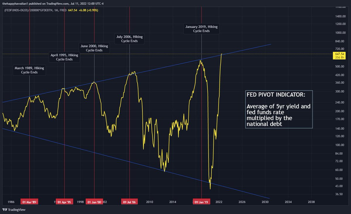
I'm overdue on updating the fed pivot indicator, and frankly it's showing we have arrived already

We are at the point where the fed would usually halt rate hikes and begin easing again

As they gear up for 75bp in a couple weeks, they would be knowingly blowing up the system
This chart is essentially proxy for the acceleration rate of interest expense for the US government, and has been a reliable indicator of fed pivot for 30+ years as the fed has ensured the US doesn't enter a debt death spiral
what is a debt death spiral? It's an increasingly large debt load, with ongoing deficit, that only gets exponentially larger as interest expense increases

The treasury has to issue more bills/notes/bonds to fund interest which drives up supply and can overwhelm demand
Read 11 tweets
Jul 10
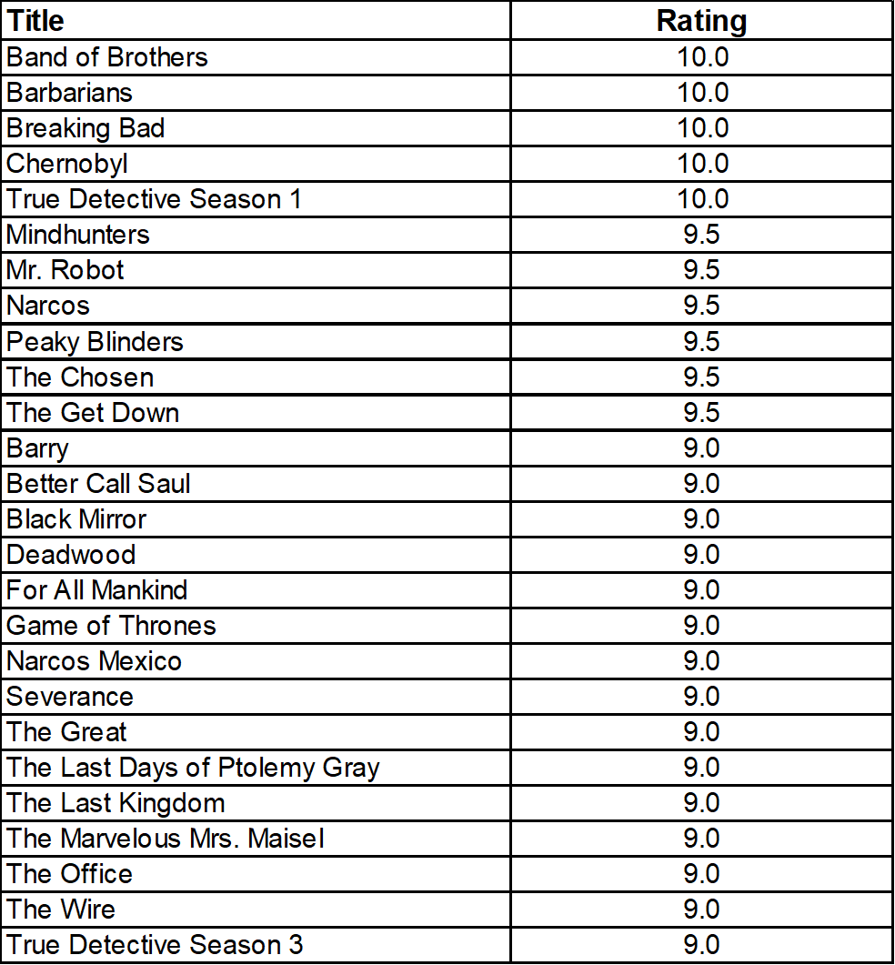
Do you agree with my TV show ratings?

For me a 7.0 is considered good/decent

A 10 is a masterpiece
continued to the 8s
Read 4 tweets
Jun 24
Revisiting SMOEC, and updating some of the old excel charts for you guys

I've since begun tracking SMOEC (SIlver - MOney - EConomy) in trading view because its automated and easier, but there's some fun things in the excel charts also

1st, here's the Money Supply to GDP ratio:
As you can see it's been pretty flat, and has technically been flat since April 2020

Why use nominal GDP? I made SMOEC as a way to measure silver valuation levels without touching CPI at all, given the changes over the years to how it's measured. So Real GDP is a no go for me
The next step is to divide the silver price by said ratio and then you have what I call 'SMOEC' ("smoke")

I do think there is some subjectivity on how you draw the long term support line, so I've drawn both of my interpretations here
Read 11 tweets
Jun 24
Ok so @GlobalProTrader blocked me because I disagreed with his tweet a month ago that the 30yr yield had broken out

Didn't say anything offensive at all

How do so many on #fintwit get such large followings when they act like this? ImageImageImage
Honestly let me know if there was something other than this, if there is I can't find it, but I'm open minded if I offended somehow @GlobalProTrader

it appears he deleted his tweet after I posted my chart though
@INArteCarloDoss another one for you
Read 6 tweets
Jun 24
Not much of a victory lap for the home price crash crowd, three charts in this thread:

1st one, the average price of new homes, still up 15% from a year ago even with this print
2nd one, new homes but using median prices, still up 15% from a year ago
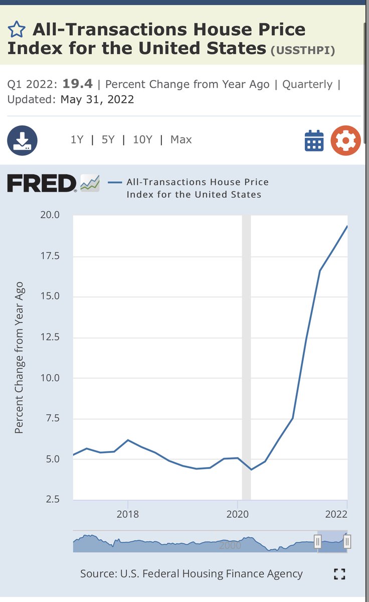
And finally, the chart that matters most, all home prices, remember that existing homes make up the vast overwhelming majority of homes, it’s not even close

Still up 19% over last year, with a new print coming next week
Read 4 tweets
May 6
The fed is in danger of crashing the housing market. The mortgage payment index adjusted for #inflation is now at a record high

Do I think that nominal home prices in the US will decline on a year-over-year basis? I still don't think so and here's why 👇

(click chart to zoom)
The mortgage payment index is comprised on 3 things: nominal home prices, interest rates, and inflation

Thus there are 3 ways this chart can decline back into the safety zone below the yellow trend line

1. Home prices decline
2. Mortgage rates decline
3. Inflation stays high
If you are expecting the fed to cause another 2008 by willingly hiking us into oblivion (a scenario they explicitly talk about never allowing to occur again), then you are expecting number 1, a home price crash
Read 8 tweets

Did Thread Reader help you today?

Support us! We are indie developers!


This site is made by just two indie developers on a laptop doing marketing, support and development! Read more about the story.

Become a Premium Member ($3/month or $30/year) and get exclusive features!

Become Premium

Don't want to be a Premium member but still want to support us?

Make a small donation by buying us coffee ($5) or help with server cost ($10)

Donate via Paypal

Or Donate anonymously using crypto!

Ethereum

0xfe58350B80634f60Fa6Dc149a72b4DFbc17D341E copy

Bitcoin

3ATGMxNzCUFzxpMCHL5sWSt4DVtS8UqXpi copy

Thank you for your support!

Follow Us on Twitter!

:(