
Since Central Bank swap lines are probably going to start blowing up again because of energy and FX issues, I decided I would make some charts on their usage during COVID. Because why not.
short thread
#btc #macro #DXY
1/
short thread
#btc #macro #DXY
1/
Currency swaps are a loan. Fed buys foreign currency from a central bank, and agrees to sell back later for same amount of $, plus interest (in $). The € or ¥ could devalue vs $ in meantime, making that loan cost more than the published interest rate
2/
2/
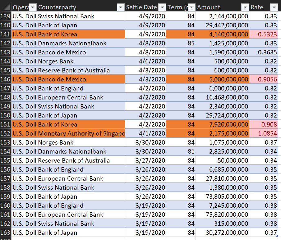
Mexico, Korea, and Singapore got really screwed on their 12-week swap interest rates early in the pandemic. (1.08% vs 0.3%). Mexico's own policy rate at this time was pretty high, but the others were basically zero. Later they all got the same rates.
3/
3/
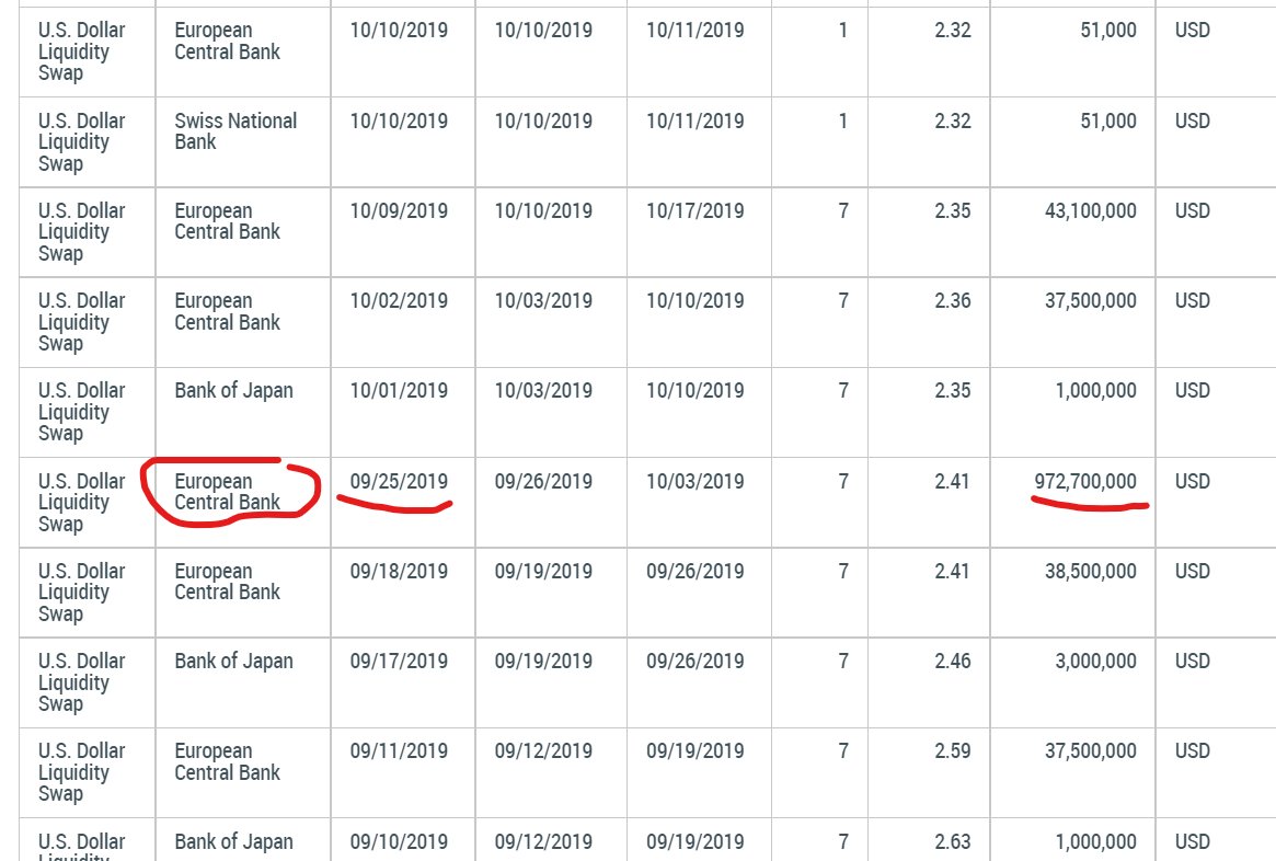
Europe gets the BASKET CASE award for actually borrowing before Covid started. I'm sure there's a super normal reason for borrowing a yard from the USA in Sep 2019 and it has nothing to do with the EU monetary experiment being rickety
4/
4/
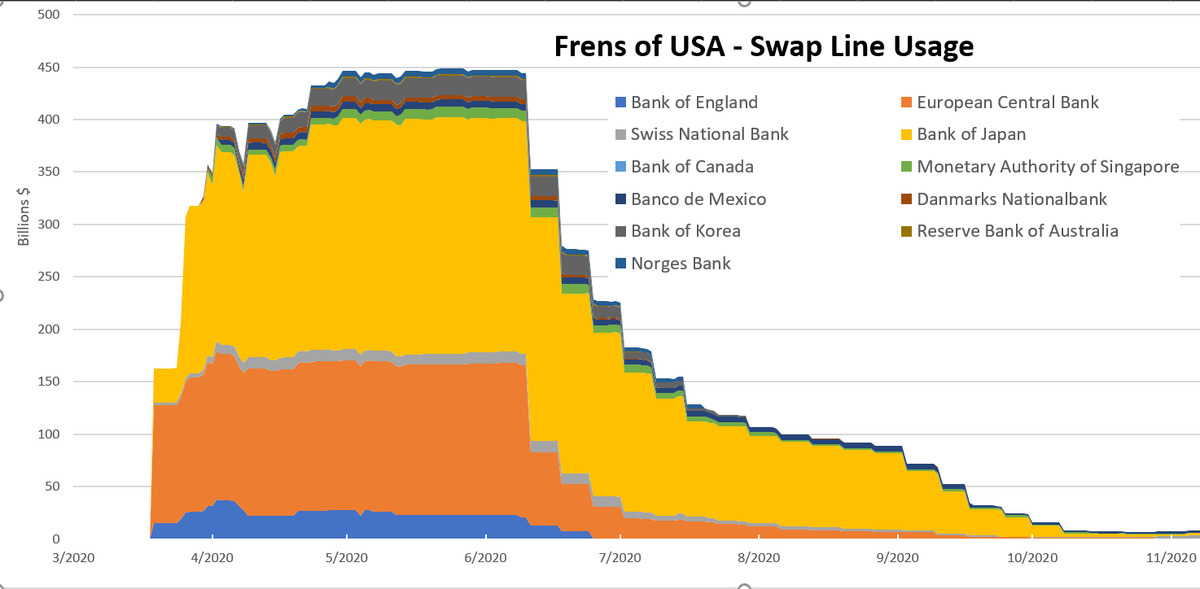
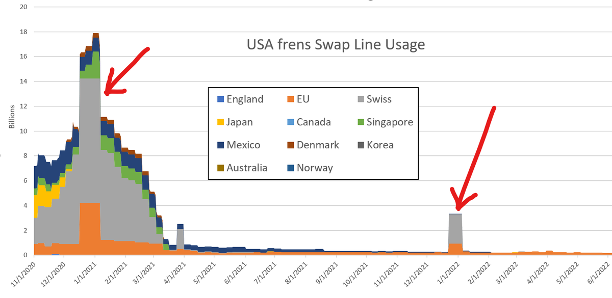
Japan gets the GO BIG OR GO HOME award for totally sending it, topping out at $225 billion
Canada gets the ABSTINENCE award for not actually using the swap line (ok they tested $60,000 but didn't inhale).
5/
Canada gets the ABSTINENCE award for not actually using the swap line (ok they tested $60,000 but didn't inhale).
5/
Denmark and Norway get ITS COMPLICATED award for being in NATO but not part of the Euro so they need their own swap line.
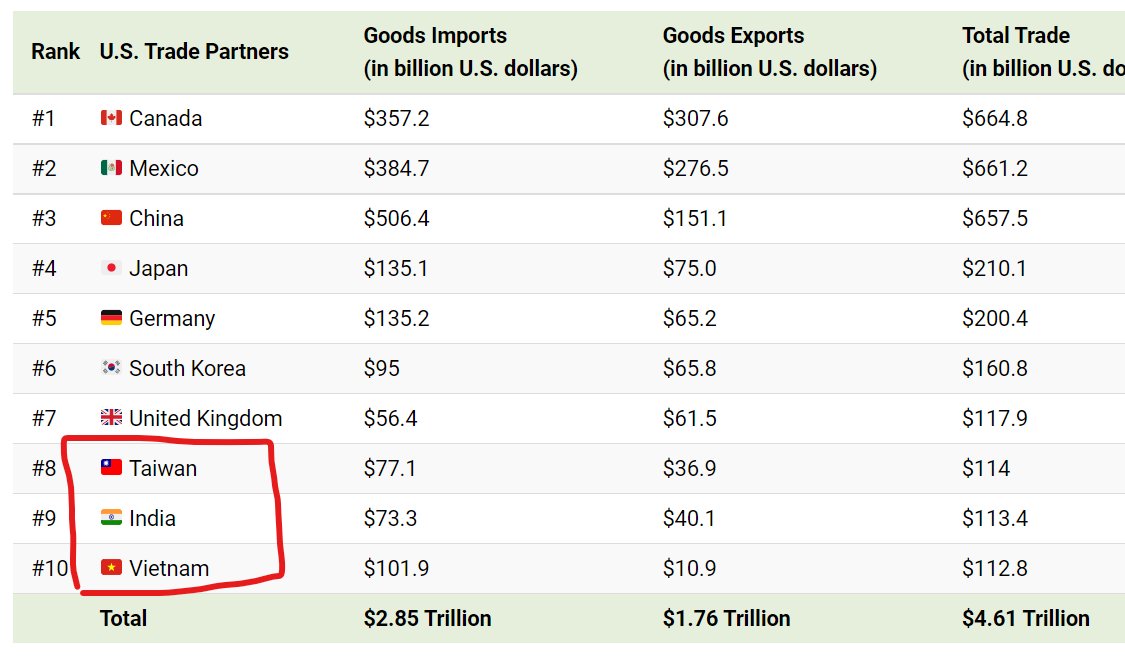
Taiwan, India, and Vietnam -- #8, 9, 10 largest trade partners with the US get the MAYBE NEXT TIME award for not making the list. Swaps for frens only
6/
Taiwan, India, and Vietnam -- #8, 9, 10 largest trade partners with the US get the MAYBE NEXT TIME award for not making the list. Swaps for frens only
6/
The Swiss get the HOLIDAY SPIRIT award for always borrowing a lot for Xmas and New Years for some reason 🎅🎄. Not sure why because their FAANG portfolio was still doing OK both festive periods.
7/
7/
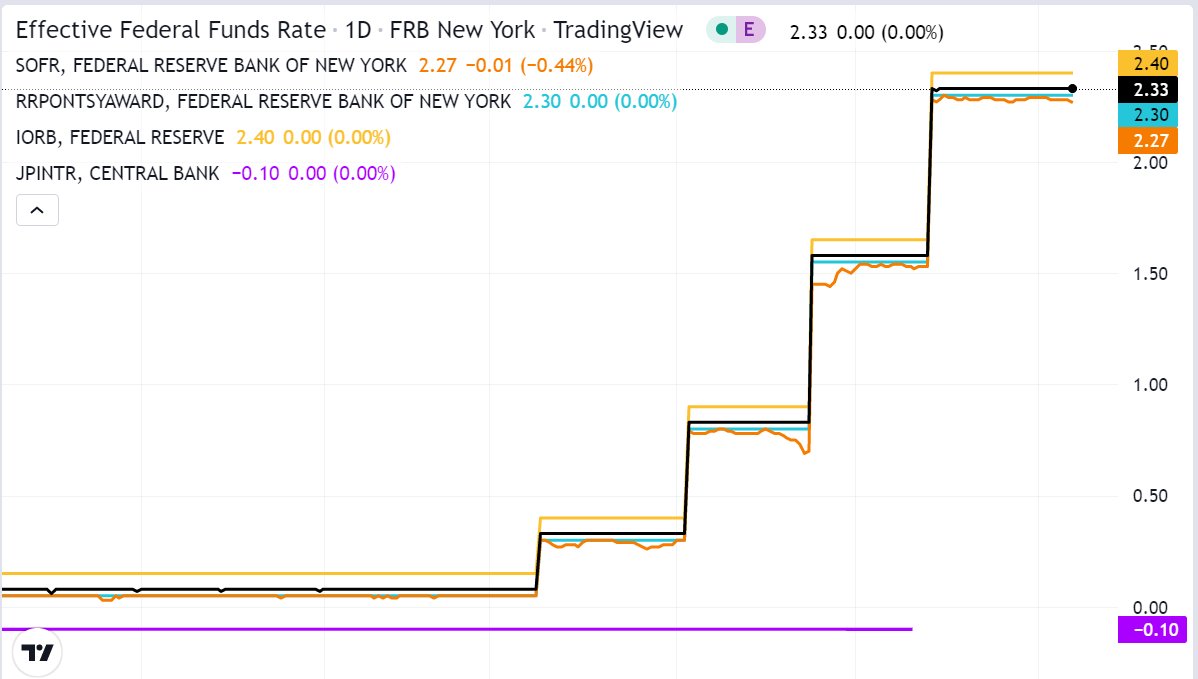
Current rate for a 7 day swap is 2.58% annualized- similar to other rates in the US. But for Japan with a policy rate of -.10%, this is pretty high (purple line).
Check out this page as winter approaches to see if the swap lines take off again:
newyorkfed.org/markets/desk-o…
8/
Check out this page as winter approaches to see if the swap lines take off again:
newyorkfed.org/markets/desk-o…
8/
Some of the central banks that didn't get swap lines in 2020 (but did in GFC) include:
Brazil
New Zealand
Sweden
Probably still frens of USA, especially 5-eye NZ. From now we barely have free markets anymore-- geopolitics is at the forefront until things settle down.
9/
Brazil
New Zealand
Sweden
Probably still frens of USA, especially 5-eye NZ. From now we barely have free markets anymore-- geopolitics is at the forefront until things settle down.
9/
Just a little bit of humor (not a PhD thesis) and a few charts to get us ready for swap line extravaganza, winter 2023!
tagging swap line nerds out there to see what they have to add
@matthew_pines @chilipiper234 @jameslavish @Max__Fin @LukeGromen @JeffSnider_AIP @huskerrx
end/
tagging swap line nerds out there to see what they have to add
@matthew_pines @chilipiper234 @jameslavish @Max__Fin @LukeGromen @JeffSnider_AIP @huskerrx
end/
• • •
Missing some Tweet in this thread? You can try to
force a refresh


