New article in @JAMANetworkOpen provides critical data on the long-term trajectory of COVID-19 symptoms.
Lots of bad news. 😕
Very bad news for ppl w/cancer or bad acute case of COVID. 😬
Also, a few rays of hope. 🌞
#LongCOVID #COVIDcancer
1/12
jamanetwork.com/journals/jaman…
Lots of bad news. 😕
Very bad news for ppl w/cancer or bad acute case of COVID. 😬
Also, a few rays of hope. 🌞
#LongCOVID #COVIDcancer
1/12
jamanetwork.com/journals/jaman…

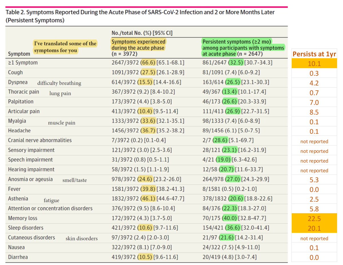
66% of adults had at least 1 symptom during the acute phase (first 2 months) of diagnosis of #COVID-19.
I’ve highlighted the symptoms experienced by at least 10%. Note that some of the less common symptoms are quite debilitating though (e.g., 9% w/lung pain).
2/12
I’ve highlighted the symptoms experienced by at least 10%. Note that some of the less common symptoms are quite debilitating though (e.g., 9% w/lung pain).
2/12

If you had a #COVID symptom initially, what are the chances it persists beyond 2 months? See 2nd column, green highlights emphasize those enduring among >10%.
Many of the initial symptoms endure in about 20% of ppl. Russian-roulette like odds.
3/12
Many of the initial symptoms endure in about 20% of ppl. Russian-roulette like odds.
3/12

If you know someone with a new #COVID infection/reinfection who is experiencing symptoms, dive deep into that particular row.
For example, while memory loss is rare (4.3%), it’s the most enduring symptom beyond 2 months (40% persisting).
4/12
For example, while memory loss is rare (4.3%), it’s the most enduring symptom beyond 2 months (40% persisting).
4/12

If you had an acute #COVID symptom, what were the chances it would resolve within 1 year?
See authors’ BLACK text.
I’ve also added a column with the chances a symptom persists (ORANGE text). Balanced framing. 🙂
5/12
See authors’ BLACK text.
I’ve also added a column with the chances a symptom persists (ORANGE text). Balanced framing. 🙂
5/12

Now, let’s manually combine the acute (<2 month), near-term (>2 month), and long-term (>1yr) #COVID data into one figure. Silly JAMA. 😊
Some symptoms present at 2 months largely fall off. Others persist in >25% (palp, art pain, att/conc, memory, sleep).
6/12
Some symptoms present at 2 months largely fall off. Others persist in >25% (palp, art pain, att/conc, memory, sleep).
6/12
Overall, the number of #COVID-19 symptoms each person experiences diminishes over time.
Caveats: Initial infections were all pre-vax (call for hope), but also pre-omicron and before many reinfections (call for caution). Note, %s are among those who had an acute symptom.
7/12
Caveats: Initial infections were all pre-vax (call for hope), but also pre-omicron and before many reinfections (call for caution). Note, %s are among those who had an acute symptom.
7/12

Older adults, women, and ppl w/>5 acute symptoms were more likely to have persistent #COVID symptoms at 1 year.
A history of #cancer predicted prolonged symptoms. #COVIDcancer
Higher BMI = more persistent symptoms. Bad for the U.S.
8/12
A history of #cancer predicted prolonged symptoms. #COVIDcancer
Higher BMI = more persistent symptoms. Bad for the U.S.
8/12

An Appendix figure models the typical time to resolution of a #COVID symptom (crude estimate, varies by symptom & individual).
I added the blue line, which suggest about 5% would experience symptoms at 3 yrs. That's >16 million Americans. Very rough estimate. #recession
9/12
I added the blue line, which suggest about 5% would experience symptoms at 3 yrs. That's >16 million Americans. Very rough estimate. #recession
9/12

Model of time to COVID-19 symptom resolution by subgroup.
#COVID has persistent effects for those with a history of cancer or who had a bad acute case. Either we have a critical gender health disparity or men are trying to walk off heart palpitations. 🤔
#COVIDcancer
10/12
#COVID has persistent effects for those with a history of cancer or who had a bad acute case. Either we have a critical gender health disparity or men are trying to walk off heart palpitations. 🤔
#COVIDcancer
10/12
An average of 10% of adults were experiencing long-term symptoms from #COVID-19.
The authors note that this is a critical public health problem b/c of the high incidence of infection. They are perhaps too optimistic. We have a high incidence of REinfections.
11/12
The authors note that this is a critical public health problem b/c of the high incidence of infection. They are perhaps too optimistic. We have a high incidence of REinfections.
11/12

Limitations: The COVID-19 initial infections were all before the vaccine era, mostly before reinfections, and pre-omicron.
You cannot have long-term data AND up-to-date world events. Stay cautious until the long-term data are optimistic.
12/12
You cannot have long-term data AND up-to-date world events. Stay cautious until the long-term data are optimistic.
12/12
By the way, feel free to share any of this on other platforms (Mastodon, Discord, TikTok, Myspace, or even Facebook) and with family/friends. I tried to annotate the figures in a way that it would be relatable to a general audience. Where I failed, ask questions.
• • •
Missing some Tweet in this thread? You can try to
force a refresh