📊🤓Calling all UK data nerds. From today, there's an exciting new way to get #Census2021 data for any set of variables you like.
Use the @ONS "Create a custom dataset" tool to build your own multi-variate tables (for England & Wales). ons.gov.uk/datasets/create 1/3
@ONS With data from this tool, you can look at things like how age and health correlate with employment across local authorities... ons.gov.uk/datasets/creat… 2/3
The "Create a custom dataset" service is built using #Cantabular, a system developed by @sensiblecodeio, which allows for real-time "statistical disclosure" checks and processing to protect data privacy. You can read more about the technology here... cantabular.com
3/3
• • •
Missing some Tweet in this thread? You can try to
force a refresh
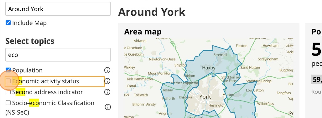
Want to get #Census2021 data for any area in England and Wales? Wards, parishes, parliamentary constituencies, or perhaps a 1km radius around a local park, school or train station? "Build a custom area profile" is here to help! ons.gov.uk/visualisations… 1/3
Build a custom area profile allows you to:
- find an area on a map + customise it
- select #Census2021 data tables
- save your profile, or even embed it in your website
Read more on our blog! digitalblog.ons.gov.uk/2023/01/17/cus… 2/3
You can read more about Build a custom area profile, how to use it, and how it works, in this blog post. This is tool is new and a little experimental. Please do share your feedback! (See survey link at bottom of blog post) surveymonkey.co.uk/r/2SGF6X2
3/3
🚨 BREAKING 🚨
There's a brand new @Census2021 release this morning with data covering England and Wales right down to a neighbourhood level. You can explore the data using our brand new #CensusMaps tool, but here's a 🧵 with a few highlights... ons.gov.uk/census/maps 1/9
MEDIAN (AVERAGE) AGE
The oldest local authority in the country on Census day 2021 was North Norfolk (54 years) and the youngest was Tower Hamlets (30 years). At neighbourhood (MSOA) level, average ages ranged from 20 years to 66 years ons.gov.uk/census/maps/ch… 2/9
MARRIAGE & CIVIL PARTNERSHIPS
There was a huge variation across England and Wales in the proportion people who were married (incl. civil partnerships). The highest % in Wokingham (55.0%) was almost double the lowest in Lambeth (25.6%) ons.gov.uk/census/maps/ch… 3/9
In case you didn't get the memo, we've got a big @Census2021 data release coming this Wednesday (2 November) at 9:30am. A quick 🧵 on what to expect... 1/5
This next data release will include datasets on the topic of "demography and migration". It is the first of nine topic summary data releases, and is the first @Census2021 release with data down to a neighbourhood level (AKA "output area" level) census.gov.uk/census-2021-re… 2/5
Specifically, you can expect to find data for variables including population density, median age, sex, household size and deprivation, marital status, passports held, and length of residence in the UK 3/5
1/ Ever wondered how your local area has changed over half a century? Today, @ONS is releasing an interactive article covering some of the most interesting changes between 1961 and 2011 England & Wales censuses right down to a local/district level ons.gov.uk/peoplepopulati…
2/ This piece—developed by my colleagues @Annaekhoo (#DataJournalism) and @SamCtrl (#DataViz) from analysis by Amy Boyson (@ONS historical)—has been an opportunity to test some of the techniques we’re hoping to use to explore 100 years of change up to the most recent @Census2021
3/ In particular we've been exploring ways to use historical @OrdnanceSurvey maps painstakingly digitised by @natlibscotmaps as a background for the historical datasets. We hope this #steampunk-esque retro-innovation helps to bring the past to life...
1/ Today we published this first of two interactive #scrollytelling pieces focused on economic inequality in the UK, based on measures of income and productivity for each local area. Check it out here... ons.gov.uk/visualisations…
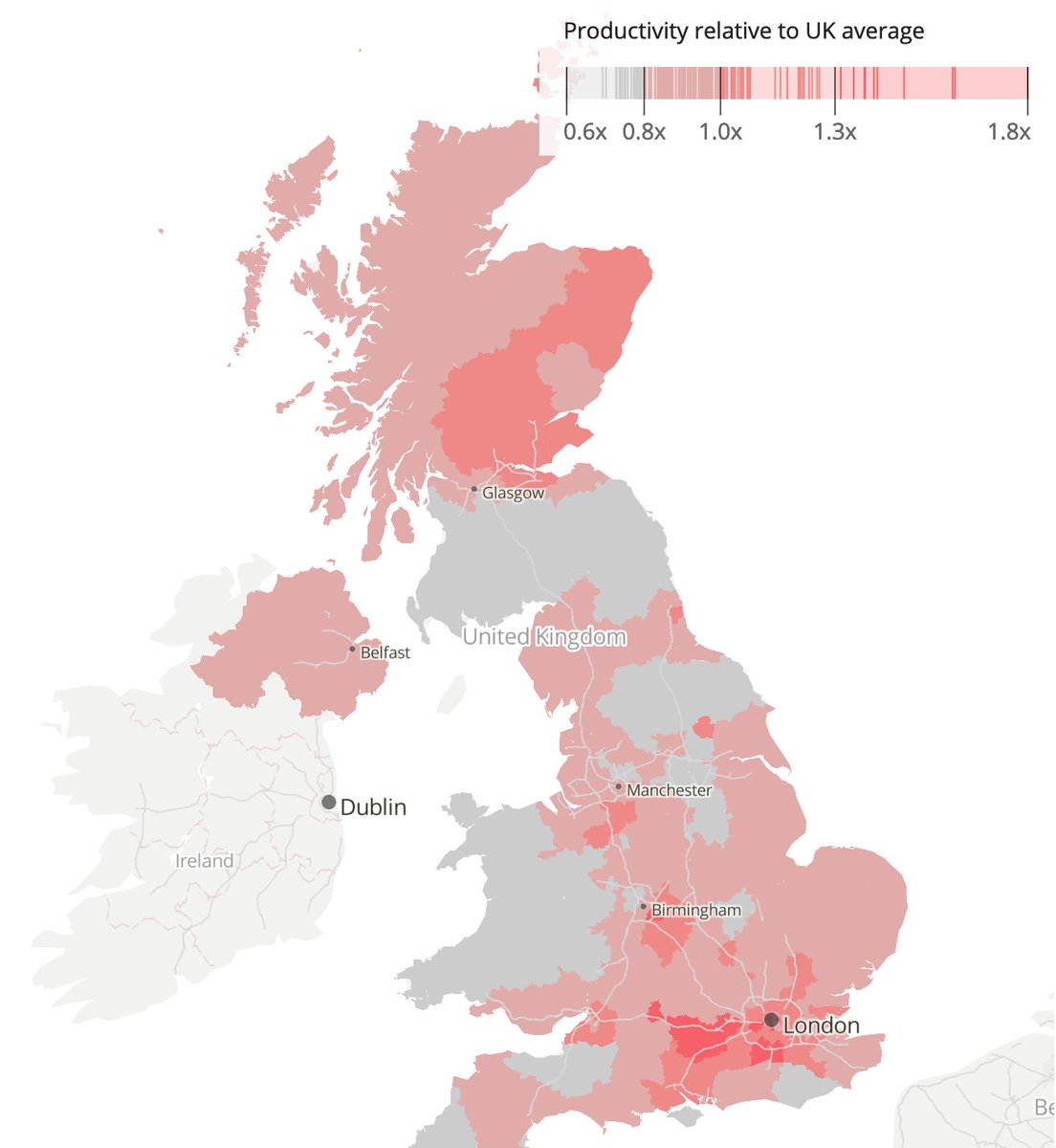
2/ As you'd expect, the analysis found notable economic disparities between southern England and the rest of the UK (the blue map shows relative income, the pink shows relative productivity)... But there were also other notable findings
3/ Importantly, the analysis found some interesting patterns once the two economic measures were overlaid as a #bivariate map, including disparities between cities and their surrounding rural areas (the scatter plot top-right explains the colours)
2/ Looking at the history of the region in this way helps us to put today's events in context. Eg. in "mixed cities" like #Jaffa, #Haifa or #Lydd, where many #Palestinians were forcibly displaced in 1948, and those that remained became an isolated minority today.visualizingpalestine.org/lydda/