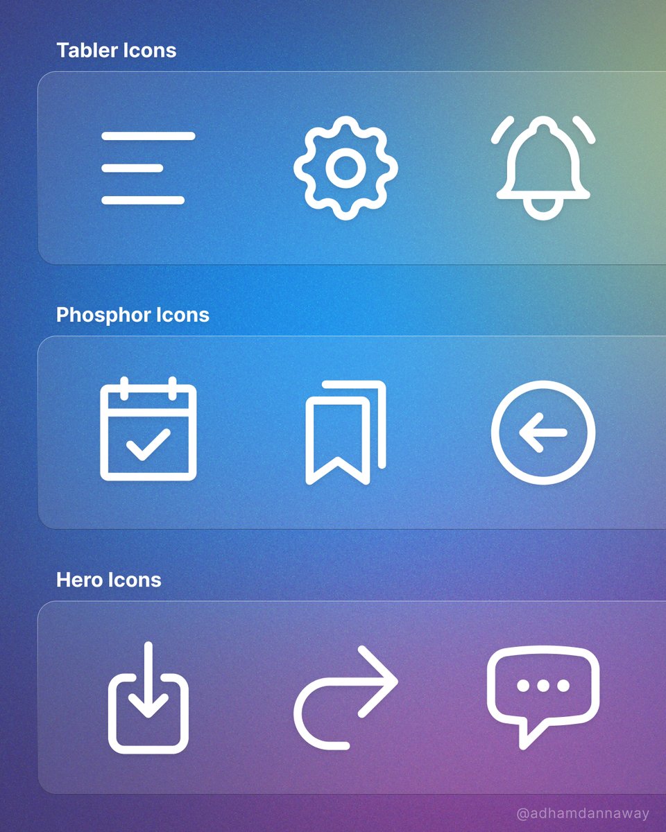
⭐️ 10 Awesome free icon sets
I honestly can't believe they're free.
What's your go-to icon set? 🤔
#design #icons #ux #webdesign #icondesign
I honestly can't believe they're free.
What's your go-to icon set? 🤔
#design #icons #ux #webdesign #icondesign

1️⃣ glyphs.fyi
2️⃣ lucide.dev
3️⃣ iconic.app
4️⃣ iconoir.com
5️⃣ tabler-icons.io
6️⃣ remixicon.com
7️⃣ heroicons.com
8️⃣ icons.download
9️⃣ feathericons.com
If you found this thread helpful:
❤️ Follow me @AdhamDannaway for daily design tips
🔁 Retweet the below tweet to share this thread 👇
❤️ Follow me @AdhamDannaway for daily design tips
🔁 Retweet the below tweet to share this thread 👇
https://twitter.com/AdhamDannaway/status/1658271565471989761
• • •
Missing some Tweet in this thread? You can try to
force a refresh

 Read on Twitter


