1/ #Bitcoin and precious metals have shown a noticeable increase in correlation recently🪙🧵
2/ The crypto market seems to be tracking gold and silver more closely as the macro focus shifts from interest rates to bank failures and the risk of default.
3/ The higher correlation with precious metals likely began following the Silicon Valley Bank failure and the subsequent government response. It seems to persist as the debt ceiling deadline approaches. #SVBBank
4/ The USD rebound may also be a factor in the recent decline in both crypto and precious metals, with Bitcoin and the DXY index having a strong negative correlation of -0.7 at the moment #DXY
5/ Is this recent movement in tandem with precious metals merely a coincidence, or are there compelling reasons to support the idea of Bitcoin as digital gold?
1/5 Investing in the crypto industry requires specific knowledge. Stay ahead of the game by understanding analytics, data, and onchain analysis. These tools can provide valuable insights and help you make informed decisions. #cryptoinvesting#onchainanalysis
2/5 Onchain analysis is a powerful tool for understanding the health and performance of a particular cryptocurrency. By analyzing the underlying blockchain data, you can identify patterns and trends that can indicate future performance. #onchain#cryptoanalytics
3/5 Analytics and data play a crucial role in gaining an edge. By analyzing historical price data and market trends, you can identify undervalued coins that may be poised for growth. You can combine these insights with onchain analytics. #cryptoanalytics#data
Capital markets and #crypto have been under constant pressure given the geopolitical crisis between Russia and Ukraine.
Looking at some @intotheblock’s indicators for crypto and capital markets, reveals some shocking correlations with different asset classes.
A thread
1/ Despite the correction, $BTC and $ETH remain better investment than most large tech equities. This is shown by IntoTheBlock’s Sharpe and Sortino ratio analysis.
Outflows from exchanges tend to serve as a bullish signal.
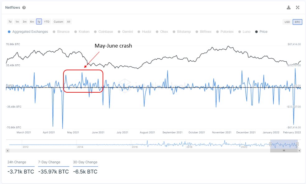
Moreover, comparing the drawdowns experienced during May-July of last year and the current, the exchanges netflows paint a different picture.
A short thread.
1/ Between May and June of 2021, there were significant inflows of Bitcoin into exchanges (net amount of 130k BTC), coinciding with the sell-off that happened during that period
2/ But this time, as $BTC dropped to $32k, net outflows of 80k BTC trend suggests that less Bitcoin is available to buy at exchanges
Moreover, on Jan 29, there was an outflow of 64k BTC (the largest since April 18), and from then, the price increased by 18.4%
1/ Just like the federal reserve “prints” money by buying securities and bonds to stimulate the economy, it can sell these to decrease inflationary pressures
The graph shows how Bitcoin grew along with M1 supply during QE in 2016 and 2017, but dropped as QT began in early 2018.
2/ The correlation between $BTC price change and M1 supply change is at a high level of 0.77, pointing to strong statistical relationship between the two.
After the fed minutes were released with discussions of QT, a potential decrease in money supply is becoming more likely