Profile picture
Derek Featherstone @feather
, 11 tweets, 3 min read Read on Twitter
OK, I get it. You created a search results page using the latest single page app hotness. But here's the deal. When I click on one of the items to see its details and then go back to the search results page, here's what I expect:
1. You need to remember the change that I made to the "number of items per page" dropdown. If you don't, I was on page 1 of 2, and now I'm on page who knows what of who knows how many.
2. You need to remember the filters I had applied. Because I explicitly said I wanted French door refrigerators only, and now you're showing me mini-fridges and fridge only and side by side models and now I'm angry at you because I HATE our current side by side with a passion.
3. You need to remember the sort order. Because I wanted them listed lowest price to highest price. And now you're showing me $12,000 refrigerators, and that's just not happening. Again, angry.
4. You need to remember which item I was viewing so that when I go back, I can just continue on from there.

Please?
Some of you retailers are hurting my head with this stuff. Oh, also, you're making me think not nice things about you. And your brand.

Because I narrowed down the results to what I wanted. And then you made me do all that work again.
And I think of how much of an inconvenience that is for me, and then I think... How bad would this be for someone with a disability to use? Take that frustration and amplify it by a factor of 10X. Ouch.
Reality check for retailers: go through that search process and then view an item and then go back to the search results to chose another item with a keyboard ONLY.

That’ll demonstrate the potential impact on the experience and how significant it is to have to do work again.
It also demonstrates the difference between QA testing and real world testing. In a QA setting, we might set a requirement that the “user must be able to search, browse search results, view an item with a keyboard”

That’s usually a binary “yes they can” or “no they can’t”
But that doesnt reflect the real world where people don’t find the thing they want. It doesn’t take into account that people have decisions to make. That they choose between many items.

A holistic approach to tasks is needed to make this stuff more apparent.

#accessibility #ux
Was just thinking about this a little more after a comment from @sil - when you take something away that was already there in the underlying architecture or browser or whatever, use the Indiana Jones method (wrote this in 2013). It applies here too:

simplyaccessible.com/article/indian…
Missing some Tweet in this thread?
You can try to force a refresh.

Like this thread? Get email updates or save it to PDF!

Subscribe to Derek Featherstone
Profile picture

Get real-time email alerts when new unrolls are available from this author!

This content may be removed anytime!

Twitter may remove this content at anytime, convert it as a PDF, save and print for later use!

Try unrolling a thread yourself!

how to unroll video

1) Follow Thread Reader App on Twitter so you can easily mention us!

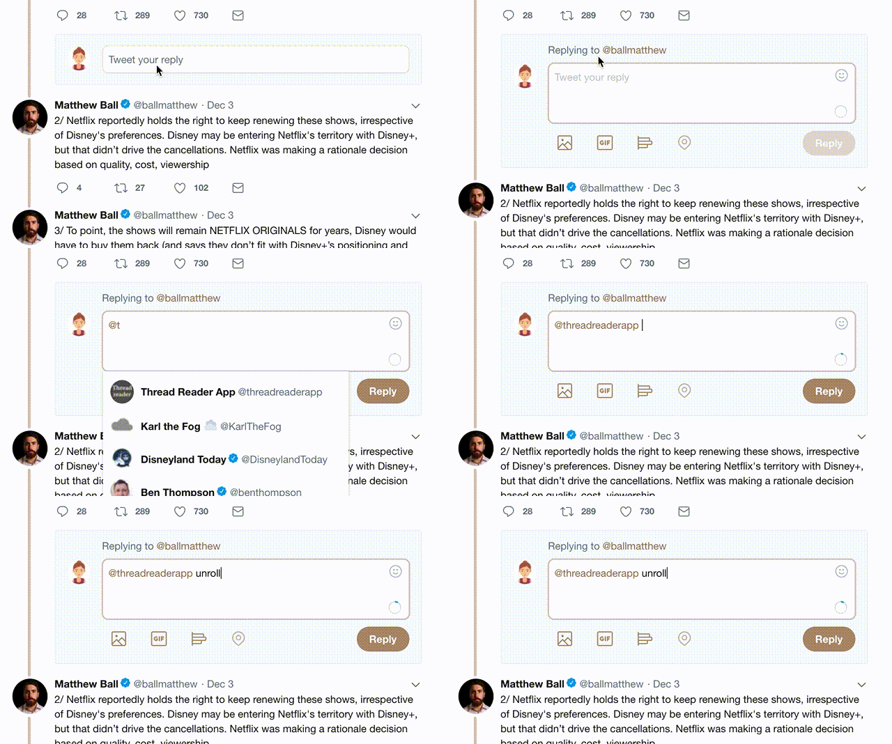
2) Go to a Twitter thread (series of Tweets by the same owner) and mention us with a keyword "unroll" @threadreaderapp unroll

You can practice here first or read more on our help page!

Did Thread Reader help you today?

Support us! We are indie developers!


This site is made by just three indie developers on a laptop doing marketing, support and development! Read more about the story.

Become a Premium Member and get exclusive features!

Premium member ($30.00/year)

Too expensive? Make a small donation by buying us coffee ($5) or help with server cost ($10)

Donate via Paypal Become our Patreon

Thank you for your support!