
1. Last night I started working on a #Covid19 dashboard for New Zealand that scrapes data from health.govt.nz/our-work/disea…
Today I'm trying to work out how I can best serve up the data experience I want given the strengths, constraints of the tool. I'll live tweet thoughts as I go.
Today I'm trying to work out how I can best serve up the data experience I want given the strengths, constraints of the tool. I'll live tweet thoughts as I go.
2. First up, I did a critique of existing charts and dashboards covering the NZ situation. I cut them into an Excel doc, with one tab for each provider. Here's a collection of vis from the page at stuff.co.nz/national/healt… 
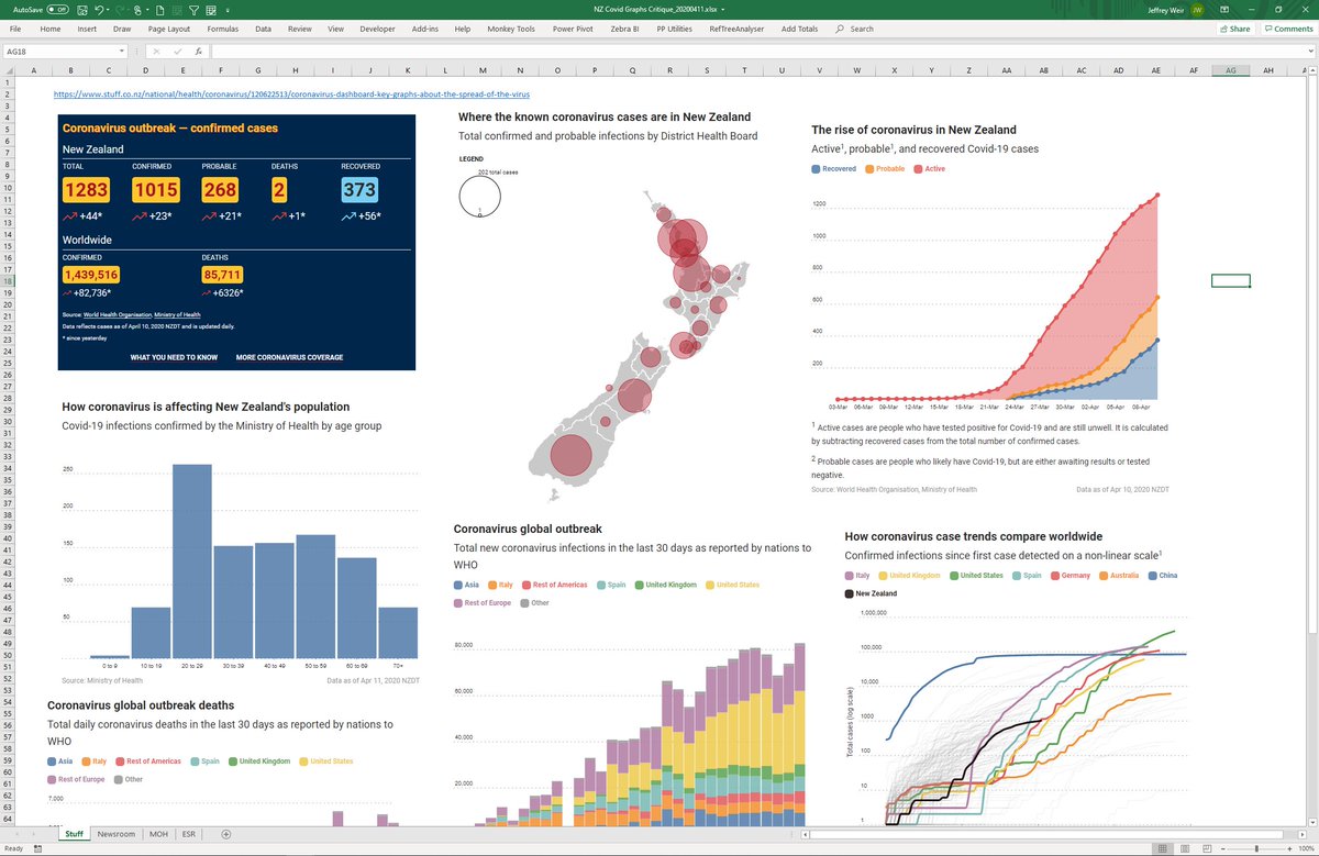
3. Then I did a review. I tweeted some of this. Lots of viz that was intermediate at best. Opportunity lost.
Newsroom:
Ministry of Health:
ESR:
Stuff (yet to do more critique):
Newsroom:
Ministry of Health:
ESR:
Stuff (yet to do more critique):
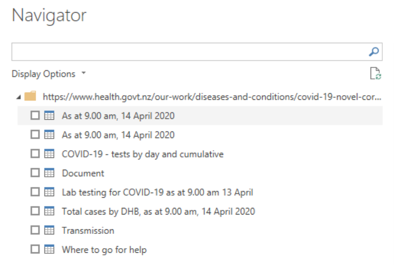
4. Next I tried to find the best place to grab data from. The NZ Ministry of Health doesn't make this data accessible enough. It is hard to find, tables have datestamped names, many images without links to underlying data, some time sync issues. Piss poor. health.govt.nz/our-work/disea…
5. I fired up #PowerBI and used PowerQuery to get data. While it can be downloaded as XLS, I'm scraping it direct from the page. @minhealthnz add datetime to all table names that unnecessarily makes this harder. Not cool, MOH.
health.govt.nz/our-work/disea…
health.govt.nz/our-work/disea…
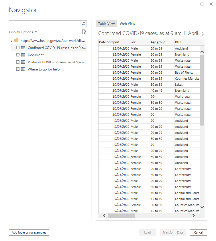
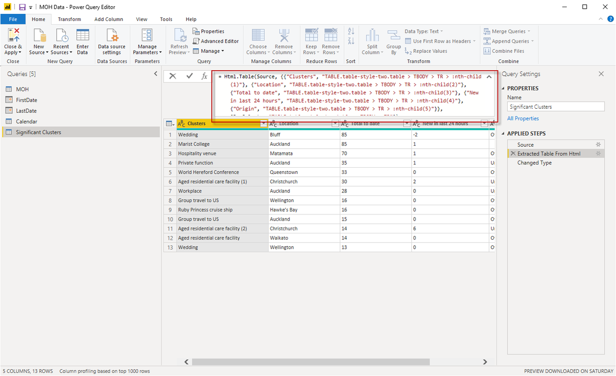
6. In some cases I'm using PowerQuery's very cool Add Table Using Examples to get around @minhealthnz's bad table naming. This functionality makes it childs play to scrape from the web, and produces the PowerQuery M code shown below. When the hell will this come to #Excel?
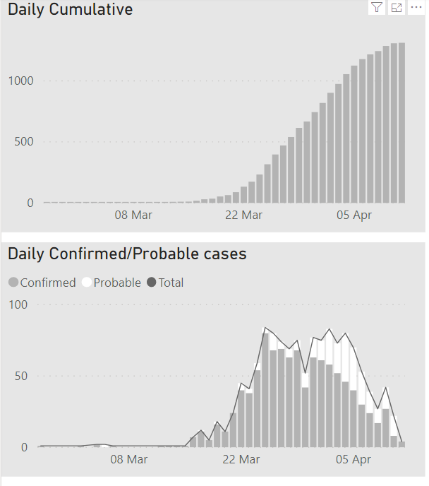
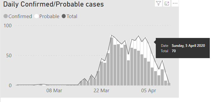
7. Next its time to work out how best to present the data.Cumulative vs daily totals seems like the best starting point. I've seen dashboards that put this on one graph - either at the same time, or via a toggle. Why would you impose that on the user? Just use two graphs.
8. The reason I used a line for Total here is that this is the only way I could work out how to get #PowerBI to show the total in a tooltip. @MSPowerBI there should be an options to display totals (and all series values in bar at once) for stacked columns. ideas.powerbi.com/forums/265200-…
9. Maybe this works better as a line chart? What do you think, people?
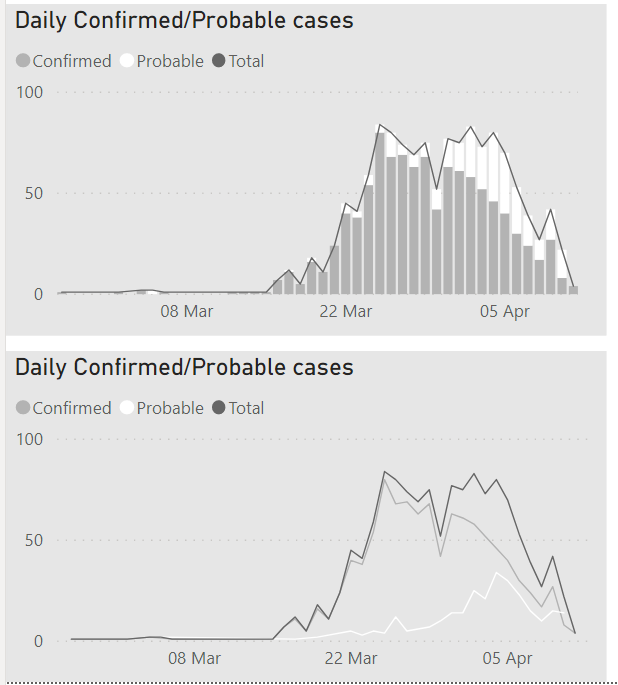
10. Next stop is to think about how to show regional totals and trends. On the totals front, sticking with the same grey theme here's a couple of options. I like the white bars, but perhaps there's not enough contrast. But moving to dark, some numbers become illegible
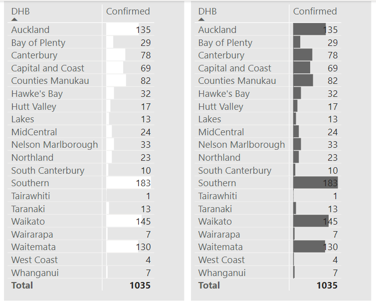
11. The way around this is to use two series; one of which has the Show Bar Only option ticked. (It has to be a different measure too...if you use the same exact measure, changes to DataBars appear to be global. @Will_MI77 maybe a bug?) I don't want a column name so I used ".".
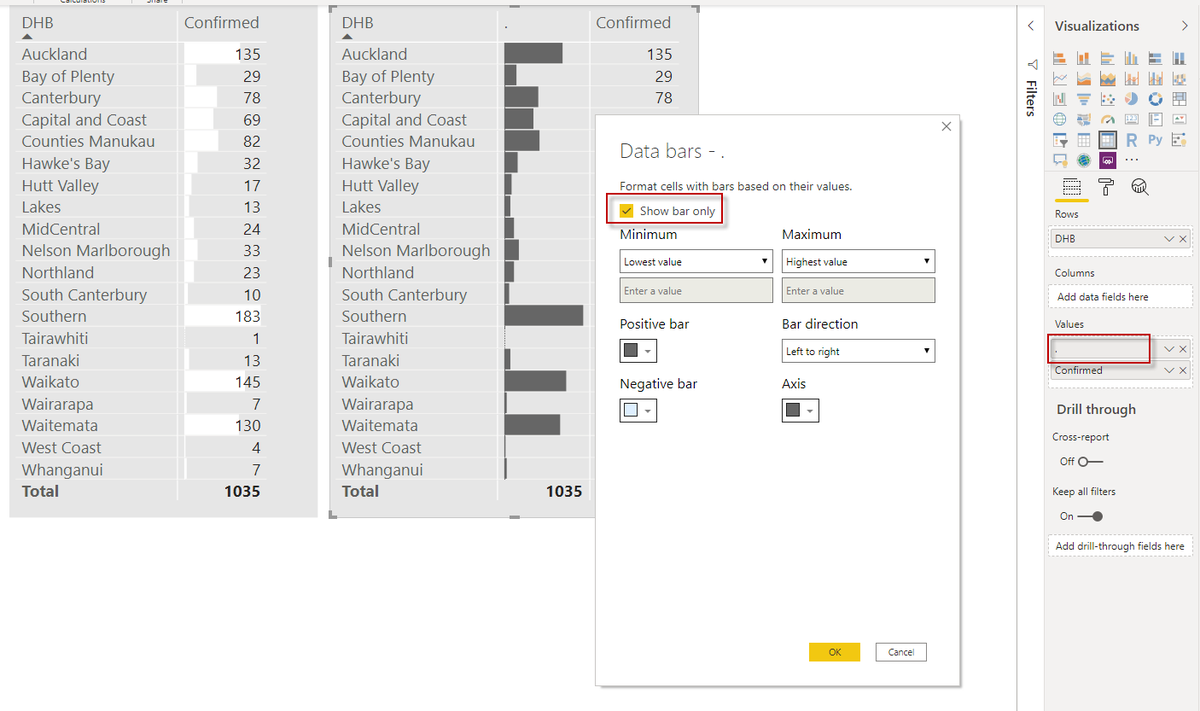
12. (I haven't tested if you can use non printing characters as column headers, but I really wish #PowerBI would respect my choice of renaming columns as " " or " " or even " X ".
I tried to add an idea for this, but I can't lodge ideas any more. ideas.powerbi.com/forums/265200-…
I tried to add an idea for this, but I can't lodge ideas any more. ideas.powerbi.com/forums/265200-…
13. So this is where I'm at now. I'll add more as I progress further.
8a. Note that you can set the line width to 0 if you don't want it to show up, but still want "Total" in your tool tip. But this just replaces one issue with two: How will users know to hover over that invisible series? And what will users make of that "Total" in the legend?

10a. I really wish that this dialog was 'live'. You can't preview how a change of colour will look - you have to commit it. And then the dialog disappears. Meaning unnecessary click tax, wasted time. I'd lodge an idea to fix this, but I seem to be suspended from the Ideas site 😡

14. Here's what I plan to add:
*Comparison to Australia
*Ethnicity/Age breakdown, weighted by demographic popn
*Map of incidence by DHB with spikes (probably thin bars) rather than bubbles.
*Small multiples allowing comparison between regional trends
* Whatever else U want to see
*Comparison to Australia
*Ethnicity/Age breakdown, weighted by demographic popn
*Map of incidence by DHB with spikes (probably thin bars) rather than bubbles.
*Small multiples allowing comparison between regional trends
* Whatever else U want to see
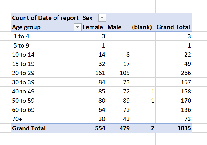
15. #Covid19 incidence data from @minhealthnz uses unequal age-groups, with 4 bands covering folk aged 1 to 20, but just 1 band for 70+. In a pandemic that disproportionately impacts older folk.
Please give us better access to better data @minhealthnz
health.govt.nz/our-work/disea…
Please give us better access to better data @minhealthnz
health.govt.nz/our-work/disea…
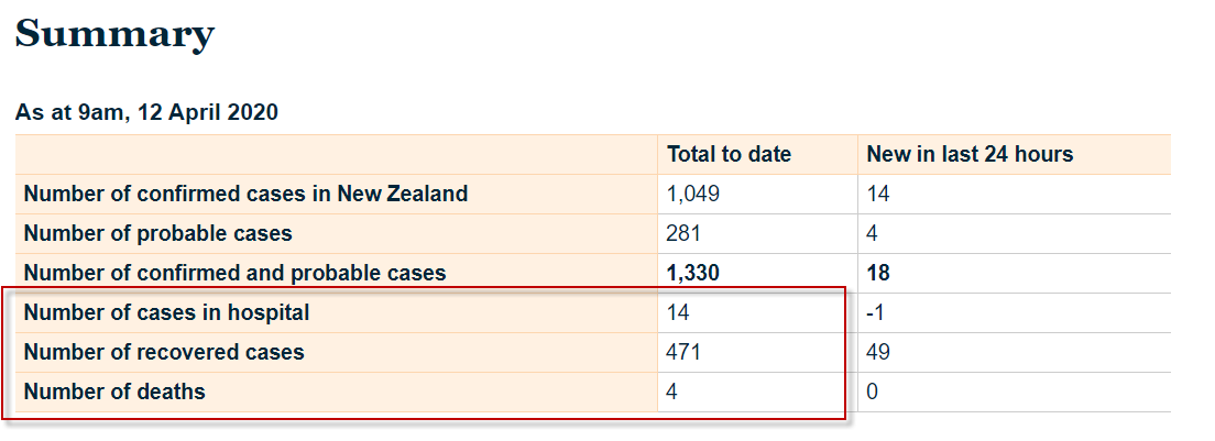
16. It's also hard to build a dashboard when the publicly available datasources are at different levels of granularity. @minhealthnz give us daily confirmed cases by Dist. Health Board, but only give us hospitalised/recovered/deaths on a national basis.
health.govt.nz/our-work/disea…
health.govt.nz/our-work/disea…
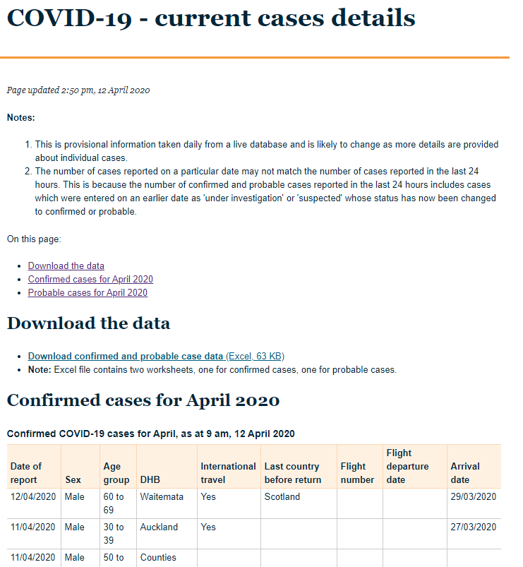
17. Jeez: the web tables on the MoH website is for April only, and the only way to get all the data is to download an Excel file. Which is hard to automate because @minhealthnz hardcode the date in the filename like so:
case-list-12-april-2020-for-web.xlsx
Another fail. C'mon!
case-list-12-april-2020-for-web.xlsx
Another fail. C'mon!
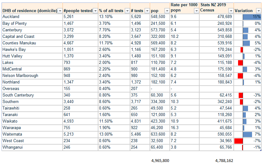
18. Hmm. The table on the MOH site here has NZ population at 4.9 Million. I thought we were 4.6 million.
I've added in NZ Census figures on the right that show 15% variation for Auckland. This affects per capital testing figures. What am I missing?
health.govt.nz/our-work/disea…
I've added in NZ Census figures on the right that show 15% variation for Auckland. This affects per capital testing figures. What am I missing?
health.govt.nz/our-work/disea…
15a. I hope that this issue and the next 3 in this thread come to the attention of someone at @minhealthnz who can comment. I've spoken to dataviz folk in NZ media who agree - MOH data structure makes it unnecessarily hard for folk to get insights out @iantown3 @ChiefSciAdvisor
19. Another problem with MOH data is that different tables relate to different 24 hours periods.
MOH main page says 15 new in 24 hours to 8.30 am, 13 April
MOH Case Details page says 18 cases on 12 April, and 1 on 13 April.
Press conf at 3:25pm 13 April says 19 cases.
MOH main page says 15 new in 24 hours to 8.30 am, 13 April
MOH Case Details page says 18 cases on 12 April, and 1 on 13 April.
Press conf at 3:25pm 13 April says 19 cases.
20. So which to report? I'll use the daily Case Details data from here: health.govt.nz/our-work/disea…
...and just don't show the latest day, as there is often just a few entries as at the time they upload it.
But then folk will say "Your numbers don't match reported ones"
*Sigh*
...and just don't show the latest day, as there is often just a few entries as at the time they upload it.
But then folk will say "Your numbers don't match reported ones"
*Sigh*
21. @minhealthnz publish info on no. of people tested by ethnicity or by DHB district. But they don't show % of tests that return positive. They also don't break these down by age.
Do you think they should? Should they crosstab too? I'm not sure...still mulling it over.
Do you think they should? Should they crosstab too? I'm not sure...still mulling it over.
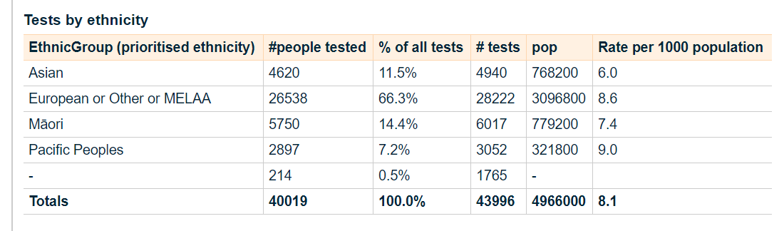
22. @minhealthnz also publish a count by ethnicity. But this doesn't tell you whether a particular ethnicity is disproportionately effected. If you're not going to tie this back to the underlying popn distribution, why report it at all?
(I will in my dashboard)
(I will in my dashboard)
22a. And guess what: Ethnicity isn't published in the "Current Case Details" data. Nor elsewhere on MOH site that I can find. You have to manually copy numbers from this image if you want to report on it. Another open data fail, @minhealthnz
@ChiefSciAdvisor any assistance appr
@ChiefSciAdvisor any assistance appr
22b. I think reporting prioritised ethnicity in the Current Case Details file is important. We want to be alerted if there is faster growth in a particular ethnicity, so geo-targeted countermeasures can be ramped up. (And we want to know whether MOH are monitoring for this).
23. Okay, back to the actual dashboard build. Almost all dashboard I've seen sort areas A-Z (left). But does it *really* make sense to have Northland in the middle of the list when it is at the top of the country? Either sort on values, or sort North to South, I say. You?

24. Bringing in testing now. @minhealthnz have trend series data at the national level here: health.govt.nz/our-work/disea…
...but at the DHB level they just show the last data point. I think they should publish time series by DHB that ultimately includes data on false pos & neg. You?
...but at the DHB level they just show the last data point. I think they should publish time series by DHB that ultimately includes data on false pos & neg. You?
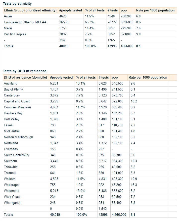
25. I've added Tests (# performed and # people tested) as well as retests, and testing rates based on Stats NZ latest Census data (which differs from projections that MOH are using as per earlier tweet). I'd like to colour-code bars and assoc. column together but you can't.

25a. What I *could* do is put a rectangle around each column/bar grouping to visually tie them together, but I personally find that even more distracting.
Maybe I'll make Table transparent, and park suitably shaded rectangles underneath to better tie those bars with cols.
Maybe I'll make Table transparent, and park suitably shaded rectangles underneath to better tie those bars with cols.

26. This is starting to take up quite a bit of the canvas. I'll be adding title above later, and will add navigation to allow users to see Small Multiples of the DHB data showing trends for each across time. Tempting to try to squeeze a map in, but does it really add anything?

26a. Previous screenshot had DHBs sorted by popn. This shows how I intend - sorted North to South. Users can of course sort it however they want.
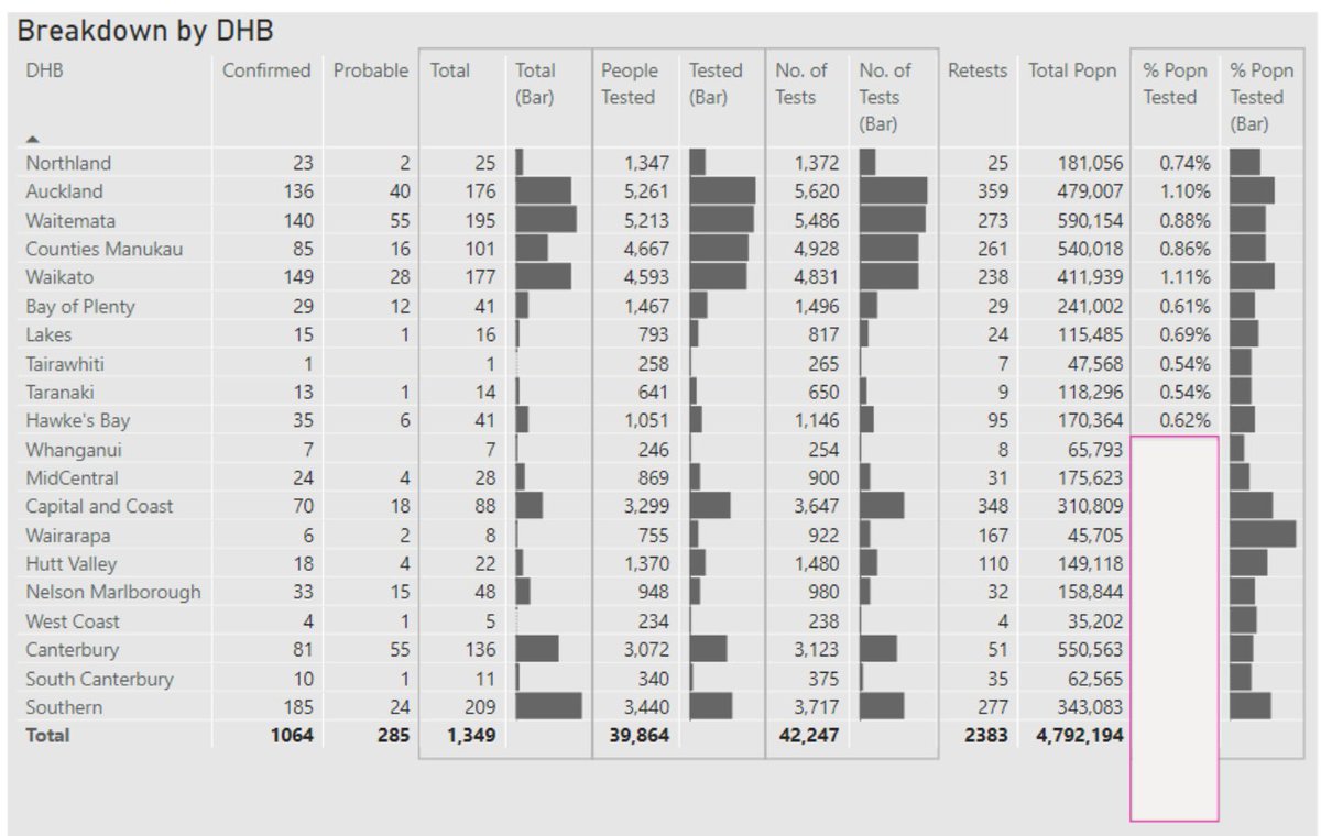
Should I add data bars for Popn also? There *is* room...
Should I add data bars for Popn also? There *is* room...
26b. Setting column widths in #PowerBI tables is a PITA as they don't (yet) expose a column width setting. So you've got to eyeball it. I use a shape as a ruler, as shown here.
There are a LOT of different requests for this over at the Ideas site. e.g:
ideas.powerbi.com/forums/265200-…
There are a LOT of different requests for this over at the Ideas site. e.g:
ideas.powerbi.com/forums/265200-…
27. The beauty of #PowerBI is that I just need to push refresh, and everything is updated.
I believe @minhealthnz just uploaded the new figures for NZ, so here's the update. I probably should supress the last day, as it's not a complete day...it was the numbers as at 9am.
I believe @minhealthnz just uploaded the new figures for NZ, so here's the update. I probably should supress the last day, as it's not a complete day...it was the numbers as at 9am.
28. Trying now to add Hospitalised figures from health.govt.nz/our-work/disea…
The image below shows that @minhealthnz aren't even giving web tables unique names. So again I'll have to manually cut and paste from their webpage. Again, a fail in the age of open data.
@ChiefSciAdvisor
The image below shows that @minhealthnz aren't even giving web tables unique names. So again I'll have to manually cut and paste from their webpage. Again, a fail in the age of open data.
@ChiefSciAdvisor
29. As per earlier tweet, @minhealthnz use variable banding on Covid data. I want to keep existing bands but add new column that uses decade bands where possible. Turns out if you put 70+ in #PowerQuery's 'Else' clause, it thinks you want the number 70, not the string "70+".
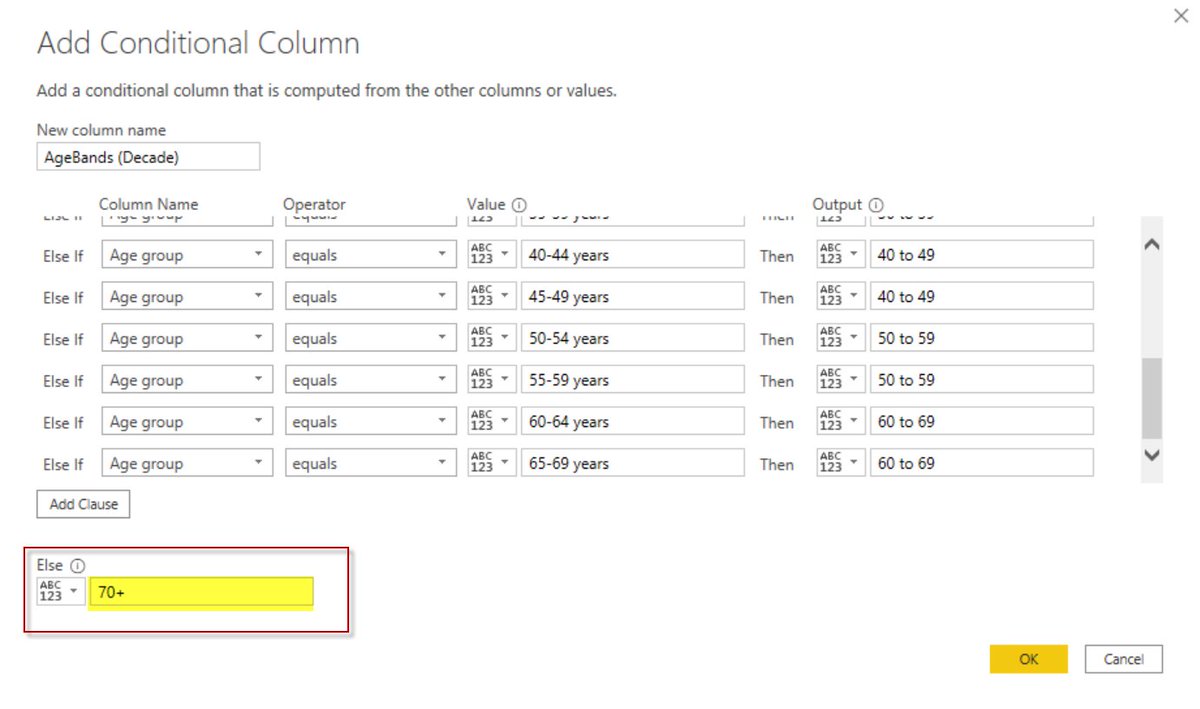
29b. The only way to get it to accept 70+ is to manually adjust the M code. (If you use quotes in that 'Else' clause dialog, you get "70+" and not 70+)

30. I've added Case by Age Group. But I've also added in the underlying Popn by Age Group. Now things are starting to get interesting...now we can calculate *incidence* per Age Group.
Please hold, caller...
Please hold, caller...

30a. Well look at that, will you: When adjusted for popn, 20 to 30 year olds have higher incidence.
Not surprising, given a) They probably made up bulk of overseas returns and b) They are probably more social and c) They are more likely to attend weddings and stag parties.
Not surprising, given a) They probably made up bulk of overseas returns and b) They are probably more social and c) They are more likely to attend weddings and stag parties.

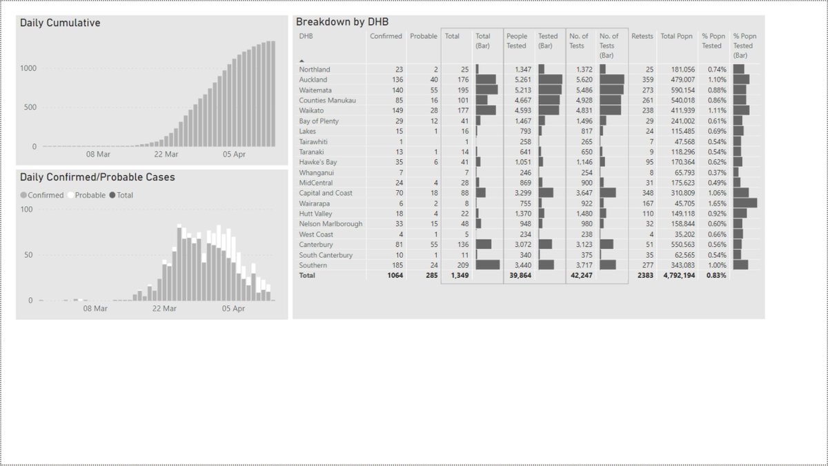
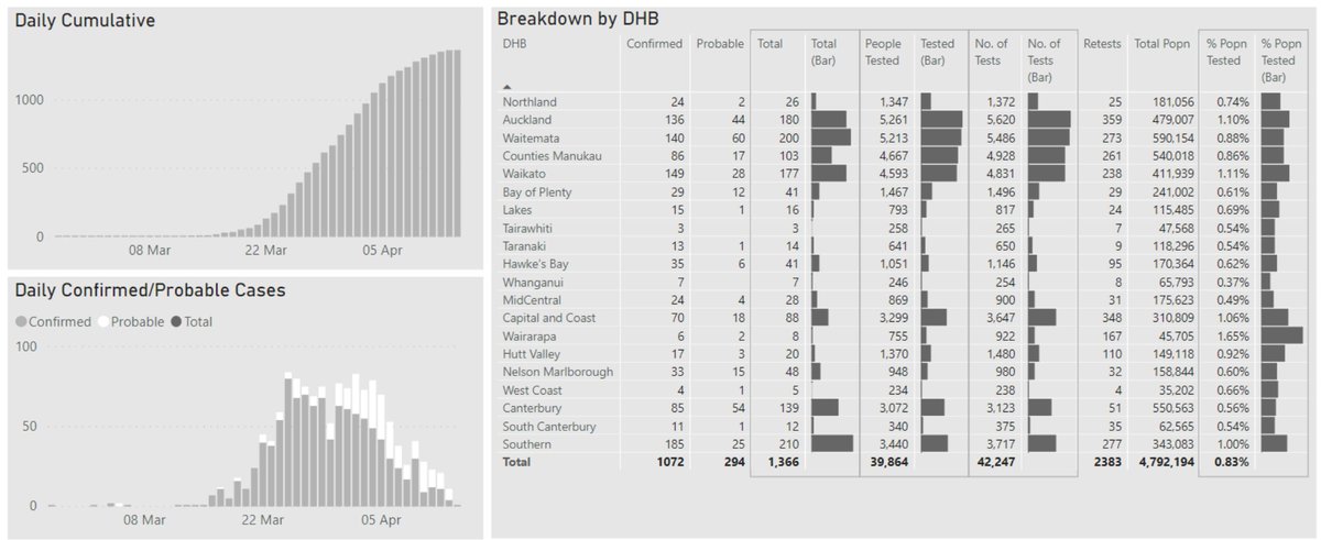
30b. Here's how the dashboard is looking now. Yet to do titles, labels etc. Right now, we're still in Data Discovery mode.
Feedback? Comments? Requests? Colour ideas?
Feedback? Comments? Requests? Colour ideas?

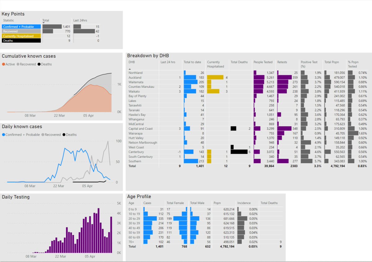
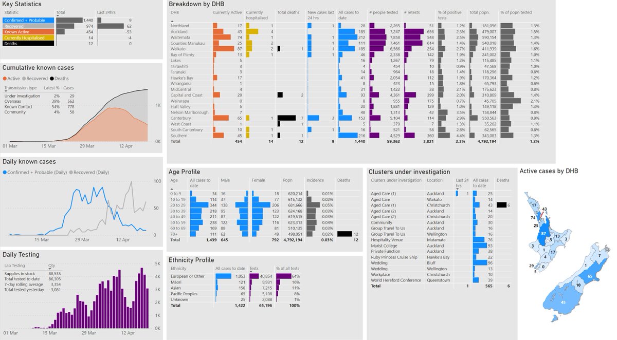
31. Made the canvas 25% bigger so I could fit in some more visuals. First up, some summary stats in a Table. (I'm not a fan of BANs.) Always feel in two minds about databars in a table like this when the lengths between rows CAN be compared, but between columns cannot. But hey...

32. Also added in the number in hospital in each DHB. Figures don't sum to the summary stats, even though both figures are from MoH. Maybe different cutoff times?
This is the reality of working with data from the web. No guarantees anything adds up.
Next, ethnicity breakdown.
This is the reality of working with data from the web. No guarantees anything adds up.
Next, ethnicity breakdown.

33. I'm thinking about what is actually usable/insightful info, vs what is unnecessary. Would end users cares about the breakdown between Confirmed and Probable? This distinction takes up a lot of space. It adds little. Out it's gonna go. Any objections?

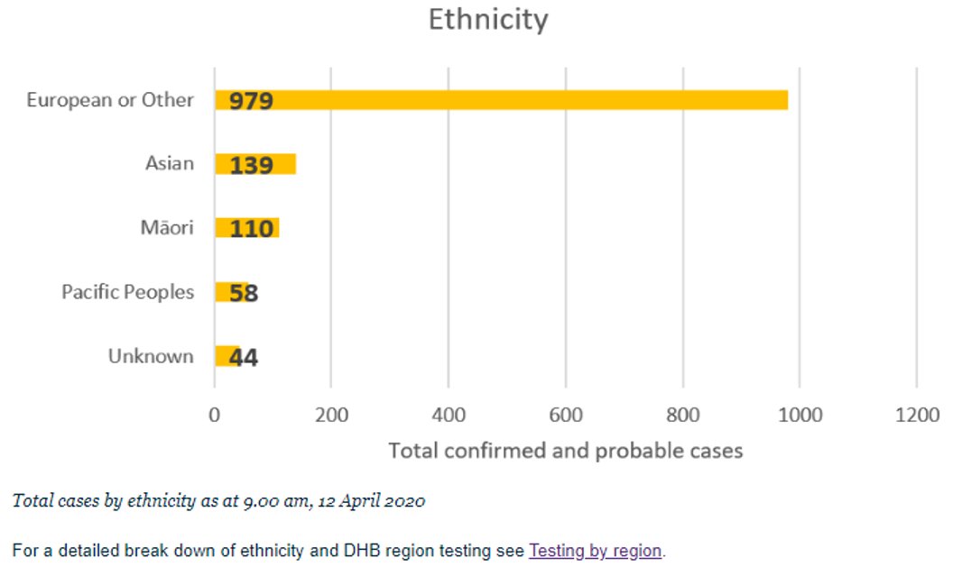
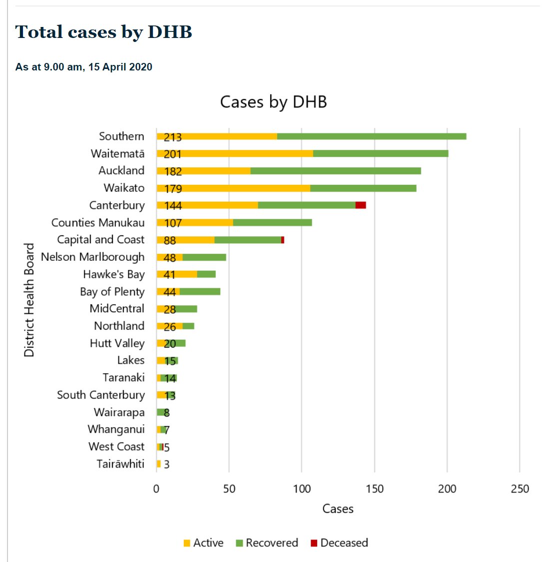
34. The only place I can find on the Ministry of Health where deaths are reported by DHB is in this picture of a graph.
C'mon @minhealthnz - do I REALLY have to get my ruler out or go through previous press releases to get a figure that should be available in a Table or by CSV?
C'mon @minhealthnz - do I REALLY have to get my ruler out or go through previous press releases to get a figure that should be available in a Table or by CSV?
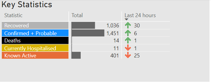
35. Here's today's latest NZ Covid figures in the half built dashboard. MOH changed column names on quite a few web tables, which required some quick recoding.
I'll have to add in a linechart showing % popn tested over time and/or do it as small multiples by region.
I'll have to add in a linechart showing % popn tested over time and/or do it as small multiples by region.

36. Ah the joys of stitching together data from multiple web tables and press releases on a rush.
Data modelling, schmoddling.
For some reason this reminds me of the Flying Spaghetti Monster. (I certainly have been touched by his noodly relationships)
Data modelling, schmoddling.
For some reason this reminds me of the Flying Spaghetti Monster. (I certainly have been touched by his noodly relationships)

37. I'm making up the saddest measure of this dashboard. There are real people behind these numbers. And their families and health professionals.
But I'm NOT going to put a comma in that number format. No way. We won't be needing it. Not if you #StayHomeNZ
But I'm NOT going to put a comma in that number format. No way. We won't be needing it. Not if you #StayHomeNZ
38. Plotted "Diagnosed" (more correctly Confirmed + Probable cases) against "Recovered". I hadn't expected there would be such a short offset between the two profiles. Maybe by the time you're symptomatic, you generally recover quickly? This graph meaningful in any way to anyone?
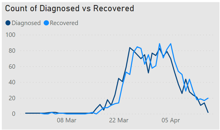
38a. Note that I'm not considering adding this to my dashboard. Just want to see if anyone has any wisdom about whether it falls in the "Potentially Useful/Interesting" camp or "Likely completely misleading/dangerous" camp.
And also note that this isn't a longitudinal study :-)
And also note that this isn't a longitudinal study :-)
38b. That graph in 38 was just me being incompetent. This is me being (hopefully) less so.
Don't know what I was thinking....
Don't know what I was thinking....

39. Have switched from using column charts to area/line charts for cumulative/daily graphs, as it more clearly shows multiple series on the one graph.
I've also put Y axis on RHS, closer to where the action is. HT @TheSpinoffTV
Colours are placeholders. Need #Datafam advice!
I've also put Y axis on RHS, closer to where the action is. HT @TheSpinoffTV
Colours are placeholders. Need #Datafam advice!
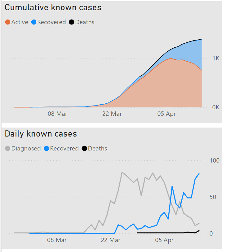
39a. I chose to put Deaths at the top of the Stacked Area because I felt it wasn't visible enough when at the bottom running along the X axis.
The whole purpose of the lockdown is to avoid deaths. So I think it's fitting it goes right at the top in a prominent place.
The whole purpose of the lockdown is to avoid deaths. So I think it's fitting it goes right at the top in a prominent place.

39b. Not for the first time, I wish #PowerBI had more control over markers etc. You can't have markers on a continous date axis. But without them, then the straight line that gets drawn between dots makes it look like we had constant deaths between the first point and this one.
39c. If you are a #PowerBI user you should go vote for the ability to have markers for charts with categorical axis, so that our end users have less of a chance of drawing incorrect conclusions from our data.
Go. Vote.
ideas.powerbi.com/forums/265200-…
Go. Vote.
ideas.powerbi.com/forums/265200-…
39d. Aside: If you want to know why @MSPowerBI decided you can't have markers on a categorical axis, go read this:
It's a valid argument. I just don't care for it :-)
It's a valid argument. I just don't care for it :-)
39e. Whoops, here's a better entry point for that discussion.
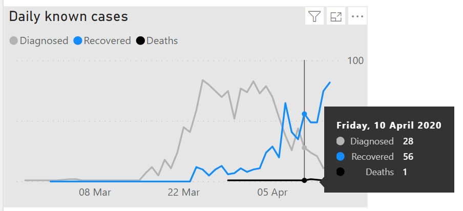
40. I've added daily testing bottom right, and moved the Age Profile table to make way for it, as it makes more sense to align graphs with time series vertically so users can more easily eyeball trends between them. Interesting to see that testing went up then down, now up again.

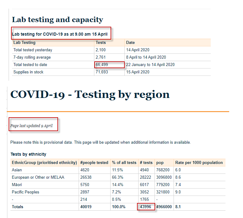
41. We've got 72k tests in stock. We've already tested around 1.5% of our popn, and this will get us to ~ 3%. I wonder if we buy these or make 'em, or both? Risk is if we spend these too quickly we might leave ourselves exposed.
Glad I don't have to make any hard calls...
Glad I don't have to make any hard calls...

41a. Another data issue with the MOH website: The regional/ethnic breakdowns of testing haven't been updated for days; the national totals get updated daily. Meaning anybody but MoH building a dashboard can't include a regional/ethnic breakdown. #Fail @minhealthnz
42. Before I had separate columns for the Data Bars to stop them obscuring numbers (Bottom). But I've realised I can use the Max CF setting to force the data bars to be narrower, and so have everything in the one column. If *only* that CF dialog was "live" and so easier to set.

43. Databars are so space efficient that you've got to ask yourself why you would ever want to use a bar chart instead.
Here I'm using them to make a Divergent Stacked Bar, so we can compare relative Female vs Male cases. Interestingly, Females have a much higher incidence. Why?
Here I'm using them to make a Divergent Stacked Bar, so we can compare relative Female vs Male cases. Interestingly, Females have a much higher incidence. Why?

44. Made male/female same colour so as not to introduce a visual distortion. Looks better. I'd like to add a breakdown by ethnicity but it's not recorded in the case data. (They only report ethnicity of people tested. Mind you, that's probably a proxy for % infected).

45. @ItsAMaysin suggested tying the colours in from the graphs, and formatting the items in the Key Points table top left to match.
Good idea. I think it works. I need some #Tableau #Datafam person to tell me what colours to use tho...us #PowerBI folk are "colour challenged" 🎨
Good idea. I think it works. I need some #Tableau #Datafam person to tell me what colours to use tho...us #PowerBI folk are "colour challenged" 🎨
46. Trying to work out how to fit in a map. And trying to source said map. And still trying to get MOH to a) update regional/ethnic testing data and b) provide ethnicity breakdown of confirmed cases by DHB. Deaf ears.

47. Hooray...today @minhealthnz added 3 IMPORTANT columns to their Covid 19 data. On the upside, I can now do a much better job of showing how things are changing by region. On the downside, a) I need to rebuild my dashboard to include this and b) they haven't provided timeseries
48. Added summary tables to the top left of graphs given there is (currently) space, as well as # tests by ethnicity.
Have also stopped scraping data direct from MOH website in favour of manually cutting data into Excel each day so I can create timeseries out of daily snapshots
Have also stopped scraping data direct from MOH website in favour of manually cutting data into Excel each day so I can create timeseries out of daily snapshots

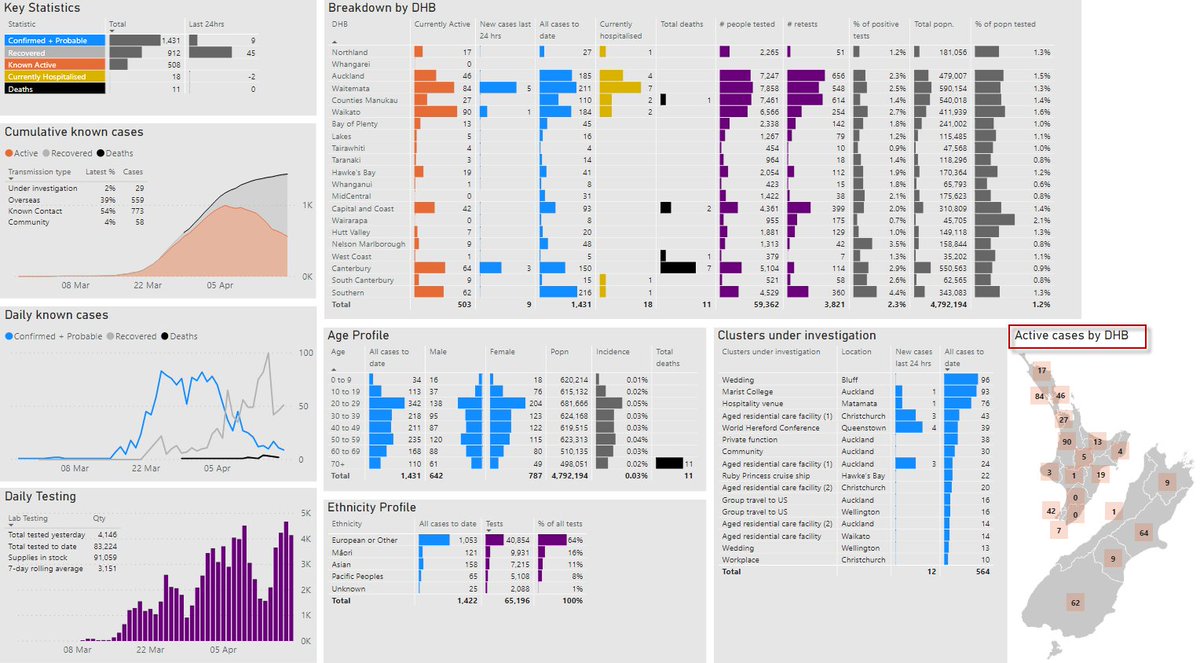
49. I've added Currently Active cases by DHB, as well as a breakdown by cluster bottom right. Still very much a work in progress...for instance I still want to add Small Multiples/Panel Charts to show regional comparison as well as a shape map (but #PowerBI makes that very hard).
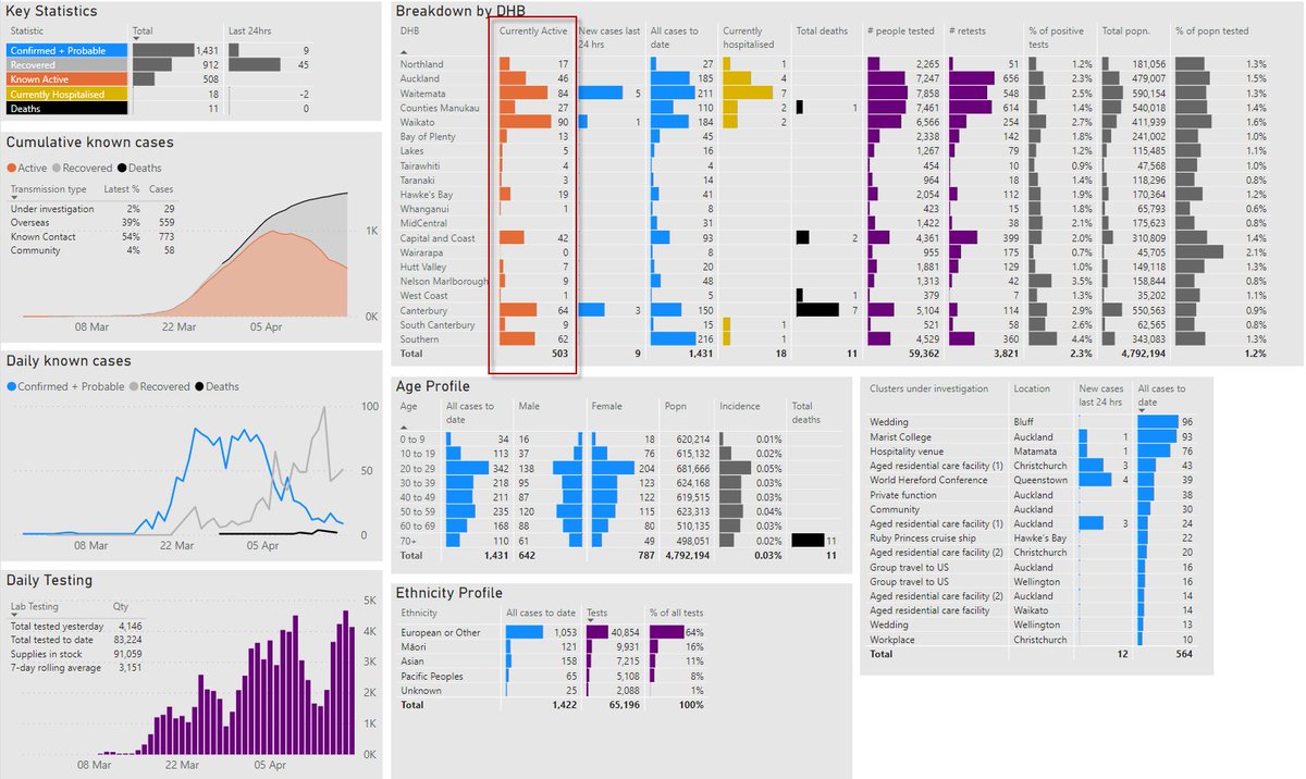
50. I added an image of NZ with active cases with islands geo-shifted to use less space). Used a text box as a title and found that there is no DIN font option in text boxes, but as per @MMarie you can use DIN in tb title, which is what I have done here.
dataveld.com/2018/01/02/fon…
dataveld.com/2018/01/02/fon…
51. I've moved to a combo of #PowerBI shape map and superimposed data labels. The idea is to not force the user to hover over each point in order to get the numbers encoded in the shape map. Also, native shape map doesn't have a key afaik.
Also added deaths by cluster. Mission.
Also added deaths by cluster. Mission.
52. Trying a different layout that's a bit more space efficient. This will also allow me to add notes down the RHS.
Any thoughts?
Still lots to do...including explanations of data sources etc.
Any thoughts?
Still lots to do...including explanations of data sources etc.

53. Let's try replacing those data bars under the Last 24 Hours column with icons. Cool...arrows look better than the data bars we had before. But I'll need to adjust the number format to suppress negative numbers.
Please hold, caller...
Please hold, caller...

53a. Cool, that's easier to process. And #PowerBI even lets you align the numbers so they appear right beside the arrows. Nice work, @MSPowerBI...although it would also be handy to be able to align the icons so they appear beside right-aligned values.
53b. Can anyone spot the problem with my choice of CF colours here?

53c. This just doesn't look as effective as coloured icons. Mind you, this is probably more like how it looks to someone with RG deficiency. (Sorry, can't immediately recall the correct word).

54. The Ministry of Health added a new table today that gives 2 things I couldn't derive from the source data: Recovered and Active by Age.
But those aren't really that useful a statistic, c/w Cases and Deceased. So I'm making the call to leave those two out.
But those aren't really that useful a statistic, c/w Cases and Deceased. So I'm making the call to leave those two out.

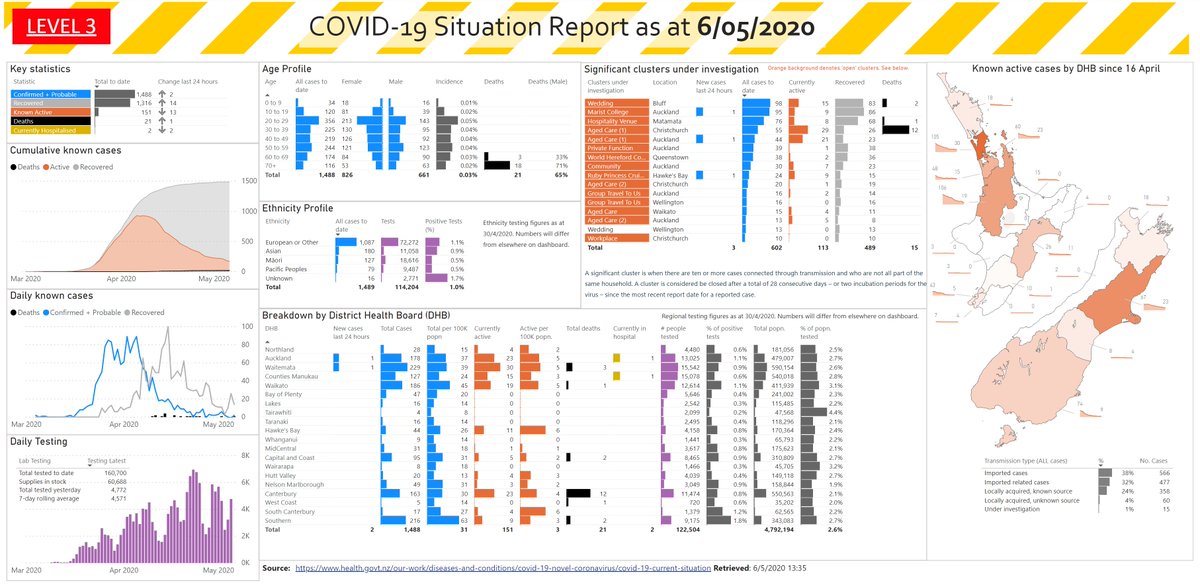
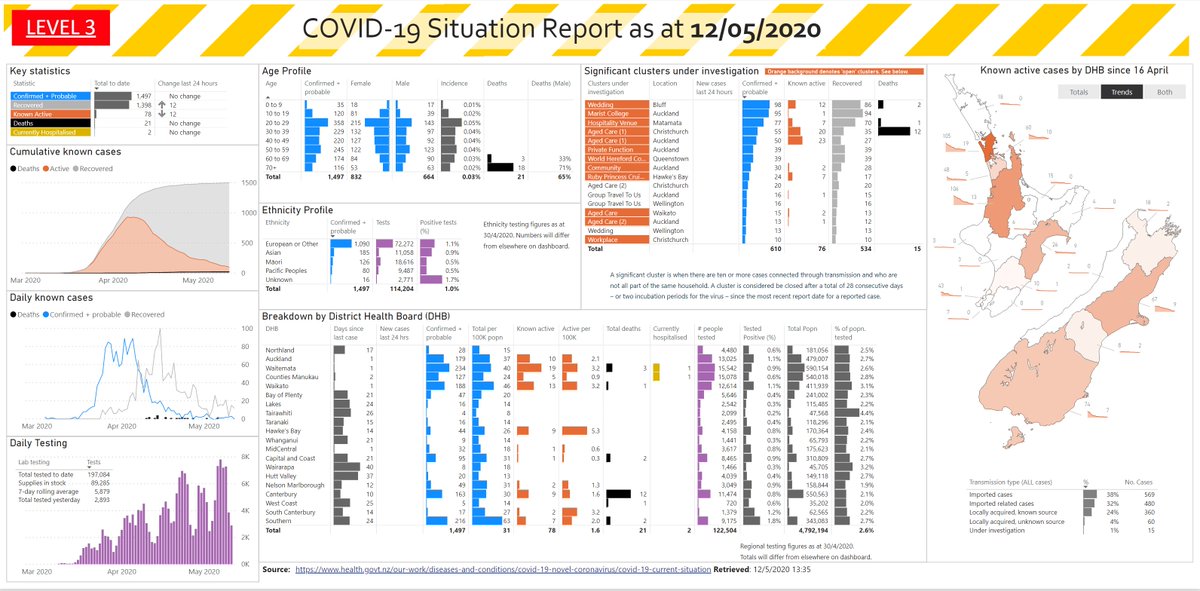
55. I've incorporated the NZ Government Covid 'branding' from covid19.govt.nz/latest-updates/ and changed the format back to more of a landscape orientation.
I'm not 100% happy with the grey background, but it helps the DataBars stand out more in conjunction with white gridlines.
I'm not 100% happy with the grey background, but it helps the DataBars stand out more in conjunction with white gridlines.
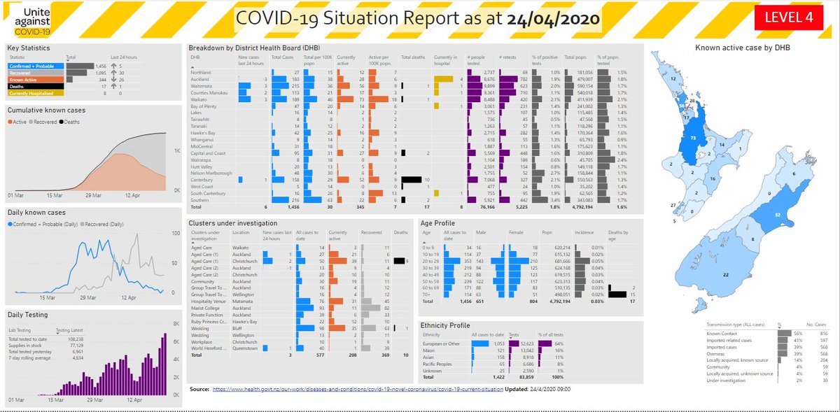
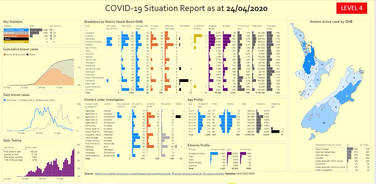
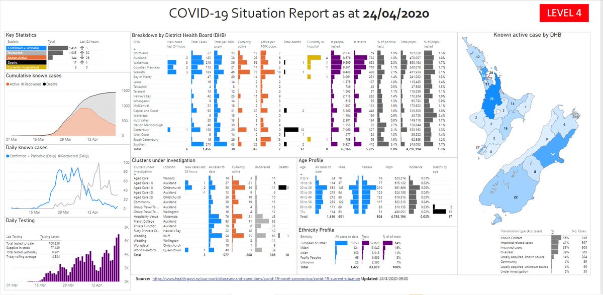
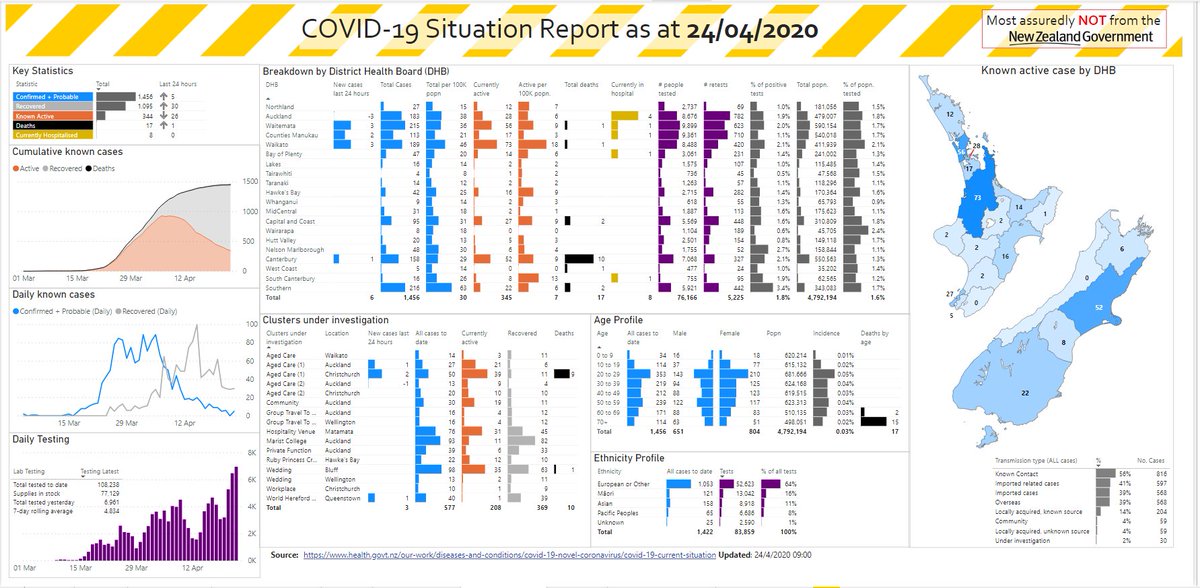
55a. By contrast, this is how the "Official" dashboard from the Government looks. It's in portrait layout, and so doesn't fit onto one screen, so I've taken three screenshots.
If you want to find out more about their dashboard, there's a YouTube video:
If you want to find out more about their dashboard, there's a YouTube video:


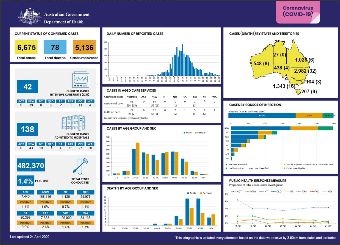
55b. And here's the dashboard from the Australian government that you'll find here: health.gov.au/news/health-al…
56a. Time to play around with colour options. First up, I've copied the sheet, and removed all backgrounds to see what it looks like in plain white.
It's a bit bright on the eyes
It's a bit bright on the eyes

56b. Here it is with borders one shade darker. I like that less, but maybe if I colour the background it will help.

56c. @visualisingdata has some common background colour tones in the 2nd edition of his book that I just took delivery with. Maybe I could try these...but of course without adjusting the DataBar they might look bad for the wrong reasons. But let's cycle through a few anyway.
56d. #FFFFCC is one I see a lot, but I'm not sure I like it here. Maybe the gaps between borders doesn't help
56e. Here's the same thing, but with no space between the visuals.

56f. And ditto in white. Notice the misalignment of borders? I blame #PowerBI for that...I have NEVER managed to get things to align perfectly on tessellated type layouts, and I swear I have seen PBI resize things by a pixel of its own accord. You?

56g. Oh, and also notice that some horizontal lines in the tables seem to be missing, and others thicker? That's actually why I went with grey backgrounds in the first place...they seemed more 'forgiving' of #PowerBI's inconsistencies when it comes to grids in Tables. GRRR!
Having decided I like the white branding without gaps the best, it's time to apply my fake New Zealand Government branding, along with a suitable disclaimer, @genetis ;-)
57. @genetis made more than one astute suggestion/critique, incl changing order of Deaths in cumulative graph to bottom (but as shown here it gets lost I think) and moving Age/Ethnicity to the top (as shown here I think that's a good call, and it puts clusters table next to map).

58b. Can you switch one off and force both series to use the same scale? If you find the Show Secondary Axis option you'll see that strangely, #PowerBI tells you that it's already off. (Bug, @Will_MI77?)
58c, But if you toggle it on, you now have the option to turn in off for real. And it seems that both series now respect the same scaling, if my experiments are anything to go by.


59a. You *can* add a Visual Header Tooltip that tells the user what to do, but that is far less discoverable. Plus there's no alignment options...and the default alignment looks pretty messy here.

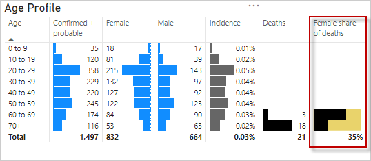
60. Strange that @minhealthnz don't report deaths by gender. I source this from press releases, and have just added it in. (I took out popn count to make room for it, but still have incidence, as a measure of "How widespread is Covid-19 in popn")
60a. Or rather, I added in % Male deaths. (Redundant to have both genders in, and I picked Male as they are over-represented here, although Male often used as 'default' choice in stats. I did list Male 1st in popn pyramid due to "convention". P'haps @CCriadoPerez can comment?)
61. Whoops...just realised I hadn't been consistent in my use of colour for the map. Elsewhere I use Blue to denote "Confirmed + Probable" but had used it in the map as well. But the map denotes Active cases, which is orange elsewhere. Rookie mistake. Here's original + revision


61a. I still need to find more appropriate colours for the data bars, but haven't had time or fortitude to experiment.
I find colours hard in any tool, but especially loathe the colour picker in Power BI.
You?
I find colours hard in any tool, but especially loathe the colour picker in Power BI.
You?
62. Time to break out the Small Multiples to compare across different DHBs. First, here's what I can do using individual charts and a LOT of copying, clicking, and crying.
(Dark grey shows totals before @minhealthnz started breaking down further by active/recovered on 16 April)
(Dark grey shows totals before @minhealthnz started breaking down further by active/recovered on 16 April)
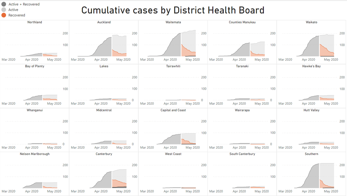
62a. Look at just how steep those dark grey bits are folks. It only takes a single case to spark off a Corvid-19 inferno, which is why you need to ignore Rage Against The Machine's advice, and instead do exactly what they tell you.
63. What if I added *SPARKLINES* to the map, so that you could not only see what the 'Active' figure is today, but also what it was for the last few weeks?
I've done the North Island. Looks pretty good. Lakes in the middle gets a bit lost, so I might move it and use a callout.
I've done the North Island. Looks pretty good. Lakes in the middle gets a bit lost, so I might move it and use a callout.

63a. I'll try adding the start number on the left too. Currently using Card Visuals for the numbers, but will switch to using a second (hidden) series in each sparkline that I just use to populate a start and end datalabel.
64. Here's today's #PowerBI NZ Covid-19 report. Instead of just showing current active case count in the Shape Map I now have Sparklines showing trend in Active for as far back as @minhealthnz give us DHB-level active cases.
Will add toggle to show this or just simple numbers.
Will add toggle to show this or just simple numbers.
65a. Dataviz is about constantly tweaking. Here's a small one I made today: Previously I added an orange label calling out what the orange CF means.
Okay, that works.
But why not go the whole hog and make the message look exactly like the CF it talks about?
Okay, that works.
But why not go the whole hog and make the message look exactly like the CF it talks about?


66a, Wouldn't it be cool if you could make a Shape map display a value, or Sparklines, or both!
All courtesy of a Slicer with some bookmarks in front of it that 'harvest' the attempted Slicer click, then change the status of things accordingly (including the Slicer).
I know!
All courtesy of a Slicer with some bookmarks in front of it that 'harvest' the attempted Slicer click, then change the status of things accordingly (including the Slicer).
I know!


66b. Go on...have a play. app.powerbi.com/view?r=eyJrIjo…
Warning: Performant at *loading*, it ain't.
Performant at *insight-ing*, it is.
Warning: Performant at *loading*, it ain't.
Performant at *insight-ing*, it is.
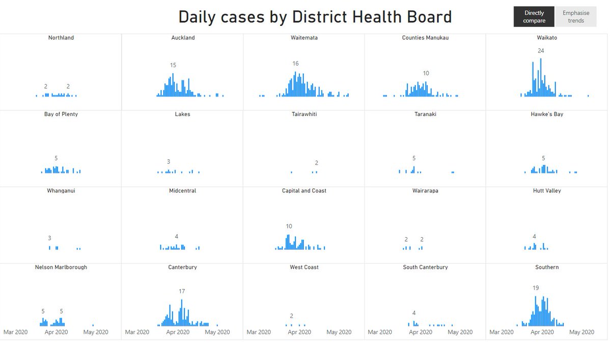
67a. Working on a Small Multiple view giving daily cases by DHB, I had some very strange looking wide graphs. Took me too long to work out what was going here.
Any takers, before I spill the beans?
Any takers, before I spill the beans?

67b. Beans Spilled: Show items with no data. Wish it was on by default oftentimes. Maybe a theme can help with that?


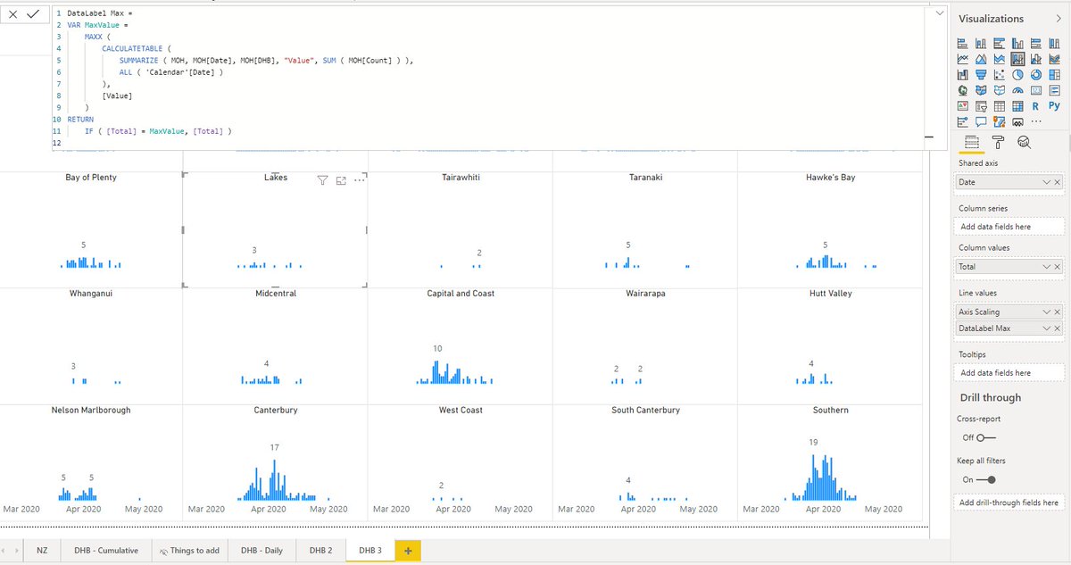
68a. If you stack lots of little charts together - and sync their axes so you can directly compare - you can build a panel chart. But that might leave you with lots of redundant things, like the repeated Y Axis I've highlighted. Distracting.

68b. Here I've changed the font color of the Y axes for the middle three columns to white to hide them, and changed the alignment of the far right column to Right Aligned.
Much tidier.
Much tidier.

68c. In fact, you could argue that the X axis for the middle 6 graphs is redundant too. Here's how it looks without them.


68e. Here's how it would look if I ditched the X axes from the top row. Not sure if this is an improvement or not.

68f. Here I use a 3 series DAX-driven solution to label max point(s) in each visual so I can ditch Y axes completely! This took me about a year to gain the PBI skills to implement, and setting up one panel takes hours. My advice: just buy @ZebraBI: It does this for you in seconds
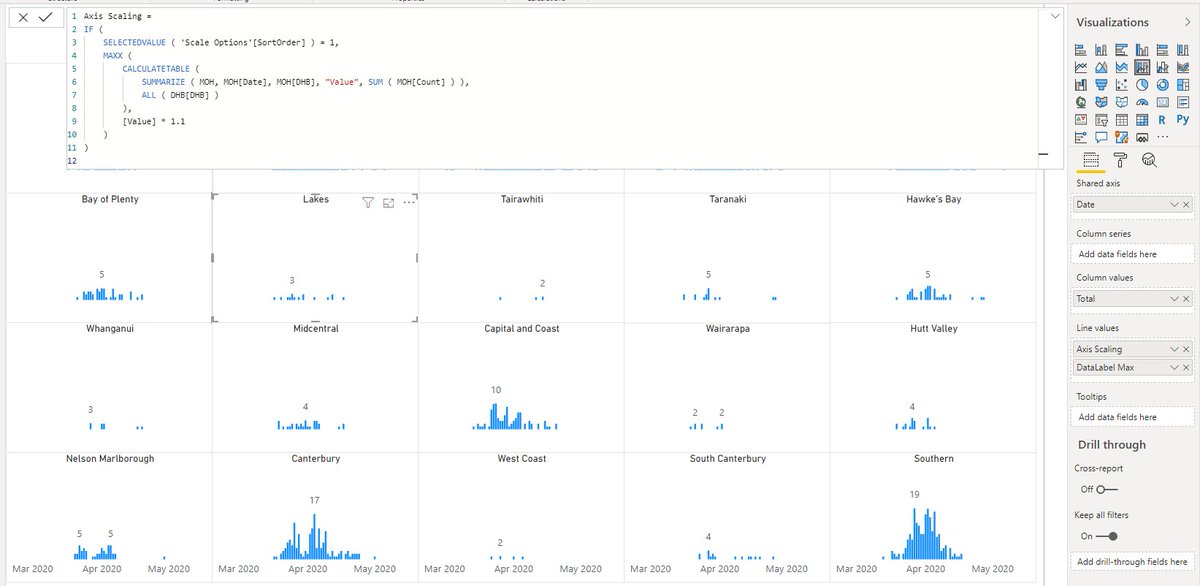
68g. Previous screenshot was for autoscaling code. This one shows the code, that lets me just apply datalabels to the Max value in each series. (Something that PBI should allow out of the box IMHO)
Vote for measure-driven datalabels here: ideas.powerbi.com/forums/265200-…
Vote for measure-driven datalabels here: ideas.powerbi.com/forums/265200-…
69. Some would say it would be really cool if you could toggle the shared scaling for small multiples between "on" (so you can compare) and "off" (so you can see the details).
(Some of course wouldn't...and I expect to hear from Mr @lapajne shortly 😂)
(Some of course wouldn't...and I expect to hear from Mr @lapajne shortly 😂)
70. I've broken out the data to show cases from international travelers (dark blue) vs local transmissions (including contacts of those international travelers).

70b. Weird: In #PowerBI desktop I get the sort order I want - dark blue on the bottom. But in the service, I get the reverse - dark blue on the top. Anyone seen this behavior before? I have a Sort Order composed via a Sort By column, but it's not consistent.
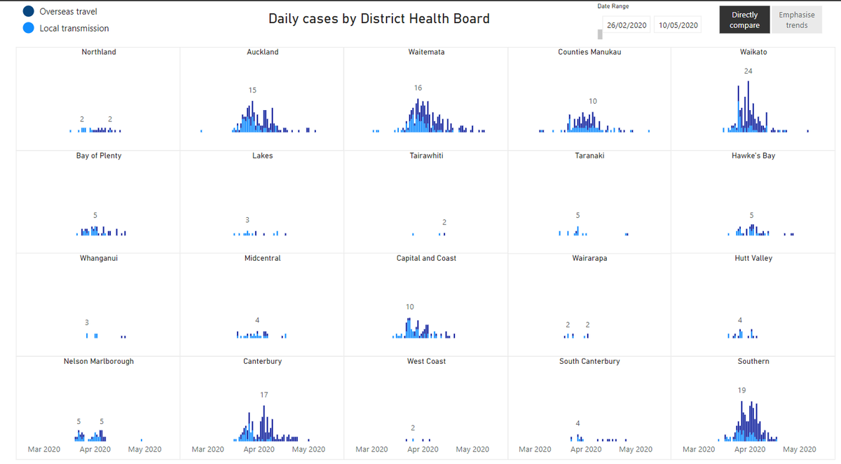

Whoops, posted same picture twice. Here's Desktop vs Service.


71a. Having a bunch of zeroes in a Table might sometimes be desirable, but here they are noisy. You could supress them by using a custom number format, but while that ditches the Zeroes, it still leaves the ugly DataBar dotted axis line

71b. So better to check if your measure returns zero, and if it does just suppress it.

72. Trying some light horizontal lines to better delineate my columns. May or may not show up in this screenshot but looks much cleaner and spacious somehow in mine.

72b. Trying another screenshot.

72c. Stuffed up that one too...some databars dropped out when I changed their measures I think. (Does that always happen?)
73a. I really love databars in #PowerBI. Much more space efficient than individual bar charts, and jointly sortable. They rock.
Not many people know you can do a 100% stacked databar in #PowerBI like I'm doing here....including @Will_MI77 😂
Not many people know you can do a 100% stacked databar in #PowerBI like I'm doing here....including @Will_MI77 😂
73b. (In reality, this effect is achieved by putting an appropriately scaled shape behind the table, and using white gridlines within the table)
73c. Working out how to add a legend to my stacked data bar far right. Making (faking) the column header formatting match the bar works well.
Unfortunately I can't find a way to add numerical female % labels to LHS and keep bars from overlapping :-(
Unfortunately I can't find a way to add numerical female % labels to LHS and keep bars from overlapping :-(

73d. I *can* add that Female Death % to the RHS. Initially I was worried that it's proximity to the grey (male deaths) series might mean people misinterpret it. But I think it's clear we're talking about Female for the value too...especially now I've added the title formatting.


