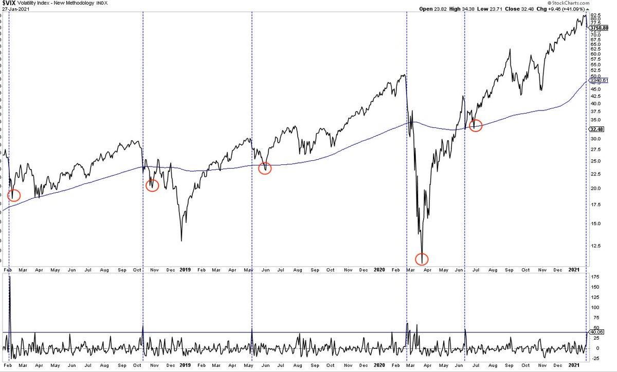
$VIX up >40% yesterday. Others in past 30 yrs. None marked the exact low on an intraday basis $spx 1/2 
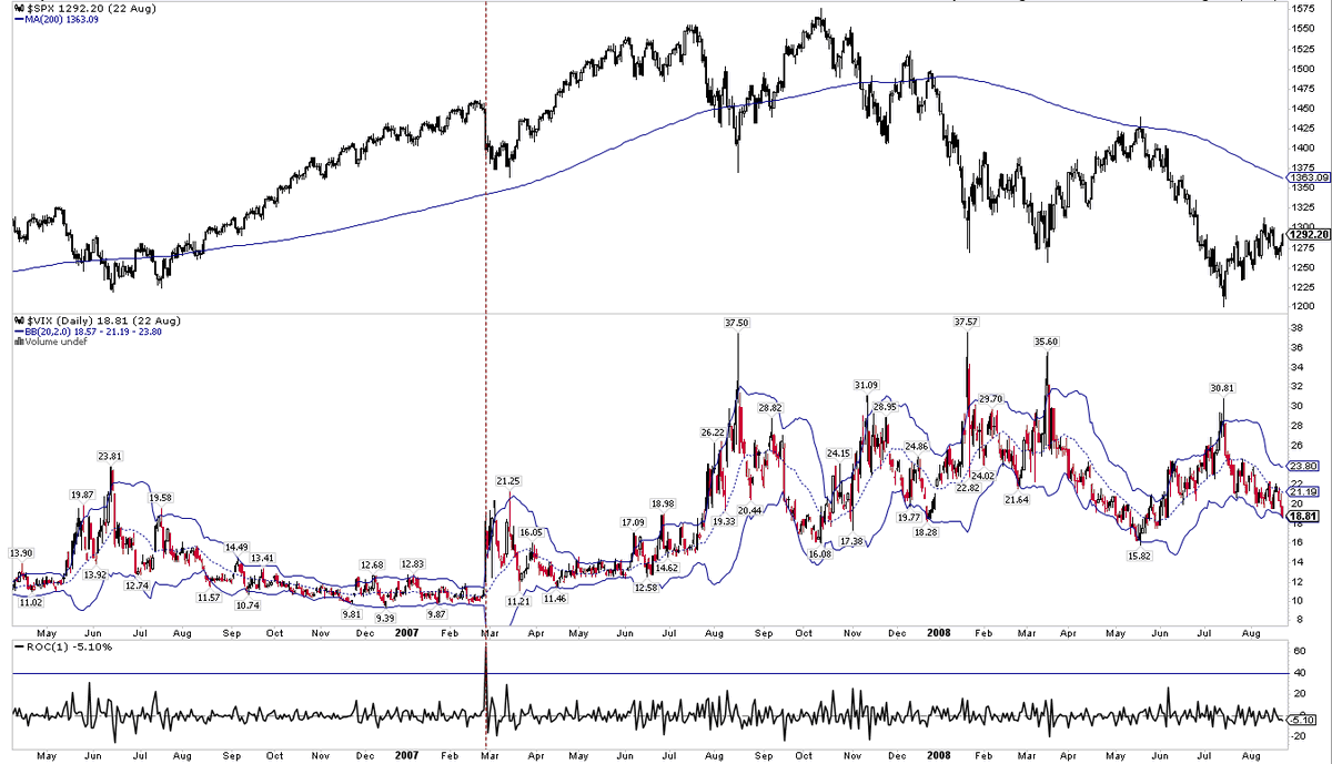
Cont 2/2
New intraday low today. For the immediate term, both the $vix spike and the mega distribution day pattern have been fulfilled. Charts on both earlier today and last night $spx
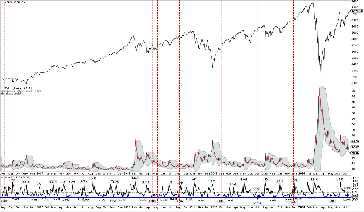
$Vix closed right on the lower Bollinger today. Vertical lines are days it closed below the BB in the last 5 yrs
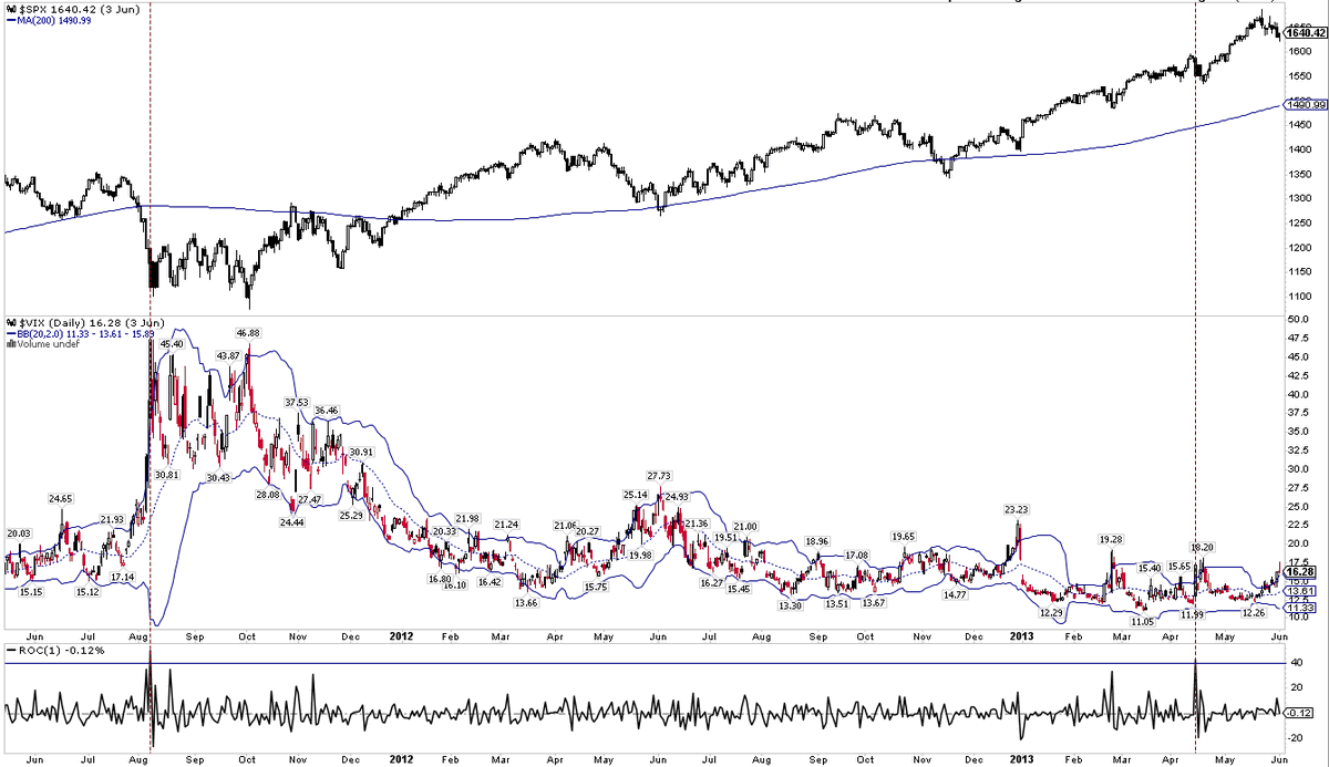
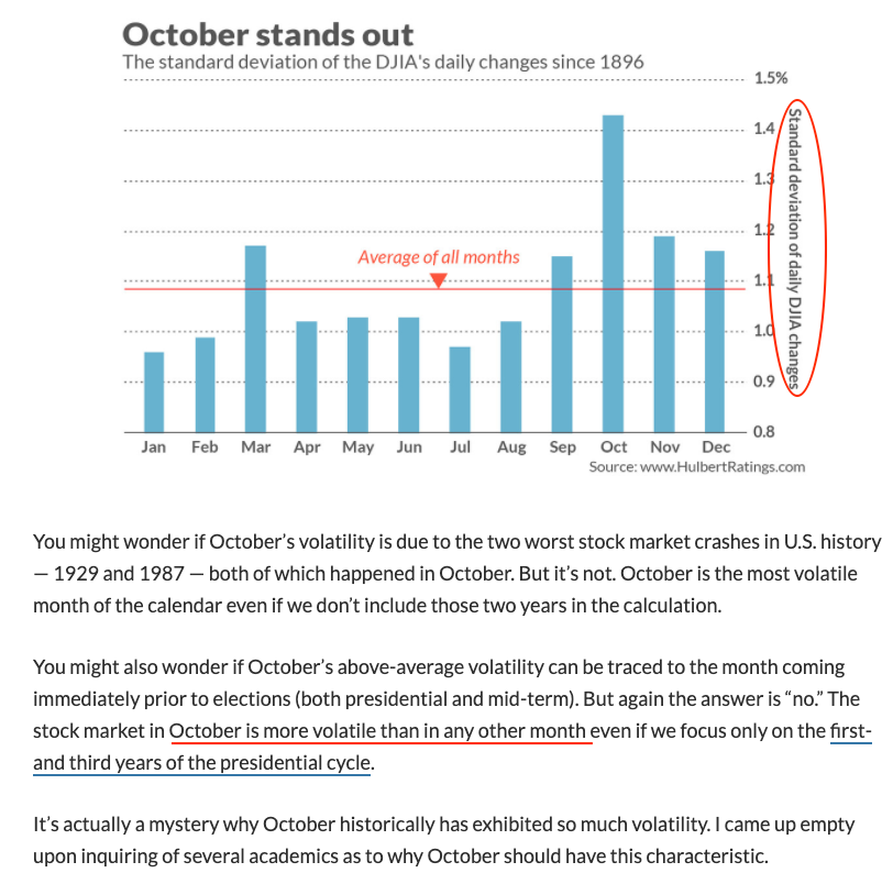
An August surprise typically results in a summer pop in volatility (between blue lines), but it’s been a while since $VIX entered the month well over 20
Narrator: there was no surprise this August, no pop in volatility and $VIX is still over 20
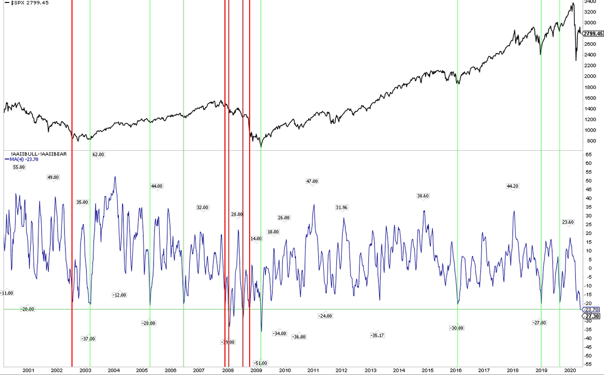
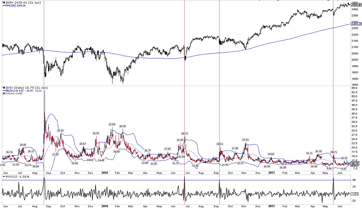
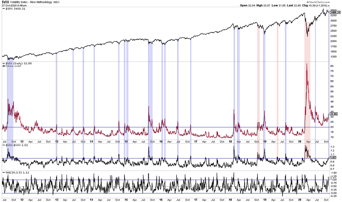
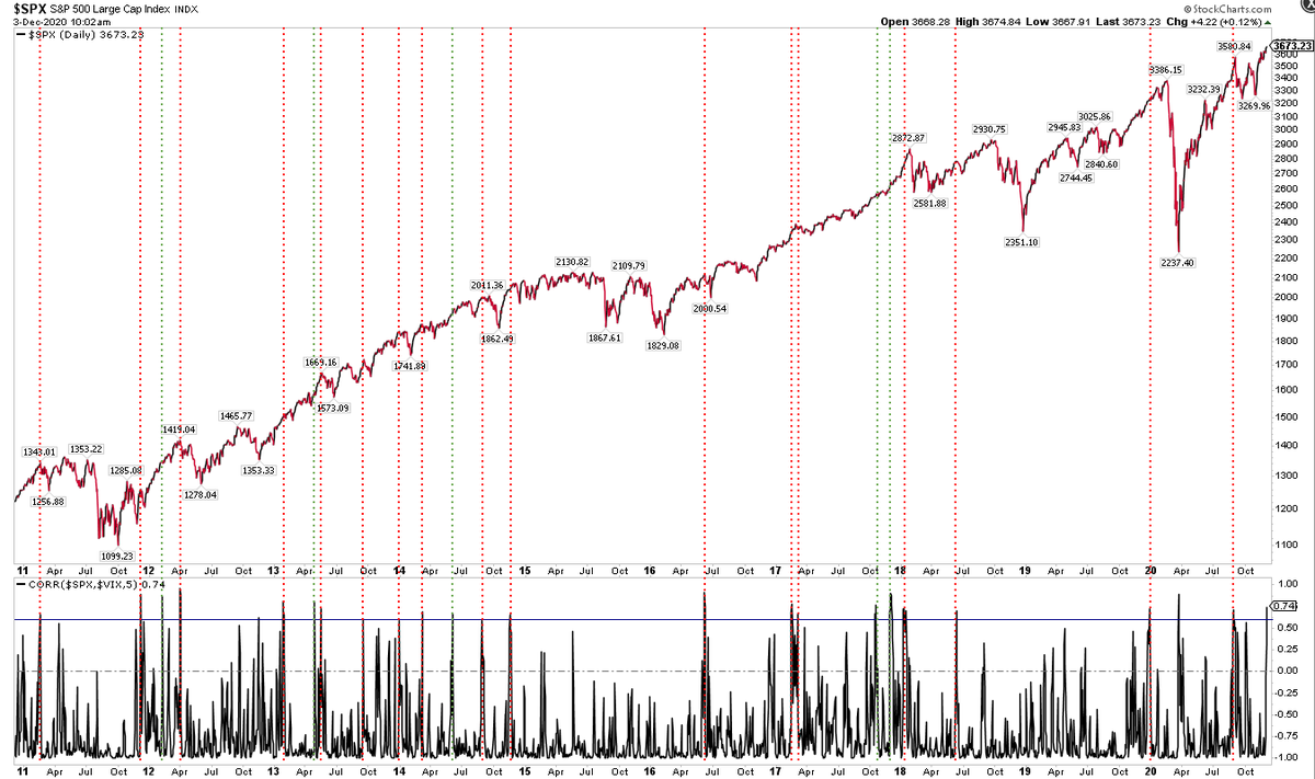
$SPX and $VIX have been unusually positively correlated. That has mostly been bad news (red lines) but not always (green lines)

So far so good and little reason to expect that to change $vix
https://twitter.com/ukarlewitz/status/1310593164240060416
Up 200 pts in 6 days and then down 100 pts in 3 days. Half the month still ahead :)
https://twitter.com/ukarlewitz/status/1312070428676898818
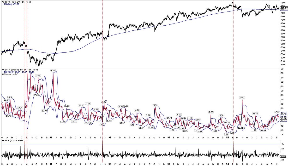
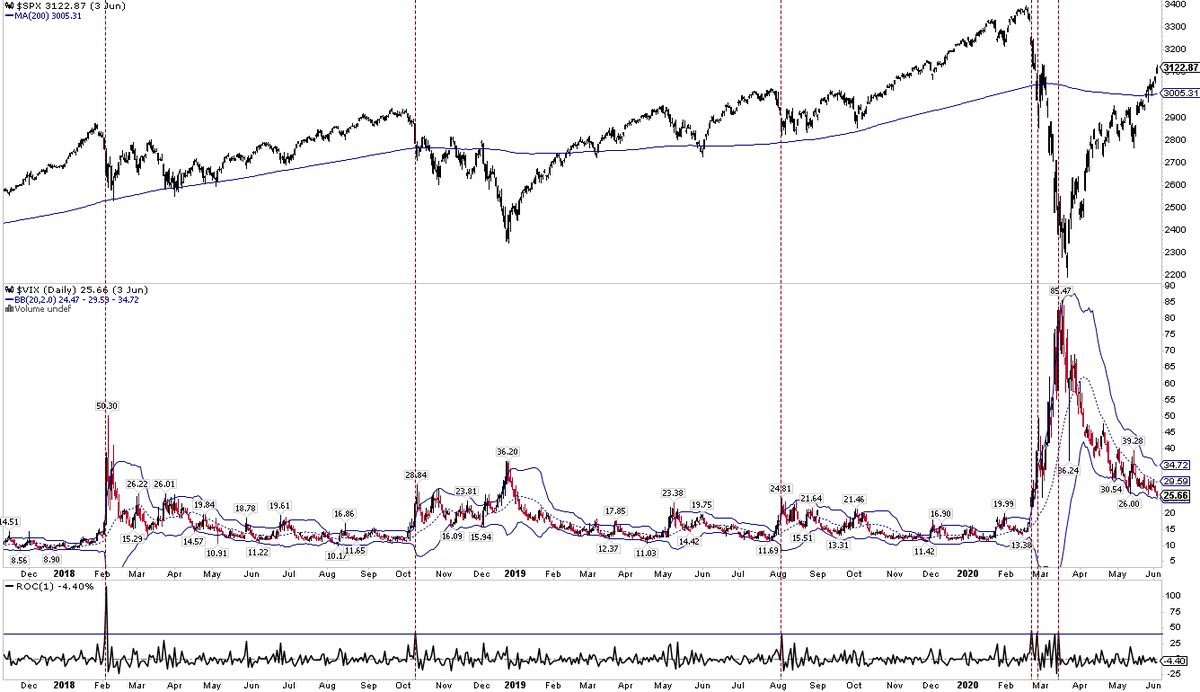
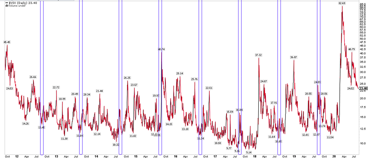
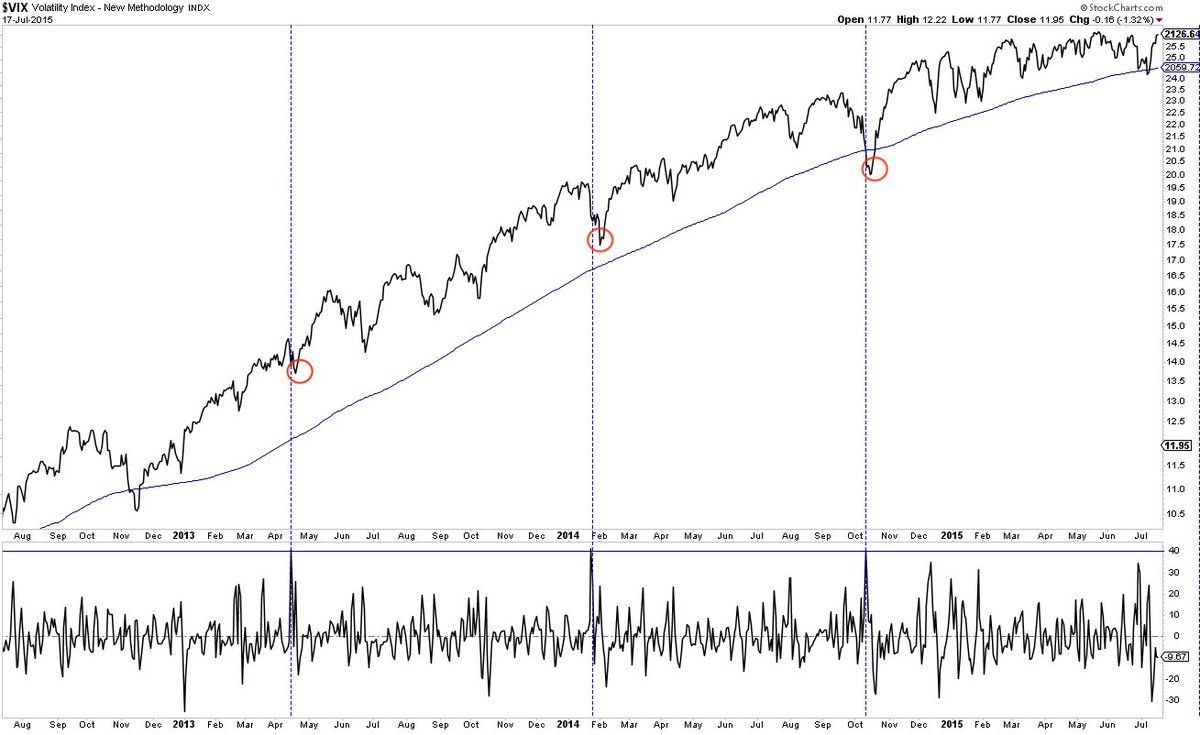
$VIX spike above upper BB + over 20 + in backwardation = usually (but not always) near a low in $SPX
The most accurate prognosticative chart for October
https://twitter.com/ukarlewitz/status/1312070428676898818
$VIX massive dump

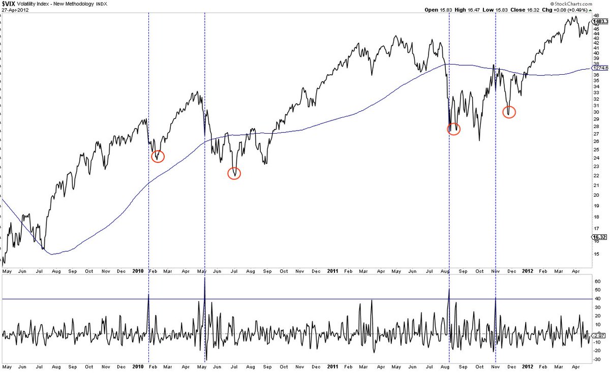
$VIX under 20 could initiate a grind higher
https://twitter.com/sentimentrader/status/1329111052471201796
Blue arrows when $vix <20
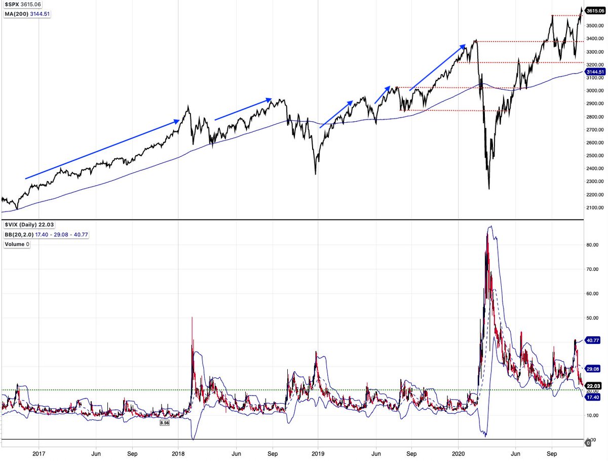
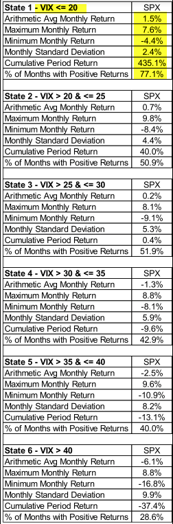
A little dated but this table shows the superior $SPX returns and R/R when $vix <20 versus higher. Hence, the ‘grind higher’ vs ‘things happen’ (std dev)
I like having the COTD
https://twitter.com/TheChartReport/status/1329197605801308162
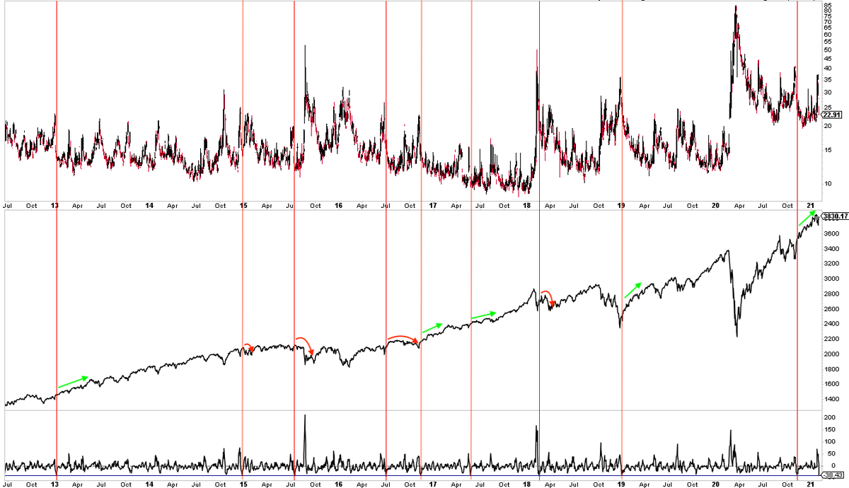
High positive correlation between $SPX and $VIX the past 5 days (bottom panel). In an uptrend, $SPX usually (not always) has an upcoming burp; some big, some small, some soon, some in a month
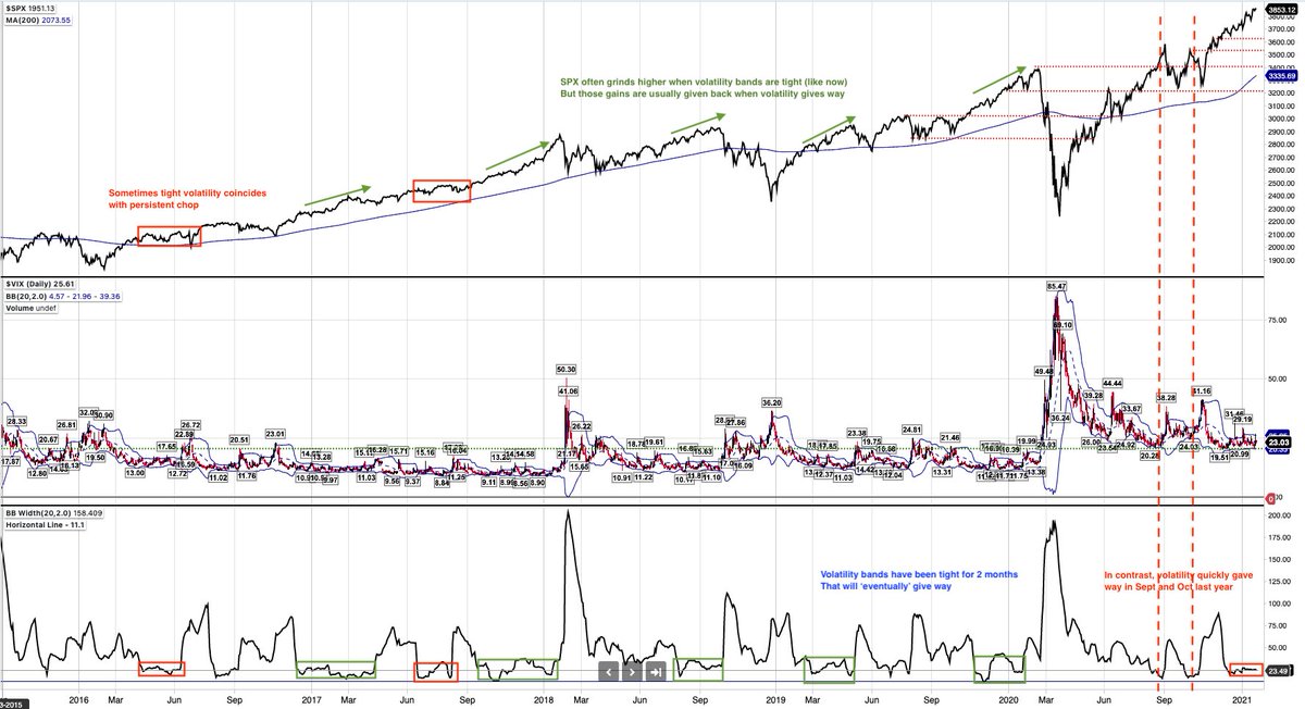
Volatility has stayed in a tight range for 2 months. That can go on but it will not last (bottom panel). The 'grind higher' in $SPX then usually gives way. Mr Market likes regime changes, keeps everyone on their toes
$VIX up +40% today (lower panel). Here are others since 2009. Looks like a lot of bounces in $SPX that then get sold (red circles), with one exception (green arrow)

$SPX +1.8% so far after a big drop on FOMC and a massive $VIX spike was strongly odds-on. That’s usually not the end of it
https://twitter.com/ukarlewitz/status/1354522457562959875
So that happened
https://twitter.com/ukarlewitz/status/1354538424078766081
The nearly 40% fall in $vix in the past week (lower panel) has led to inconsistent forward returns for $SPX (middle panel)
• • •
Missing some Tweet in this thread? You can try to
force a refresh