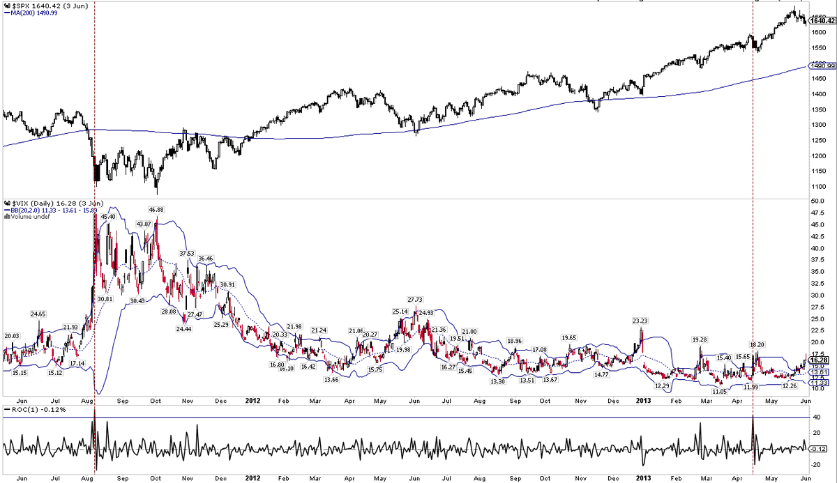
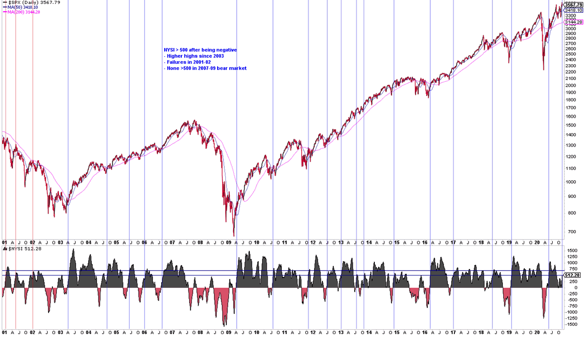
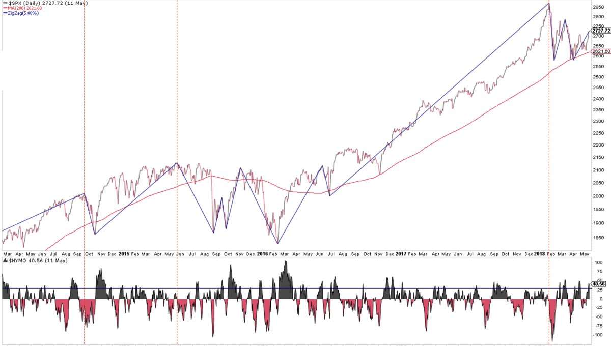
FinTwit is full-on breadth hating mode again. Reminder that was also the case until about a week before the June 8 high.
And at that $SPX high, A/D was at a new ATH and 97% of the $NYSE was >50-d and 70% >200-d. Breadth peaked with price
And at that $SPX high, A/D was at a new ATH and 97% of the $NYSE was >50-d and 70% >200-d. Breadth peaked with price
https://twitter.com/ukarlewitz/status/1265757894504374273
To each his/her own, but bad breadth is useful at price lows (a washout), but in real-time (key), it is a minefield of false signals at price highs. There are better signals available to you. Jmo from the past 26 yrs
https://twitter.com/ukarlewitz/status/1265754166611161088
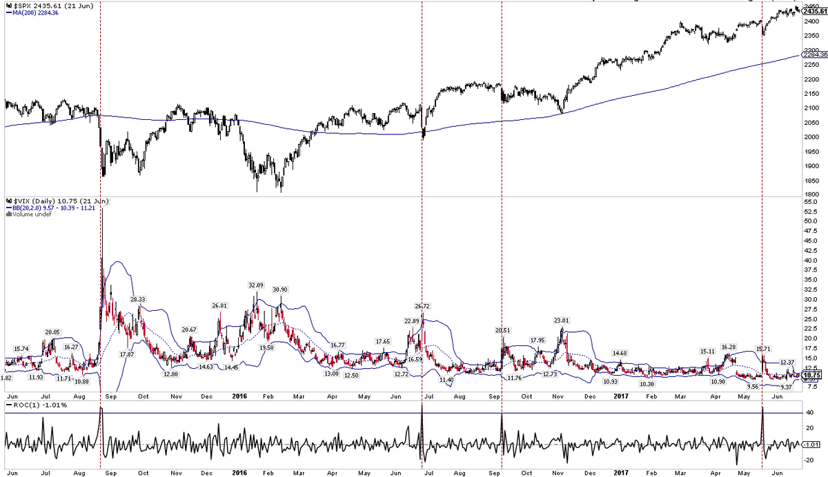
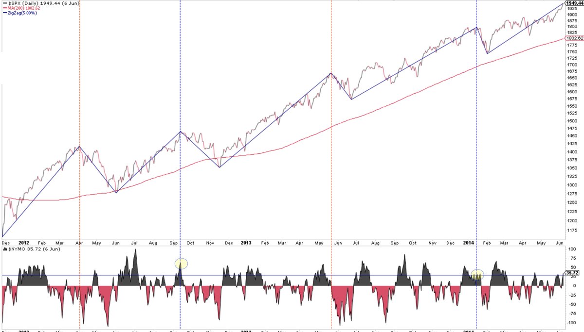
Another real time example of ‘good breadth’ preceding a high in price. $RUT still lower than it was then
https://twitter.com/sentimentrader/status/1265595555293601793
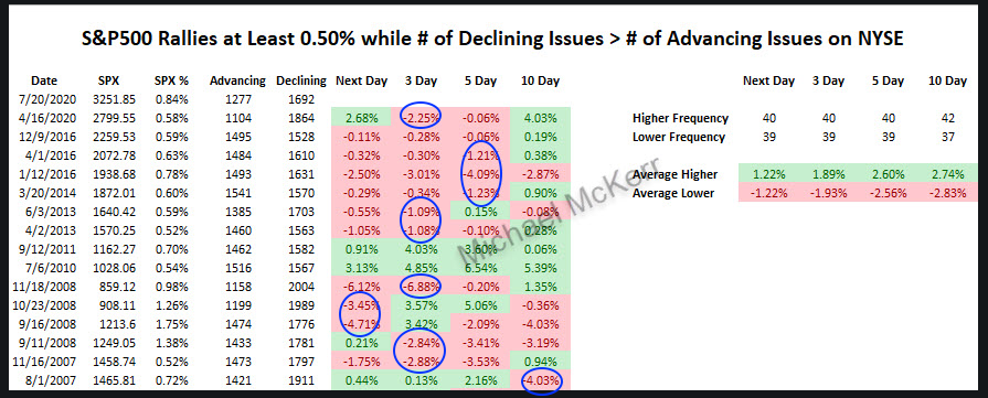
$SPX up big but breadth negative. Last 15 time, 12 (80%) down more 1%, 2 (13%) up big and 1 flat. No bueno

https://twitter.com/MikeMcKerr_TDA/status/1285312238157520896
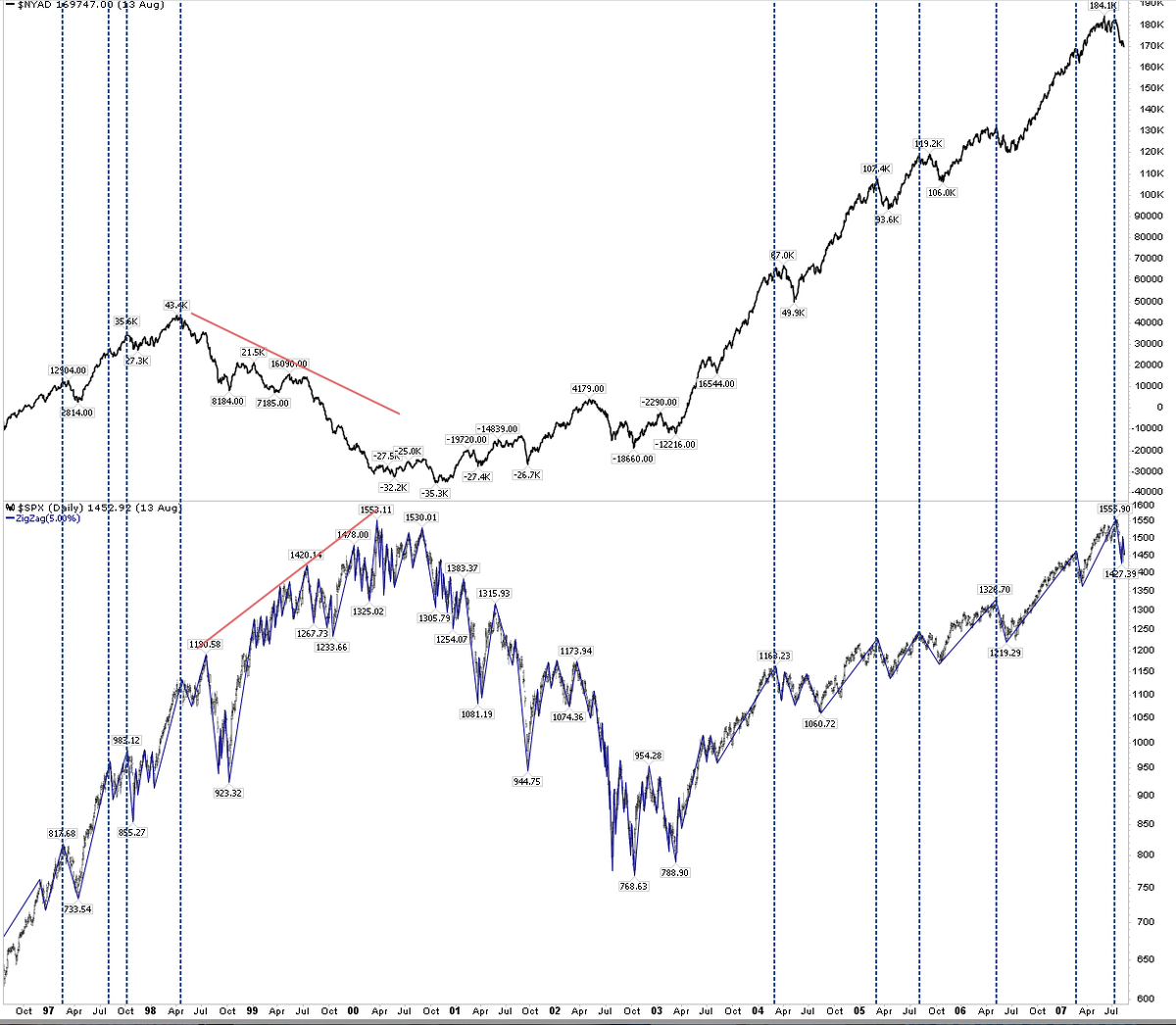
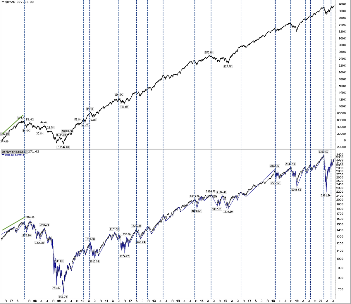
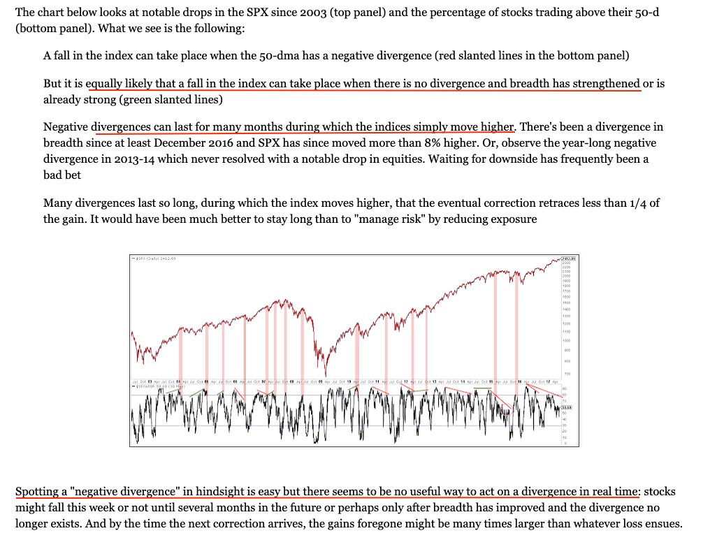
Breadth: Cumulative A/D (top panel) is at a new high. Why this is considered a good sign is a mystery since a new A/D high has occurred at nearly every >5% fall in $SPX (bottom panel), whether $SPX was at an ATH (2013-on) or a lower high (2003-07; 2009-13)
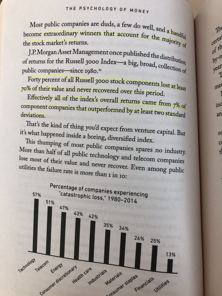
Long story short: generations of bright minds have tried to figure out which stocks will be the next FAAMNG and in the process 95% of them have underperformed $SPX. The end.
https://twitter.com/SamRo/status/1286249849457975296
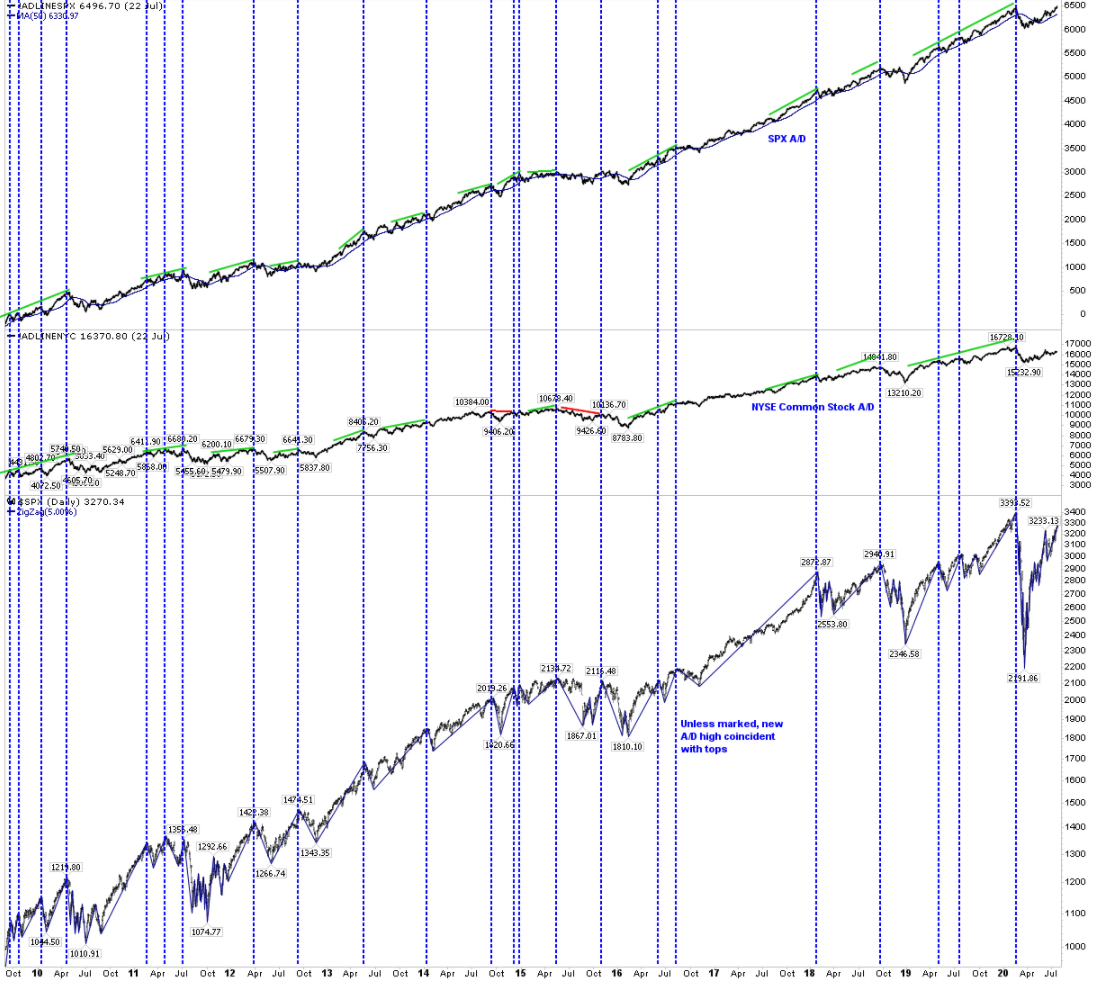
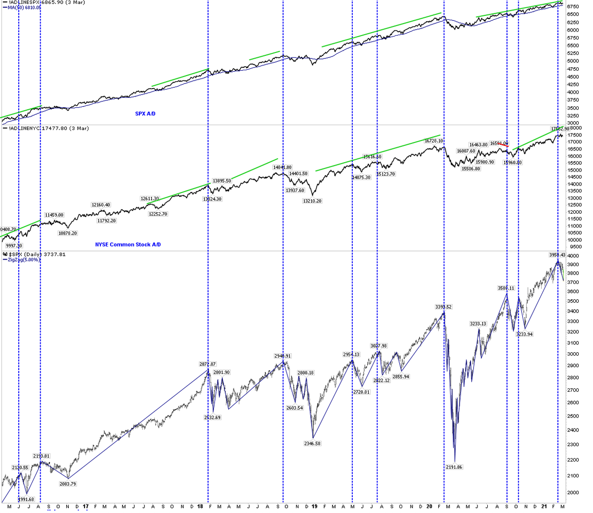
Using $SPX A/D (top panel; at new high) or $NYSE common stock A/D (middle) doesn’t give a different conclusion
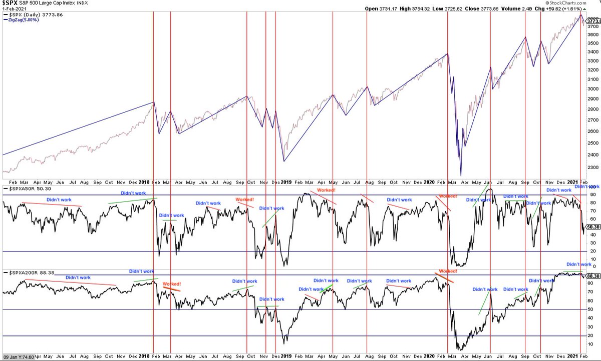
Another look at breadth, using % stocks >50-d or 200-d. Poor participation + divergences hasn’t stopped a 4-mo rally back to ATHs. This is nothing new. Divergences can last days or a year. Markets can peak with or without them, on 'good breadth' or bad. In real time, worthless
I have been regularly tweeting this message out throughout this rally to demonstrate that things can look tidy in hindsight but real time is all that matters and most (not all) of this kind of analysis doesn’t give any edge.
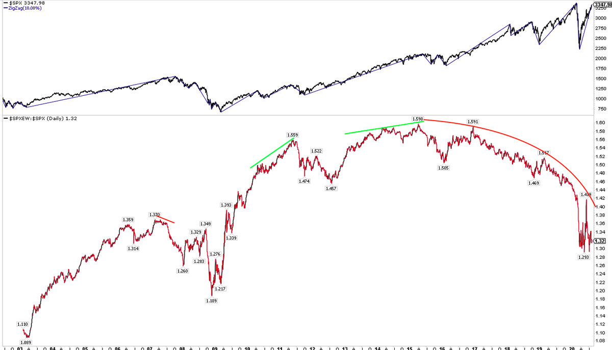
‘Equal weight’ $SPX has been underperforming 'market weight' $SPX for 5 years (bottom panel), during which $SPX has gained 50% (top). Other peaks before a >10% drop occurred when equal weight outperformed. Not useful but it's still a FinTwit favorite for some reason
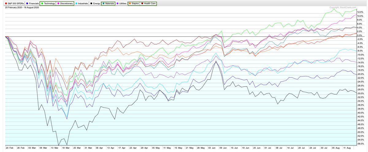
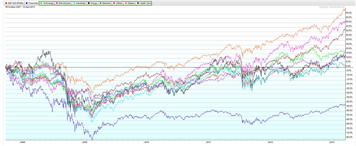
Breadth: 5 of 9 sectors have outperformed $SPY since the Feb peak to yesterday’s new ATH in $SPX (LHS). fwiw, by the time $SPX made a new ATH in April 2013, 8 of 9 sectors were outperforming, the big laggard being financials (RHS)
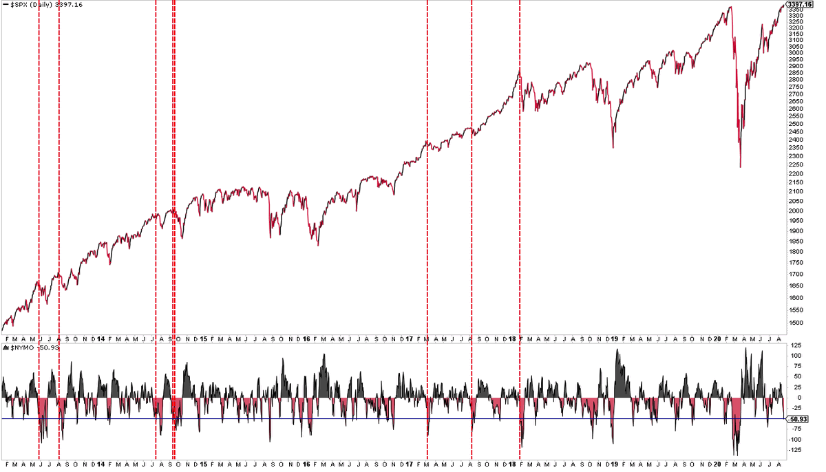
Breadth: Two looks. First, $NYMO -50 but $SPX at an ATH on Friday. I found zero since 2013 but here are some that occured close to a $SPX high
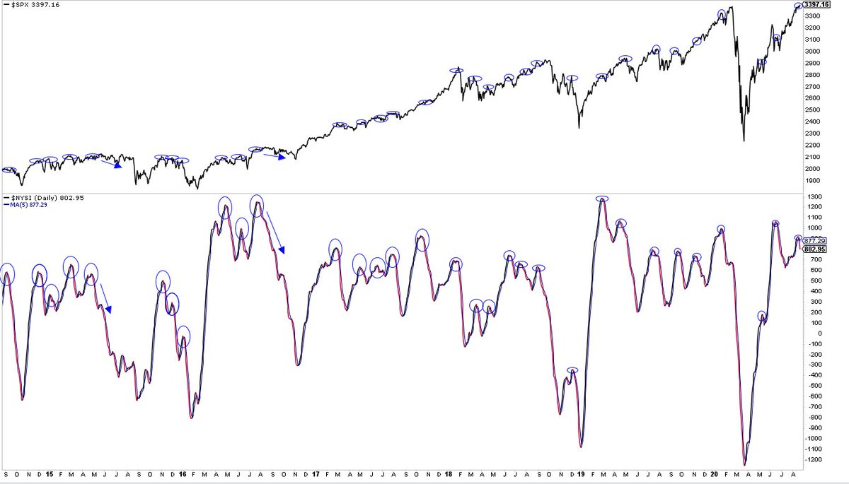
Breadth: Second, $NYSI falling below its 5-d (lower panel) with what happened to $SPX (upper panel). Oct 2017 and Nov 2019 were go-go mkts but those were the exceptions
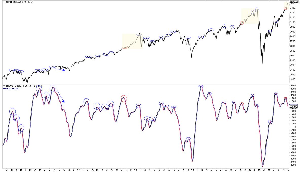
Breadth: $SPX now up +4% while $NYSI falling. This also happened in late-2017 and -2019; in both, $SPX returned to the scene of the crime months later. Late-2013 (not shown) the same
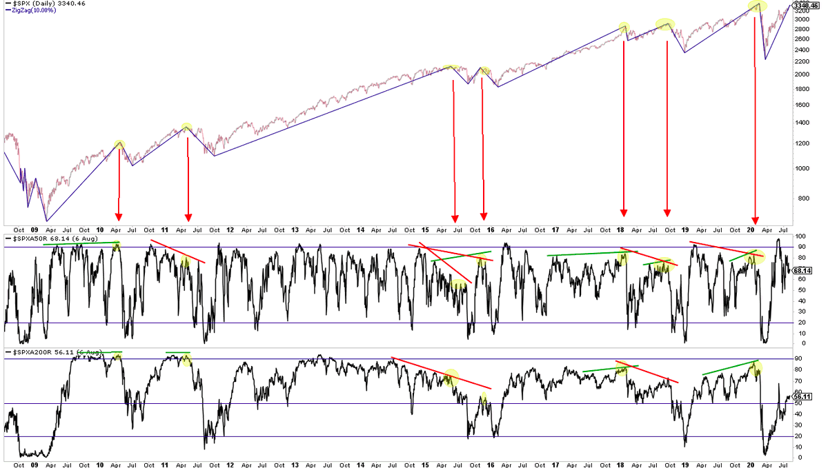
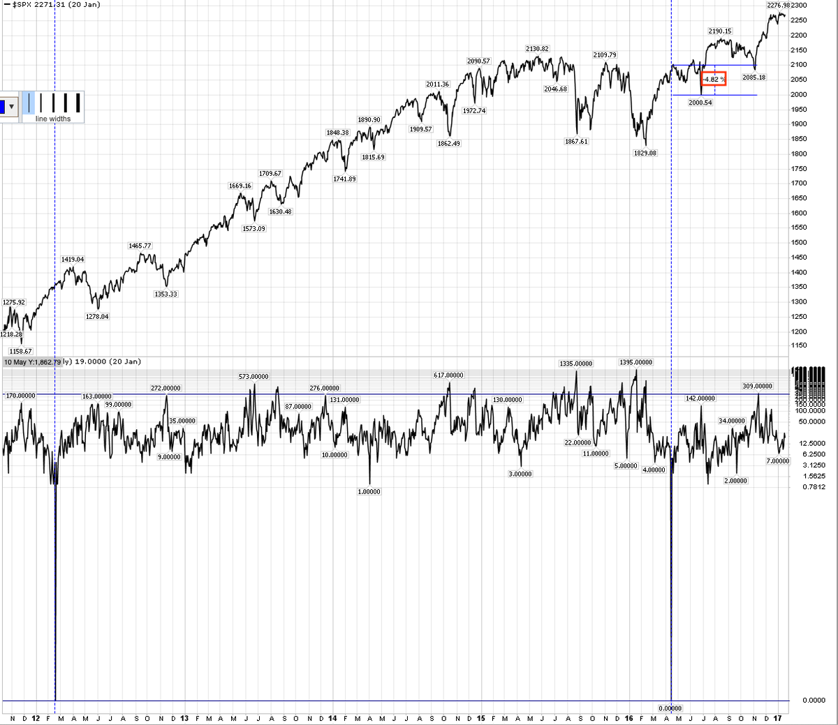
Breadth: at the Sept 2 ATH in $SPX, the $SPX A/D line was at a new high, >80% of components were above their 50-d and close to 70% above their 200-d (the best since Feb). In other words, based on these commonly used measures, $SPX peaked on "good breadth.”
(Scroill up to see charts explaining why this is not surprising or unusual. In real time, these measures are aren’t especially helpful at tops)
Breadth: $NYSI fell from +926 on Aug 18 to +6 on Friday. Today it will rise to +9. Since Aug 18, it has only risen on one day (Sept 16). The key of course is rising on consecutive days
https://twitter.com/ukarlewitz/status/1297167307886665728
Breadth: in the event, $NYSI will fall 12 pts today, to -3. No follow through breadth on consecutive days
https://twitter.com/ukarlewitz/status/1310670876287803392
$NYSI went positive Oct 1 and has risen everyday since. In the last 2 days, my stream has gone full on breadth. A good collection of breadth charts here:
https://twitter.com/TheChartReport/status/1314707473501216769
Among other things, what’s interesting about this is that about 70% of the signals over the past 40 years have taken place in the last 12
https://twitter.com/edclissold/status/1314591382477180930
Today, the stream says the market is toast. Recall that 2 weeks ago, the stream said it was definitely going to new ATHs because ‘breadth’.
This is how it works
This is how it works
https://twitter.com/ukarlewitz/status/1314943846334099458
Breadth on Monday was 91% down (a MDD). Today is follow through
https://twitter.com/ukarlewitz/status/1158788106549514240
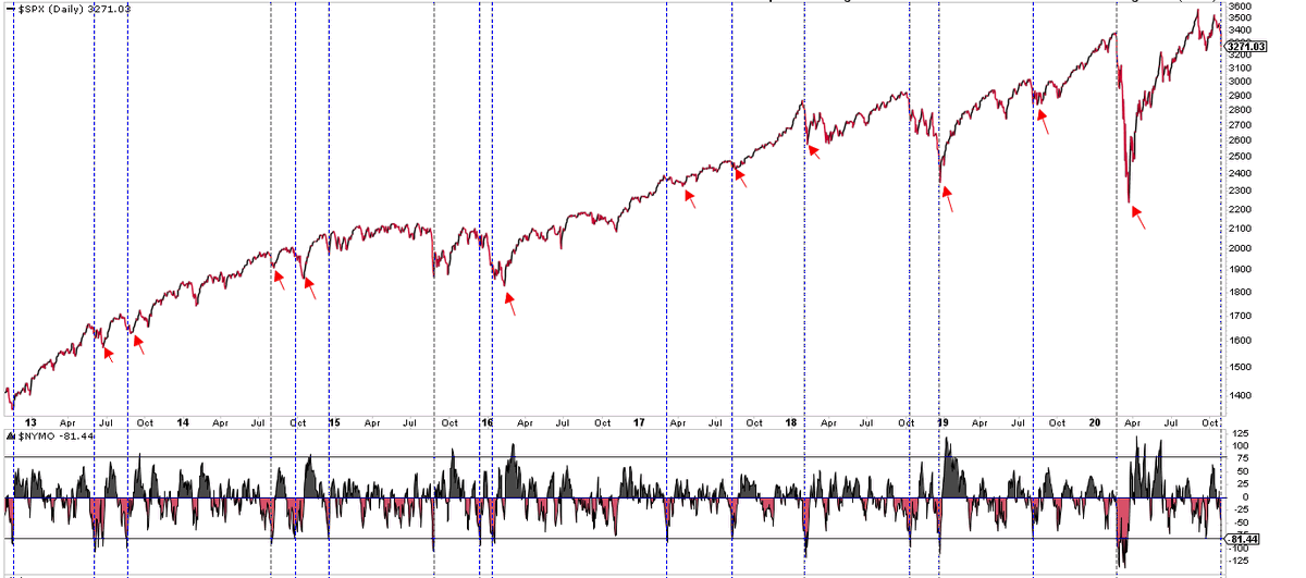
Breadth momentum ($NYMO) hit -81 today. Sometimes that’s the $SPX bottom, but more often there’s more selling ahead (either directly or after a bounce)
Yesterday, bounce. Today, lower low. Momentum, whether upward or downward, takes time to wear off.
https://twitter.com/ukarlewitz/status/1321583261479362560
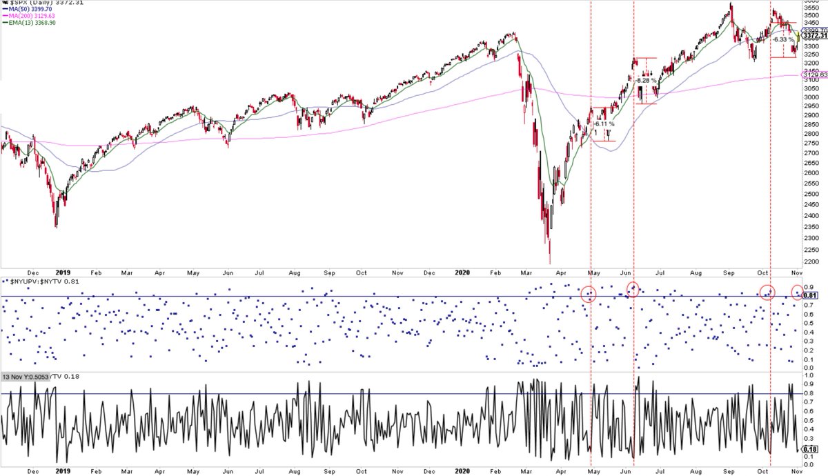
At the Oct 12 high in $SPX, the A/D line was at a new high, 80% of components were above their 50-d and 75% above their 200-d. Objective;y, very good breadth. Surprised $SPX fell 8% since then? You shouldn’t be. Beating this dead horse some more
https://twitter.com/ukarlewitz/status/1309128488587272194
Breadth: So far, a 2nd >80% up volume day in a row (middle panel). Don’t be surprised if this leads into another >5% selloff as that’s exactly what has happened several times since the March low. Remember, it’s still 2020 $spx
Breadth thrust
https://twitter.com/RenMacLLC/status/1326265055155982337
Fintwit excited that >80% of stocks above their 200-d. As many >8% drops (equal to that in Oct) take place under this condition as when breadth is weak.
https://twitter.com/ukarlewitz/status/1322216759244414976
Breadth confirmation has a major problem: all equity market returns come from just 7% of stocks. It’s a feature not a bug
This is how it works
https://twitter.com/WillieDelwiche/status/1328713503939710978
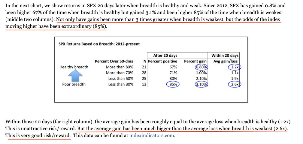
Likewise, $SPX gains and R/R best when breadth ‘weakest’. This data is 2012-17
fat-pitch.blogspot.com/2017/06/using-…
fat-pitch.blogspot.com/2017/06/using-…
Breadth momentum is a tailwind. $NYSI went from < 0 in Sept to > 500 today. Notes on chart. More upside ahead but 5% drawdown can happen anytime
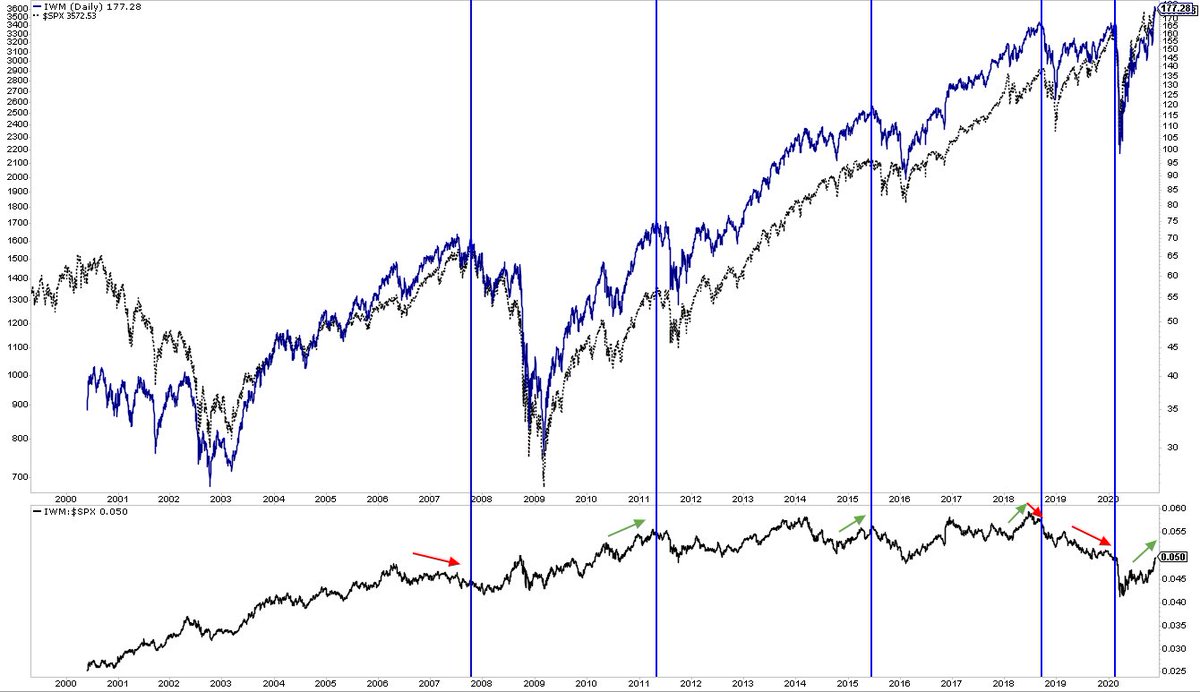
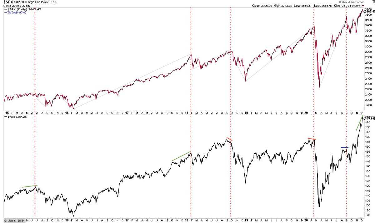
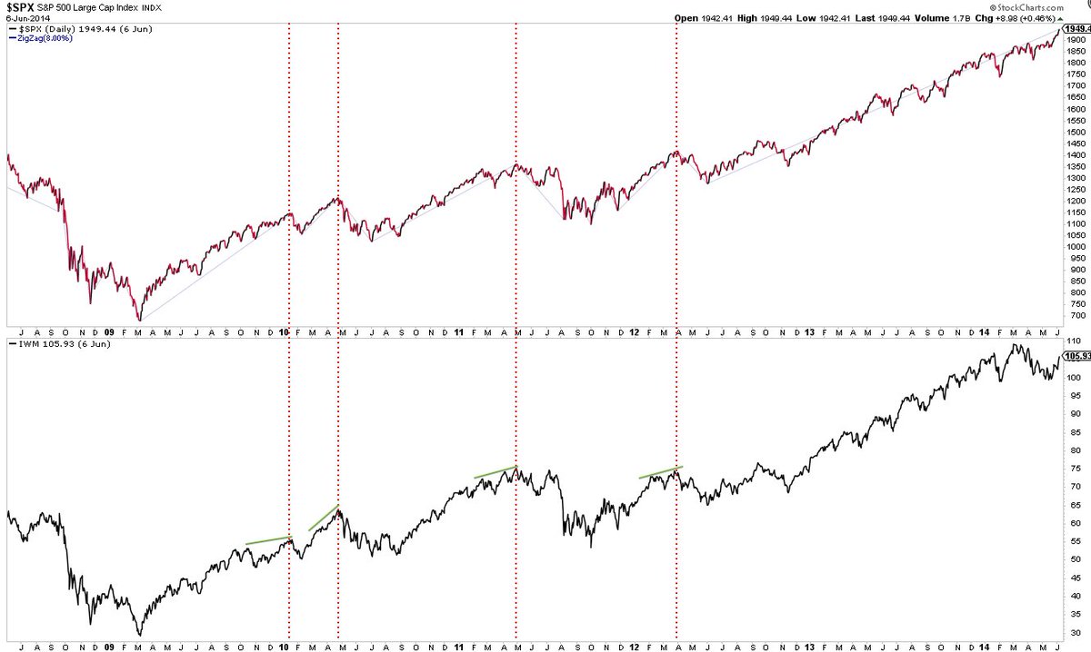
Small caps outperforming $SPX (lower panel) is irrelevant to overall market direction. Notable tops (vertical lines) happen whether they under or outperform. Why? $SPX is about 75% of total US equity market cap; small caps are less 10%. It’s dog versus tail
How 'good breadth' is equally a measure of increasing investor comfort
https://twitter.com/michaelsantoli/status/1331592549706948610
More of what’s contributing to ‘good breadth.’ Think about investors’ risk tolerance when these companies are outperforming
https://twitter.com/adam_tooze/status/1332655478229372928
$NYSI went < 0 in Sept to being on track to close ~940 today. The last time it closed >1000 was early June; $SPX promptly lost 8%. But, longer term, strong breadth momentum is a tailwind - not something that happens at bull market tops. Notes on chart
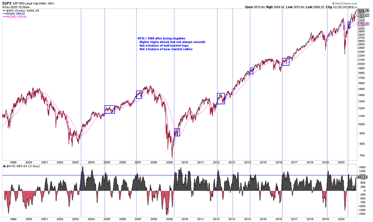
100% closed higher either 1 or 2 months later $NYSI $SPX
https://twitter.com/twillo1/status/1334902111545434113
Stuff that happens when more than 90% of $SPX stocks are above their 200-d
I have some bad news if you think small caps (lower panel) will weaken (i.e., ‘diverge’) before $SPX weakens
More generally, you will spot the ‘breadth divergences’ that matter only in hindsight. Looking for these is a complete waste of time
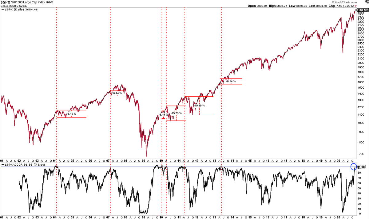
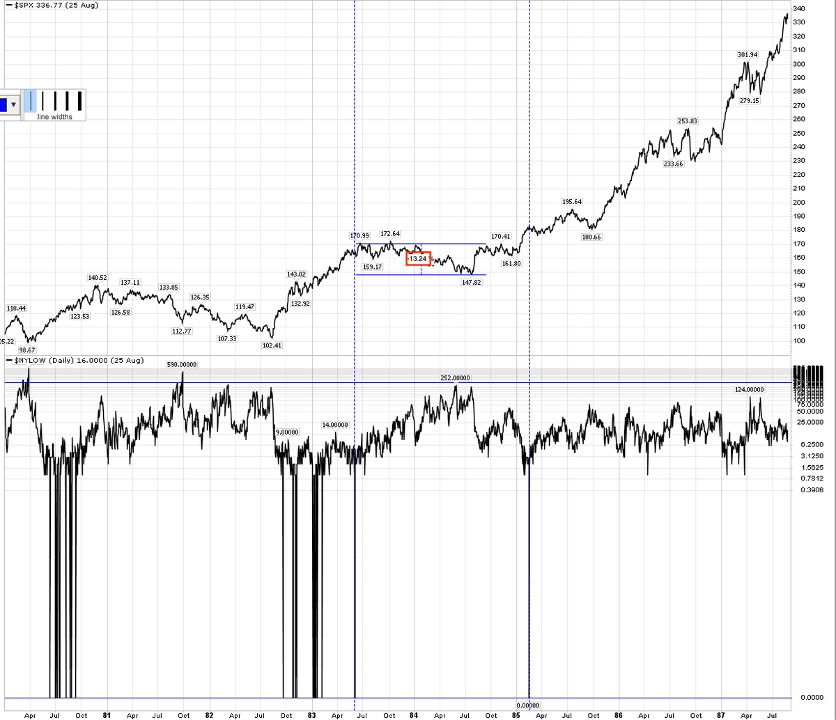
The green arrows are good entry points. Red arrows happened at tops in 1980, 1987, 2011 and others (scroll up) - if you’re fine with a 20% DD and/or 18 mo of treading water then you’ll be paid for your patience. Your preferred timeframe is what matters
https://twitter.com/RenMacLLC/status/1338490077459177477
You should be connecting these breadth numbers with the sentiment numbers. That’s not an aberration, that’s how this works
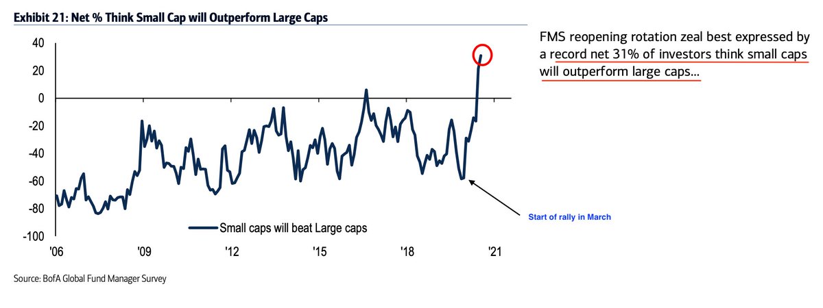
Awesome example of recency bias with small caps up 100% since March. From BAML
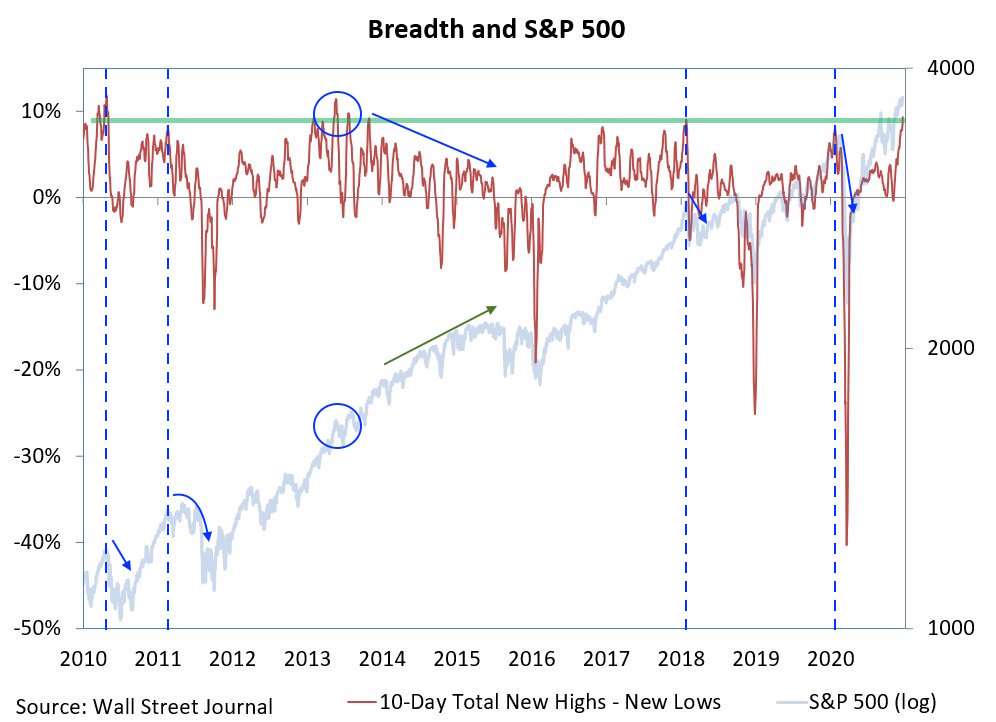
10-day total new highs minus new lows at a very high level. In the past, $SPX has fallen hard (vertical lines + blue arrows), chopped (circle) or continued higher (green arrow). Why this is considered unequivocally bullish (or even useful) remains a mystery
There were zero new $NYSE 52-wk lows last week. That can happen after big bear mkt lows (1980, 82, 91, 09) but also ahead of long consolidations and decent sized DDs (like last June)
When you see ‘strong breadth’ and ‘broad participation’, this is what is going on behind the numbers. It’s why ‘breadth’ and ‘sentiment’ are most often the same thing
https://twitter.com/lisaabramowicz1/status/1349000262330028034
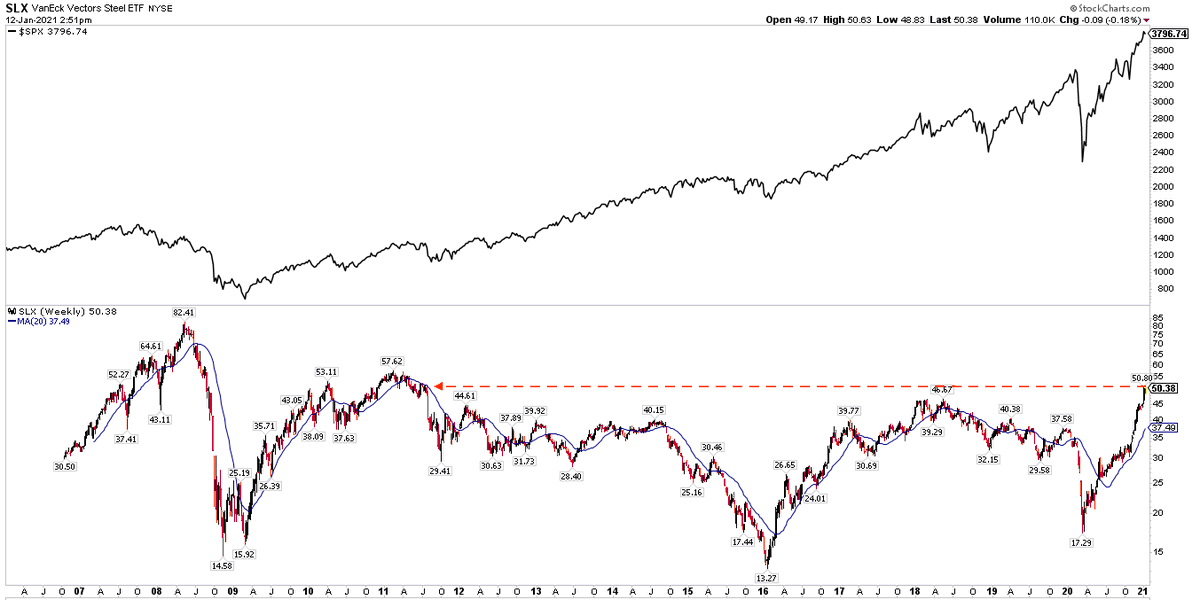
Even steel stocks - steel! - up 200% since last March. A 10 year high $SLX
$NYSE $RUA $DJIA and other indices at new ATHs today but it’s without FAANMG
- $aapl near ATH
- $amzn $nflx $msft $goog all under 50-d
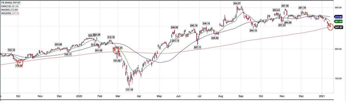
- $fb under 200-d
- $aapl near ATH
- $amzn $nflx $msft $goog all under 50-d
- $fb under 200-d
Strong breadth leads to statistically lower forward returns. Scroll up. From the always awesome @sentimentrader Sign up for their free daily email here: sentimentrader.com/blog/ (I’m not affiliated, just a fan)

What was behind the ‘strong breadth’ pundits have been in love with. Scroll up for more
https://twitter.com/RobinWigg/status/1354535965503737857
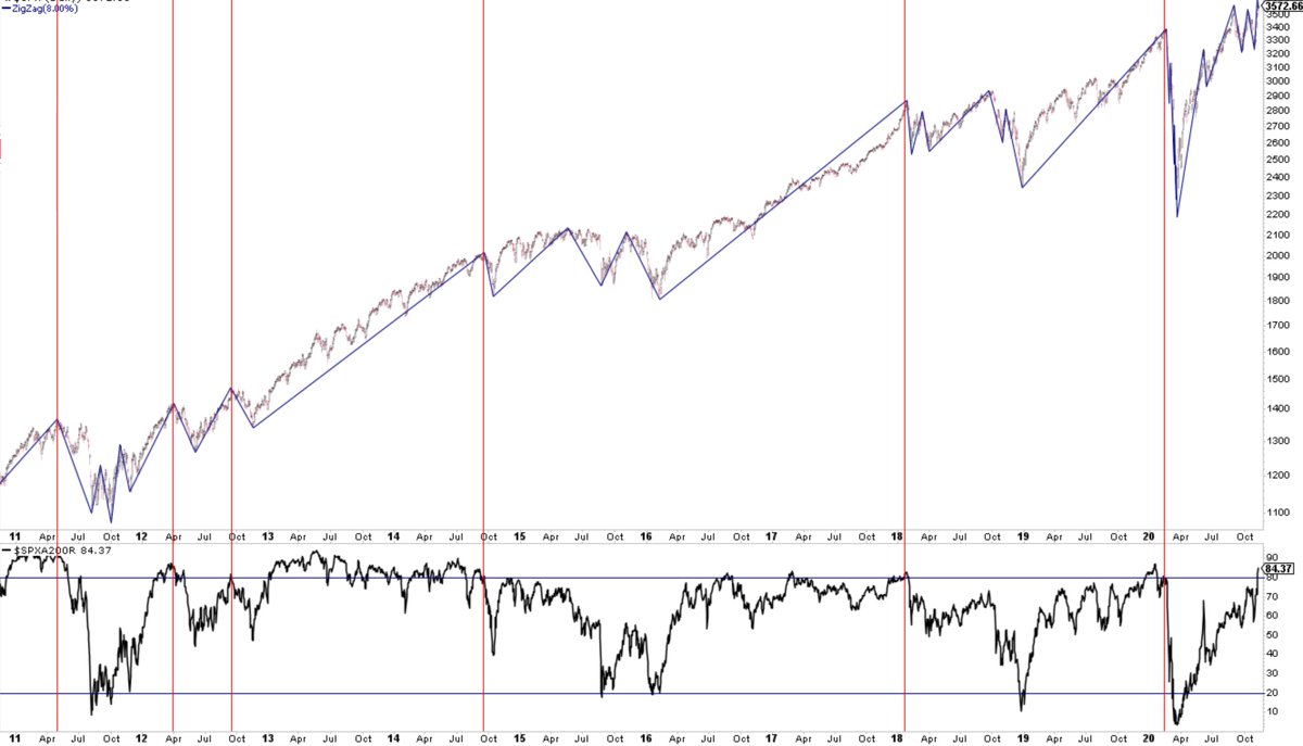
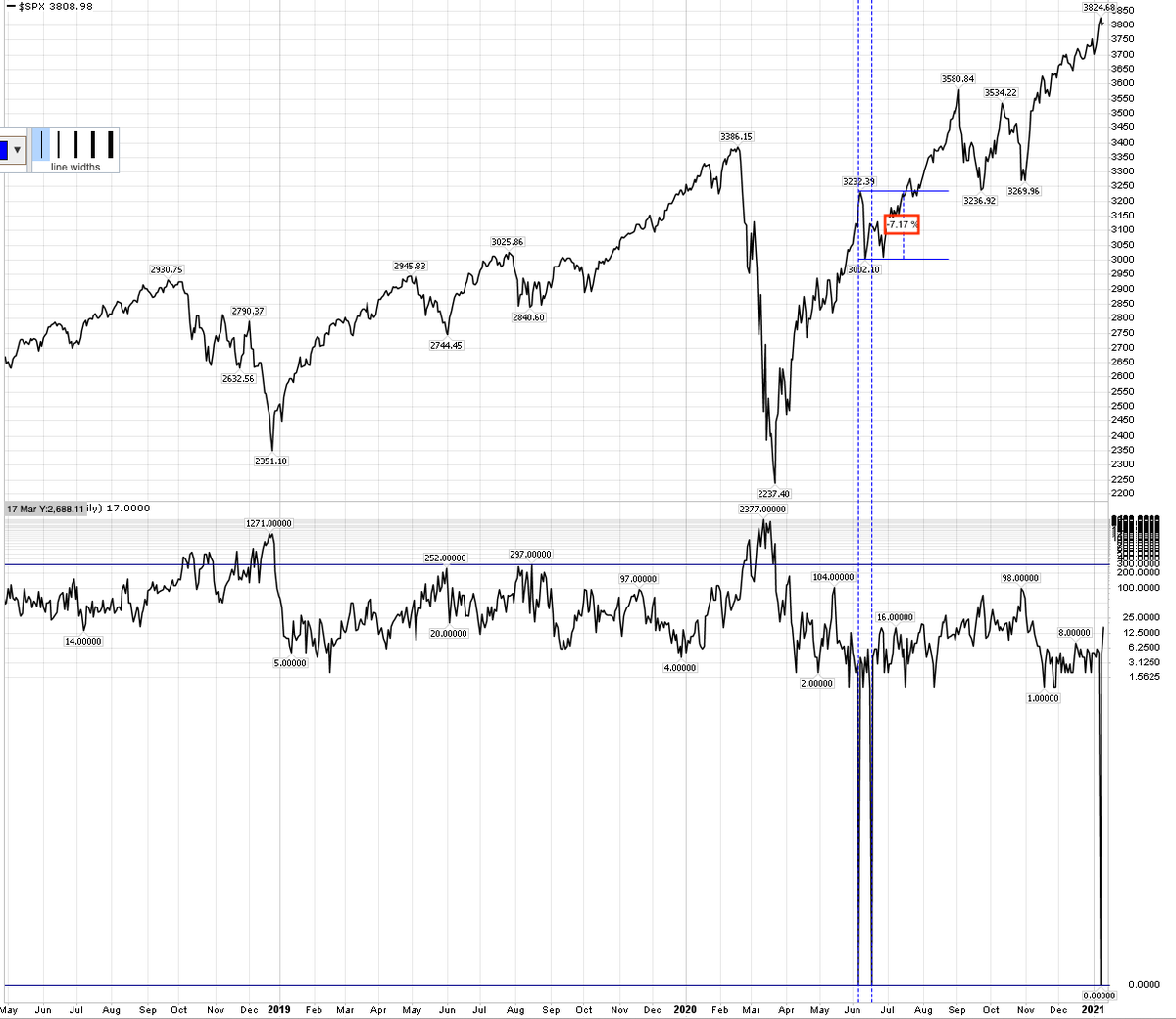
Breadth: New ATHs in NYSE A/D and SPX A/D just last week. >90% of $SPX above 200-d and 80% above 50-d. The very broad $WLSH (3500 stocks) at ATH this week. On these measures, breadth strong right into the price high. Scroll up
$NYMO (breadth momentum) closed > 30 Friday (lower panel). Signalling the all clear? No.
New 1-yr highs in $SPX (top panel) have not topped ahead of >5% drop w/ $NYMO >30 in the past 6 yrs (red lines) but that was not the case earlier (blue lines)
New 1-yr highs in $SPX (top panel) have not topped ahead of >5% drop w/ $NYMO >30 in the past 6 yrs (red lines) but that was not the case earlier (blue lines)

Last weekend, FinTwit was in a tither over the ‘negative breadth divergence’. $SPX up 5% since then.
Here’s how often that has worked in the past few years
Here’s how often that has worked in the past few years
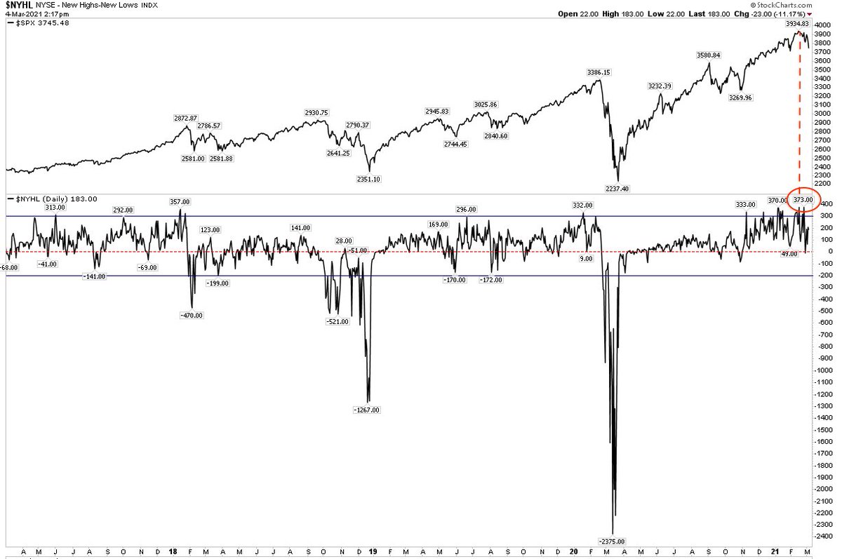
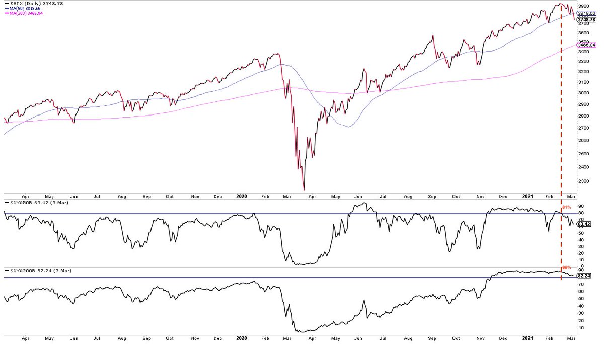
When US equities peaked in mid-Feb, breadth was objectively strong:
- NYSE and SPX A/D at new highs
- NYSE High-Low at a new high
- NYSE % above 50-d and 200-d 81% and 88%, respectively
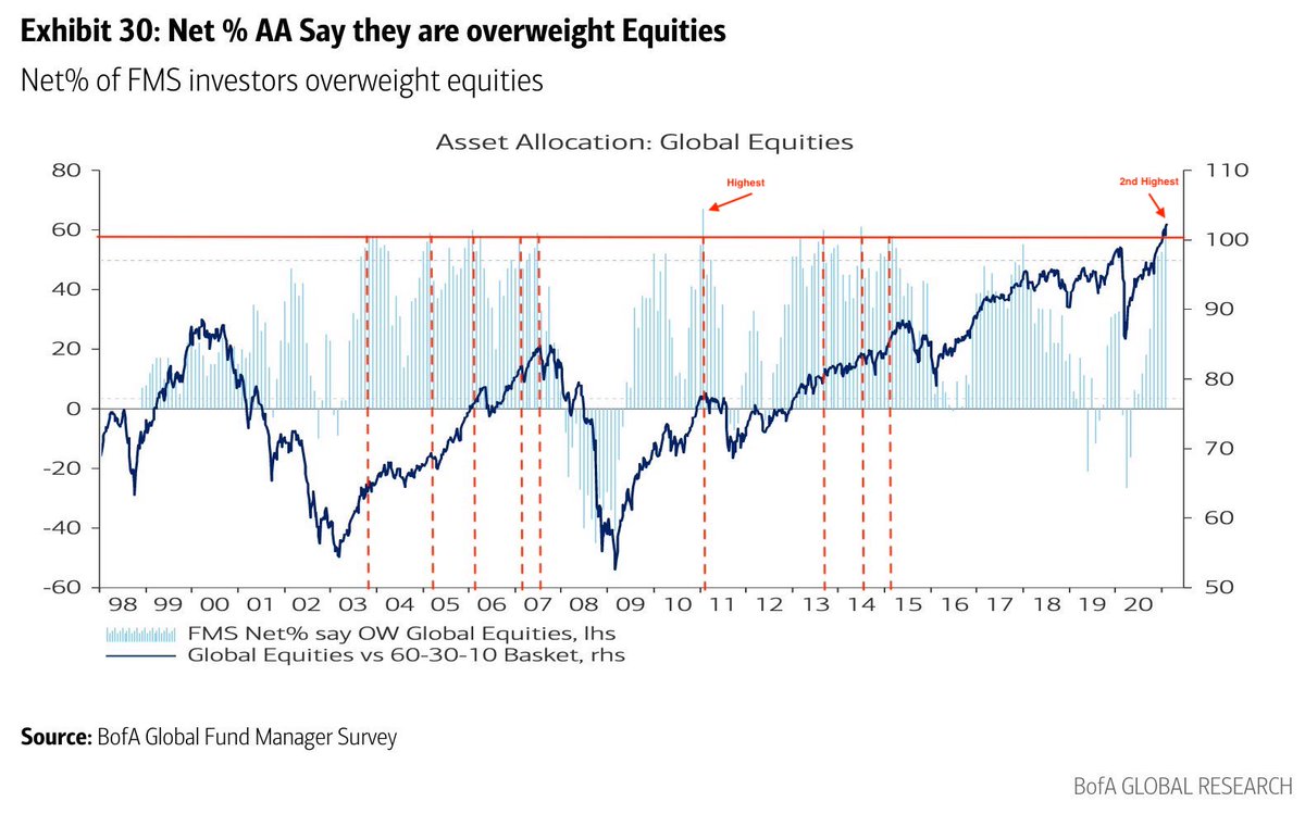
Also, BAML fund managers equity allocation was the 2nd highest in survey history
- NYSE and SPX A/D at new highs
- NYSE High-Low at a new high
- NYSE % above 50-d and 200-d 81% and 88%, respectively
Also, BAML fund managers equity allocation was the 2nd highest in survey history
That’s not an anomaly, that’s how this works
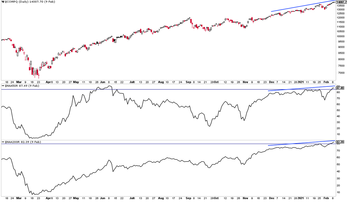
Nasdaq’s breadth right as it started its 11% drop
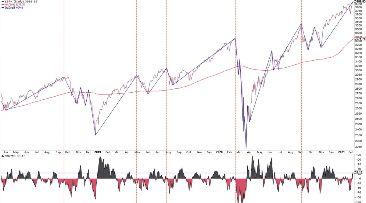
This thread: Breadth indicators like A/D lines and % above 50-d or 200-d are demonstrably garbage as real-time tells at highs (not at lows) but I am a fan of $NYMO and $NYSI and track them at every close.
To each his/her own, do what works for you
To each his/her own, do what works for you
$NYMO +20 today, the first positive close since Feb 16. Still needs follow through. Here are all drops in $SPX >4% the last 5 yrs. A rising $NYSI has been coincident with at least an interim low

• • •
Missing some Tweet in this thread? You can try to
force a refresh