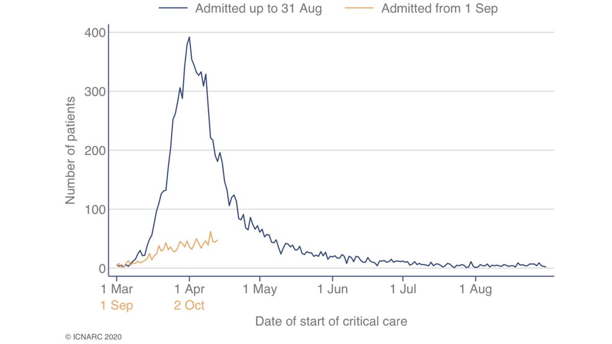
The latest @ICNARC intensive care weekly report has been published. A short thread to summarise, including a link to the full report. The report covers critical care admissions to 15 October and compares the second wave (1 Sep onwards) to the first. 1/10 
The report now covers 1,233 patients from 1 September. Of these, 643 have outcomes reported and 590 are still receiving critical care.
Most admissions in the North of England and the Midlands. However, allowing for size of local population N. Ireland and London look bad. 2/10
Most admissions in the North of England and the Midlands. However, allowing for size of local population N. Ireland and London look bad. 2/10
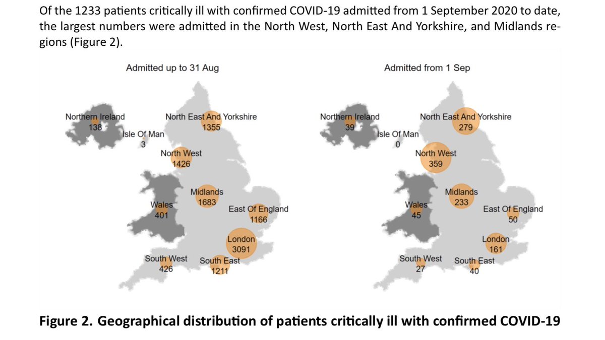
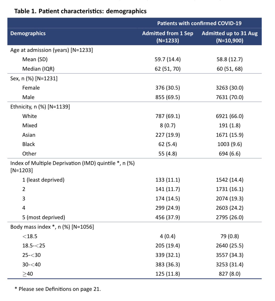
Table 1 summarises patient characteristics, showing how these compare with the first wave.
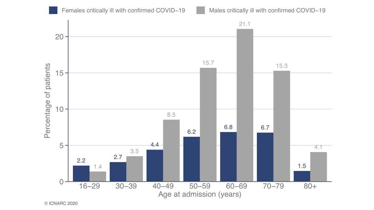
As before, seven out of ten ICU admissions are males, with most aged 50-80. 3/10
As before, seven out of ten ICU admissions are males, with most aged 50-80. 3/10
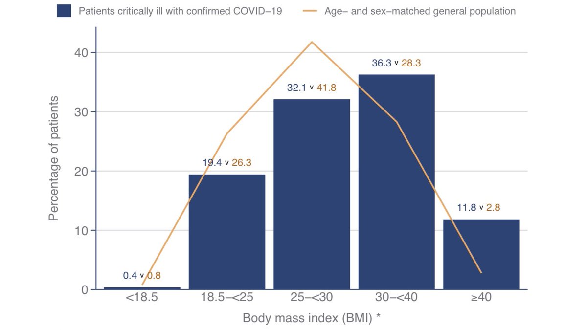
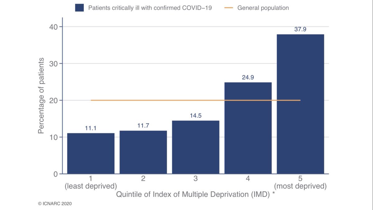
The charts below show the same data as Table 1 but more visually and with a comparison to what would be expected based on the local population. Over-represented groups include:
- Asian and Black ethnicity
- More deprived groups
- those who are obese 4/10
- Asian and Black ethnicity
- More deprived groups
- those who are obese 4/10
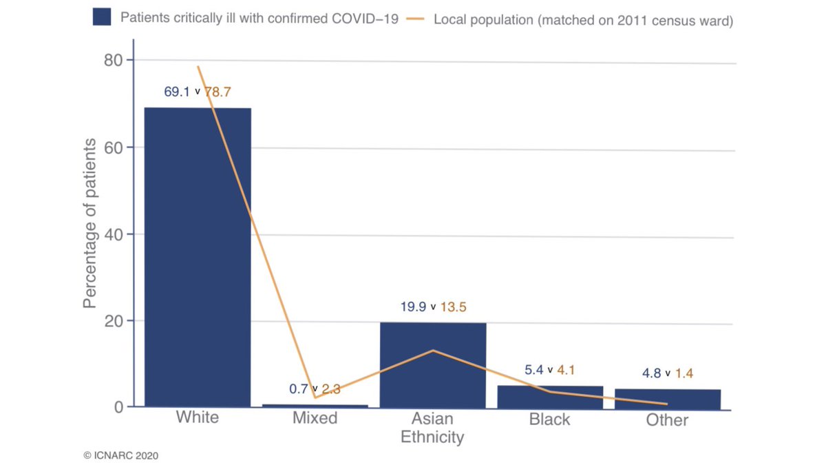
It’s worth noting that over-representation in the ethnicity distribution looks less extreme than last week.
Looking at medical history in Table 2 we see that nine out of ten needed no assistance with daily activities. A similar number were free of severe comorbidities. 5/10
Looking at medical history in Table 2 we see that nine out of ten needed no assistance with daily activities. A similar number were free of severe comorbidities. 5/10
Compared to the first wave, patients are much less likely to be mechanically ventilated within the first 24hrs (26% vs 58%).
They are much less likely to need advanced respiratory or cardiovascular support, or renal support.
Indications that cases are less severe. 6/10
They are much less likely to need advanced respiratory or cardiovascular support, or renal support.
Indications that cases are less severe. 6/10
Regarding outcomes it is still early days but survival is much better than was seen at this stage of the first wave.
Of those no longer in critical care,
around one-in-four has died and three-in-four have been discharged from ICU. 7/10
Of those no longer in critical care,
around one-in-four has died and three-in-four have been discharged from ICU. 7/10

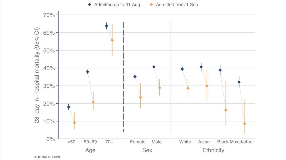
Here is a new presentation of the 28-day mortality data, compared to the first wave. This clearly shows the fall in mortality across all demographic groups between first wave (blue) and second (orange). Most of these differences are already statistically significant. 8/10
So, in summary ICU admissions still rising, though slower than first wave. Admissions were already falling sharply at this stage last time (we’d already locked down).
Severity appears less acute on admission and survival improved. A stay in ICU is still best avoided though! 9/10
Severity appears less acute on admission and survival improved. A stay in ICU is still best avoided though! 9/10
Here is a link to full report which contains lots of extra information as well as the items I’ve highlighted. In particular more medical breakdowns (I tend to focus on demographics).
The best way we can help those working in ICU is by not catching and spreading this virus. 10/10
The best way we can help those working in ICU is by not catching and spreading this virus. 10/10
https://twitter.com/icnarc/status/1317163960957849601
• • •
Missing some Tweet in this thread? You can try to
force a refresh