A release from the CDC that I suspect one presidential candidate will find rather untimely. 300,000 excess deaths, a third of which are not directly attributed to COVID - that's a higher proportion than in the UK. 1/4 cdc.gov/mmwr/volumes/6…
Media comment already noting that the 25-44 group has been hit hardest. Maybe in terms of % increase, but given very low death rates at younger ages, I'm not sure I'd agree with that view. 2/4
The disparity by ethnicity that we see here is repeated, but just looking at the graphs even more so. 3/4
Coming just two weeks before the election, I can't imagine the Trump campaign will be pleased with the body the administration sidelined early on in the pandemic producing such a set of figures. It'll be interesting to see whether it has an effect on the final days' debate. 4/4
• • •
Missing some Tweet in this thread? You can try to
force a refresh
The latest weekly PHE Flu & COVID Surveillance Report is out. assets.publishing.service.gov.uk/government/upl… At first glance there's been a welcome flattening off of both cases and infectivity, but the age split shows that at older ages there are still increases. Case rates first.... 1/5
Now infectivity levels, for pillar 2 (community testing). Most are still rising steeply, except for younger ages. 2/5
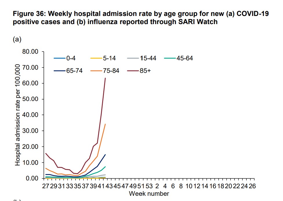
Admissions next, using rates per 100k, to allow for differing populations by region. It's still consistent with the picture @COVID19actuary has been sharing for some time now. The age split shows the concern over older age groups. 3/5
The @imperialcollege#REACT Survey has published an interim report of its 5th round. The headline is that it suggests R has fallen sharply in recent weeks, and could now be around 1.1 . Let's take a more detailed look... 1/9
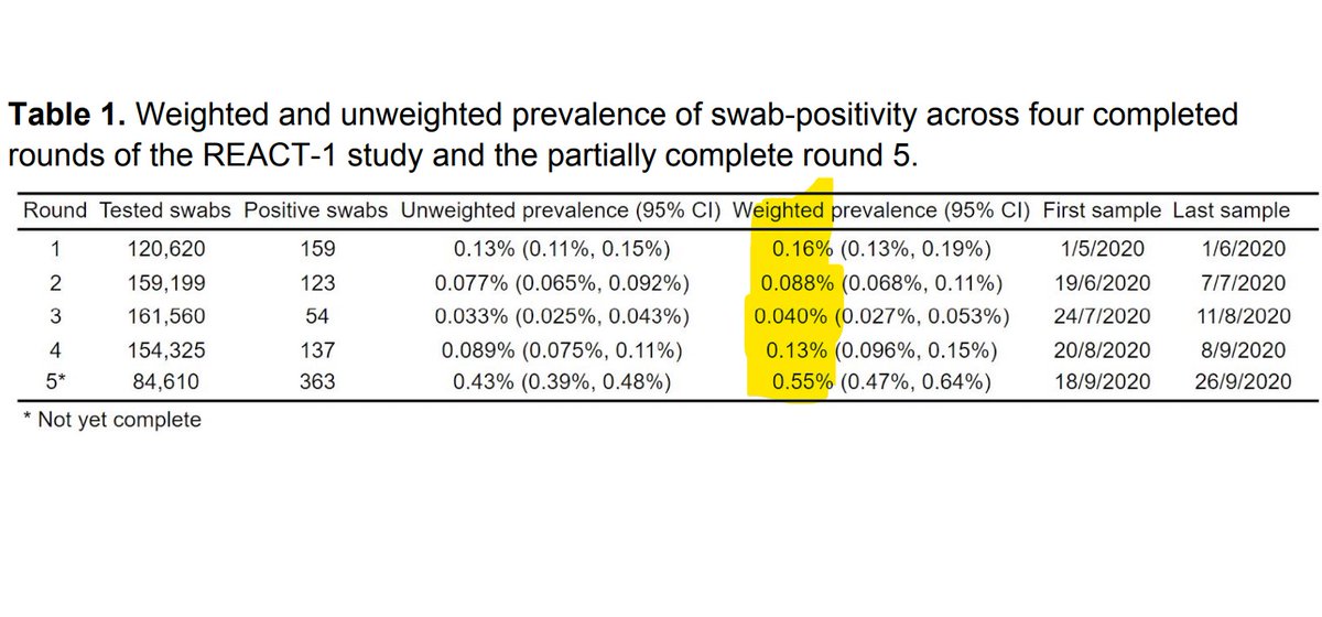
The interim report covers 85,000 samples over the period 18th-26th Sept, so is very up to date. It found 363 positive samples, an infectivity of 0.55% (over 1 in 200) , consistent with the latest @ONS report. That's the highest since the survey started in May. 2/9
Round 4 put R at 1.7 for late Aug/early Sep. These results show a clear slowing, and the report notes other indicators (eg calls to the NHS) are consistent with this direction. The CI is wider though as this is an interim report, so the sample size is reduced. 3/9
The @ONS is producing some terrific analysis regarding COVID-19. Today's release provides some maybe predictable, and some maybe surprising, findings regarding the recent spread. Let's start with deprivation. 1/7
We know that in the first wave, the virus took a greater toll on those from more deprived areas, both in terms of incidence and outcomes. But there's a very clear reverse now for incidence, with the most affluent areas driving the increase. 2/7
Digging a bit deeper, it's also clear that it is those under 35 and are more affluent for whom infectivity is rising quickest. For over 35's there's not much difference by deprivation. 3/7
The latest admission for England has topped 300 today, and again a question raised is are these "WITH" COVID or "FROM" COVID? Just like yesterday's analysis of deaths, let's dig into this question a bit... 1/7
First of all, note that any elective admissions, ie for planned surgery, is preceded by a COVID test. If it's positive, the admission doesn't happen. So the only cases that might by chance test positive are emergency admissions for what are believed to be non COVID reasons. 2/7
There are approx 15k such admissions a day. What proportion of them might test positive, yet be totally unrelated? The latest ONS figures give a clue, suggesting that 1 in 500 now has the virus. That would suggest 30, out of the 300 cases. 3/7
A common question by those who may feel that the effects of COVID-19 are overstated is to ask how many deaths have been WITH COVID as opposed to being DUE TO COVID.
Here's why I think these questions and underlying beliefs are misguided. 1/6
The actuarial profession, through the CMI, has monitored mortality in the UK for many years, so it's in a good position to understand the level of overall excess mortality we've seen in E&W since March. Here's a graph showing recent years in comparison with each prior year. 2/6
It currently estimates 55,000 excess deaths since March. It uses age standardised mortality rates, so changes in population distribution (such as an ageing pop'n) are allowed for. There's very little reduction since June, which would happen if people had "just died early". 3/6
A short thread with some key points on the latest PHE surveillance report issued Friday. I'll start with the age breakdown and trend - the colour coding highlights how the level of infection is gradually spreading to older, more vulnerable, ages. 1/5
The regional split shows a now familiar picture. There's not the same concept of spreading as for age of course. The E/SE/SW regions are not showing the same growth - possibly an argument against national measures where they are particularly damaging economically? 2/5
We know that outcomes are worse for ethnic minorities once infected, but the difference in infectivity levels is startling. The correlation with other factors (eg socio-economic) needs to be understood before jumping to conclusions, but surely more research is needed here? 3/5