NEW with @clivecookson
Hospital mortality data suggests the autumn resurgence of Covid-19 is proving less lethal than the spring, but is it that simple?
What’s going on beneath the surface, and is there cause to be optimistic?
A deep dive into the data: ft.com/content/b3801b…
Hospital mortality data suggests the autumn resurgence of Covid-19 is proving less lethal than the spring, but is it that simple?
What’s going on beneath the surface, and is there cause to be optimistic?
A deep dive into the data: ft.com/content/b3801b…
1) The autumn resurgence of the virus is well underway, however you want to measure it.
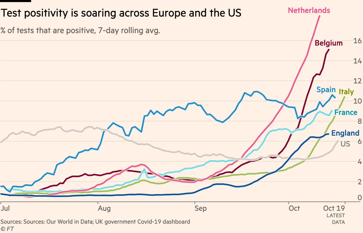
Skeptics will say that we’re just seeing more cases because of more testing, so let’s head that one off at the pass.
Here are positivity rates, which are now rising across Europe and the US
Skeptics will say that we’re just seeing more cases because of more testing, so let’s head that one off at the pass.
Here are positivity rates, which are now rising across Europe and the US
2) Some might object that we’re just spotting much more mild cases of the virus now than we were in spring.
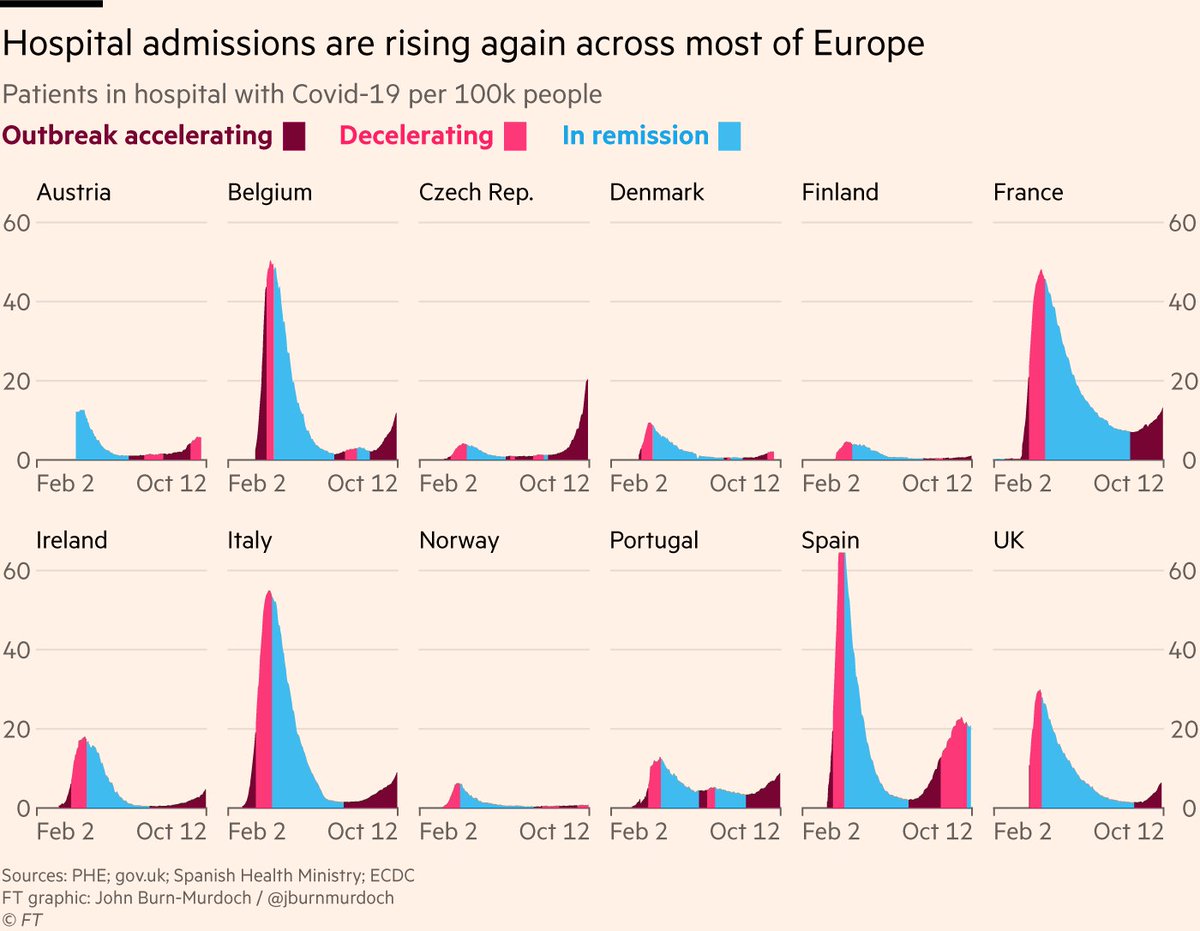
This is true (and a good thing — we’re catching more people who could infect others), BUT serious cases are also climbing, as measured by people in hospital with Covid-19
This is true (and a good thing — we’re catching more people who could infect others), BUT serious cases are also climbing, as measured by people in hospital with Covid-19
3) The critical metric is loss of life, so what do we see from deaths data?
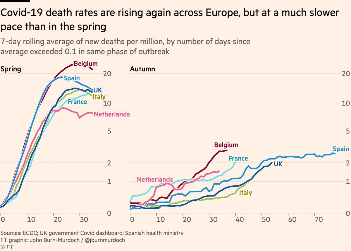
Unfortunately deaths are rising too, but it’s useful to plot spring and autumn side by side here:
It’s taken ~a month for daily deaths to climb to 1 per million. In March the same ascent took one week.
Unfortunately deaths are rising too, but it’s useful to plot spring and autumn side by side here:
It’s taken ~a month for daily deaths to climb to 1 per million. In March the same ascent took one week.
4) Main reason for slower climb in autumn deaths is the virus spreading more slowly. Social distancing and other restrictions, and folks are being cautious regardless.
But another factor often touted is that people with serious cases are more likely to survive now
Is this true?
But another factor often touted is that people with serious cases are more likely to survive now
Is this true?
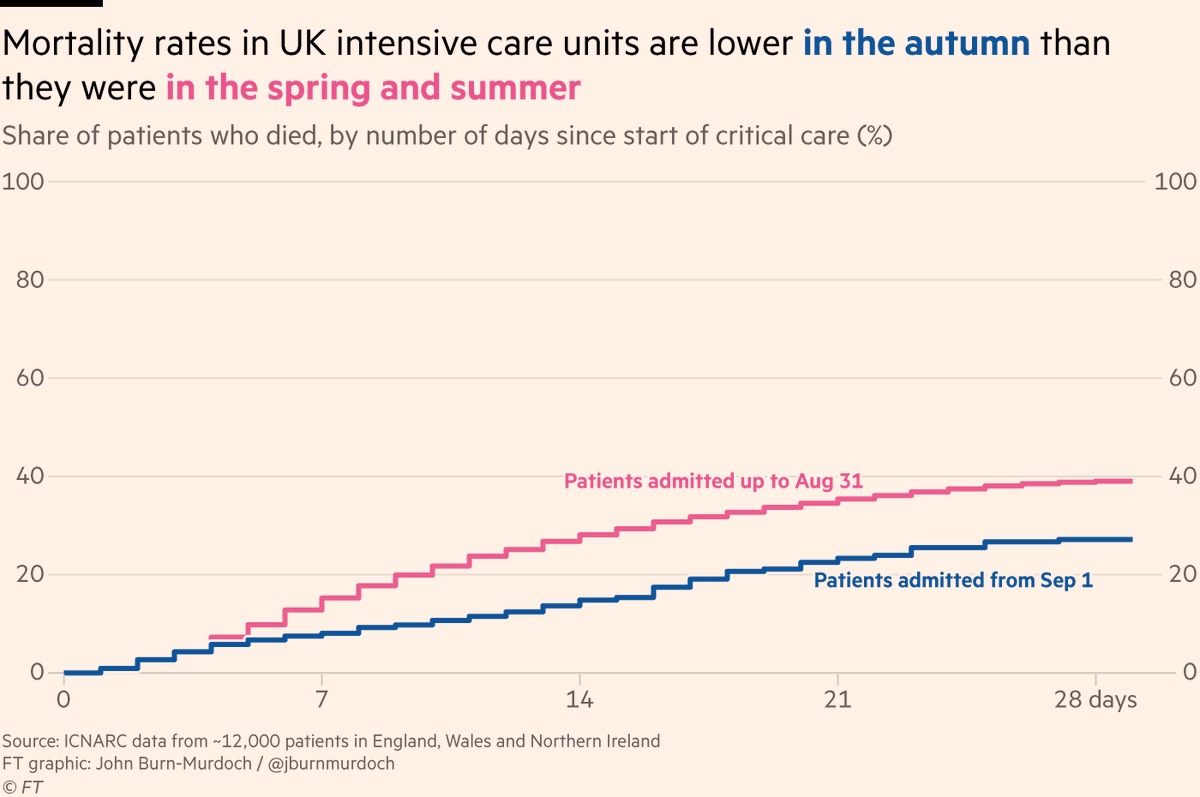
5) Data from UK intensive care patients looks promising:
The latest weekly figures from @ICNARC (a goldmine of data) show that 28 days after admission to ICU, mortality rates for UK Covid-19 patients have fallen from 39% in the spring/summer to 27% in the autumn
The latest weekly figures from @ICNARC (a goldmine of data) show that 28 days after admission to ICU, mortality rates for UK Covid-19 patients have fallen from 39% in the spring/summer to 27% in the autumn
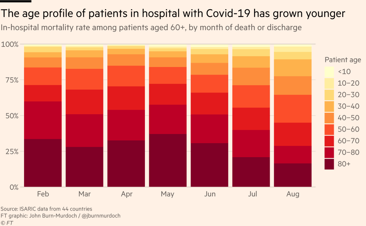
6) One possibility is hospital mortality rates may have fallen because of the shifting age composition of cases.
Indeed, data from @ISARIC1 spanning hospitals in 44 countries shows the proportion of Covid-19 patients aged 60 and above has fallen from 70% in Feb to 44% in Aug
Indeed, data from @ISARIC1 spanning hospitals in 44 countries shows the proportion of Covid-19 patients aged 60 and above has fallen from 70% in Feb to 44% in Aug
7) But that doesn’t seem to explain all of it:
Even if limit our analysis to Covid-19 hospital patients aged 60 and older, in-hospital mortality rates have halved from 50% in early spring to 25% in August
Even if limit our analysis to Covid-19 hospital patients aged 60 and older, in-hospital mortality rates have halved from 50% in early spring to 25% in August

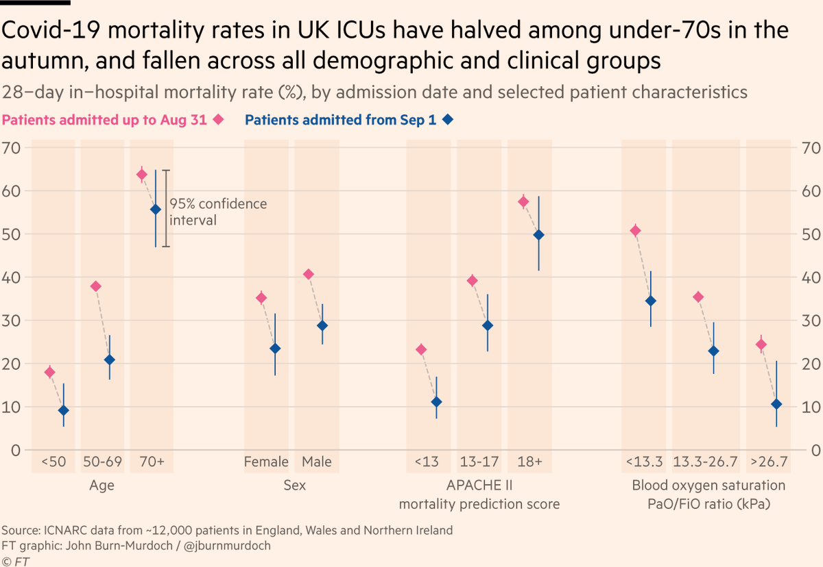
8) @icnarc data show similar patterns in ICU, with biggest falls in mortality among younger patients. 28-day measure of mortality halved among under-70s btwn spring/summer & autumn
They also find reduced mortality for patients in especially poor condition (low blood oxygen etc)
They also find reduced mortality for patients in especially poor condition (low blood oxygen etc)
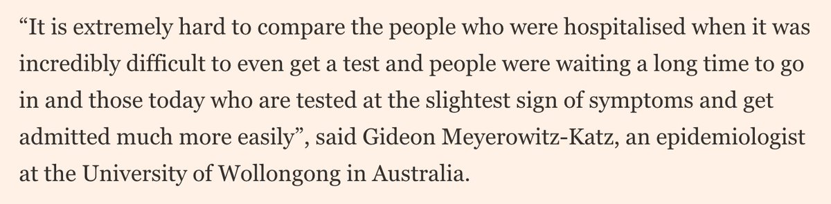
9) However, as @GidMK told me this morning, we need to be cautious in how we interpret those numbers:
Such was the state of crisis in the spring that many patients arrived at hospital (let alone ICU) already severely ill, and healthcare resources themselves were more stretched
Such was the state of crisis in the spring that many patients arrived at hospital (let alone ICU) already severely ill, and healthcare resources themselves were more stretched
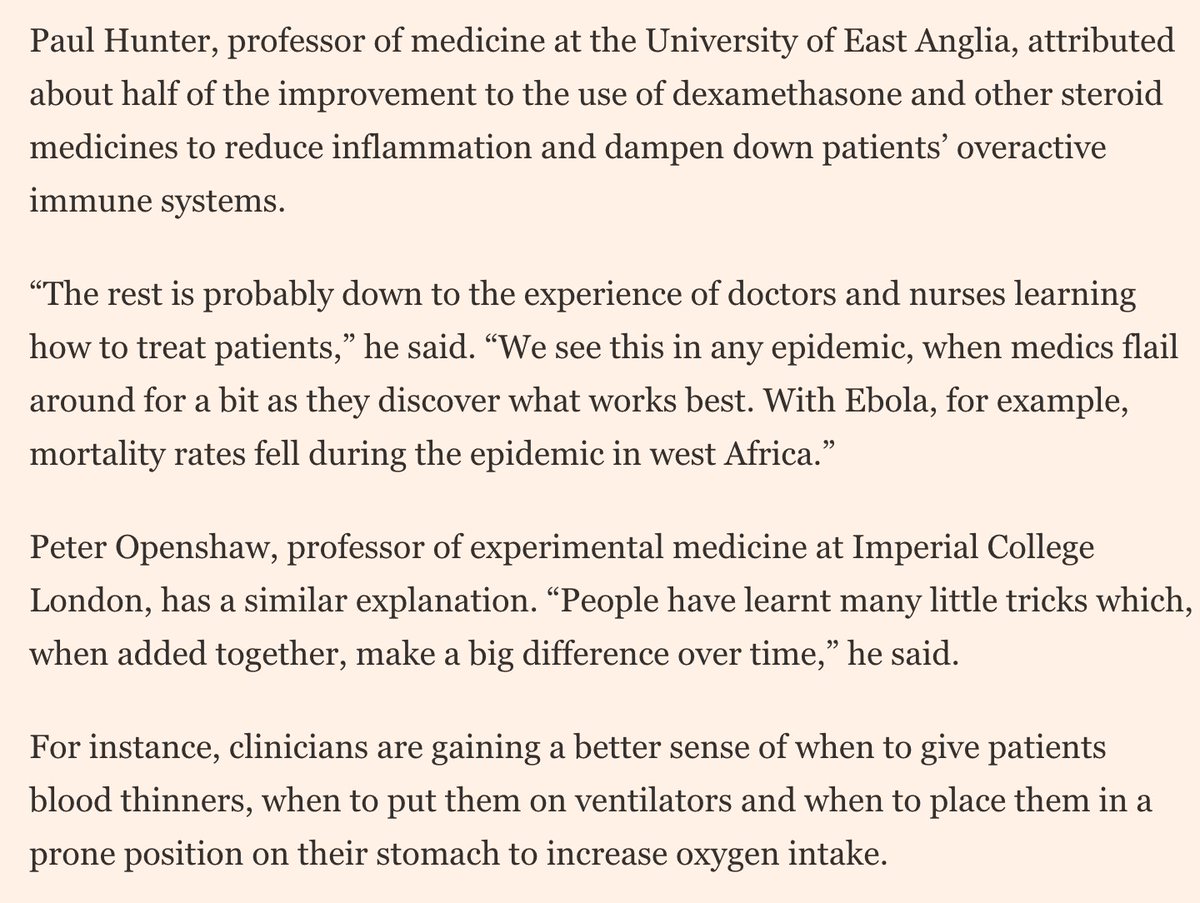
10) But it’s certainly plausible that improvements in critical care over the course of the pandemic have led to tangible reductions in mortality
@metadoc & @p_openshaw explained to @clivecookson how new medicines & lessons learned along the way by doctors could be playing a part
@metadoc & @p_openshaw explained to @clivecookson how new medicines & lessons learned along the way by doctors could be playing a part
11) But many of the improvements listed here are fragile, and depend on what happens as the autumn resurgence continues
As @GidMK noted, a big factor in reduced hospital mortality could be the reduced pressure on hospitals & ICUs as case rates & bed occupancy fell over summer
As @GidMK noted, a big factor in reduced hospital mortality could be the reduced pressure on hospitals & ICUs as case rates & bed occupancy fell over summer
12) If the virus continues to spread rapidly as autumn becomes winter, demand for hospital beds and specialist care could reach or exceed capacity, and outcomes would surely suffer as a result.
tl;dr
- Autumn resurgence more muted than spring, due to social distancing etc. Lose that & transmission accelerates
- Mortality rates down in some contexts, but due in part to reduced pressure on healthcare system
- To keep pressure down & outcomes up, gotta control transmission
- Autumn resurgence more muted than spring, due to social distancing etc. Lose that & transmission accelerates
- Mortality rates down in some contexts, but due in part to reduced pressure on healthcare system
- To keep pressure down & outcomes up, gotta control transmission
14) Full story ft.com/content/b3801b…
• • •
Missing some Tweet in this thread? You can try to
force a refresh