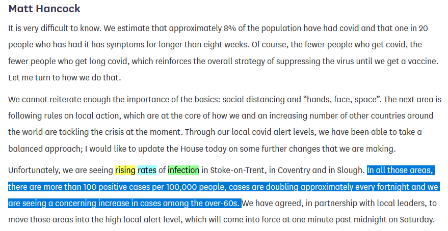
Matt Hancock told the Commons today, placing Stoke, Coventry & Slough into Tier 2

"In all those areas, there are more than 100 positive cases per 100,000 people, cases are doubling approximately every fortnight and we are seeing a concerning increase in cases among the over-60s"
So, it appears that we now appear to have criteria for placing local authorities into Tier 2:
- more than 100 cases per 100,000 people
- cases doubling approximately every fortnight
- concerning increase in cases among the over-60s
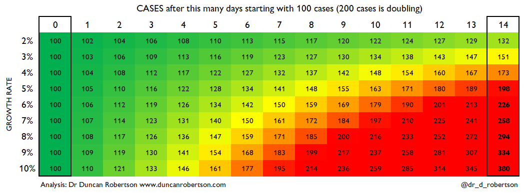
100 cases per 100,000 seems arbitrary, especially considering it doubles the previous rate for interventions:
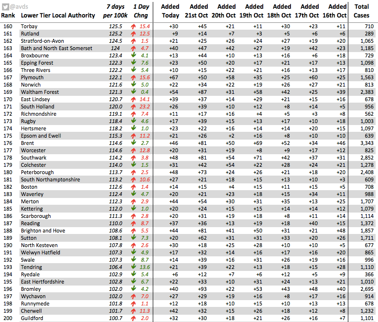
So, let's look at the first criterion: more than 100 cases per 100,000 people. Here are the local authorities meeting this threshold (figures from @avds)
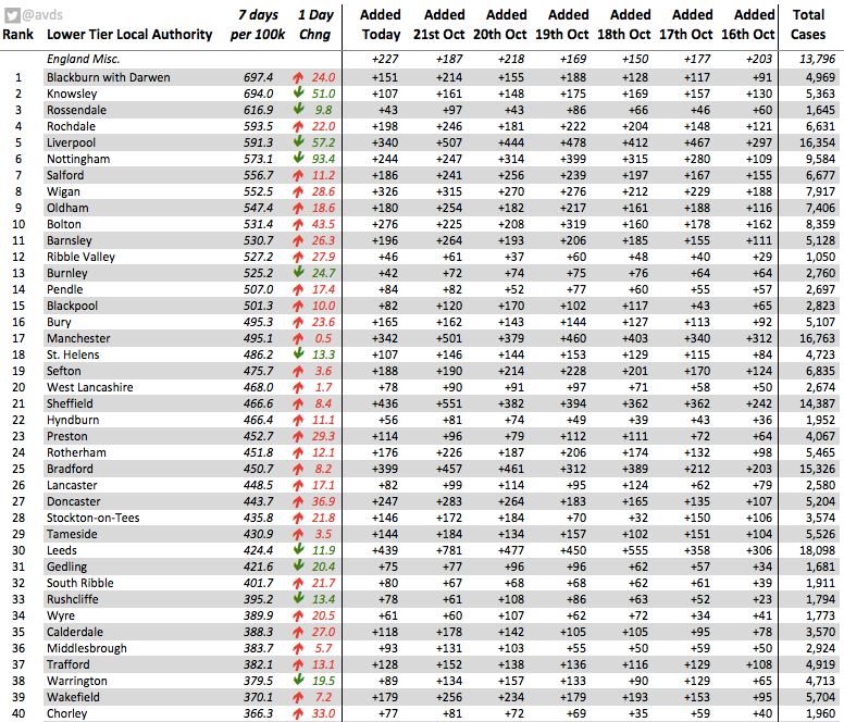
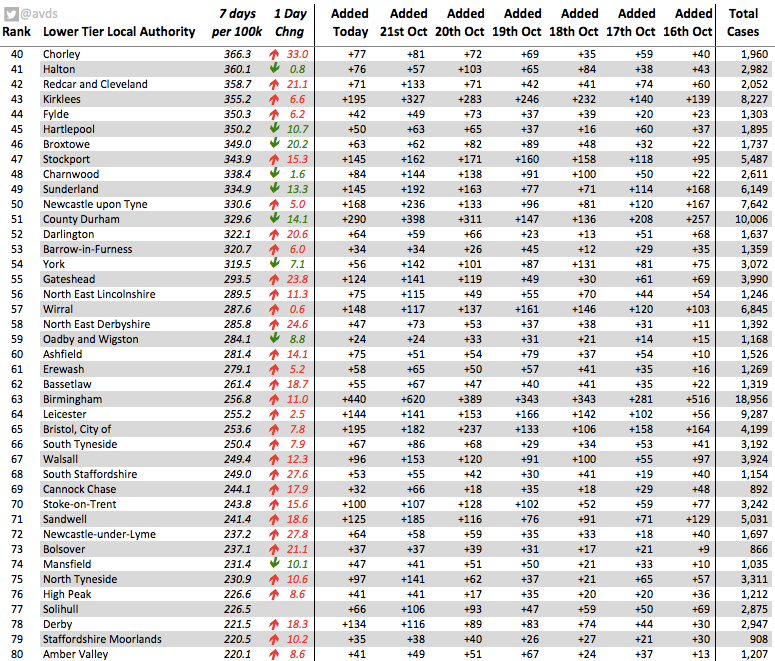
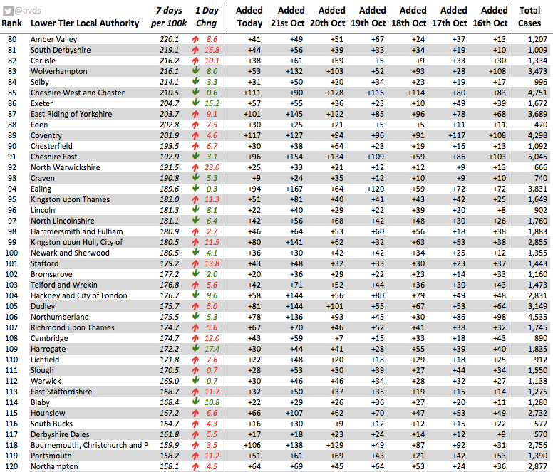
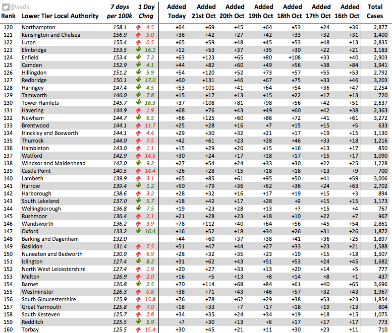
I ran out of space, so here's the fifth page. There are *TWO HUNDRED* local authorities meeting this criterion (out of 315). So why not place these local authorites into Tier 2 now?
Maybe it's the second criterion: cases doubling approximately every fortnight. Let's look at the growth rate according to gov.uk/guidance/the-r…
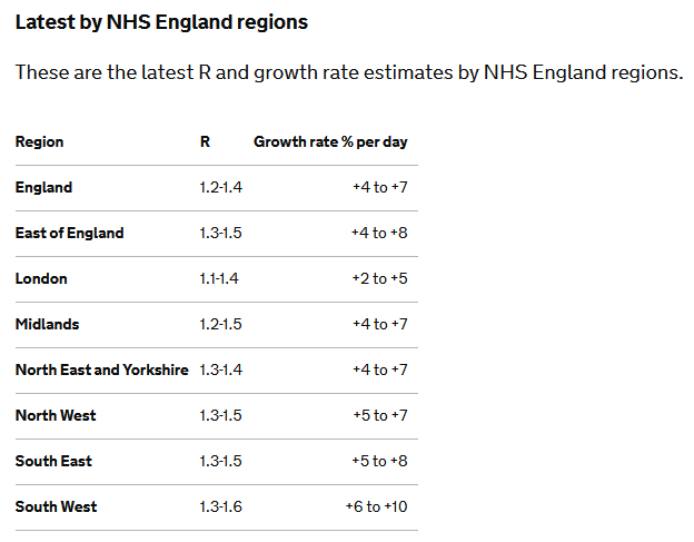
Let's do a quick calculation of percentage growth and see which of these meet that criterion.

So, cases have roughly doubled when the growth rate is 5% or above. So, looking at the R values / growth rates above, that's definitely the whole of the South East and the South West
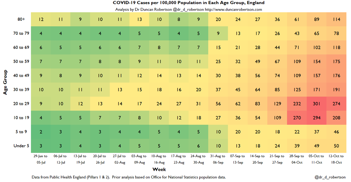
And what about the third and final criterion, 'concerning' increase in cases among the over-60s? Well, we can look at the national picture. I for one am concerned. Compare with the rate in the over 80s from a couple of months ago.

We could delay, but this will mean doubling of cases and doubling of death rates. And we are talking about *Tier 2* here. We know that the higher *Tier 3* restrictions by themselves won't reduce R to below 1 (source: @uksciencechief)
We know that delay means further deaths from Covid.

Why are we delaying?

This incremental policy creates arguments and headlines and distracts from the big picture.

Is the reason that Test & Trace has failed and the Government has no Plan B?
I have said it many times, but:

What is the Government's reasonable worst case scenario estimate for deaths?

And if it cannot answer that question, why not.

• • •

Missing some Tweet in this thread? You can try to force a refresh
 

Keep Current with Dr Duncan Robertson

Dr Duncan Robertson Profile picture

Stay in touch and get notified when new unrolls are available from this author!

Read all threads

This Thread may be Removed Anytime!

PDF

Twitter may remove this content at anytime! Save it as PDF for later use!

Try unrolling a thread yourself!

how to unroll video
  1. Follow @ThreadReaderApp to mention us!

  2. From a Twitter thread mention us with a keyword "unroll"
@threadreaderapp unroll

Practice here first or read more on our help page!

More from @Dr_D_Robertson

22 Oct
Here is the latest heatmap of COVID-19 cases in England. There are now *114* cases per 100,000 in the over-80s, a 28% rise since last week.

These are not just cases, hundreds of these are deaths to come in the next few weeks.
Monochrome heatmap of England COVID-19 cases.

*114* cases per 100,000 in the over-80s, a 28% rise since last week.

@CMO_England said that Tier 3 restrictions by themselves will not reduce R below 1. Increasing cases and more deaths to come under this policy.

Winter is coming.
Positivity for Males.

Real problem with not doing enough testing for men. Espeically as men are more likely to die from Covid.

Over 5% indicates not enough testing. Which covers 10-80 year old men.
Read 6 tweets
22 Oct
Public Health England have today (22 October) released their latest (Influenza and) COVID-19 surveillance report.

It is for week 43 and includes data up to week 42.
Cases tested remained roughly constatnt. This may be due to limited availability of tests.

Positivity has increased to over 8% in pillar 2 indicating not enough testing is being done.
Here is the map of COVID-19 cases detected this week. Most of the country is now above 50 cases per 100,000
Read 12 tweets
9 Oct
Here is my latest heatmap showing how cases are travelling through the age groups.

It is very concerning.
"The first thing to note is the more-than-doubling in the rate of Covid cases in 10-19 year olds. Many of these will be university students, but it's not clear how many of these are schoolchildren.
“Studies in Spain, France, and the US have all shown that although the second wave may start in young people, it will inevitably move to older people.

“The remarkable thing about this disease is that the death rate increases massively with age.
Read 12 tweets
9 Oct
Commentary on the Slide Pack shown to MPs

'COVID-19 TaskForce: Data briefing 8 October 2020'

Here it is:
assets.publishing.service.gov.uk/government/upl…

h/t @robpowellnews and @Smyth_Chris
Slide 1
Comment: The ONS survey does not include students in halls of residence so will underestimate due to outbreaks in halls of residence

But, yes, everything points to the epidemic not being under control

See:
Slide 2

Shows cases above 50 per 100,000. This is good. However, note several colour shades above this - not just the dark purple (and why no scale?)
Read 32 tweets
9 Oct
Here endeth the National COVID-19 surveillance reports series.

gov.uk/government/pub…
These have been replaced with the National flu and COVID-19 surveillance reports. So, that's good.

And I'll be providing weekly updates on these.

But - a few things.
The new reports don't show hospitalizations by NHS trust. These were useful for showing e.g. the 5th highest hopsital trust with admissions per 100,000 population was in London, not the north of England
Read 7 tweets
8 Oct
Public Health England have published their latest (week 41) COVID surveillance report. However, this is in a new format called the 'influenza and COVID-19 surveillance report'. It is not clear whether a separate COVID report will be published

assets.publishing.service.gov.uk/government/upl…
This report does not appear to contain a watchlist of local authorities. Previous weeks have contained a watchlist of local authorities published jointly by PHE / Joint Biosecurity Centre / NHS Test and Trace.

See this for last week's
This is the chart for positivity. Increasing. Change of methodology this week - a good thing as a more conventional calculation.

'Positivity is calculated as the number of individuals testing positive during the week divided by the number of individuals tested during the week.'
Read 19 tweets

Did Thread Reader help you today?

Support us! We are indie developers!


This site is made by just two indie developers on a laptop doing marketing, support and development! Read more about the story.

Become a Premium Member ($3/month or $30/year) and get exclusive features!

Become Premium

Too expensive? Make a small donation by buying us coffee ($5) or help with server cost ($10)

Donate via Paypal Become our Patreon

Thank you for your support!

Follow Us on Twitter!