Here endeth the National COVID-19 surveillance reports series.

gov.uk/government/pub…
These have been replaced with the National flu and COVID-19 surveillance reports. So, that's good.

And I'll be providing weekly updates on these.

But - a few things.
The new reports don't show hospitalizations by NHS trust. These were useful for showing e.g. the 5th highest hopsital trust with admissions per 100,000 population was in London, not the north of England
The other thing that may now not be published is the watchlist of local authorities which was (from last week) published here
gov.uk/government/pub…

So I've created my own. Two thirds of local authorities (give or take) would be in the watchlist

And maybe only 3 of these 149 local authorities would not be areas of concern.

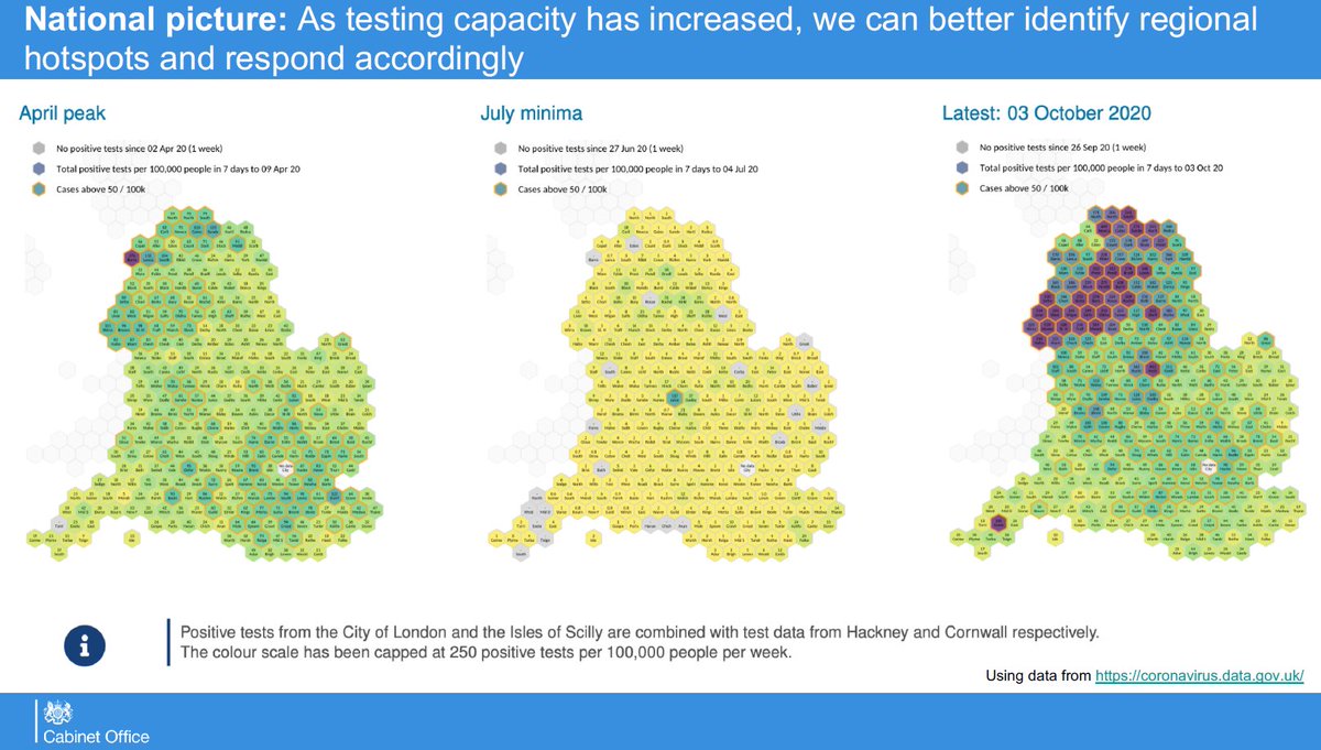
And gov.uk/government/pub… also published nice maps of local authorities which was useful for seeing for example that some parts of cities such as Liverpool had case rates in excess of 1200 cases per 100,000

The colour scale on the map has also changed. PHE kept the colour scale (and the maximum colour threshold of >45 per 100,000) since 11 June

assets.publishing.service.gov.uk/government/upl…

Why change the scale now?

• • •

Missing some Tweet in this thread? You can try to force a refresh
 

Keep Current with Dr Duncan Robertson

Dr Duncan Robertson Profile picture

Stay in touch and get notified when new unrolls are available from this author!

Read all threads

This Thread may be Removed Anytime!

PDF

Twitter may remove this content at anytime! Save it as PDF for later use!

Try unrolling a thread yourself!

how to unroll video
  1. Follow @ThreadReaderApp to mention us!

  2. From a Twitter thread mention us with a keyword "unroll"
@threadreaderapp unroll

Practice here first or read more on our help page!

More from @Dr_D_Robertson

9 Oct
Here is my latest heatmap showing how cases are travelling through the age groups.

It is very concerning. Image
"The first thing to note is the more-than-doubling in the rate of Covid cases in 10-19 year olds. Many of these will be university students, but it's not clear how many of these are schoolchildren.
“Studies in Spain, France, and the US have all shown that although the second wave may start in young people, it will inevitably move to older people.

“The remarkable thing about this disease is that the death rate increases massively with age.
Read 12 tweets
9 Oct
Commentary on the Slide Pack shown to MPs

'COVID-19 TaskForce: Data briefing 8 October 2020'

Here it is:
assets.publishing.service.gov.uk/government/upl…

h/t @robpowellnews and @Smyth_Chris
Slide 1
Comment: The ONS survey does not include students in halls of residence so will underestimate due to outbreaks in halls of residence

But, yes, everything points to the epidemic not being under control

See:
Slide 2

Shows cases above 50 per 100,000. This is good. However, note several colour shades above this - not just the dark purple (and why no scale?)
Read 32 tweets
8 Oct
Public Health England have published their latest (week 41) COVID surveillance report. However, this is in a new format called the 'influenza and COVID-19 surveillance report'. It is not clear whether a separate COVID report will be published

assets.publishing.service.gov.uk/government/upl…
This report does not appear to contain a watchlist of local authorities. Previous weeks have contained a watchlist of local authorities published jointly by PHE / Joint Biosecurity Centre / NHS Test and Trace.

See this for last week's
This is the chart for positivity. Increasing. Change of methodology this week - a good thing as a more conventional calculation.

'Positivity is calculated as the number of individuals testing positive during the week divided by the number of individuals tested during the week.'
Read 19 tweets
8 Oct
Test Trace and Isolate isn't working.

Specifically
- Testing isn't working
- Tracing isn't working
- Isolating isn't working
SAGE minutes of 1 May (Meeting 32) stated that 'at least 80% of contacts of an index case would need to be identified for a system to be effective'

gov.uk/government/pub…
Here's a chart of the progression of people through the TTI system
nuffieldtrust.org.uk/resource/chart…

Also follow @ADMBriggs for excellent analysis of the TTI statistics

You can see we are nowhere near where we need to be
Read 9 tweets
6 Oct
Let's not lose sight of what's happening.

We may not be able to rely on case data. But here's the latest PHE map of cases. Not now restricted to the north east and the north west - look at London

So if we can't rely on cases, we have to use other metrics. Image
Here is a graph of admissions to hospital in England.

478 people were admitted today. And the trend is upwards. Image
What happens if you deteriorate is that you end up in ICU or a High Dependency Unit.

So what's happening there? These are increasing too. Image
Read 6 tweets
6 Oct
Positivity calculations (please ignore this everyone, trying to work something out)

@theosanderson @ADMBriggs @dan_grey (please add in anyone interested)
We are trying to reconcile the data from this chart
(source: assets.publishing.service.gov.uk/government/upl… ) Image
Let's look at week 36, as that's what @theosanderson used in his FOI request
whatdotheyknow.com/request/689515…
Read 8 tweets

Did Thread Reader help you today?

Support us! We are indie developers!


This site is made by just two indie developers on a laptop doing marketing, support and development! Read more about the story.

Become a Premium Member ($3/month or $30/year) and get exclusive features!

Become Premium

Too expensive? Make a small donation by buying us coffee ($5) or help with server cost ($10)

Donate via Paypal Become our Patreon

Thank you for your support!

Follow Us on Twitter!