Public Health England have published their latest (week 41) COVID surveillance report. However, this is in a new format called the 'influenza and COVID-19 surveillance report'. It is not clear whether a separate COVID report will be published
assets.publishing.service.gov.uk/government/upl…
assets.publishing.service.gov.uk/government/upl…
This report does not appear to contain a watchlist of local authorities. Previous weeks have contained a watchlist of local authorities published jointly by PHE / Joint Biosecurity Centre / NHS Test and Trace.
See this for last week's
See this for last week's
https://twitter.com/Dr_D_Robertson/status/1311998656174788608
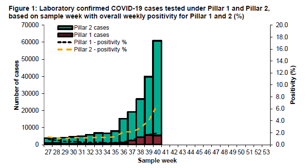
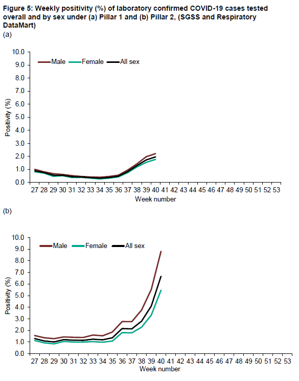
This is the chart for positivity. Increasing. Change of methodology this week - a good thing as a more conventional calculation.
'Positivity is calculated as the number of individuals testing positive during the week divided by the number of individuals tested during the week.'
'Positivity is calculated as the number of individuals testing positive during the week divided by the number of individuals tested during the week.'
Age groups of people testing positive
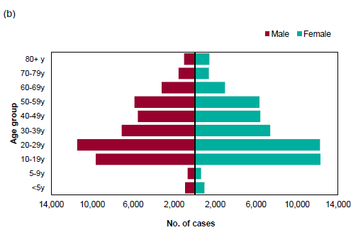
Proportion of age groups testing positive. Significant increases in 10-29 year-olds
Pillar 2 (community testing) positivity increasing significantly. Greater than 5% in Pillar 2 (indicating not enough testing being performed) (WHO guidance)
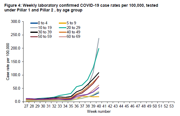
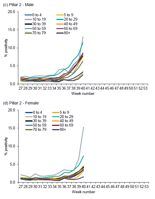
Pillar 2 (community testing) positivity broken down by age cohorts. Positivity of >10% for 10-19 year olds and 20-29 year olds. This indicates that not enough testing is being performed particularly in these age groups. Cases in these age groups particularly under-reported.
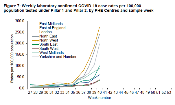
Covid case rates broken down by region. North East, North West, Yorkshire & Humber high.
East Midlands rising fast too (dark green line)
East Midlands rising fast too (dark green line)
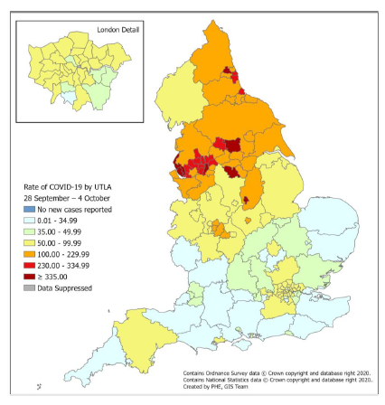
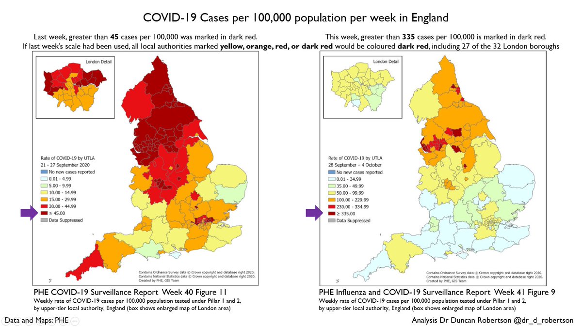
Covid cases map for the UK. Doesn't look as scary as last week - last week darkest red was for greater than 45 cases per 100,000.
It's now greater than 335 cases per 100,000.
If this was using the same colour scheme as last week, *everything yellow or above would be dark red*.
It's now greater than 335 cases per 100,000.
If this was using the same colour scheme as last week, *everything yellow or above would be dark red*.

So, this week, the *whole of London* would be dark red if using the same scale as last week.
Here's last week's map for comparison. Things have got worse since then.
Here's last week's map for comparison. Things have got worse since then.
https://twitter.com/Dr_D_Robertson/status/1311984858785296384
Deaths increasing

It is not clear whether the (only) Covid surveillance report will be published tomorrow. If so, I will produce another thread, which I expect will include hospitalisation location data and maps of cases in local authorities.
Correction. Most of London - the yellow London boroughs here (and potentially some of the green London boroughs)
* part of the UK :)
A couple of clarifications/corrections
- This is a map not of the UK, but of England 🙂 (data from Public Health England)
- The areas that would formerly be dark red are 27 of the 32 London boroughs: all London boroughs except for: Bexley, Bromley, Greenwich, Merton, and Sutton
- This is a map not of the UK, but of England 🙂 (data from Public Health England)
- The areas that would formerly be dark red are 27 of the 32 London boroughs: all London boroughs except for: Bexley, Bromley, Greenwich, Merton, and Sutton
And thank you to @rob_aldridge and @junipertwo for pointing me in the right direction: the Covid-specific report will no longer be published.
The watchlist and local authority maps have been published on Fridays, and I will look out for them tomorrow.
The watchlist and local authority maps have been published on Fridays, and I will look out for them tomorrow.
https://twitter.com/Junipertwo/status/1314307728244903936
Although the watchlist of local authorities has not yet been published, you can make a rough estimate - here are the upper tier local authorities (these are the equivalent of county councils) and include unitary authorities such as Leicester.
105 out of 149, or over two-thirds
105 out of 149, or over two-thirds
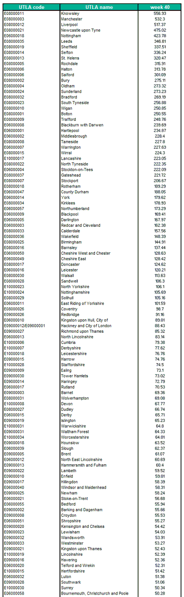
Only *three* of these 149 upper tier local authorities are below a threshold of 20 cases per 100,000
"above 20 per 100,000 are of particular concern when [the Government] decides whether to update the [self-isolation for travellers to the UK] list."
news.sky.com/story/coronavi…
"above 20 per 100,000 are of particular concern when [the Government] decides whether to update the [self-isolation for travellers to the UK] list."
news.sky.com/story/coronavi…
Here's a slide summarizing the colour scheme change
• • •
Missing some Tweet in this thread? You can try to
force a refresh