@COVID19Tracking *Today’s #Covid19 Update Thread*
(tests, cases, deaths, hospitalizations, ICU, and % testing positive as of Today, 1 week, 2 weeks, 1 month, and 2 months ago—data from @COVID19Tracking)
UNITED STATES
(Summary and region-by-region breakdown in thread below)
@COVID19Tracking Reported average daily deaths seem to finally be showing the results of our high case counts (+ high % testing positive).
If the past is any guide, it runs at a ~21-day lag. We were in the mid-80k range 21 days ago. We're double that now. Not a great harbinger for mid-December.
@COVID19Tracking Happy to see a decent-sized drop in % testing positive today. I'll be happier still when we see smaller absolute percentages nationwide.
@COVID19Tracking Week-over-week percentage change in cases and % positive over the last 2 months:
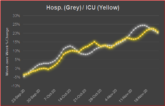
@COVID19Tracking Week-over-week percentage change in hospitalizations and ICU numbers over the last 2 months:
@COVID19Tracking Week-over-week percentage change in deaths over the last 2 months:
It is getting tiresome watching media, government, and other Twitter folks present erroneous numbers for certain states’ #Covid19 positive testing percentage.
Many of the Johns Hopkins percentages are flat wrong, and it's the denominator problem (again).
🧵THREAD🧵
1/
First, it’s important to know that these aren’t "Johns Hopkins' numbers." Their testing data is from @COVID19Tracking, who gets it from state websites.
But there are 3 options from which to choose the test number. Here are the definitions of each, in CTP’s priority order:
2/
Ok--I said that I'd provide some more information on the issue of how I (and others) have reported testing numbers wrong in several states.
This is actually a pretty big deal, and could affect policy decisions with a cursory look at the wrong positive testing percentage.
1/x
People looking at the national snapshot often use @COVID19Tracking's data. I do. Their site provides easy-to-access data.
And they have updated testing data for several states in a new column on their spreadsheet, but many of us continued to use the "legacy" column.
2/x
For 24 states, using that column provides a *very* skewed version of daily testing numbers (some states more skewed than others), creating erroneously high *current* positive testing percentages.
3/x
For those who follow my daily data update, I have a major adjustment I need to make in several states. 24 out of the 50 states are being reported exactly like Florida in terms of test numbers and positive %--which is DEAD WRONG (and inflates % positive).
I had no idea it was this big a deal, but it's a very big deal. Here's a thread on why it's a big deal:
Bottom line: @COVID19Tracking, and everyone who builds graphs off of it, use data for "new tests" that does not include anyone who has ever been tested before!
CO, ND, SD, and a ton of others--their percent testing positive are simply nowhere near as high as I've been reporting.
Hey @ianbremmer--you're using incorrect data as the denominator. To be fair, FL puts it out on the dashboard, but using the difference in the daily "Total People Tested" number is flawed, and pretty obviously so. Here's why...
First, here's your tweet and graphic. The graphic is clearly using the day-over-day difference in the Total People Tested metric, which is what @COVID19Tracking uses (last I checked), and which is wildly inaccurate when seeking out current testing.
That number measures only the number of people tested *for the first time ever*. So anyone ever tested--in April, May, June, whenever--will not show up here if they test again tomorrow. This excludes tens of thousands of tests every single day.
The US's 7-day average number of tests as of yesterday (per @COVID19Tracking) was ~846K. The week before? ~688K. Of course, this is expected with increased testing as schools open up.
The 7-day average percent testing positive hit 4.74% yesterday—the lowest since mid-June.
2/x
Turning to state-level data, "more than half" of US states certainly did not show an increase in percent testing positive.
21 of them did. But even that number is misleading. It includes CT, NH, NJ, VT, and NM, all of which are below 3% positive (VT is 0.59%, up from 0.54%)
3/x
To give you an idea of the lag between when a Covid death occurs and when it is reported, let's look at today's report from the state of Florida, which reported 153 resident deaths on 9/16.
The picture shows "newly identified" deaths (today's) in darker purple:
So, of the 153 resident deaths Florida reported today:
27 of them occurred in the last week (17.7%)
26 of them 1-2 weeks ago (17.0%)
30 of them 2-3 weeks ago (19.6%)
20 of them 3-4 weeks ago (13.1%)
Which leaves 50 deaths that occurred more than 4 weeks ago (32.7%).
On top of normal reporting lag, backlog clearing (death certificate matching) and reclassifying what counts as a death enter the mix as well.
An example of the former is Virginia's reported deaths today (45) and yesterday (96). The VDH website provided the following disclaimer: