I deployed some new features to covid19-projections.com over the past week. Here's a brief summary:

1) Maps over time - you can now view how the pandemic progresses over time for the US, on both a state and county level: covid19-projections.com/maps-infection…
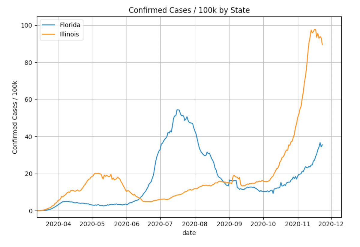
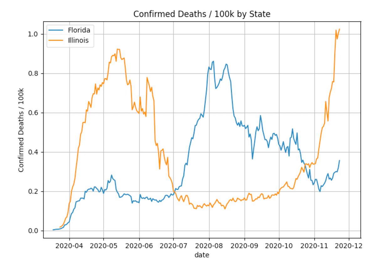
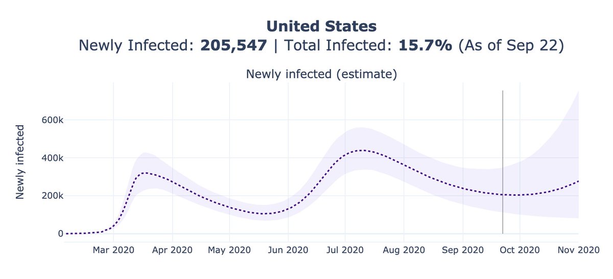
2) Plots of confirmed cases and deaths for every state and county in the US (in addition to estimates of true infections).

Example: covid19-projections.com/infections/us Image
3) Methodology writeup: covid19-projections.com/estimating-tru…. Will write a more detailed Tweet soon.

4) Daily county-level estimates: github.com/youyanggu/covi…. Due to storage constraints I moved it to a separate repository.
These features are based on requests/comments I've received, so thank you for all of your continued feedback.

If you have more tips / feature requests, feel free to reach out on the website: covid19-projections.com/contact.
As a reminder, cases and deaths will likely reach new record highs over the next week as states catch up on their reporting from the Thanksgiving holiday.

It's important that we don't make any premature assumptions until more data comes in.

• • •

Missing some Tweet in this thread? You can try to force a refresh
 

Keep Current with Youyang Gu

Youyang Gu Profile picture

Stay in touch and get notified when new unrolls are available from this author!

Read all threads

This Thread may be Removed Anytime!

PDF

Twitter may remove this content at anytime! Save it as PDF for later use!

Try unrolling a thread yourself!

how to unroll video
  1. Follow @ThreadReaderApp to mention us!

  2. From a Twitter thread mention us with a keyword "unroll"
@threadreaderapp unroll

Practice here first or read more on our help page!

More from @youyanggu

3 Dec
I posted the methodology for the new covid19-projections.com nowcasting model:

covid19-projections.com/estimating-tru…

I'm going to do a layman summary here, and hopefully receive some feedback from #epitwitter. Image
I've adjusted the methodology that I posted back in August based on new data and research:


Disclaimer: with that said, this is still a simple heuristic and hence is not perfect. There are more advanced methods (e.g. see covidestim.org).
The basic idea is this: for each day, we try to estimate the ratio of true infections to reported cases that day.

We call this the prevalence ratio, and we model this ratio as a function of the day and positivity rate: Image
Read 16 tweets
24 Nov
Last week, Illinois reported 15,415 cases in a single day, more than Florida ever did in a single day. This is despite Illinois' population being 40% lower.

Many of you probably did not know the dire situation in Illinois. That's because no mainstream media chose to report it.
Here is how the media chose to report Illinois now (left) vs Florida in July (right).

Unfortunately, no national news outlet is covering the situation in Illinois.
No other state has ever averaged 12,000 cases a day for a whole week. Not even Florida (1.7x pop), California (3x pop), and Texas (2.3x pop).

For deaths per capita, Illinois also exceeded the peak deaths in Florida twice, once in May and once again now. So why is this not news?
Read 6 tweets
23 Nov
New feature! I added detailed county-level infections estimates for all 3,000+ US counties.

Find your county here: covid19-projections.com/#us-counties-i…

For example, NYC (left) is currently at <10% of its March/April peak, while Chicago (right) has likely surpassed its spring peak.
I also created a new Maps page where you can view the county-level estimates: covid19-projections.com/maps-infection…

Using this map, you can see that many counties in the Northeast and Northwest still have very low rates of prevalence, and thus are susceptible to a future wave.
A few more observations:

Zooming in to the Midwest, it seems like counties in Minnesota have a lower prevalence than its neighboring states.

Western side of Kansas also shows very high prevalence, but prevalence is many times lower just across the border in eastern Colorado.
Read 4 tweets
1 Oct
If you're under 50, your odds of dying if you contract COVID-19 is ~0.013% or 1 in 8000. This is similar to the odds of dying in a car accident in a year.

BUT many infected people will go on to infect others. In this thread I'll explain why we cannot treat the two risks equally.
The current Rt for the SARS-CoV-2 virus in the US is ~1. This means that an infected person will infect, on average, 1 other person. That person will infect another, and so on.

After 3 months, ~20 people will have been infected that can be indirectly attributed to the 1st case.
If Rt increases to 1.2, then 130 people will have been infected after 3 months. All stemming from 1 infection.

The chance that at least 1 person among the 130 will die is non-trivial (~50%).

That's why we need to view COVID-19 as a *community risk*, not an *individual risk*.
Read 9 tweets
30 Sep
9/30 Weekly covid19-projections.com Update:

We forecast 24,000 (13-42k) additional reported deaths in the US by November 1 (~750/day).

Nov 1 Total Deaths Forecasts:

Today: 230k (219-248k)
Last week: 223k (213-238k)
2 weeks ago: 219k (208-233k)
4 weeks ago: 219k (205-240k) Image
We increased our forecasts over the past week after incorporating several new factors:

- A potential loss of immunity after >6 months
- Further relaxation of policies
- Increased interactions (school reopenings, return to work, etc)
- Plateau in cases/hospitalizations
There is currently a lack of consensus among the top models about the short-term deaths forecasts.

Our model and the COVIDhub ensemble model both suggest a possible plateau in reported deaths over the next few weeks. Image
Read 13 tweets
22 Sep
9/22 Weekly covid19-projections.com Update:

We forecast 23,000 (13-38k) additional reported deaths in the US by November 1 (~600/day).

Nov 1 Total Deaths Forecasts:

Today: 223k (213-238k)
Last week: 219k (208-233k)
2 weeks ago: 219k (207-236k)
4 weeks ago: 219k (202-244k) Image
This week's forecast is a slight uptick from past weeks' forecasts.

We believe new infections may be flattening at 2x the level it was back in May. That is a cause for concern.

Which direction new infections will go is still uncertain, at least from the data. Image
We may see cases plateau at around the 40k/day mark. Cases may increase in the near future, but it's unclear if that'll be due to backlog/increased testing or due to a true rise.

Hence, test positivity and hospitalizations are better metrics to monitor.

Read 15 tweets

Did Thread Reader help you today?

Support us! We are indie developers!


This site is made by just two indie developers on a laptop doing marketing, support and development! Read more about the story.

Become a Premium Member ($3/month or $30/year) and get exclusive features!

Become Premium

Too expensive? Make a small donation by buying us coffee ($5) or help with server cost ($10)

Donate via Paypal Become our Patreon

Thank you for your support!

Follow Us on Twitter!