I posted the methodology for the new covid19-projections.com nowcasting model:
covid19-projections.com/estimating-tru…
I'm going to do a layman summary here, and hopefully receive some feedback from #epitwitter.
covid19-projections.com/estimating-tru…
I'm going to do a layman summary here, and hopefully receive some feedback from #epitwitter.

I've adjusted the methodology that I posted back in August based on new data and research:
Disclaimer: with that said, this is still a simple heuristic and hence is not perfect. There are more advanced methods (e.g. see covidestim.org).
https://twitter.com/youyanggu/status/1291092311045283841
Disclaimer: with that said, this is still a simple heuristic and hence is not perfect. There are more advanced methods (e.g. see covidestim.org).
The basic idea is this: for each day, we try to estimate the ratio of true infections to reported cases that day.
We call this the prevalence ratio, and we model this ratio as a function of the day and positivity rate:
We call this the prevalence ratio, and we model this ratio as a function of the day and positivity rate:

What does this mean? Two things:
1) As test positivity increases, the prevalence ratio increases due to not enough testing.
In the below plot, a 20% test positivity corresponds to a prevalence ratio of 4, meaning that for every reported case, there are 4 true infections.
1) As test positivity increases, the prevalence ratio increases due to not enough testing.
In the below plot, a 20% test positivity corresponds to a prevalence ratio of 4, meaning that for every reported case, there are 4 true infections.

2) As time goes on, the prevalence ratio decreases due to increased testing availability.
The reasoning is intuitive: If testing is widespread, we are catching more cases.
The increase in testing was much more rapid in the beginning, with a more taper-off in recent months.
The reasoning is intuitive: If testing is widespread, we are catching more cases.
The increase in testing was much more rapid in the beginning, with a more taper-off in recent months.

When you combine the above two factors, you end up with different curves of the prevalence ratio depending on the day and positivity rate.
As you can see in the plot below, test positivity has a more muted effect on the prevalence ratio as time goes on.
As you can see in the plot below, test positivity has a more muted effect on the prevalence ratio as time goes on.

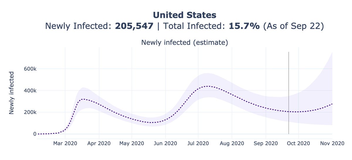
Using the above equations, we can plot the test positivity and prevalence ratio for the US over time.
You can see that we believe the current ratio is around 3.4, meaning that we are catching 1 out of every 3-4 infections (~30% detection rate).
You can see that we believe the current ratio is around 3.4, meaning that we are catching 1 out of every 3-4 infections (~30% detection rate).

We can then multiply the prevalence ratios on each day with the reported cases to estimate the true infections (from 14 days earlier, after accounting for lag).
We can do this for each individual state and take the sum, or for the US as a whole. The results are quite similar.
We can do this for each individual state and take the sum, or for the US as a whole. The results are quite similar.

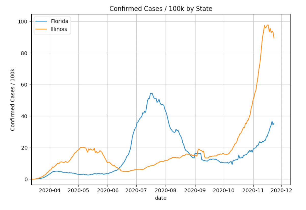
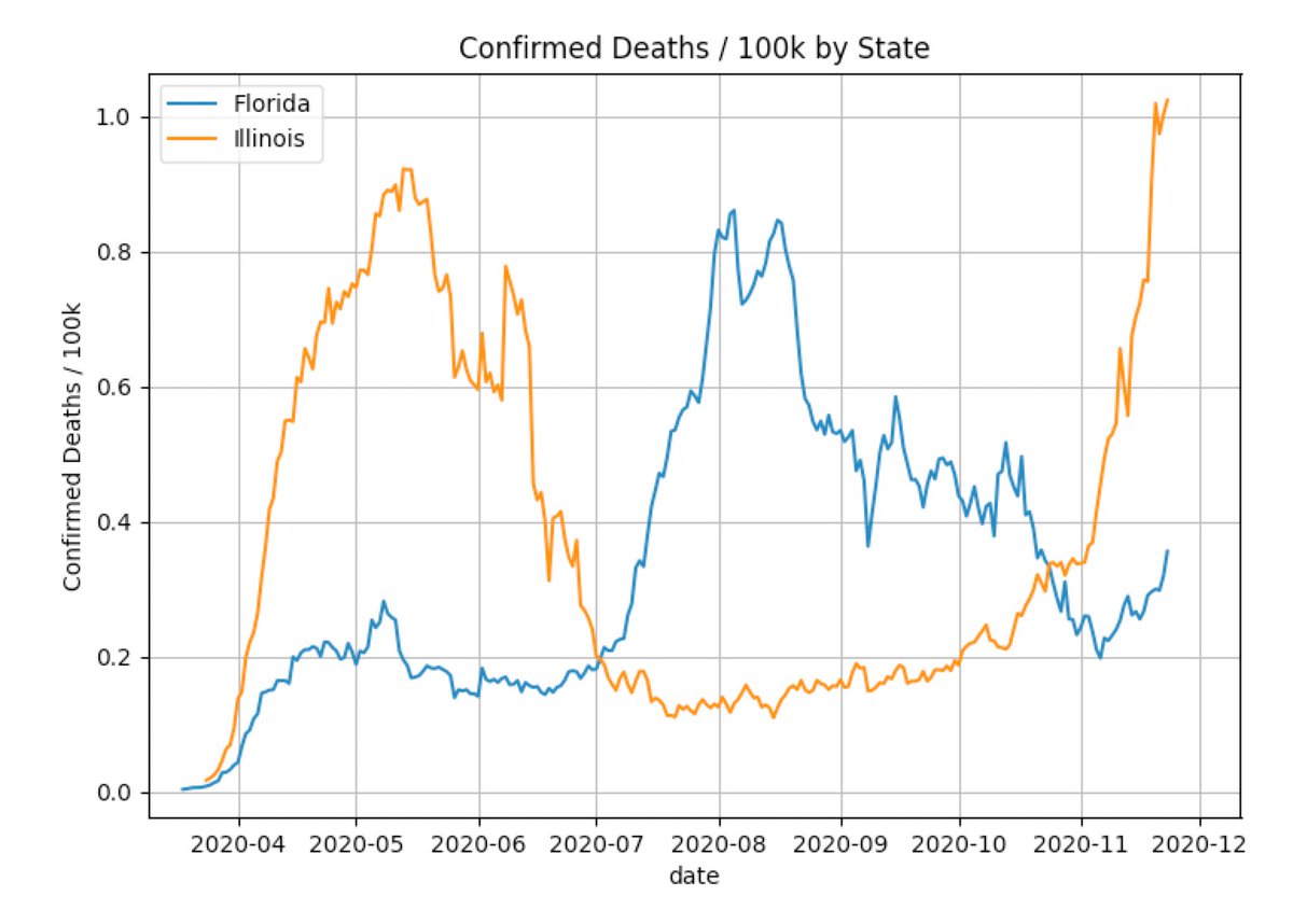
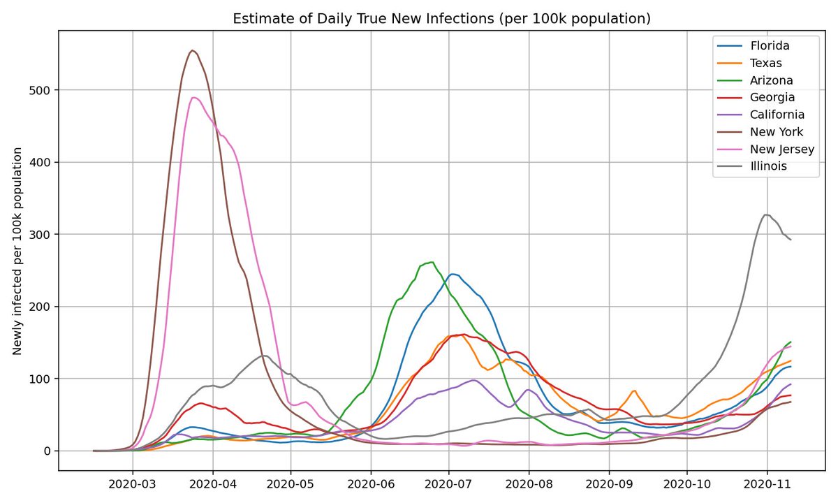
Here's what the estimated true infections for each state looks like for a few select states (normalized by population).
Out of the large states, Illinois currently has the largest outbreak, but that may not be the case for long.
Out of the large states, Illinois currently has the largest outbreak, but that may not be the case for long.
We can apply the same heuristic to estimate what true infections look like based on age group. This is based on the CDC COVIDView data:
cdc.gov/coronavirus/20…
You can see that the age distribution has not changed much since the summer (minus a bump during school reopenings).
cdc.gov/coronavirus/20…
You can see that the age distribution has not changed much since the summer (minus a bump during school reopenings).

Because this method is fairly simple and easily applicable, we can apply it to virtually every US county on a daily basis.
covid19-projections.com/maps-infection…
covid19-projections.com/maps-infection…

One thing I have not yet mentioned is the calculation of the positivity rate. Each state has its own standard in reporting test results, and we must first standardized them before computing test positivity.
covidtracking.com/blog/test-posi…
covidtracking.com/blog/test-posi…
While I've seen many people cite South Dakota's 50%+ test positivity rate, the adjusted test positivity is closer to 20-25%. This is true for several other states as well.
If you want more details, see the @COVID19Tracking post above or the write-up (warning: it's complicated).
If you want more details, see the @COVID19Tracking post above or the write-up (warning: it's complicated).


We can also use the true infections and reported deaths to estimate an implied infection fatality rate (IIFR).
The IIFR has fallen from >1% in the spring to ~0.5% now.
After adjusting for age, possible undercounting and excess deaths, we believe the true IFR is ~0.7%.
The IIFR has fallen from >1% in the spring to ~0.5% now.
After adjusting for age, possible undercounting and excess deaths, we believe the true IFR is ~0.7%.

That about sums it up. As always, let me know if there are any errors / suggestions / feedback.
These estimates are tuned based on a limited sample of randomized serology surveys. So if you come across any new ones in the US, please send them my way.
These estimates are tuned based on a limited sample of randomized serology surveys. So if you come across any new ones in the US, please send them my way.
On a related note, I'm glad that the open-access journal @eLife is transitioning to a "publish then review" model.
While there are always tradeoffs, this will hopefully lead to faster turnaround times for time-sensitive issues (such as a pandemic) .
While there are always tradeoffs, this will hopefully lead to faster turnaround times for time-sensitive issues (such as a pandemic) .
https://twitter.com/mbeisen/status/1333852292055875584
• • •
Missing some Tweet in this thread? You can try to
force a refresh