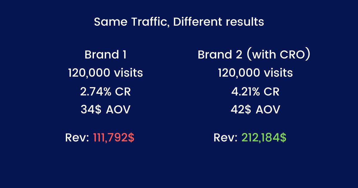
I increased the conversion rate of a 6 fig ecom Brand by 22% just by making a few changes on their product page.

+22% in CR meant an extra +24,000$ in revenue for them every month (without any additional ad spend)

Here is what I did

/ / THREAD //
First of all, you have to understand that spending more on ads is not the only way to make more money as an Ecom brand.

By optimizing well your CR and AOV you can literally x3 your revenue (depending on where you are right now) with the same traffic that you're getting now.
The most effective way to increase the CR is by improving the product pages.

That's the first thing you should do if you want to optimize your revenue

That's what I did for my client's main product page.

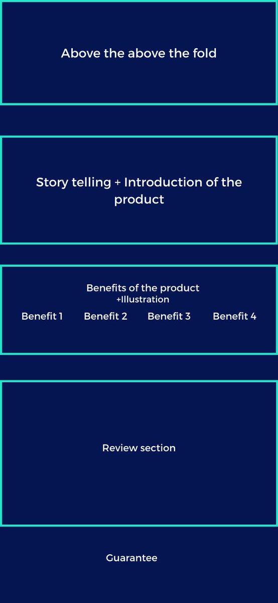
Here was the old product page structure (which was not bad actually):
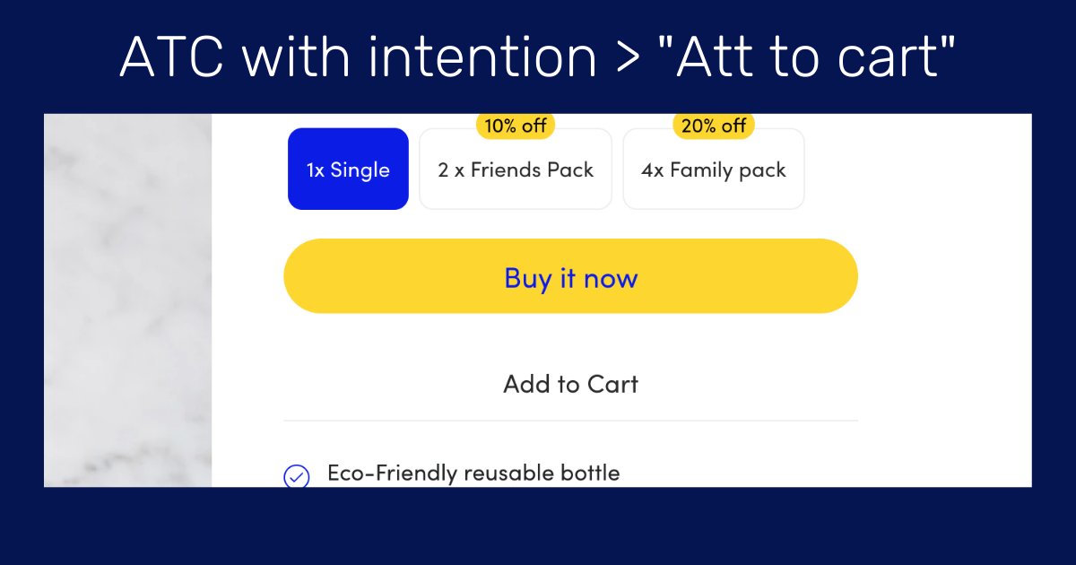
Good copy and a benefits list is a great thing to have on a product page but it's not enough.

A review is also not enough for social proof.

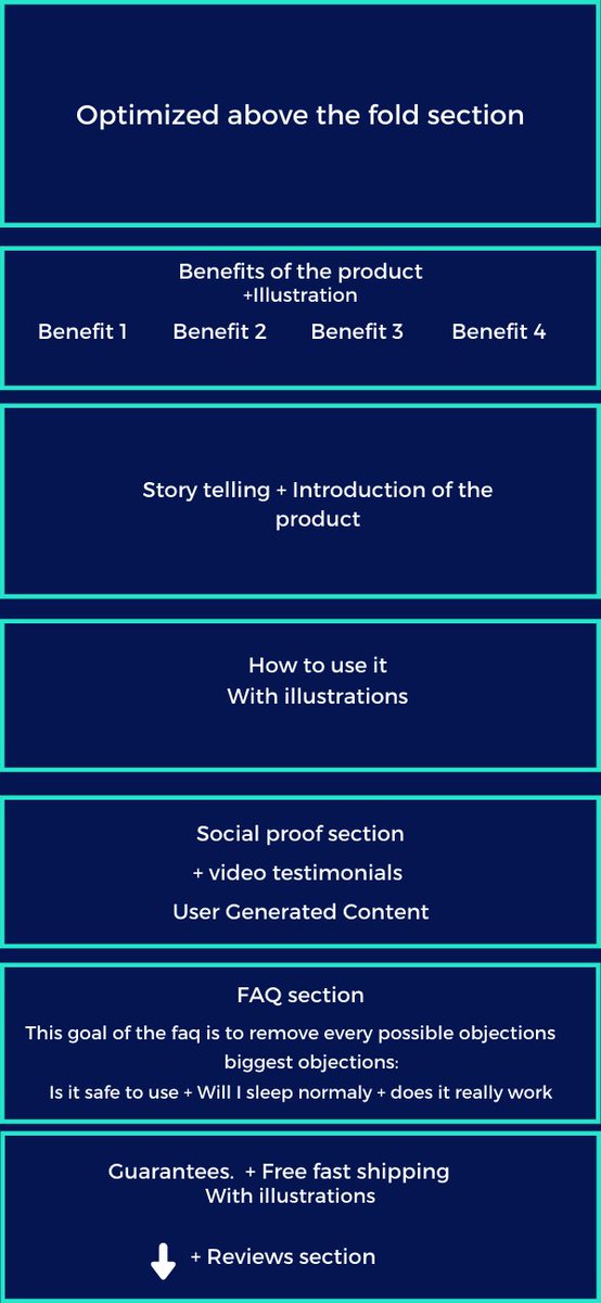
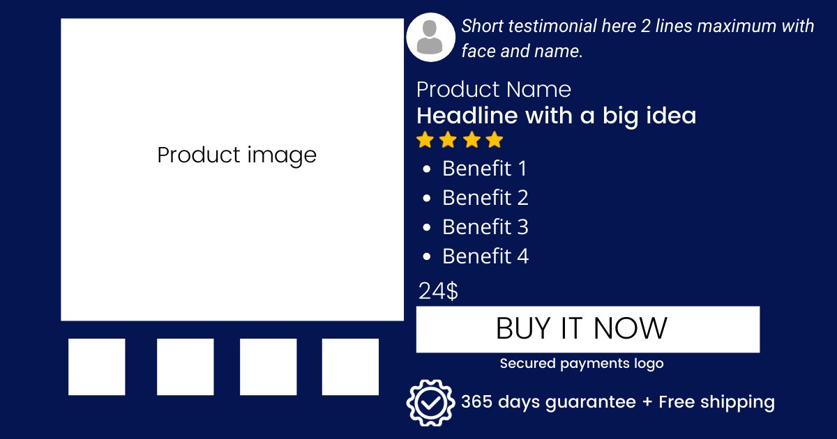
Here is the product page structure I used to increase the CR by 22%:

I built the page on Shogun btw
Here is an example of a great product page that converts well:
mantasleep.com/products/manta…
More than 50% of people will leave the page without scrolling (in less than 5sec)

That's why the Above the fold is the most important section

It should include:
>A Great Headline
>A short benefit list
>A Clear CTA + Guarantees/FS
>A short testimonial

Like that:
Here is an example of great Above the Fold (Skinnyfit)

-Headline with a big idea "Super Youth'
-Very visible benefit list
-Clear and visible CTA
-Social proof (start+social medias icons)
-Money-back guarantee + secured payment
-Visible Discount
Of course, there are a lot of other ways to improve the CR

but I wanted to show you the impact (in term of revenue) that can have a few changes on a product page

3 days of work, + extra 24000$ generated every month for this brand.
If you're an Ecommerce brand making +30k$/month and you're interested in getting the same results or more(+30/60% in rev)

Send me a dm
twitter.com/messages/compo…

• • •

Missing some Tweet in this thread? You can try to force a refresh
 

Keep Current with Olivier - The Framing Effect

Olivier - The Framing Effect Profile picture

Stay in touch and get notified when new unrolls are available from this author!

Read all threads

This Thread may be Removed Anytime!

PDF

Twitter may remove this content at anytime! Save it as PDF for later use!

Try unrolling a thread yourself!

how to unroll video
  1. Follow @ThreadReaderApp to mention us!

  2. From a Twitter thread mention us with a keyword "unroll"
@threadreaderapp unroll

Practice here first or read more on our help page!

More from @thframingeffect

10 Nov
🟠 Ritual - Case study: From 0 to 20m$ per year in 4 years selling vitamins.

This Ecom brand achieved this in a market know to be "saturated" dominated by Amazon.

If you are in Marketing & Ecommerce, read this thread.

This brand is really a golden gem

/ / Mega Thread / / Image
In this case study, we will take a deep dive into every aspect of their marketing strategy and analyze their success

>The Brand & Competitors
>Marketing & Social media Strategy
>Acquisition and traffic
>Facebook ads
>The website & Conversion rate/AOV Optimization

👇
🟠What is Ritual?

Ritual is a DTC eCommerce brand selling multi-vitamins to women.

They only offer subscriptions (it starts at 30$ per month)
no single products.

They have offers for every type of woman (segmentation & personalization)

They recently launched an offer for men Image
Read 25 tweets
22 Oct
Organifi: CRO case study

Why Organifi?

>Well know for having a crazy conversion rate (around 10%)
>Made billions of tests to get the best CR
>+50m$ in Rev per year
>Fitness/health Supplements Brand

Here are 10 techniques Organifi uses to get crazy CR% and AOV
*/Thread/* Image
1. Ultra Optimized "Above the fold" section

The goal is to grab attention and make people scroll

How they do it:
>Problem solved(benefits list + testimonial)
>Discount(in red)
>Social proof (mini testimonial
>Obvious CTA (Enormous + color contrast)
>Money back guarantee Image
2. AIDA Product page structure

They respect the AIDA principle and focus on showing as much social proof as possible

See it by yourself:
organifishop.com/products/organ…

Here is the product page structure: Image
Read 11 tweets
22 Sep
[Ecom CRO case study #2 - Dropbottle]

7 techniques Dropbottle uses to increase conversion rate & average order value :

If you're into ecom, take notes.

Thread👇
1. Clear call to action with buying intent

Instead of a simple "Add to cart" button, it's always better to have a clear call to action like "Buy it now" "Grab it now" "Get mine now".

It just converts more.

The CTA is the most visible element of the page. As it should be.
2. More items added to cart = Progressive discount

Most ecom stores only offer a discount for more items added to the cart.

It's good, but it could be much better.

Dropbottle offers discount "packs" with unique names & identities.

Much more powerful.
Read 9 tweets
2 Sep
Let's analyze a product page that converts like Crazy

Overview:
-benefit-oriented product name
-Amazing "Above the fold" section
-Benefits details + illustrations
-How to use section with 3 easy steps
-UCG photos (with faces) with testimonials
-Us vs Them

👇Thread Image
1. Above the fold (the most important part of the page)

You can find all the most valuable information :

- The attention-grabbing product name "super youth"
-Benefits list + color contrast
-Great CTA in green
-secure badge+guarantee
-Social proof with reviews
-small description Image
2. List of benefits

Just under the fold, you find the benefits of the product.

-Great illustrations with relevant design & colors
-Goal-oriented benefit names with good contrast Image
Read 9 tweets
25 Jun
🔃Case Study Thread- Nuggs

How Nuggs went from 0$ to m$ in just a year selling vegan nuggets with an INSANE branding & Marketing strategy.

Let's study their Brand, marketing strategy, Website/CRO, and their ad creatives.

👇Mega Thread👇 Image
Some facts about Nuggs:

- The brand was created just a year ago and already has a great success.
- Their marketing strategy and branding are incredible.
- CEO is a 20 years guy who sold a company at 18.
- The product is far from being perfect
- 100% DTC & going on stores soon.
1. What is Nuggs ?

Nuggs is a DTC brand that sells vegan nuggets.

Their nuggets are gluten-free unlike of their competitors , and contain more proteins and fewer calories than regular nuggets.

ps: I don't care about their nuggets, I am just interested in the business side. Image
Read 26 tweets
19 Jun
[Ads Examples] Nomatic make great creatives that convert like crazy

Let's analyze their ads

1. Functionalities/product centered ad angle

✅Strong message 1st sec "The most functional backpack"
✅Eye-cathing effects /dynamic text
✅Great Music & effect

👇Other examples bellow
2. Competitors alternative/problem-centered ad angle

✅Eye-catching 1st seconds + Adress problem from competitors
✅Introduce a solution to the problem + he wakes up + epic music + voice sounds more confident
✅Strong claim "The most functional bag ever" "you're gonna love it"
3. Social proof/UCG/fonctionnalities ad angle

✅eye-catching text & message at 1st seconds "BUILD LIKE A TANK"
✅short UGC videos with keywords: "very solid "super-durable" "I can carry so many things"
✅focuses on people and emotions
Read 7 tweets

Did Thread Reader help you today?

Support us! We are indie developers!


This site is made by just two indie developers on a laptop doing marketing, support and development! Read more about the story.

Become a Premium Member ($3/month or $30/year) and get exclusive features!

Become Premium

Too expensive? Make a small donation by buying us coffee ($5) or help with server cost ($10)

Donate via Paypal Become our Patreon

Thank you for your support!

Follow Us on Twitter!