
if our beloved $SPX tanks 20-30% from here, I would post a looooong BTFD list 😉
stay tuned.
it is coming 🤣
stay tuned.
it is coming 🤣
https://twitter.com/kerberos007/status/1339742953716199425
$USD up
$VIX up
$USD up
$VIX up
$SPX down
the correlation between $USD and $VIX > 50%,
since March
If USD == up and SPX == up
STFR 👌
if USD ~= 85:
sky is falling 🤣
Plus $JPY correlation,
$VIX up
$USD up
$VIX up
$SPX down
the correlation between $USD and $VIX > 50%,
since March
If USD == up and SPX == up
STFR 👌
if USD ~= 85:
sky is falling 🤣
Plus $JPY correlation,

$JPYAUD up
$VIX up
$VIX up
$JPYAUD up
$SPX down
$JPYAUD and $VIX correlation > 60%
$JPY up
$VIX up
$SPX down
super leading indicator.. 👌🧐
$VIX up
$VIX up
$JPYAUD up
$SPX down
$JPYAUD and $VIX correlation > 60%
$JPY up
$VIX up
$SPX down
super leading indicator.. 👌🧐

$CHFEUR up
$VIX up
$VIX up
$CHFEUR up
$SPX down
Hence,
$USD up &
$JPYAUD up &
$CHFEUR up
==>
$VIX spike secured 🔥
$SPX down secured
Super leading indicators 👌🧐
$VIX up
$VIX up
$CHFEUR up
$SPX down
Hence,
$USD up &
$JPYAUD up &
$CHFEUR up
==>
$VIX spike secured 🔥
$SPX down secured
Super leading indicators 👌🧐

In summary:
A. risk-off, #Volmageddon, safe-haven & the sky is falling currencies:
1 $USD
2 $JPY
3 $CHF
B, commodity, speculation, euphoria, all-in, stonks always go up currencies.
1 $EUR
2 $AUD
3 $NZD
Trading accordingly. 🧐😉
A. risk-off, #Volmageddon, safe-haven & the sky is falling currencies:
1 $USD
2 $JPY
3 $CHF
B, commodity, speculation, euphoria, all-in, stonks always go up currencies.
1 $EUR
2 $AUD
3 $NZD
Trading accordingly. 🧐😉
ICYMI.
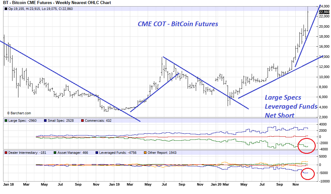
CME $COT - BT (BitCoin)
large specs = dumb money
small specs = smart money
post in Oct.
guess what the large specs & leveraged funds' positioning looked like last week as #BitCoin surging above $24,000
CME $COT - BT (BitCoin)
large specs = dumb money
small specs = smart money
post in Oct.
guess what the large specs & leveraged funds' positioning looked like last week as #BitCoin surging above $24,000
https://twitter.com/kerberos007/status/1318912825142743040
#BitCoin COT
large specs and leveraged fund net short positioning increased again last week.
large specs = dumb money
small specs = smart money (???)
the battle between the large specs vs small retails @ CME.
large specs and leveraged fund net short positioning increased again last week.
large specs = dumb money
small specs = smart money (???)
the battle between the large specs vs small retails @ CME.
Amazing high correlation:
$SPX vx Equity Call/Put Ratio Smoothed Z-Score
call/put ratio = put/pall ratio inverted.
maximum optimism > 3 sigma = what could go wrong?
capitulation zone < -2 sigma
trading accordingly.😉
$SPX vx Equity Call/Put Ratio Smoothed Z-Score
call/put ratio = put/pall ratio inverted.
maximum optimism > 3 sigma = what could go wrong?
capitulation zone < -2 sigma
trading accordingly.😉

CPR from a historical perspective:
2011 - 2020
$SPX vs Equity Call/Put Ratio Smoothed Z-Score
human traders' sentiment never change,
"maximum optimism" as world CB "go brrrrr" gone mad, especially after March Pandemic
high density "all-in calls" after March.
too obvious
2011 - 2020
$SPX vs Equity Call/Put Ratio Smoothed Z-Score
human traders' sentiment never change,
"maximum optimism" as world CB "go brrrrr" gone mad, especially after March Pandemic
high density "all-in calls" after March.
too obvious

"alternative data" investing:
sentiment:
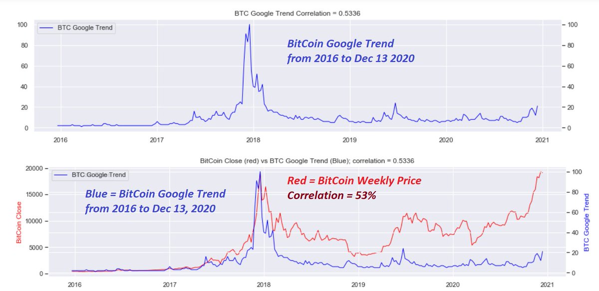
Google trend analysis for #BitCoin trading
below is the Google weekly trend chart for $BitCoin
since 2016
blue = Google trend for #Bitcoin (2016 to Dec 13 2020)
red = #BitCoin price
correlation = 53%;
great leading indicator👌😉
sentiment:
Google trend analysis for #BitCoin trading
below is the Google weekly trend chart for $BitCoin
since 2016
blue = Google trend for #Bitcoin (2016 to Dec 13 2020)
red = #BitCoin price
correlation = 53%;
great leading indicator👌😉
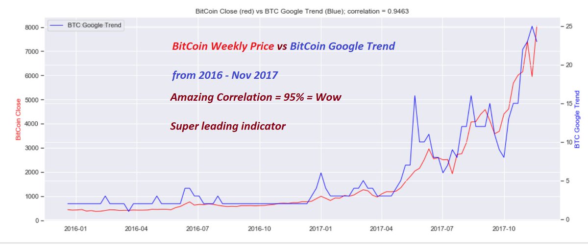
#BitCoin and Google Trend: Shocking correlation:
from 2016 to Nov 2017
Correlation = 95% ==> wow, amazing 🤣
leading indicator? 🧐😉
from 2016 to Nov 2017
Correlation = 95% ==> wow, amazing 🤣
leading indicator? 🧐😉
#BitCoin and Google Trend: Shocking correlation:
from Jan 2017 to Dec 2018
The "rise and fall" of #BitCoin regime
Correlation = 75%
leading indicator..
from Jan 2017 to Dec 2018
The "rise and fall" of #BitCoin regime
Correlation = 75%
leading indicator..

#BitCoin and Google Trend: Shocking correlation:
from July 2019 to Dec 13, 2020
The "rise" of #BitCoin
Correlation = 63% still good 😉🧐
from July 2019 to Dec 13, 2020
The "rise" of #BitCoin
Correlation = 63% still good 😉🧐

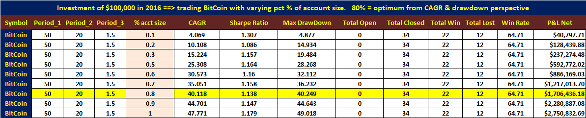
to prove "effectiveness" of trend data with high corr with price. is it leading? or lagging?
I did a quick ML algo backtest using one of my strategies
1 initial= $100,000
2 strategy parameters not optimized
3 good on both training & testing data
4 80% of acct sizing: CAGR = 40%
I did a quick ML algo backtest using one of my strategies
1 initial= $100,000
2 strategy parameters not optimized
3 good on both training & testing data
4 80% of acct sizing: CAGR = 40%
Busy working on a long-term trend indi
& short-term trading breadth indi
top pane = long term trend
middle pane = short-term swing breadth
when long-term == green
BTFD on short-term red-bar uptick
when long-term == pink
STFR on short-term green-bar downtick
2016 to 2010 🧐😉
& short-term trading breadth indi
top pane = long term trend
middle pane = short-term swing breadth
when long-term == green
BTFD on short-term red-bar uptick
when long-term == pink
STFR on short-term green-bar downtick
2016 to 2010 🧐😉

From May 2009 to May 2013
Uptrend 99% of the time:
So, only BTFD on all red histogram upticks.
I am still amazed 😉that both the long-term trend and short-term trading histograms are so smooth, with almost zero delays. unpossible.
super leading indicators. 🧐🍻
Uptrend 99% of the time:
So, only BTFD on all red histogram upticks.
I am still amazed 😉that both the long-term trend and short-term trading histograms are so smooth, with almost zero delays. unpossible.
super leading indicators. 🧐🍻

from Feb 2012 to June 2015 = Uptrend = BTFD only
from July 2015 to Mar 2016 = Downtrend = STFR only
from April 2014 to Feb 2017 = Uptrend = BTFD only
that's it for today.... 😉🤣
from July 2015 to Mar 2016 = Downtrend = STFR only
from April 2014 to Feb 2017 = Uptrend = BTFD only
that's it for today.... 😉🤣

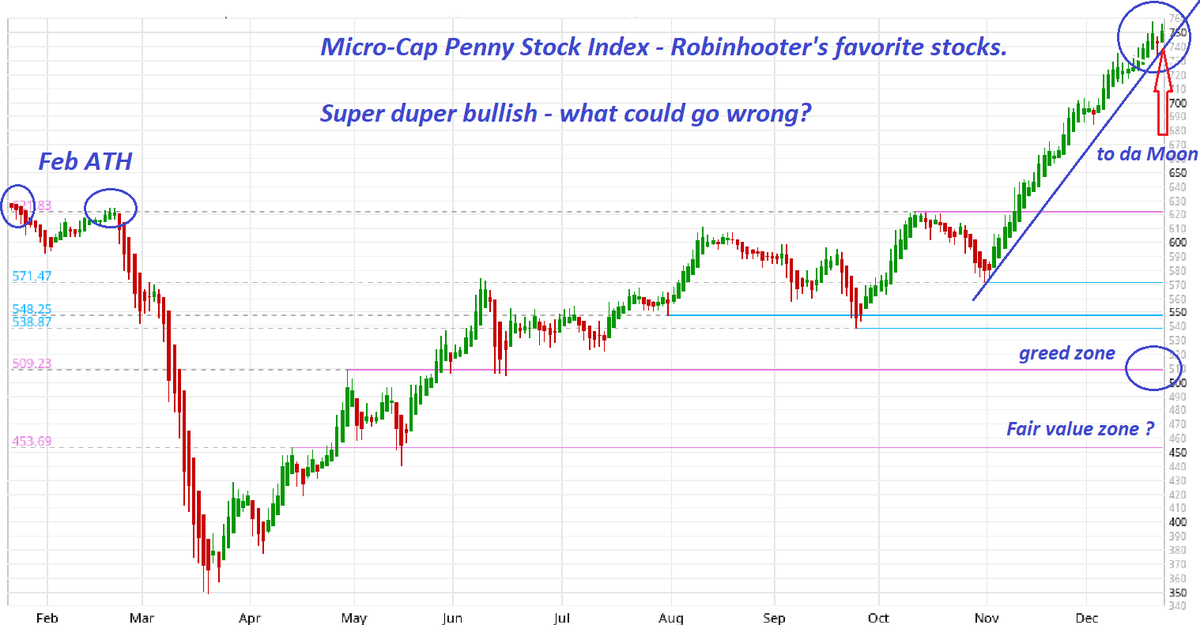
Breaking: getting rich index
follow the leader to da Moon.
Micro-cap penny stock index
straight up from Nov 1
super leading indicator
99% of these $600 Covid check went directly to the Ponzi penny stonks
what could go wrong?
penny stonks only go up. all-in, fomo 🍻😉
follow the leader to da Moon.
Micro-cap penny stock index
straight up from Nov 1
super leading indicator
99% of these $600 Covid check went directly to the Ponzi penny stonks
what could go wrong?
penny stonks only go up. all-in, fomo 🍻😉
one more😉
To simply the trading logic:
1 long when Trend turning Green (risk-on)
2 exit long & short when Trend turning Pink (risk-off)
3 Since 2006💯
A a total of 5 long trades = winners
B one short trade in 2007 to 2009 = winner
C three short & long trades = wash trades
To simply the trading logic:
1 long when Trend turning Green (risk-on)
2 exit long & short when Trend turning Pink (risk-off)
3 Since 2006💯
A a total of 5 long trades = winners
B one short trade in 2007 to 2009 = winner
C three short & long trades = wash trades

Merry xRiskfreeMas quiz😉
1 two highly correlated green indictors:
2 given the Risk-Free 🤣 "mean reversion" nature of these two green indicators, can we predict the short-term VIX directions?
3 "mean reversion" risk-free 🔥 means employing both long and short VIX trades.
1 two highly correlated green indictors:
2 given the Risk-Free 🤣 "mean reversion" nature of these two green indicators, can we predict the short-term VIX directions?
3 "mean reversion" risk-free 🔥 means employing both long and short VIX trades.

Same indicators on the chart from 2012 to 2019
same high correlations,
for $VIX and two green indicators.
same high correlations,
for $VIX and two green indicators.

Same indicators on the chart from 2014 to Dec. 2020
same high correlations,
for $VIX and two green indicators.
hint:
the slow green indicator trended in the opposite direction of SPX.
slope matters.
same high correlations,
for $VIX and two green indicators.
hint:
the slow green indicator trended in the opposite direction of SPX.
slope matters.

Long-Short VIX strategy
new VRP = VRP normalized by Equity PCR
new-VRP> 0 => VIX overpriced = > short VIX/long SVXY
new-VRP< 0 => VIX underpriced => long VIX/VXX
for lotto tickets & hedging for long SPX (stocks) portfolio
new-VRP hedging strategy alone outperformed SPX B&H
new VRP = VRP normalized by Equity PCR
new-VRP> 0 => VIX overpriced = > short VIX/long SVXY
new-VRP< 0 => VIX underpriced => long VIX/VXX
for lotto tickets & hedging for long SPX (stocks) portfolio
new-VRP hedging strategy alone outperformed SPX B&H

nVRP hedging strategy vs SPX buy & Hold
since Nov 2011
nVRP hedging outperforming SPX by a factor of 2.
SPX Buy & Hold
vs
nVRP long & short strategy (always in the market with proper hedging ratio & leverage applied)
👌past performance does not guarantee future returns😉
since Nov 2011
nVRP hedging outperforming SPX by a factor of 2.
SPX Buy & Hold
vs
nVRP long & short strategy (always in the market with proper hedging ratio & leverage applied)
👌past performance does not guarantee future returns😉

Happy xRiskFreeMas.
Merry xMaxOptimismMas
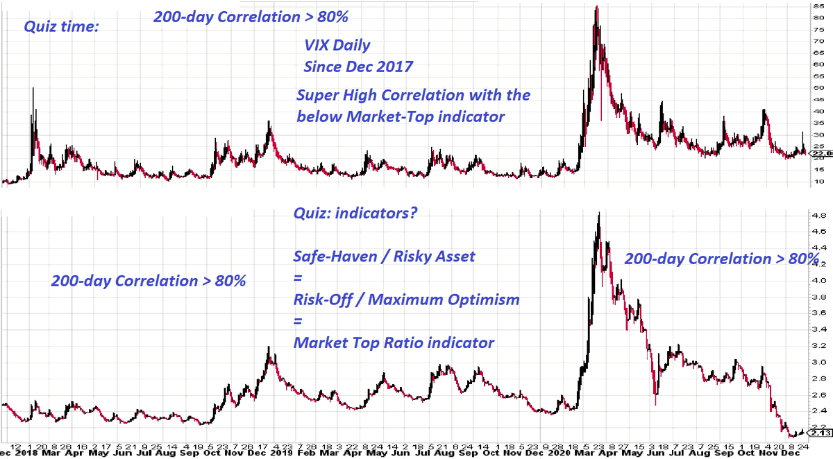
the ultimate risk-off & risk on indicators.
= safe-haven / maximum optimism ratio indicator
= IEF / SPHB ratio
Happy All-in FOMO holidays!
what could go wrong? enjoy it while it lasts 🍻
not sustainable
what goes up must come down😉
Merry xMaxOptimismMas
the ultimate risk-off & risk on indicators.
= safe-haven / maximum optimism ratio indicator
= IEF / SPHB ratio
Happy All-in FOMO holidays!
what could go wrong? enjoy it while it lasts 🍻
not sustainable
what goes up must come down😉

Happy xMarketTopMas indicator
easy quiz for xMas
super high correlation: 200-day corr > 80%
super leading when at extremes
$VIX
vs
Market-Top ratio indicator
= safe-haven/maximum optimism
= risk-off/risk-on
what could go wrong? all-in FOMO
enjoy it while it lasts🍻
Quiz😉
easy quiz for xMas
super high correlation: 200-day corr > 80%
super leading when at extremes
$VIX
vs
Market-Top ratio indicator
= safe-haven/maximum optimism
= risk-off/risk-on
what could go wrong? all-in FOMO
enjoy it while it lasts🍻
Quiz😉
$SPHB vs $IEF Spread Z-score
Euphoria Zone >= +2 Sigma
Greed Zone >= +1 Sigma
Neutral Zone = between +1 & -1 Sigma
Fear Zone <= -1 Sigma
Capitulation Zone <= -2 Sigma
the verdict = euphoria, all-in, fomo, what could go wrong?
Euphoria Zone >= +2 Sigma
Greed Zone >= +1 Sigma
Neutral Zone = between +1 & -1 Sigma
Fear Zone <= -1 Sigma
Capitulation Zone <= -2 Sigma
the verdict = euphoria, all-in, fomo, what could go wrong?

Fun Chart
Renko $SPX trend finder chart from 1997 to 2020
the "duration" is dependent upon the points moved.
the entire year of 2015 was shorter than Feb/Mar 2020 in terms of points transversed 🧐
Renko intraday chart would be very useful for staying on the right side.
Renko $SPX trend finder chart from 1997 to 2020
the "duration" is dependent upon the points moved.
the entire year of 2015 was shorter than Feb/Mar 2020 in terms of points transversed 🧐
Renko intraday chart would be very useful for staying on the right side.

#BitCoin Renko Chart from Dec 2016 to 2020
#BitCoin is approaching $27,000 wow.
Merry xBitCoinMas !! 🍻🔥
Similarity?
from late 2016 to Dec 2017
and
From Mar 2020 to Dec 2020
Go burrrrrrrrr 4ever 🧨💣🔥
#BitCoin is approaching $27,000 wow.
Merry xBitCoinMas !! 🍻🔥
Similarity?
from late 2016 to Dec 2017
and
From Mar 2020 to Dec 2020
Go burrrrrrrrr 4ever 🧨💣🔥

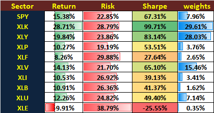
New Year performance and Sharpe Ratio analysis for SPY & SPY sectors:
3 year performance: from Jan 2, 2018 to Dec 31, 2020
3 year Annualized Return and Annualized Risk (Sigma)
Sharpe Ratio = (A-Return - risk-free rate) / A-Risk
One picture is worth a million words 😉
3 year performance: from Jan 2, 2018 to Dec 31, 2020
3 year Annualized Return and Annualized Risk (Sigma)
Sharpe Ratio = (A-Return - risk-free rate) / A-Risk
One picture is worth a million words 😉
A table is worth a thousand words.
SPY & SPY Sector performance (3 years) annualized
with Equal Weight Portfolio (EWP) performance calculated.
EWP for portfolio diversification analysis
SPY & SPY Sector performance (3 years) annualized
with Equal Weight Portfolio (EWP) performance calculated.
EWP for portfolio diversification analysis

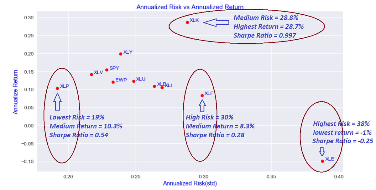
Modern Portfolio Theory (MPT)
&
the efficient frontier
MPT is the set of weighted portfolios that satisfy the condition that no other portfolio exists with a higher annualized return but with the same annualized risk (std)
first attempt: 100,000 random weighted portfolios (red)
&
the efficient frontier
MPT is the set of weighted portfolios that satisfy the condition that no other portfolio exists with a higher annualized return but with the same annualized risk (std)
first attempt: 100,000 random weighted portfolios (red)

Color coded Sharpe-Ratio of 100,000 random weighted portfolio
Red dots = Hot Sharpe Ratio portfolio
==>hi-return & lo risk
Blue dots =Cool Sharpe Ratio portfolio
==> lo return & hi risk
which red dot (portfolio) achieves the best return per risk taken?
beware
past != future😉
Red dots = Hot Sharpe Ratio portfolio
==>hi-return & lo risk
Blue dots =Cool Sharpe Ratio portfolio
==> lo return & hi risk
which red dot (portfolio) achieves the best return per risk taken?
beware
past != future😉

Star portfolio = Maximum Sharpe Ratio Portfolio among 100,000 random weighted portfolio
beware:
backward looking portfolio optimization
past performance != future returns
but could be used as a bench mark for 1 M hedge funds' year-end performance🧐
beware:
backward looking portfolio optimization
past performance != future returns
but could be used as a bench mark for 1 M hedge funds' year-end performance🧐

Max Sharpe Ratio Portfolio weights
This best weighted portfolio assumes that the portfolio did not perform re-balancing (since Jan 2018)
not a realistic assumption
the question is:
what is the best re-balancing period to maintain the best weights for highest Sharpe-Ratio?
This best weighted portfolio assumes that the portfolio did not perform re-balancing (since Jan 2018)
not a realistic assumption
the question is:
what is the best re-balancing period to maintain the best weights for highest Sharpe-Ratio?
Capital Asset Pricing Model (CAPM)
Capital Market Line from efficient frontier
2 funds risk-parity portfolio construction
optimizations
1 best portfolio weights
2 best re-balancing period (weekly, monthly, quarterly) to maintain best portfolio weights for best Sharpe-Ratio
Capital Market Line from efficient frontier
2 funds risk-parity portfolio construction
optimizations
1 best portfolio weights
2 best re-balancing period (weekly, monthly, quarterly) to maintain best portfolio weights for best Sharpe-Ratio

From CAPM theory
many modern financial terms are based open
A alpha & beta derived/defined
B systematic risk vs unsystematic risk defined
C unsystematic risk from assets' internal risk (acct fraud) can be diversified away
D systematic risk can only be hedged
more later 😉
many modern financial terms are based open
A alpha & beta derived/defined
B systematic risk vs unsystematic risk defined
C unsystematic risk from assets' internal risk (acct fraud) can be diversified away
D systematic risk can only be hedged
more later 😉
What Is the Capital Asset Pricing Model?
especially useful in a Fed driven "FrankenBull" market.🤣
investopedia.com/terms/c/capm.a…
especially useful in a Fed driven "FrankenBull" market.🤣
investopedia.com/terms/c/capm.a…
In case you haven't noticed this correlation.
The Fed's QE4ever & NIRP since March driving USD into the abyss, in the mean time:
$USD driving $SPX to da Moon.
$USD & $SPX since March, 2020
200 day Correlation >= -95% amazing.
mirror image. tick for tick
unsustainable
The Fed's QE4ever & NIRP since March driving USD into the abyss, in the mean time:
$USD driving $SPX to da Moon.
$USD & $SPX since March, 2020
200 day Correlation >= -95% amazing.
mirror image. tick for tick
unsustainable

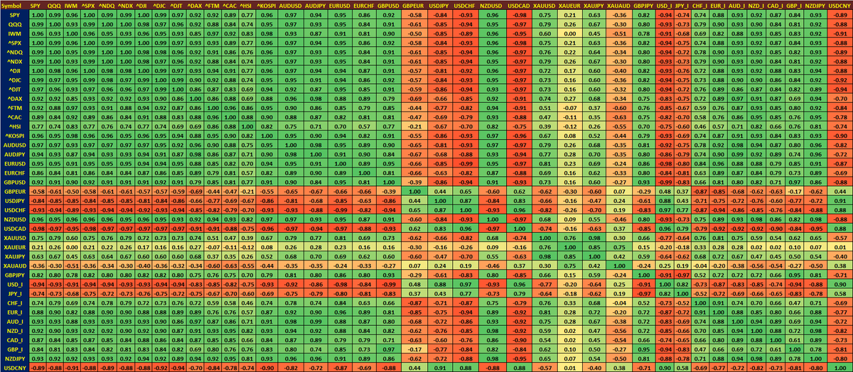
Need a magnifier
since March:
200-day Corre matrix among world indices, FX & Gold (XAU)
SPX positive corr = risk-on FX cur
SPX negative corr = risk-off FX cur
the diagonal corre always = 1, self to self corre
upper & lower triangle=mirror image
USD:SPX corr = SPX:USD corr
since March:
200-day Corre matrix among world indices, FX & Gold (XAU)
SPX positive corr = risk-on FX cur
SPX negative corr = risk-off FX cur
the diagonal corre always = 1, self to self corre
upper & lower triangle=mirror image
USD:SPX corr = SPX:USD corr
In case you haven't noticed this correlation? 😉
#BTC and $SPX on the same linear scale.
#BitCoin since mid 2017 breakout to almost $20,000 by Dec 2017
#BitCoin > $40,000 intraday today.
#BTC and $SPX on the same linear scale.
#BitCoin since mid 2017 breakout to almost $20,000 by Dec 2017
#BitCoin > $40,000 intraday today.

Fun & amazing performance stats.
#Bitcoin
$TSLA
$AAPL
buy & hold since 2011-6-13
#BitCoin
total return = 203,865%
CAGR = 121.65%
max drawdown = -91%
$TSLA
total return = 15,377%
CAGR = 69.3%
max drawdown = -60.6%
one table is worth a million words😉
#Bitcoin
$TSLA
$AAPL
buy & hold since 2011-6-13
#BitCoin
total return = 203,865%
CAGR = 121.65%
max drawdown = -91%
$TSLA
total return = 15,377%
CAGR = 69.3%
max drawdown = -60.6%
one table is worth a million words😉


$TSLA
Monthly & Yearly Performance Since June 2011
Monthly & Yearly Performance Since June 2011

SPY, QQQ, IWM and SP-500 Sectors
Performance stats since Feb 2007 ==> GFC included
$XLF only up 20% since 2007🧐
$QQQ up 701%
$XLE down -3.9% ( #GS Oil to $200 call in 2008 )😉
Performance stats since Feb 2007 ==> GFC included
$XLF only up 20% since 2007🧐
$QQQ up 701%
$XLE down -3.9% ( #GS Oil to $200 call in 2008 )😉

Risky FX currency vs risky FrankenBull market
$AUDUSD vs $QQQ
225-day Corr = 96.6%;
amazing
one-sided & crowded trades:
Short $USD & Long $AUD
carry trade
unsuatainable.
wait for the carry trade to unwind in times of stress
snowball😉🧐
bubble everywhere
&
everything bubble
$AUDUSD vs $QQQ
225-day Corr = 96.6%;
amazing
one-sided & crowded trades:
Short $USD & Long $AUD
carry trade
unsuatainable.
wait for the carry trade to unwind in times of stress
snowball😉🧐
bubble everywhere
&
everything bubble

I have to steal this chart for the record
Citi: The Panic/Euphoria Model
Maximum Optimism: off the chart.
looks like a 10 sigma event? once in a billion years?🤣
What could go wrong? BTF-ATH; BTF-Euphoria fomo
Citi: The Panic/Euphoria Model
Maximum Optimism: off the chart.
looks like a 10 sigma event? once in a billion years?🤣
What could go wrong? BTF-ATH; BTF-Euphoria fomo

For the record:
from 2018 Citi Panic/Euphoria sentiment indicator:
Jan 2018
Sep 2018
Euphoria.
what happened 1-2 months later?
from 2018 Citi Panic/Euphoria sentiment indicator:
Jan 2018
Sep 2018
Euphoria.
what happened 1-2 months later?

For the record:
from 2018 - 2019 Citi Panic/Euphoria sentiment indicator:
Sep 2018 - Euphoria
Dec 2018 - Panic/Capitulation
April 2019 - Euphoria
June 2019 - Panic
super leading contrarian indicator.
what happened 1-2 months later?
from 2018 - 2019 Citi Panic/Euphoria sentiment indicator:
Sep 2018 - Euphoria
Dec 2018 - Panic/Capitulation
April 2019 - Euphoria
June 2019 - Panic
super leading contrarian indicator.
what happened 1-2 months later?

For the record:
from 2019 - 2020 Citi Panic/Euphoria sentiment indicator:
Jan 2020- Euphoria
Feb 2020 - Euphoria
Mar 2020 - Panic/Capitulation
Aug 2020 - Euphoria++
Nov/Dec 2020 - Euphoria++++ (^n)
Jan 2021 - need a new scale; 2 sigma
super leading contrarian indicator.
from 2019 - 2020 Citi Panic/Euphoria sentiment indicator:
Jan 2020- Euphoria
Feb 2020 - Euphoria
Mar 2020 - Panic/Capitulation
Aug 2020 - Euphoria++
Nov/Dec 2020 - Euphoria++++ (^n)
Jan 2021 - need a new scale; 2 sigma
super leading contrarian indicator.

for the record: top secret indicators.
posted on Feb 16th.
see my market top indicator (top one) aligned with Citi indicator perfectly.
also my market crash indicator (bottom: probability > 90%)
In Jan 2018 and
Feb 2020.
perfect. 👌🍻 for the record
posted on Feb 16th.
see my market top indicator (top one) aligned with Citi indicator perfectly.
also my market crash indicator (bottom: probability > 90%)
In Jan 2018 and
Feb 2020.
perfect. 👌🍻 for the record
https://twitter.com/kerberos007/status/1229194103356887041
futures #COT positioning update
VX🔥
Comm & dealer = huge long
Lg/sm specs & lev funds = huge short
NQ👌
Comm & dealer = net short
Lg/sm specs = net long
Rut🧐
Comm & dealer = huge short
Lg/Sm specs = net long
USD💣
Comm & dealer = net long
Lg specs = net short
ES😴
mixed
VX🔥
Comm & dealer = huge long
Lg/sm specs & lev funds = huge short
NQ👌
Comm & dealer = net short
Lg/sm specs = net long
Rut🧐
Comm & dealer = huge short
Lg/Sm specs = net long
USD💣
Comm & dealer = net long
Lg specs = net short
ES😴
mixed
Current Shiller PE Ratio: 34.77 +0.19 (0.55%)
Mean: 6.78
Median: 15.81
Min: 4.78 (Dec 1920)
Max: 44.19 (Dec 1999)
Schiller PE still below Dec 1999😉
S&P-500 super-duper under-valued?
BTF-ATH
what could go wrong? go burrrr 4ever
Schiller PE magnet = 100🤣🔥
Mean: 6.78
Median: 15.81
Min: 4.78 (Dec 1920)
Max: 44.19 (Dec 1999)
Schiller PE still below Dec 1999😉
S&P-500 super-duper under-valued?
BTF-ATH
what could go wrong? go burrrr 4ever
Schiller PE magnet = 100🤣🔥

Current S&P 500 Price to Book: 4.24 +0.02 (0.55%)
Mean: 2.84
Median: 2.78
Min: 1.78(Mar 2009)
Max: 5.06(Mar 2000)🔥
PB ratio still below Mar 2000
S&P-500 super-duper under-valued
BTF-ATH
what could go wrong? go burrrr 4ever
PB ratio magnet= 10 🧐🍻
Mean: 2.84
Median: 2.78
Min: 1.78(Mar 2009)
Max: 5.06(Mar 2000)🔥
PB ratio still below Mar 2000
S&P-500 super-duper under-valued
BTF-ATH
what could go wrong? go burrrr 4ever
PB ratio magnet= 10 🧐🍻

Current S&P 500 Price to Sales Ratio: 2.79 +0.02 (0.55%)
Mean: 1.57
Median: 1.50
Min: 0.80(Mar 2009)
Max: 2.79(Jan 2021)🔥
PS ratio ATH👍
BTF-ATH
what could go wrong? go burrrr 4ever
The Fed mandate/target: PS ratio = 10🤣
Mean: 1.57
Median: 1.50
Min: 0.80(Mar 2009)
Max: 2.79(Jan 2021)🔥
PS ratio ATH👍
BTF-ATH
what could go wrong? go burrrr 4ever
The Fed mandate/target: PS ratio = 10🤣

If all of above do not matter:
how about Earnings Yield?
Current S&P 500 Earnings Yield: 2.59% -1.42 bps
I miss 1917🍻 with avg Earnings Yield of 18.8%
mean = 7.3% is fair
Mean: 7.32%
Median: 6.74%
Min: 0.81% (May 2009)
Max: 18.82% (Dec 1917)
magnet = 0😉
how about Earnings Yield?
Current S&P 500 Earnings Yield: 2.59% -1.42 bps
I miss 1917🍻 with avg Earnings Yield of 18.8%
mean = 7.3% is fair
Mean: 7.32%
Median: 6.74%
Min: 0.81% (May 2009)
Max: 18.82% (Dec 1917)
magnet = 0😉

beware
enjoy the party (party like 1999 with virus masks on) while it lasted
all bubbles would always burst
this time is different?
human greed never changes
when in times of stress, Fed can't fix it with go burr4ever
point of diminishing return
it is just a matter of time🧐
enjoy the party (party like 1999 with virus masks on) while it lasted
all bubbles would always burst
this time is different?
human greed never changes
when in times of stress, Fed can't fix it with go burr4ever
point of diminishing return
it is just a matter of time🧐
Busy day-trading/scalping to fund my long-term put lotto tickets
Below: one of my fav charts for day trading
Confluence is KEY
Gold stair line= 10 day SMA on an hourly chart
Short-term trend: strong support if price abovet
Confluence:: Blue (or Red ) waves & FX same direction
Below: one of my fav charts for day trading
Confluence is KEY
Gold stair line= 10 day SMA on an hourly chart
Short-term trend: strong support if price abovet
Confluence:: Blue (or Red ) waves & FX same direction

4-Hour $SPX and FX major currencies since Mar 2020
Safe-haven (risk-off) = $USD & $JPY dumped since Mar
Risky FX (risk-on) = $AUD & $NZD surged since Mar
$SPX (bottom) surged.
All about Fed driven risky assets & FX currencies bubble.
plus #BitCoin & housing bubble
FrankenBull
Safe-haven (risk-off) = $USD & $JPY dumped since Mar
Risky FX (risk-on) = $AUD & $NZD surged since Mar
$SPX (bottom) surged.
All about Fed driven risky assets & FX currencies bubble.
plus #BitCoin & housing bubble
FrankenBull

Maximum Optimism:
Russell-3000 stocks trading above 200-day SMA = 90.45%
A chart is worth a million words
Jan 2018
Aug/Sep 2018
Jan/Feb 2020
=> around 70% of Rut 3000 stocks above 200d SMA
today = 90.45% Euphoria, fomo, maximum optimism
what could go wrong?
Greed is good 🍻😉
Russell-3000 stocks trading above 200-day SMA = 90.45%
A chart is worth a million words
Jan 2018
Aug/Sep 2018
Jan/Feb 2020
=> around 70% of Rut 3000 stocks above 200d SMA
today = 90.45% Euphoria, fomo, maximum optimism
what could go wrong?
Greed is good 🍻😉

Another super duper leading contrarian indicator:
I have a screener, scanning from over 4000+ stocks including penny stocks
The 1st criteria is:
price > $10
2-3 months ago ==> around 3000 stocks
today ==> almost 3500 stocks
tons of penny stocks, now trading above $10🧐🍻😉
I have a screener, scanning from over 4000+ stocks including penny stocks
The 1st criteria is:
price > $10
2-3 months ago ==> around 3000 stocks
today ==> almost 3500 stocks
tons of penny stocks, now trading above $10🧐🍻😉
Micro-Cap Index vs S&P-500 Index
Since July 2020:
S&P-500 =====> Up 20%
Micro-Cap -===> Up 50%
Micro-Cap all-in, euphoria, maximum optimism.
Penny stonks only go UP 🧨💣🔥
what could go wrong?
Greed is good 🍻😉
Since July 2020:
S&P-500 =====> Up 20%
Micro-Cap -===> Up 50%
Micro-Cap all-in, euphoria, maximum optimism.
Penny stonks only go UP 🧨💣🔥
what could go wrong?
Greed is good 🍻😉

CBOE Equity PCR=0.34🍻
Euphoria, all-in calls
lowest 12 PCR since 2010:
2021-01-12 0.34🔥
2020-12-03 0.35
2010-12-13 0.35
2020-12-07 0.37
2020-12-22 0.37
2020-12-01 0.37
2011-01-14 0.37
2020-11-09 0.37
2020-12-17 0.37
2020-06-08 0.37
2020-08-27 0.38
2021-01-07 0.38
Euphoria, all-in calls
lowest 12 PCR since 2010:
2021-01-12 0.34🔥
2020-12-03 0.35
2010-12-13 0.35
2020-12-07 0.37
2020-12-22 0.37
2020-12-01 0.37
2011-01-14 0.37
2020-11-09 0.37
2020-12-17 0.37
2020-06-08 0.37
2020-08-27 0.38
2021-01-07 0.38

QQQ-100 Short Interest as of Dec 30:
Top 45 Short-Interest SI_%change from Nov 29
$EA = 58%
$BIDU = 44.8%
$CHTR = 42%
$INTC = 35%
Top 45 Short-Interest SI_%change from Nov 29
$EA = 58%
$BIDU = 44.8%
$CHTR = 42%
$INTC = 35%
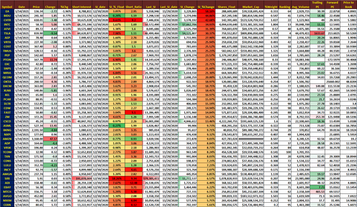
QQQ-100 Top 42 Short Interest In terms % Float.
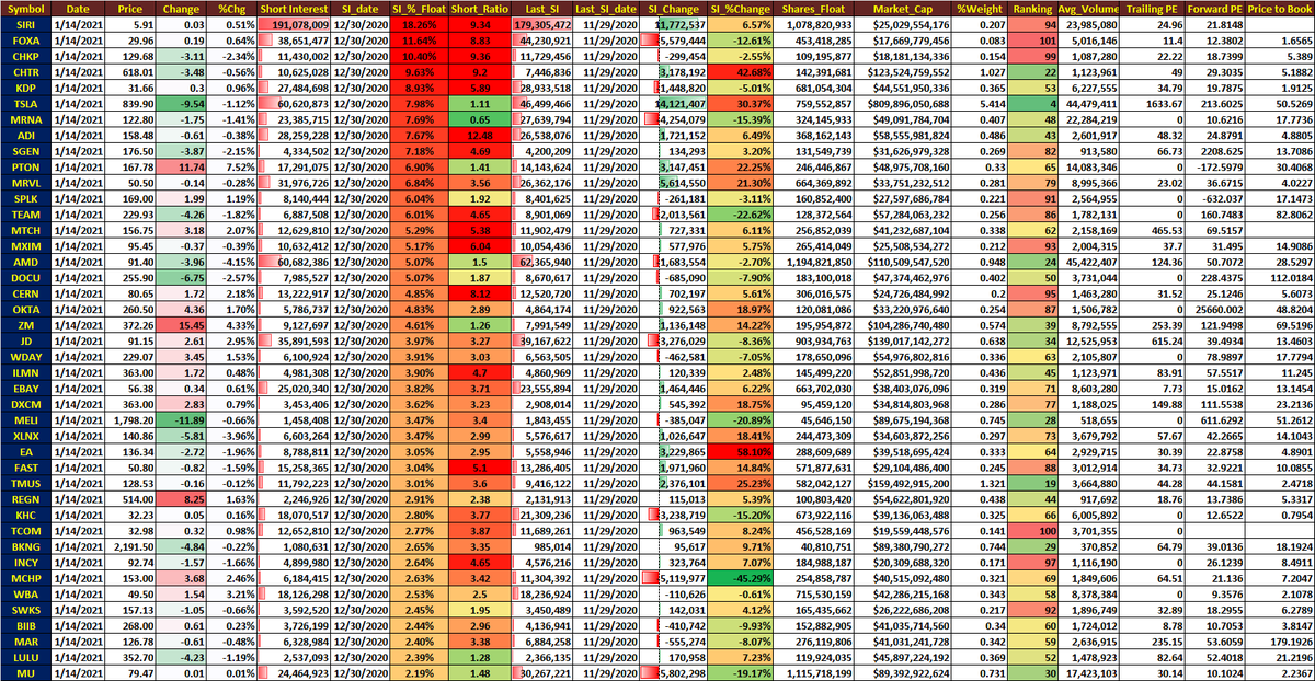
$TSLA: Mother of all Short Squeezes.
Short Interest since Aug 2019
5:1 split adjusted Short Interest and Daily Volume
SI & volume multiplied by 5 for SI prior to Aug 5:1 split
Days to cover from 6 days to 1 day.
Short Interest since Aug 2019
5:1 split adjusted Short Interest and Daily Volume
SI & volume multiplied by 5 for SI prior to Aug 5:1 split
Days to cover from 6 days to 1 day.

Top 42 QQQ-103 stocks in terms of Market-Cap & % weights in NDX
top 10 stocks = 51.85% weights for NDX-100 Index
$AAPL ranked #1 with 11.9% weight 👌
$TSLA ranked #4 in terms of market-cap weight = 5.4%
top 10 stocks = 51.85% weights for NDX-100 Index
$AAPL ranked #1 with 11.9% weight 👌
$TSLA ranked #4 in terms of market-cap weight = 5.4%

Indices and major Sector rotation heat map.
$QQQ & $XLK ranking dropping fast
$IWM still near the top
$XLU & $XLP near the bottom
Ranked by my quant momentum scoring system
QWSR scoring & % change from 1-day to 1-year
$QQQ & $XLK ranking dropping fast
$IWM still near the top
$XLU & $XLP near the bottom
Ranked by my quant momentum scoring system
QWSR scoring & % change from 1-day to 1-year

top 22 and bottom 22 S&P-500 stocks and QQQ stocks
bottom stocks mostly green today
top stocks mostly red today
interesting rotation.
sell winners (profit taking)
buy losers (mean reversion)
bottom stocks mostly green today
top stocks mostly red today
interesting rotation.
sell winners (profit taking)
buy losers (mean reversion)

Growth vs Value ETFs
Sector Rotation
1. IWM vs SPY
2. SP500 Growth vs SPY Value (SPYG vs SPYV)
3. SP400 Growth vs SP400 Value (MDYG vs MDYV)
4. SP600 Growth vs SP600 Value (SLYG vs SLYV)
Sector Rotation
1. IWM vs SPY
2. SP500 Growth vs SPY Value (SPYG vs SPYV)
3. SP400 Growth vs SP400 Value (MDYG vs MDYV)
4. SP600 Growth vs SP600 Value (SLYG vs SLYV)

$VIX vs
CBOE Put/Call Ratio (10-day MA)
both are standardized for comparison purposes
Since March 2020,
PCRs have been consistently below -2 sigma, only had seen a couple of times in 2011.
euphoria
all-in stonk calls with stimulus checks & borrowed money
what could go wrong?
CBOE Put/Call Ratio (10-day MA)
both are standardized for comparison purposes
Since March 2020,
PCRs have been consistently below -2 sigma, only had seen a couple of times in 2011.
euphoria
all-in stonk calls with stimulus checks & borrowed money
what could go wrong?

Equity PCR (10-day SMA) since 2004
vs
$VIX
linear scale
not standardized
left axis = VIX
right axis = PCR
without standardization, it is hard to compare.
super important for all ML algos to standardize/normalize all inputs to the same scale prior to the training of Neurons
vs
$VIX
linear scale
not standardized
left axis = VIX
right axis = PCR
without standardization, it is hard to compare.
super important for all ML algos to standardize/normalize all inputs to the same scale prior to the training of Neurons

some useful stats for
1 VIX
2 PCR
3 PCR-SMA(10)
A. VIX mean = 17.88; today > 24
B. PCR mean = 0.63; since March mostly below 0.4
C. PCR min = 0.35; yep, achieved last week 2 days in a row
D. euphoria; all-in stonk calls
E. what could go wrong?
F BTF-ATH🔥
1 VIX
2 PCR
3 PCR-SMA(10)
A. VIX mean = 17.88; today > 24
B. PCR mean = 0.63; since March mostly below 0.4
C. PCR min = 0.35; yep, achieved last week 2 days in a row
D. euphoria; all-in stonk calls
E. what could go wrong?
F BTF-ATH🔥

AAII Sentiment: Chart from 2010
Green = Bullish
Red = Bearish
Blue = bull - bear Spread
bull- bear spread = a good contrarian indicator
not as good as Equity PCR
but
when aligned and confluent with other breadth inds, high probability contrarian ind
accurate capitulation zone
Green = Bullish
Red = Bearish
Blue = bull - bear Spread
bull- bear spread = a good contrarian indicator
not as good as Equity PCR
but
when aligned and confluent with other breadth inds, high probability contrarian ind
accurate capitulation zone

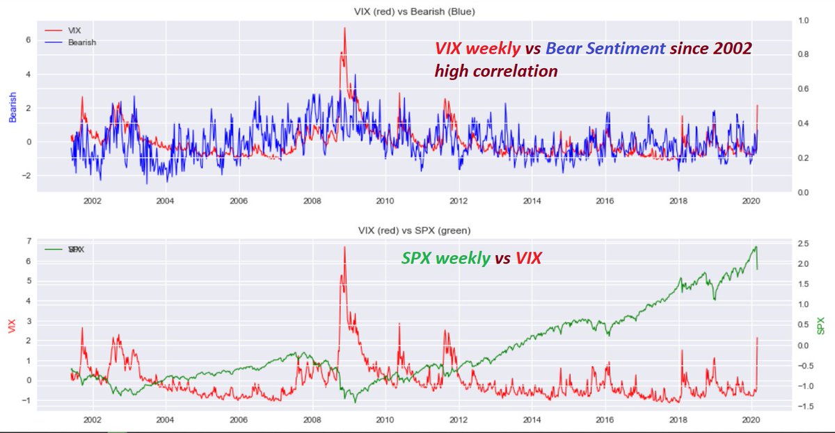
VIX weekly vs Bear-Sentiment since 2002
High Correlation.
red line = $VIX
blue line = bear-sentiment
green line = $SPX
bear-sentiment => positive correlation with $VIX
is better than bull-sentiment => pos. correlation with $SPX
High Correlation.
red line = $VIX
blue line = bear-sentiment
green line = $SPX
bear-sentiment => positive correlation with $VIX
is better than bull-sentiment => pos. correlation with $SPX
VIX weekly vs Bear-10d-SMA
SPX weekly vs Bull-10d-SMA
SPX weekly vs Bull-10d-SMA

Last post on AAII
Updated:
with projections 🤣😉
top = $VIX vs Bear-10d-SMA
bottom = $SPX vs Bull-Bear-Spread-10d-SMA
with projections
Updated:
with projections 🤣😉
top = $VIX vs Bear-10d-SMA
bottom = $SPX vs Bull-Bear-Spread-10d-SMA
with projections

bonus: the mother of all JAWS?
6 Jaws (divergence at the top) since Jan 2018, resulted huge drawdowns; plunge would soon ensue
so far so good,100% accuracy since Feb 2018
pinpointed all 6 ATHs w/ trend line break
the 7th time is different?
what could go wrong? all-in calls🍻
6 Jaws (divergence at the top) since Jan 2018, resulted huge drawdowns; plunge would soon ensue
so far so good,100% accuracy since Feb 2018
pinpointed all 6 ATHs w/ trend line break
the 7th time is different?
what could go wrong? all-in calls🍻

Support and resistance levels +- 5 pts
==>
bulls & bears stop loss levels
Ponzi algos targeting these congested stop loss levels day & night
super leading S-R levels, written on the wall days/weeks ahead
KEY to win🧐
front-run the algo stop run
fade the algo after the stop run
==>
bulls & bears stop loss levels
Ponzi algos targeting these congested stop loss levels day & night
super leading S-R levels, written on the wall days/weeks ahead
KEY to win🧐
front-run the algo stop run
fade the algo after the stop run

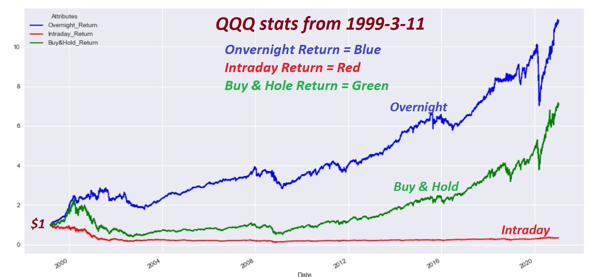
Shocking Stats
QQQ from 1999-3-11 to 2021-1-19
Overnight ret=buy at close & sell at next day open
Intraday ret=buy at open & sell at close the same day
Buy & Hold ret=buy on 1999-3-11 & hold
overnight= 1024%; Max = -38%
Intraday= -65%; max DD = -88%
B&H= 608%; Max DD = -83%
QQQ from 1999-3-11 to 2021-1-19
Overnight ret=buy at close & sell at next day open
Intraday ret=buy at open & sell at close the same day
Buy & Hold ret=buy on 1999-3-11 & hold
overnight= 1024%; Max = -38%
Intraday= -65%; max DD = -88%
B&H= 608%; Max DD = -83%

A picture is worth a million words:
study conclusion:😉
Algos have been super busy "BTFD" at night.🐵
Real traders have been super busy "STFR" intraday👌
shocking?
🧐🍻
study conclusion:😉
Algos have been super busy "BTFD" at night.🐵
Real traders have been super busy "STFR" intraday👌
shocking?
🧐🍻
QQQ overnight BTFD Seasonality..
July seemed to be a good overnight BTFD
3 negative return years
one flat year
17 positive return years
not bad.
Algos Holy Grail trading strategy 🐵🤣
July seemed to be a good overnight BTFD
3 negative return years
one flat year
17 positive return years
not bad.
Algos Holy Grail trading strategy 🐵🤣

strategy summary
from my intensive study on portfolio opt:
best portfolio construction
A pick 5 strategies (below table) with positive expected ret
B correlation of strategies should be low or negative
C monthly rebalance among 5 strategies using risk-parity allocation algo
from my intensive study on portfolio opt:
best portfolio construction
A pick 5 strategies (below table) with positive expected ret
B correlation of strategies should be low or negative
C monthly rebalance among 5 strategies using risk-parity allocation algo

D. by monthly rebalancing among 5 strategies based on risk-parity allocation algo
E. achieving portfolio diversification among 5 strategies
F. reduce overall portfolio risk (vol), minimize DD & increase Sharpe & Sortino ratios
G. enhance overall portfolio return with less risk
E. achieving portfolio diversification among 5 strategies
F. reduce overall portfolio risk (vol), minimize DD & increase Sharpe & Sortino ratios
G. enhance overall portfolio return with less risk

SPY & Micro-Cap relative performance
52 week:
all-in Penny Stock and Micro-Cap;
plus
#BitCoin and OTM calls.
what could go wrong?🍻 Booyah.
Booyah. Euphoria. Booyah
52 week:
all-in Penny Stock and Micro-Cap;
plus
#BitCoin and OTM calls.
what could go wrong?🍻 Booyah.
Booyah. Euphoria. Booyah

more & more
Booyah. Euphoria. Booyah
including $TSLA & $GME..
Speechless. Booyah. Euphoria. Booyah
the Mother of all infinity short squeezes
Off the chart. to Da Moon
what could go wrong?
when it rains it pours.
the new regime.
the Robinhooder regime. 🍻🔥
Booyah. Euphoria. Booyah
including $TSLA & $GME..
Speechless. Booyah. Euphoria. Booyah
the Mother of all infinity short squeezes
Off the chart. to Da Moon
what could go wrong?
when it rains it pours.
the new regime.
the Robinhooder regime. 🍻🔥

Super trend detection indi's
Stay with the trend until it breaks
Bottom (yellow arrows) = BTFD when Red color turned Green
potential STFR when Green turned Red;
STFR when SPX trendline break w/ Jaws (Pink arrows)
super trend detection with high prob entry & exit & Jaws
Stay with the trend until it breaks
Bottom (yellow arrows) = BTFD when Red color turned Green
potential STFR when Green turned Red;
STFR when SPX trendline break w/ Jaws (Pink arrows)
super trend detection with high prob entry & exit & Jaws

This is NOT a fake chart.
unpossible. 🔥💣
unpossible. 🔥💣

$VIX percent Change close to close.
since 1990
top 37 $VIX percent change (close to close) since 1990 inception
#Volmageddon = Ranked #1 up 115.6% in one day
today = ranked #2
$VIX = 37.21 up 61.64% in one day.
booyah.. 🧐🍻
since 1990
top 37 $VIX percent change (close to close) since 1990 inception
#Volmageddon = Ranked #1 up 115.6% in one day
today = ranked #2
$VIX = 37.21 up 61.64% in one day.
booyah.. 🧐🍻

With $VIX up 61% today
and
$SPX down almost 100 points
the Equity Put/Call ratio still <= 0.40 (yellow)
all-in call buying continued.
what fear? still Euphoria, greed & Maximum Optimism
$VIX spike today was just a huge "short-squeeze".
Short Squeeze infinity everywhere.
and
$SPX down almost 100 points
the Equity Put/Call ratio still <= 0.40 (yellow)
all-in call buying continued.
what fear? still Euphoria, greed & Maximum Optimism
$VIX spike today was just a huge "short-squeeze".
Short Squeeze infinity everywhere.

#ES_F: Ping-pong competition continues
🤣
Perfect "Head and Shoulder" & middle finger formation🐵
super duper Bullish++
Magnet = 3730
Magnet = 3700
next magnet = ???? use your imagination.🧐
🤣
Perfect "Head and Shoulder" & middle finger formation🐵
super duper Bullish++
Magnet = 3730
Magnet = 3700
next magnet = ???? use your imagination.🧐

Sector rotation:
Useful S&P-500 & Major Sector Relative performance stats
Surprising stats from Jan 2000 to Jan 2022
22 years
XLY = Best = growth
XLV = 2nd = value
XLU = 3rd = value
XLP = 4th = value
XLB = 5th
XLI = 6th
QQQ = 7th
SPY = 8th
XLK = 9th
XLE = 10th
XLF = 11th
Useful S&P-500 & Major Sector Relative performance stats
Surprising stats from Jan 2000 to Jan 2022
22 years
XLY = Best = growth
XLV = 2nd = value
XLU = 3rd = value
XLP = 4th = value
XLB = 5th
XLI = 6th
QQQ = 7th
SPY = 8th
XLK = 9th
XLE = 10th
XLF = 11th

above performance stats:
from my study/backtest, the best sector rotation in times of euphoria & stress
==>
XLY (euphoria) &
XLP (stress)
from max-dd, risk (vol) & Sharpe-R perspective
find an risk-on/off algo
to rotate b/w XLP & XLY: risk-parity
better than SPY & TLT (60/40)
from my study/backtest, the best sector rotation in times of euphoria & stress
==>
XLY (euphoria) &
XLP (stress)
from max-dd, risk (vol) & Sharpe-R perspective
find an risk-on/off algo
to rotate b/w XLP & XLY: risk-parity
better than SPY & TLT (60/40)

XLY & XLP corr>97%
to hedge the high corr portf, it is advised to add another strategy in the portf w/ low/neg corr
below is one of many good strategies that have neg corr with risky assets
stress: VRP & XLP
euphoria: VRP & XLY
both risk-parity allo
to hedge the high corr portf, it is advised to add another strategy in the portf w/ low/neg corr
below is one of many good strategies that have neg corr with risky assets
stress: VRP & XLP
euphoria: VRP & XLY
both risk-parity allo
https://twitter.com/kerberos007/status/1342695657707081729
1 million $ question
how to determine the risk-on & risk-off regime?
so, the sector rotation plus nVRP hedging strat would perform the best in time of stress & euphoria with nVRP hedging?
below thread is a super accurate risk-on & risk off indicator
how to determine the risk-on & risk-off regime?
so, the sector rotation plus nVRP hedging strat would perform the best in time of stress & euphoria with nVRP hedging?
below thread is a super accurate risk-on & risk off indicator
https://twitter.com/kerberos007/status/1341214113956061186
I always post bearish Jaws (diverg at the top) for market crash warnings
today I present both Bearish &
Bullish Jaws at the bottom for the BTFD'ers🍻
below risk-on/risk-off ratio
1. predicted 2007 top with bearish Jaws
2. 2009 bottom with huge Bullish Jaws in Mar 2009 @ 666
🧐
today I present both Bearish &
Bullish Jaws at the bottom for the BTFD'ers🍻
below risk-on/risk-off ratio
1. predicted 2007 top with bearish Jaws
2. 2009 bottom with huge Bullish Jaws in Mar 2009 @ 666
🧐

The same Risk-On/Risk-Off chart as above, with zoomed in version for Jan/Feb Jaws
The Jan/Feb bearish Jaws perfectly predicted the pandemic crash
100-day correlation is shocking=96%
Totally different asset class ratio
super leading indicator
Cross-asset correlation works.🍻🧐
The Jan/Feb bearish Jaws perfectly predicted the pandemic crash
100-day correlation is shocking=96%
Totally different asset class ratio
super leading indicator
Cross-asset correlation works.🍻🧐

For 96% correlated pairs &
1 ADF test p_value<0.05=stationary spread time series
2 COI test p_value<0.05=Co-integrated pairs
3 all 3 condi's signifying pair spread would converge over time
4 hence, pair trading or
5 STFR if SPX > ratio
6 BTFD if SPX < ratio
or use Z-score
👌🍻
1 ADF test p_value<0.05=stationary spread time series
2 COI test p_value<0.05=Co-integrated pairs
3 all 3 condi's signifying pair spread would converge over time
4 hence, pair trading or
5 STFR if SPX > ratio
6 BTFD if SPX < ratio
or use Z-score
👌🍻

The lowest CBOE Equity Put/Call ratio since `2010
lowest 38 equity PCRs from my database
Super bullish++
burrrrrr4ever & equity PCR (pink cells) & below are highly correlated🤣
all-in OTM calls
$GME to da Moon
buy bankrupt comp OTM calls
Gamma squeeze
what could go wrong?
lowest 38 equity PCRs from my database
Super bullish++
burrrrrr4ever & equity PCR (pink cells) & below are highly correlated🤣
all-in OTM calls
$GME to da Moon
buy bankrupt comp OTM calls
Gamma squeeze
what could go wrong?

super bullish trend in Insider selling activities
total $amount$ sell/buy ratio
A 1 day = 17.1
B 1 week = 44.2 ==> wow🍻 wealth-transfer🤣😉
C 1 month = 6.8
D 3 month = 9.3
E 6 month = 9.8
F 1 year = 3.8
G 2 year = 4.6
are you buying?🍻
the Fed & Robinhooters are buying?👌
total $amount$ sell/buy ratio
A 1 day = 17.1
B 1 week = 44.2 ==> wow🍻 wealth-transfer🤣😉
C 1 month = 6.8
D 3 month = 9.3
E 6 month = 9.8
F 1 year = 3.8
G 2 year = 4.6
are you buying?🍻
the Fed & Robinhooters are buying?👌

Crypto Market Fear and Greed index.
seems to be an excellent contrarian sentiment indicator,
waiting for 100 to starting shorting..🤣
"Amazon accepting $BitCoin news" would do it.😉
hurry up. $1,000,000 = Magnet
seems to be an excellent contrarian sentiment indicator,
waiting for 100 to starting shorting..🤣
"Amazon accepting $BitCoin news" would do it.😉
hurry up. $1,000,000 = Magnet

Super accurate Crypto Fear-greed index
Euphoria= 95 - 100
Over-Bought= 80 - 95
Over-Sold= 40 - 20
Fear= 20 - 10
Capitulation= below 10
super accurate BTFD & STFR se3ntiment indicator
perfectly aligned with the #BitCoin price action since Jan 2018
writing a new app🍻🧐😉
Euphoria= 95 - 100
Over-Bought= 80 - 95
Over-Sold= 40 - 20
Fear= 20 - 10
Capitulation= below 10
super accurate BTFD & STFR se3ntiment indicator
perfectly aligned with the #BitCoin price action since Jan 2018
writing a new app🍻🧐😉

MRNA - massive insider selling in the past month,
just one of 5 pages..
just one of 5 pages..

Trillion dollar sell-at-the-top strategy.
These guys at TSLA knew exactly when to sell at the top.
follow the insider strategy. 🤣🤣
Kimbal Musk has been a super leading indicator since 2019.
when Kimbal sell, we all sell. 🍻
These guys at TSLA knew exactly when to sell at the top.
follow the insider strategy. 🤣🤣
Kimbal Musk has been a super leading indicator since 2019.
when Kimbal sell, we all sell. 🍻

Micro-cap
small-cap
mid-cap
large-cap
getting there?
still a long way to go.
bubbles everywhere
Valuation Reset is healthy to the economy in the long-term, avoiding a sudden market crash & prolonged recession
small-cap
mid-cap
large-cap
getting there?
still a long way to go.
bubbles everywhere
Valuation Reset is healthy to the economy in the long-term, avoiding a sudden market crash & prolonged recession

Real-world application:
for educational purposes, using just 2 assets for illustration
QQQ and TLT (neg correlation)
from Aug 2002 to Feb 2021 = 20 yrs back-testing
1 re-balance the asset weights at month-end
2 using different optimization algos for comparison purposes
conti
for educational purposes, using just 2 assets for illustration
QQQ and TLT (neg correlation)
from Aug 2002 to Feb 2021 = 20 yrs back-testing
1 re-balance the asset weights at month-end
2 using different optimization algos for comparison purposes
conti
suing the below 5 opt strategies:
1 rp_erc= risk-parity, equal-risk-contribution with std co-variance matrix est
2 rp_erc_lw= same as above with Ledoit-Wolf co-variance est
3 IVWP=inverse volatility opt
4 MVP=minimum variance (risk) opt
5 M-VAR=mean-variance (Share-Ratio) opt
1 rp_erc= risk-parity, equal-risk-contribution with std co-variance matrix est
2 rp_erc_lw= same as above with Ledoit-Wolf co-variance est
3 IVWP=inverse volatility opt
4 MVP=minimum variance (risk) opt
5 M-VAR=mean-variance (Share-Ratio) opt
I believe most people would think
M-VAR optimization monthly would generate highest alpha
M-VAR=mean-variance optimization
=maximize the mean-return with minimum variance constraints maximize the Sharpe-Ratio portfolio
M-VAR is the the most popular momo portfolio optimization
M-VAR optimization monthly would generate highest alpha
M-VAR=mean-variance optimization
=maximize the mean-return with minimum variance constraints maximize the Sharpe-Ratio portfolio
M-VAR is the the most popular momo portfolio optimization
I have just proved that the most popular Mean-variance optimization strategy would generate the worst alpha from my back-testing results on 5 different popular algorithms
shocking
the momentum driven (Sharpe-Ratio) mean-variance optimization would be the worse strategy.👌🧐🤣
shocking
the momentum driven (Sharpe-Ratio) mean-variance optimization would be the worse strategy.👌🧐🤣
below is the comparison among 5 opt stategies:
1 QQQ:TLT 20 yrs
2 monthly optimization & re-balancing
3 at month-end, optimize the assets weights using the same method for all 5 for fairness
4 optimization based on the past month
a. returns
b. corre
c. co-variance
d. volatility
1 QQQ:TLT 20 yrs
2 monthly optimization & re-balancing
3 at month-end, optimize the assets weights using the same method for all 5 for fairness
4 optimization based on the past month
a. returns
b. corre
c. co-variance
d. volatility

the results were expected
the last strategy = mean-variance optimization lagging the other 4 strategies by a mile
the momentum/Performance based optimization generated worst result in past 20 yrs for QQQ:TLT monthly re-balancing portfolio
same result for SPY:IEF or SPY:TLT
the last strategy = mean-variance optimization lagging the other 4 strategies by a mile
the momentum/Performance based optimization generated worst result in past 20 yrs for QQQ:TLT monthly re-balancing portfolio
same result for SPY:IEF or SPY:TLT

Due to the extreme low variance (risk) in other 4 strategies, using the leverage from 1, 1.5, to 2 would be justified in a ultra-low-interest regime to augment alpha with targeted risk (variance)
below bar chart illustrates the magic of diversification & compounding returns
below bar chart illustrates the magic of diversification & compounding returns

By increase the leverage:
1 the total returns are exponentially increased to da Moon for all 4 strategies
2 but, the Sharpe Ratio stayed flat above 1
3 in a non-diversified portfolio, the higher the leverage, higher the risk, the lower the Sharpe-Ratio
4 magic optimization
1 the total returns are exponentially increased to da Moon for all 4 strategies
2 but, the Sharpe Ratio stayed flat above 1
3 in a non-diversified portfolio, the higher the leverage, higher the risk, the lower the Sharpe-Ratio
4 magic optimization

the portfolio optimization goals for all assets managers
1 CAGR> 12%
2 Sharpe Ratio> 1 (upside & downside risk adjusted)
3 Sortino Ratio> 2 (downside risk adjusted only)
4 Maximum drawdown< -30%
if a portfolio can achieve the above 4 factors, the manager would be super happy.
1 CAGR> 12%
2 Sharpe Ratio> 1 (upside & downside risk adjusted)
3 Sortino Ratio> 2 (downside risk adjusted only)
4 Maximum drawdown< -30%
if a portfolio can achieve the above 4 factors, the manager would be super happy.

the magic of diversification & compounding with leverage while keeping risk at minimum with negligible Sharpe-Ratio penalties
the magic of "monthly optimization & re-balancing" and "volatility targeting" portfolio
see below linear growth on CAGR but exponentially total returns
the magic of "monthly optimization & re-balancing" and "volatility targeting" portfolio
see below linear growth on CAGR but exponentially total returns

With leverage from 1, 1.5, to 2 in real-world app
1 CAGR grow linearly with higher leverage
2 but, total returns grow exponentially (magic of compounding)
3 Sharpe-Ratio stayed flat above 1.2
4 Sortino ratio suffered just a bit, above 7 (WOW)
5 volatility & DD rising marginally
1 CAGR grow linearly with higher leverage
2 but, total returns grow exponentially (magic of compounding)
3 Sharpe-Ratio stayed flat above 1.2
4 Sortino ratio suffered just a bit, above 7 (WOW)
5 volatility & DD rising marginally

Summary of all 5 portfolio re-balancing & optimization strategies for QQQ;TLT asset from Aug 2002 to Feb 2021
all KPI key performance metrics are calculated for comparison purposes with leverage from 1, 1.5, to 2.5 to 3
leverage of 1.5 to 2 might be optimum perf/risk portfolio
all KPI key performance metrics are calculated for comparison purposes with leverage from 1, 1.5, to 2.5 to 3
leverage of 1.5 to 2 might be optimum perf/risk portfolio

For a realistic back-testing, I even included the leverage borrowing cost based on Interactive Brokers' overnight lending rate (averaged yearly Libor rate)
deducing the leverage cost, the back-testing reflected the real-world application
The commissions are so low, negligible
deducing the leverage cost, the back-testing reflected the real-world application
The commissions are so low, negligible

For comparison;
SPX - CAGR averaged around 8% in the past 20 years
SPX - Sharpe-Ratio around 0.8 < 1
SPX - Sortino Ratio about 1.2 < 2
SPX - Max DD = -54%
no comparison.
see other KPI from above table for the diversified & optimized & monthly re-balancing portfolio
SPX - CAGR averaged around 8% in the past 20 years
SPX - Sharpe-Ratio around 0.8 < 1
SPX - Sortino Ratio about 1.2 < 2
SPX - Max DD = -54%
no comparison.
see other KPI from above table for the diversified & optimized & monthly re-balancing portfolio
All portfolio optimizations are based on the:
MMT = Modern Portfolio Theory
&
Efficient Frontier
higher the expected return
=
higher the portfolio risk (Variance or Stdev)
Optimization & re-balancing are meant to achieve the optimum portfolio given a risk level & return exp
MMT = Modern Portfolio Theory
&
Efficient Frontier
higher the expected return
=
higher the portfolio risk (Variance or Stdev)
Optimization & re-balancing are meant to achieve the optimum portfolio given a risk level & return exp

Massive sector rotation: in S&P-500 Sectors & Sub-Groups:
XLY #Automobile used to be the top 3 sub-groups in almost a year due to insane $TSLA valuation
now, it dropped to #52 ranks among 104 sub-groups... also due to $TSLA
tech wreck continued
Gold & mining carnage continued
XLY #Automobile used to be the top 3 sub-groups in almost a year due to insane $TSLA valuation
now, it dropped to #52 ranks among 104 sub-groups... also due to $TSLA
tech wreck continued
Gold & mining carnage continued

repost with better layout..

FX currency vs Risky Assets
$USD vs $SPX (or $NDX)
perfectly negatively correlated since March 2020 Pandemic
Correlation = -95%
$USD plunging drives $SPX surging
Day traders' paradise with $JPY and $AUD FX indices.
I reposted tons of FX leading indicators over the weekend.
$USD vs $SPX (or $NDX)
perfectly negatively correlated since March 2020 Pandemic
Correlation = -95%
$USD plunging drives $SPX surging
Day traders' paradise with $JPY and $AUD FX indices.
I reposted tons of FX leading indicators over the weekend.

Nobody commented on this chart?
$USD getting stronger: super bullish++ 🤣🍻
the Divergence (Jaws) started to form.
does not bode well for the risky assets.🧐
JAWS 🤣
$USD getting stronger: super bullish++ 🤣🍻
the Divergence (Jaws) started to form.
does not bode well for the risky assets.🧐
JAWS 🤣

A quiz.
What has the below arrows hinted us?
hint:
if the below perfect correlation persists in the future, what does the arrow predict?
haha..
What has the below arrows hinted us?
hint:
if the below perfect correlation persists in the future, what does the arrow predict?
haha..

Ha. the below "Trend following Turtle trading" strategy ran almost 12 hrs, just finished. super time consuming
At month end, among 500 stocks, selecting/rotating highest 50 momentum stocks of last 3 month, using trend following Turtle strategy with 12% trailing stops
from 2006
At month end, among 500 stocks, selecting/rotating highest 50 momentum stocks of last 3 month, using trend following Turtle strategy with 12% trailing stops
from 2006

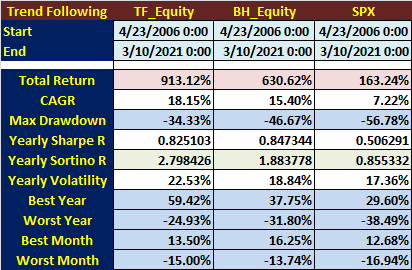
Performance Metrics for the "trend following Turtle" strategy.
1 CAGR = 18.15% (good) since 2007
2 Sharpe Ratio = 0.82 (okay)
3 Sortino Ratio = 2.79 (great)
4 Max DD = -34% (marginal)
but, much better than $SPX buy & hold, and best momentum stocks buy & hold. for one month
1 CAGR = 18.15% (good) since 2007
2 Sharpe Ratio = 0.82 (okay)
3 Sortino Ratio = 2.79 (great)
4 Max DD = -34% (marginal)
but, much better than $SPX buy & hold, and best momentum stocks buy & hold. for one month
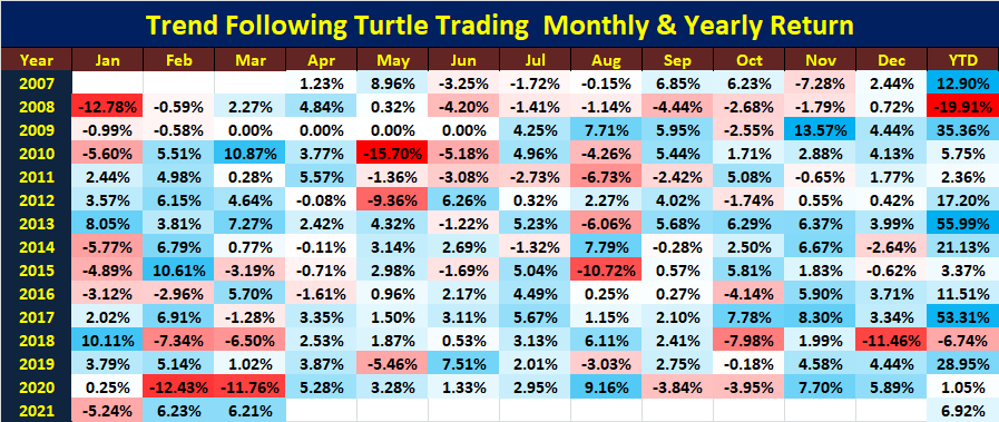
The Turtle trading monthly & yearly returns
with minor enhancements to the original Turtle entry/exit rules, below results are not bad at all by all measures.
suffering 2 losing years only (2008, yeah. of course 😉) and 12 winning years, including 2020.👌
with minor enhancements to the original Turtle entry/exit rules, below results are not bad at all by all measures.
suffering 2 losing years only (2008, yeah. of course 😉) and 12 winning years, including 2020.👌
KPI performance metrics
superior KPI for Kerb-1.5 ERC ETF🍻👍
1 CAGR= 17% (excellent: compound yearly growth)
2 Total Return= 1,151% since 2005 (wow)
3 Max Drawdown= -25.2% (good)
4 Sharpe Ratio= 1.23 (excellent)
5 Annualize Volatility (risk)= 13.1% (super)
SPY B&H = not good
superior KPI for Kerb-1.5 ERC ETF🍻👍
1 CAGR= 17% (excellent: compound yearly growth)
2 Total Return= 1,151% since 2005 (wow)
3 Max Drawdown= -25.2% (good)
4 Sharpe Ratio= 1.23 (excellent)
5 Annualize Volatility (risk)= 13.1% (super)
SPY B&H = not good

SPYV = S&P-500 Value Stocks
SPYG = S&P-500 Growth Stocks
rotation into "Value" stocks started since Mid Feb -
when $TSLA insider selling ring the Bell at the TOP 🤣
SPYV/SPYG ratio surging
SPYG = S&P-500 Growth Stocks
rotation into "Value" stocks started since Mid Feb -
when $TSLA insider selling ring the Bell at the TOP 🤣
SPYV/SPYG ratio surging

Ding ding ding bell-rang indicator:
IWD = Small-Cap (IWM) Value Stocks
IWF = Small-Cap Growth Stocks
rotation into "Value" stocks started since Mid Feb -
when $TSLA insider selling rang the "Bell" at the TOP 🐵
ding ding ding
IWD / IWF ratio surging
unpossible.
IWD = Small-Cap (IWM) Value Stocks
IWF = Small-Cap Growth Stocks
rotation into "Value" stocks started since Mid Feb -
when $TSLA insider selling rang the "Bell" at the TOP 🐵
ding ding ding
IWD / IWF ratio surging
unpossible.

$USD (Inverted)
and
#UST-10Yr Yield
highly Correlated
Below Chart
#UST10Yr-Yield
Magnet = 1.60 (today, super accurate)
What is the next Magnet? 3.0 ? 👌
super bullish++
Hyper-Stagflation🤣
Prediction
If (10Yr >= 2.0):
$SPX tanks 20-30% secured
Rate Hike secured
and
#UST-10Yr Yield
highly Correlated
Below Chart
#UST10Yr-Yield
Magnet = 1.60 (today, super accurate)
What is the next Magnet? 3.0 ? 👌
super bullish++
Hyper-Stagflation🤣
Prediction
If (10Yr >= 2.0):
$SPX tanks 20-30% secured
Rate Hike secured

Kerb-X update😉
5 multi-asset hedged strategies form a single portfolio
the magic of
diversification
CAGR compound &
monthly re-balancing/opt
Kerb-Comb:
1 highest Sharpe-Ratio
2 lowest max-drawdowns
3 lowest portfolio risk (vol)
4 near highest CAGR
than individual Kerb-X🍻
5 multi-asset hedged strategies form a single portfolio
the magic of
diversification
CAGR compound &
monthly re-balancing/opt
Kerb-Comb:
1 highest Sharpe-Ratio
2 lowest max-drawdowns
3 lowest portfolio risk (vol)
4 near highest CAGR
than individual Kerb-X🍻

What rotation to "value"?
DJI-30 hitting all time highs day after day last week.
just pump one company in 30 stonks would be enough to melt-up to da Moon
see below pct change performance table
from 1-day to 1-year %change
ranked by 10-day %chg
$BA up 24.6% in 10 days🍻
DJI-30 hitting all time highs day after day last week.
just pump one company in 30 stonks would be enough to melt-up to da Moon
see below pct change performance table
from 1-day to 1-year %change
ranked by 10-day %chg
$BA up 24.6% in 10 days🍻
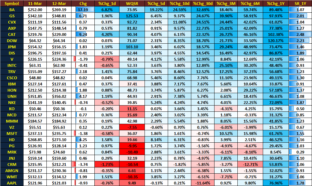
ranked by 10-day percent change
$BA up 19.22% in 5-day
$BA up 24.59% in 10-day
while $AAPL down -11.64% in 30-days.
super bullish ++
$BA up 19.22% in 5-day
$BA up 24.59% in 10-day
while $AAPL down -11.64% in 30-days.
super bullish ++

DJI_30 is price weighted Index
$BA is currently #4 in the weight rank as indicated by its price level = $273
=5.1% weight
Don't like the price weighted index
$AAPL with a price of $122, ranked around #22
=2.4% weight
market-Cap weighted index ( $SPX, $NDX) makes more sense
$BA is currently #4 in the weight rank as indicated by its price level = $273
=5.1% weight
Don't like the price weighted index
$AAPL with a price of $122, ranked around #22
=2.4% weight
market-Cap weighted index ( $SPX, $NDX) makes more sense

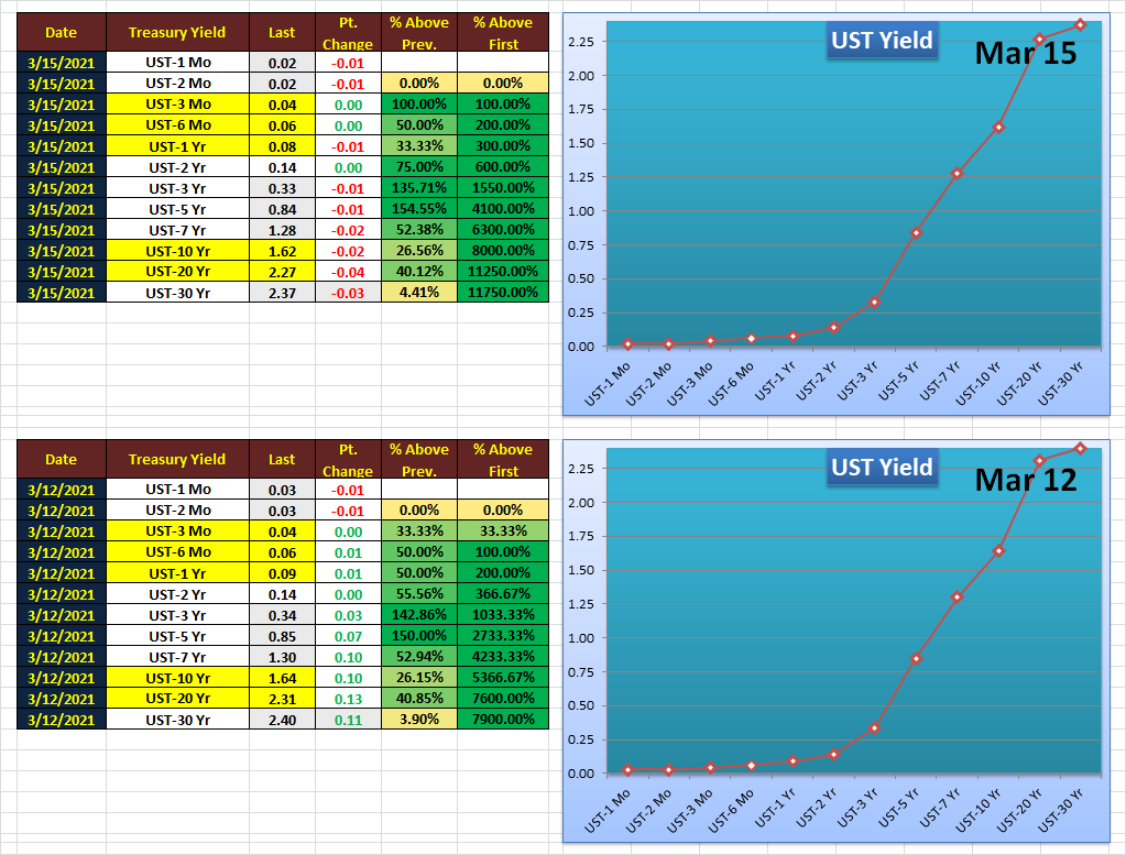
Mar 15th 2021: UST Treasury Yield Curve update
super bullish++
super bullish++
NDX-100
vs
SPX
from Mar 1993 to Mar 2000 - dot.com bubble/tulips
a picture is worth a gazillion words. 🍻
you know what is coming next? 🤣🤣🤣
vs
SPX
from Mar 1993 to Mar 2000 - dot.com bubble/tulips
a picture is worth a gazillion words. 🍻
you know what is coming next? 🤣🤣🤣

to da Moon:
NDX CAGR = 42.5% Compound Annual Growth Rate
from 1993 to 2000
Max-Drawdown < 23%
super duper bullish++ (^Moon)
what could possibly go wrong?
Tech IPOs always go up. 🍻🤣🤣
NDX CAGR = 42.5% Compound Annual Growth Rate
from 1993 to 2000
Max-Drawdown < 23%
super duper bullish++ (^Moon)
what could possibly go wrong?
Tech IPOs always go up. 🍻🤣🤣

Ready for this?
NDX-100 vs SPX
from Mar 1993 to Mar 2003
Gravity
what goes up,
must come down.
From Euphoria to Capitulation in 2 years. 🤣🤣
NDX-100 vs SPX
from Mar 1993 to Mar 2003
Gravity
what goes up,
must come down.
From Euphoria to Capitulation in 2 years. 🤣🤣

NDX-100 vs SPX
from Jan 1st, 2019 to Mar 16, 2021
getting there.🍻
from Jan 1st, 2019 to Mar 16, 2021
getting there.🍻

S&P-500 Sub-industry group rank
pay attention to
A. "change" &
B. "% change column"
top 40 sub-industry groups on the left
bottom 40 sub-industry groups on the right
stealthy rotation to "value"?
stealthy rotation from top performing groups to "value" sub-groups😉
bullish++
pay attention to
A. "change" &
B. "% change column"
top 40 sub-industry groups on the left
bottom 40 sub-industry groups on the right
stealthy rotation to "value"?
stealthy rotation from top performing groups to "value" sub-groups😉
bullish++

More NDX & SPX perf metrics
a fair comparison
we'll start just after the GFC that almost blew up the entire planet,
and the Fed & world CBs had gone mad ever since, burrr$4ever to infinity, getting ready to blow up the Galaxy this time🤣😉
From Mar 2009 to Mar 2021
bullish++
a fair comparison
we'll start just after the GFC that almost blew up the entire planet,
and the Fed & world CBs had gone mad ever since, burrr$4ever to infinity, getting ready to blow up the Galaxy this time🤣😉
From Mar 2009 to Mar 2021
bullish++

Bulls - bewarte
Shocking similarity? 🍻
Chart 1= NDX vs SPX from Mar 1993 to March 2000
Chart 2= NDX vs SPX from Mar 2009 to March 2021
History repeats itself? Hmm
They never learn?
super bullish++(^Moon)🤣🤣
what could possibly go wrong?
fomo buy the ATHs w/ free money
Shocking similarity? 🍻
Chart 1= NDX vs SPX from Mar 1993 to March 2000
Chart 2= NDX vs SPX from Mar 2009 to March 2021
History repeats itself? Hmm
They never learn?
super bullish++(^Moon)🤣🤣
what could possibly go wrong?
fomo buy the ATHs w/ free money

Alert: "Breaking news" while updating alert. 😉
the UST yield curve is literally off-the-chart.🍻
super bullish++
kick the can....
the UST yield curve is literally off-the-chart.🍻
super bullish++
kick the can....

Sector/Sub-industry group ranking
notice the top 1 & 2 subgroups within the XLB sector?
up there for a while now
canary in a coal mine
no inflation?
breakout in all major Aluminum stocks in Nov-Dec
Alu stocks
AA, KALU, CENX, ACH, CSTM
sector rotation is super important🍻
notice the top 1 & 2 subgroups within the XLB sector?
up there for a while now
canary in a coal mine
no inflation?
breakout in all major Aluminum stocks in Nov-Dec
Alu stocks
AA, KALU, CENX, ACH, CSTM
sector rotation is super important🍻

Alu stocks: ranked #1 among 104 sub-groups for a while now:
AA, KALU, CENX, ACH, CSTM
all breaking out since Nov 1st, 2020; left most level..
predicting hyper-inflation.
confirmed by the latest UST yields surge.
kick the can.
AA, KALU, CENX, ACH, CSTM
all breaking out since Nov 1st, 2020; left most level..
predicting hyper-inflation.
confirmed by the latest UST yields surge.
kick the can.

QQQ-100 ugly day - down more than -3%
ranked by the worst 30-day percent change.
$TSLA down -22.66% in 30-days.
in bear market
super-bullish++🍻
p.s. (for the bears)
ranked by the worst 30-day percent change.
$TSLA down -22.66% in 30-days.
in bear market
super-bullish++🍻
p.s. (for the bears)

Micro-Cap
Small-Cap
Mid-Cap
Large-Cap
QQQ
relative perf since Nov 1, 2020 in that order
QQQ underperforming BIGLY
Micro-Cap continues to outperform with massive Helicopter money in coming weeks, months, years, decades, forever to infinity🍻
Party like 1999
felt like Mar 2000
Small-Cap
Mid-Cap
Large-Cap
QQQ
relative perf since Nov 1, 2020 in that order
QQQ underperforming BIGLY
Micro-Cap continues to outperform with massive Helicopter money in coming weeks, months, years, decades, forever to infinity🍻
Party like 1999
felt like Mar 2000

I believe some people already noticed that I've included WQSR ranking in my previous posts
It used to run very slowly, taking half hour for 1000+ tickers with 100,000 daily prices each
Now, I re-wrote the code, taking advantage of super fast & optimized Numpy Vector, Matrix op
It used to run very slowly, taking half hour for 1000+ tickers with 100,000 daily prices each
Now, I re-wrote the code, taking advantage of super fast & optimized Numpy Vector, Matrix op
Now, for1000+ tickers with daily price back to 1998, the entire vector/matrix manipulation of the whole data would finish in less than 5 min.
Numpy is super optimized for the ML/Deep learning vector/matrix/tensor operation
AI is all about tensor calculus= N-dimensional matrix
Numpy is super optimized for the ML/Deep learning vector/matrix/tensor operation
AI is all about tensor calculus= N-dimensional matrix
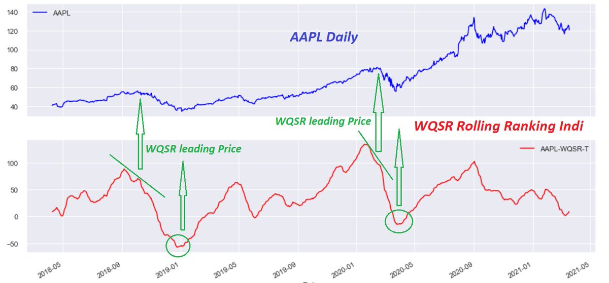
WQSR ranking system is a normalized momentum/trend/sharpe-ratio/linear-regression slope combined ind that can be used to compare RS/ranking among cross-assets
below is a sample of AAPL WQSR ranking on the bottom
at major inflection points, WQSR is bounded & slightly leading👌
below is a sample of AAPL WQSR ranking on the bottom
at major inflection points, WQSR is bounded & slightly leading👌
March 19: Major sectors and sub-industry groups
for your weekend study.
biggest winner:
XLRE Renewable Energy Equipment (+3.82%)
biggest loser:
XLF Consumer Finance(-3.74%)
for your weekend study.
biggest winner:
XLRE Renewable Energy Equipment (+3.82%)
biggest loser:
XLF Consumer Finance(-3.74%)

burrrr$4ever regime over-valuation estimation based on last 10 year avg PE ratio for S&P-500 companies
if SPX back to 5-yr PE ratio (TTM)
target=2700
if SPX back to 10-yr PE ratio (TTM)
target=2100
like 2002 & 2008
eventually, fundamentals do matter
a matter of time
bullish++
if SPX back to 5-yr PE ratio (TTM)
target=2700
if SPX back to 10-yr PE ratio (TTM)
target=2100
like 2002 & 2008
eventually, fundamentals do matter
a matter of time
bullish++

High WQSR sub-industries
Banks in XLF sector
a rising tide lifts all boats
a tradeable pattern for all these over-valued bank stocks; WQSR>100
all of the price actions crossed-over 50d & 200d SMAs almost simultaneously in Nov-Dec (breakout)
red-line: 200d SMA
blue: 50d SMA
Banks in XLF sector
a rising tide lifts all boats
a tradeable pattern for all these over-valued bank stocks; WQSR>100
all of the price actions crossed-over 50d & 200d SMAs almost simultaneously in Nov-Dec (breakout)
red-line: 200d SMA
blue: 50d SMA

• • •
Missing some Tweet in this thread? You can try to
force a refresh


